Plotly graphs and figures
Building Dashboards with Dash and Plotly

Alex Scriven
Data Scientist
What is Dash?
- A Python library for creating interactive web applications
$$
$$
Advantages:
- Free! Unlike Tableau or PowerBI
- Harness JavaScript with only Python
- Less code than web application frameworks
Plotly and Dash
- Work well together
$$
- Dash: Interactive dashboards with multiple Plotly graphs
- See this example
- Images, text and charts
- Check out the source code

What is Plotly?
- Refresh Plotly, focus on Dash
- A Python library for creating modern, interactive graphs
- Wraps JavaScript but code in Python
- Create graphs with
plotly.express
$$
$$
$$
- Check out the Introduction to Data Visualization with Plotly in Python
Our e-commerce data
- Dataset of e-commerce sales
$$
$$
- Details:
- Item category (Major, Minor) + description
- Unit price, quantity (+ OrderValue)
- Country
- Year-Month of sale

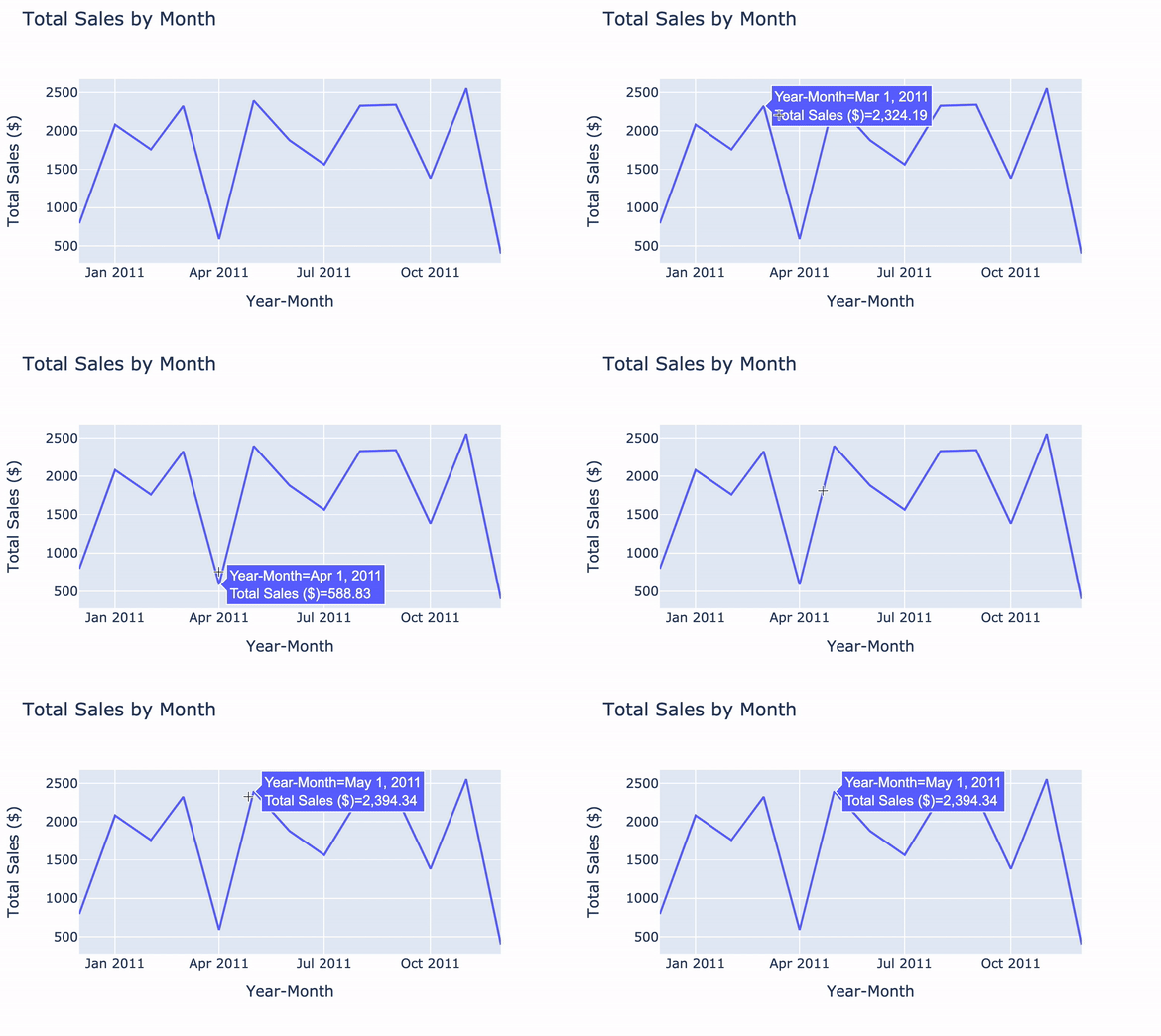
Line charts with plotly.express
import plotly.express as pxline_graph = px.line(data_frame=ecom_sales, x='Year-Month', y='Total Sales ($)', title='Total Sales by Month')line_graph.show()

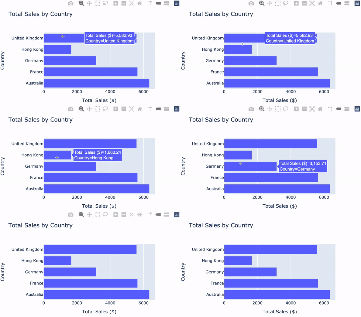
Bar charts with plotly.express
$$
bar_fig = px.bar( data_frame=ecom_sales, x='Total Sales ($)', y='Country', title='Total Sales by Country',orientation='h')bar_fig.show()

Customizing Plotly graphs
Changing the bar width of our bar graph:
bar_fig.update_layout({'bargap': 0.5})bar_fig.show()
$$
$$
$$
Check out the Plotly documentation

Let's practice!
Building Dashboards with Dash and Plotly

