Know your audience
Data Visualization in Power BI

Iason Prassides
Content Developer at DataCamp
Your intended audience
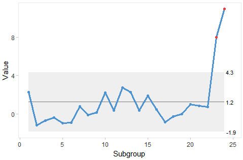
Process Control Chart
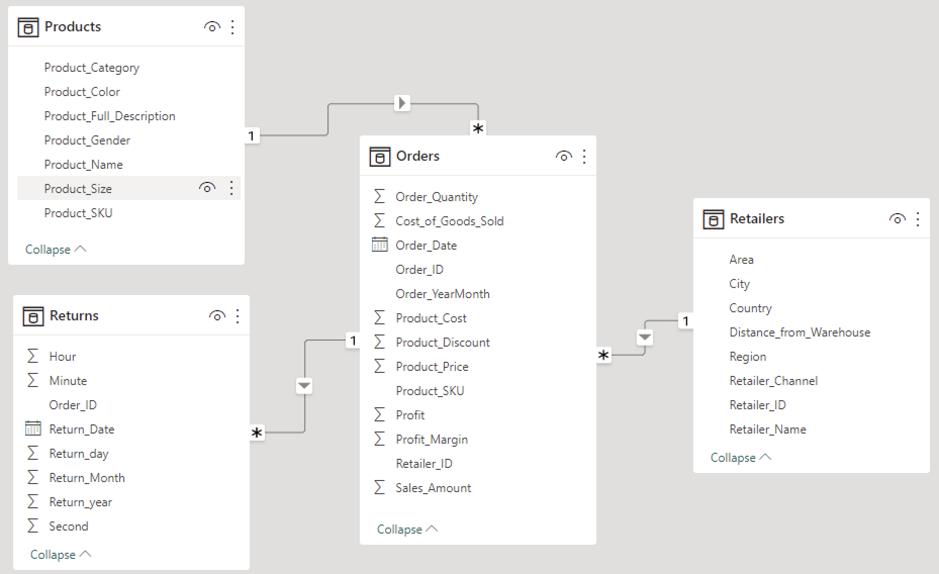
The dataset
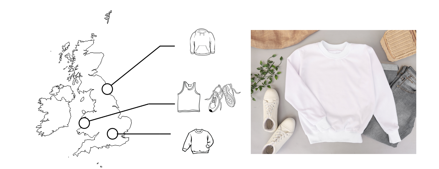
The dataset
Our audience

Data Visualization in Power BI
Iason Prassides
Content Developer at DataCamp
Process Control Chart

