Subplots
Interactive Data Visualization with Bokeh

George Boorman
Core Curriculum Manager, DataCamp
Why use subplots?
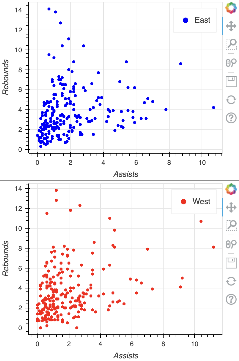
Row subplot
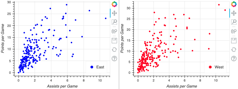
Column subplot
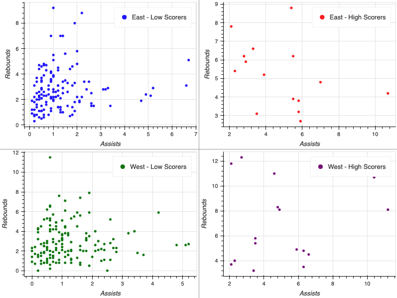
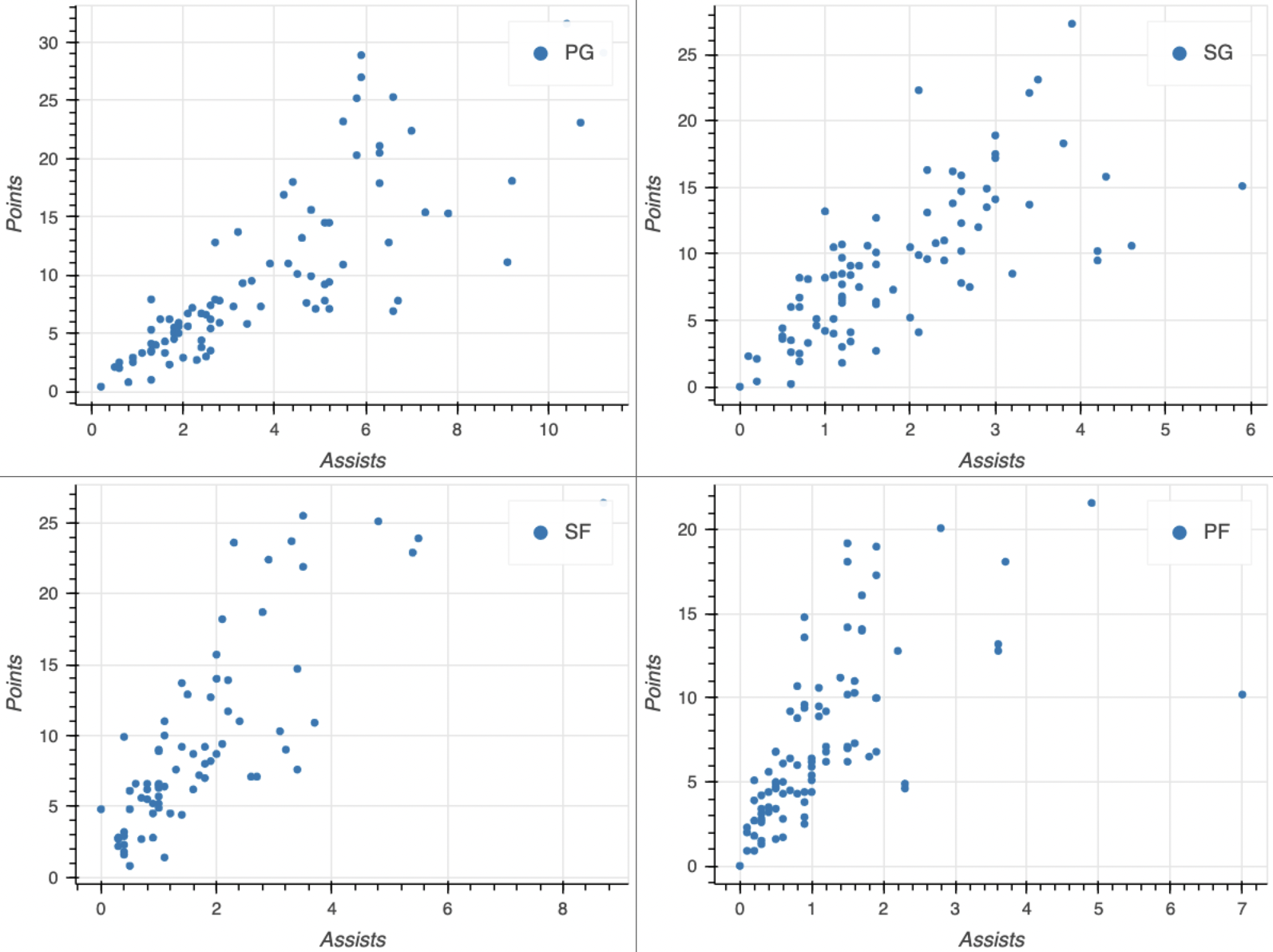
Gridplot
Customizing figure size
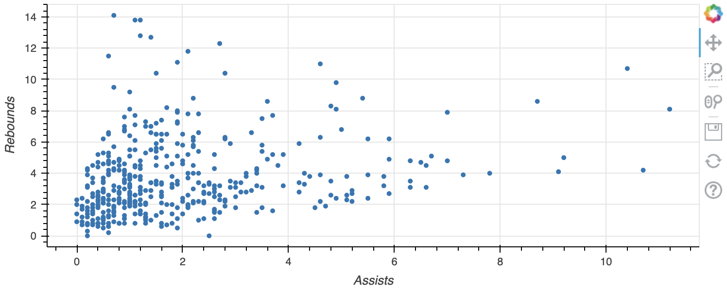
fig = figure(x_axis_label="Assists", y_axis_label="Rebounds",width=750, height=300)fig.circle(x="assists", y="rebounds", source=source) output_file(filename="custom_size_plot.html") show(fig)