Customizing axes
Interactive Data Visualization with Bokeh

George Boorman
Core Curriculum Manager, DataCamp
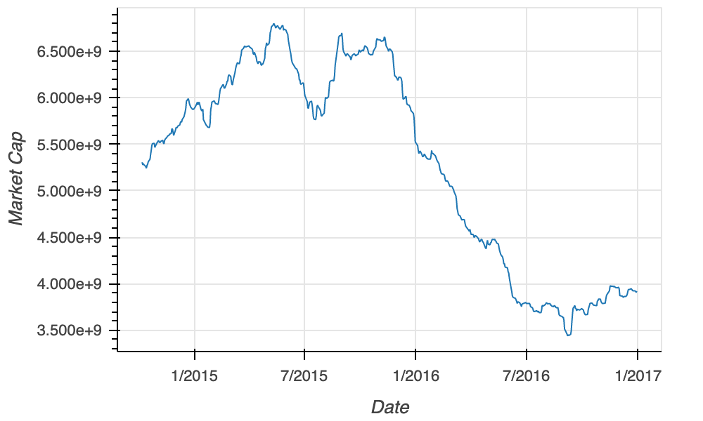
A line plot
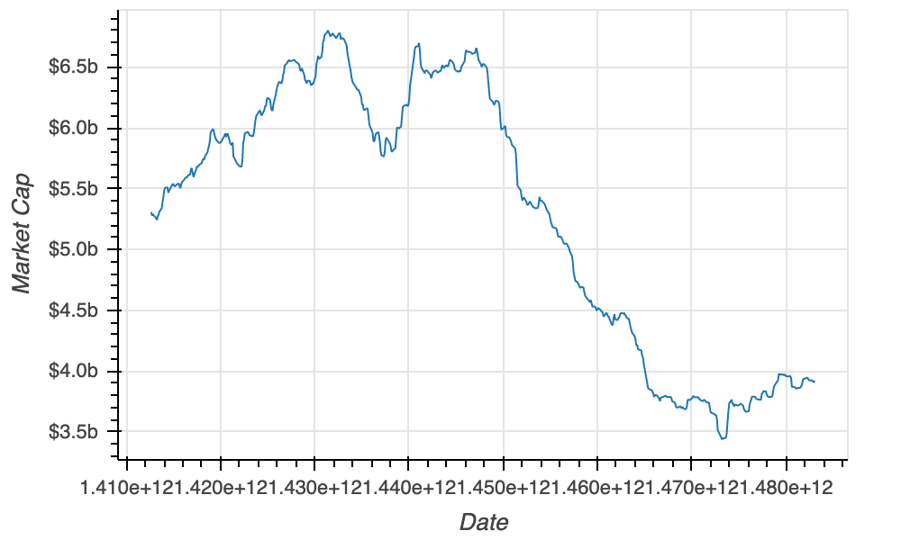
source = ColumnDataSource(data=apple) fig = figure(x_axis_label="Date", y_axis_label="Market Cap ($)") fig.line(x="date", y="market_cap", source=source)output_file(filename="unformatted_plot.html") show(fig)
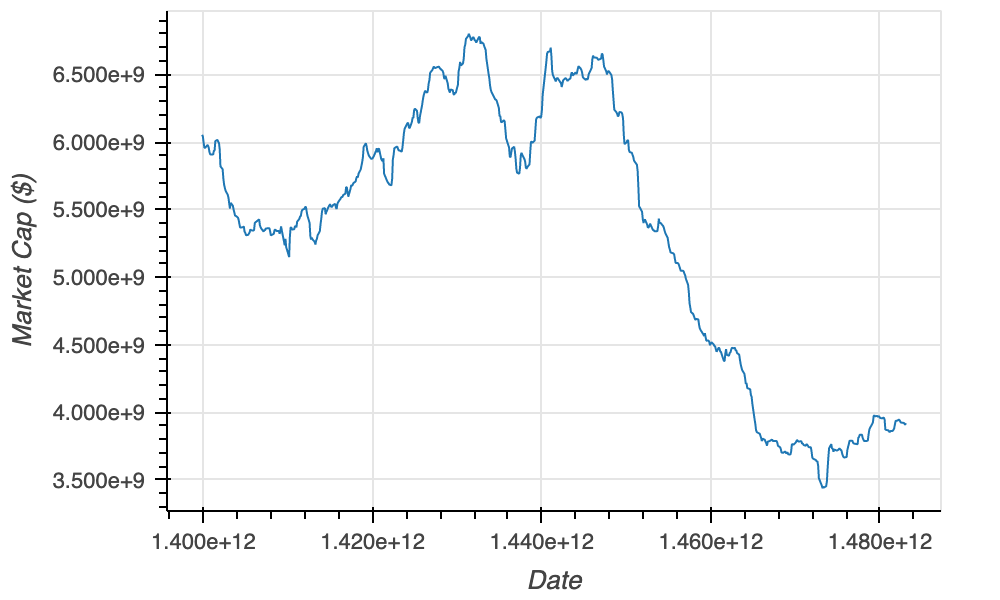
X-axis type
source = ColumnDataSource(data=apple) fig = figure(x_axis_label="Date", y_axis_label="Market Cap ($)",x_axis_type="datetime")fig.line(x="date", y="market_cap", source=source) output_file(filename="unformatted_plot.html") show(fig)
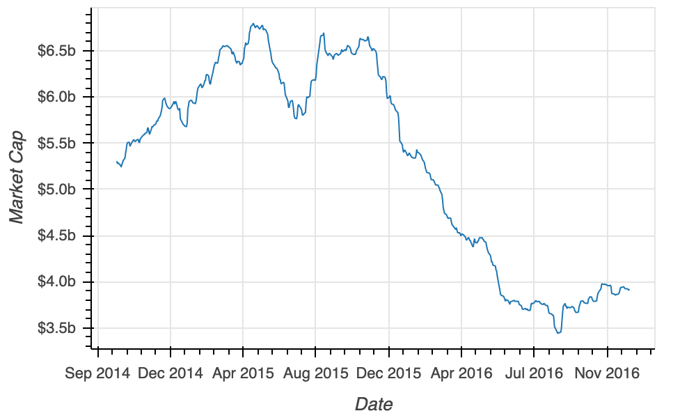
NumeralTickFormatter
from bokeh.models import NumeralTickFormatterfig = figure(x_axis_label="Date", y_axis_label="Price ($)") fig.line(x="date", y="market_cap", source=source)fig.yaxis[0].formatter = NumeralTickFormatter(format="$0.0a")output_file(filename="formatted_y_axis.html") show(fig)
The final plot