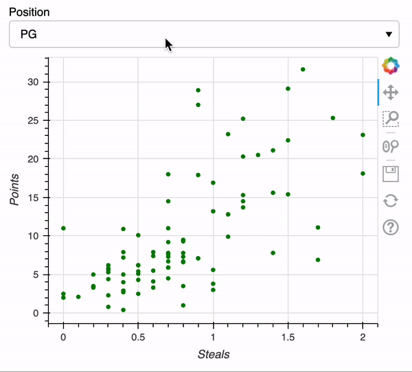
Select widgets
Interactive Data Visualization with Bokeh

George Boorman
Core Curriculum Manager, DataCamp
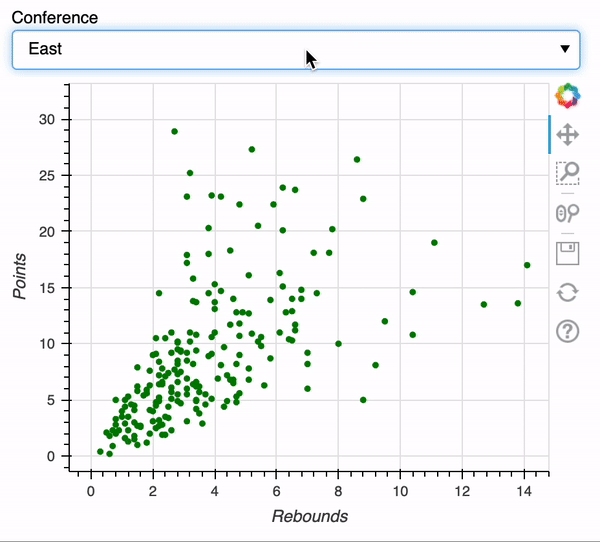
Select widget
JavaScript
![]()
The result!
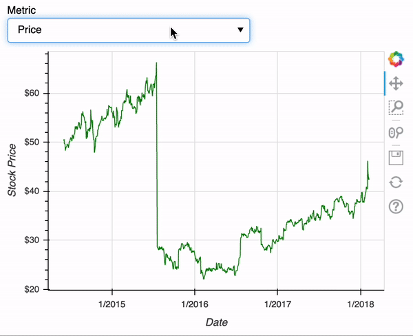
Select widget with line plots
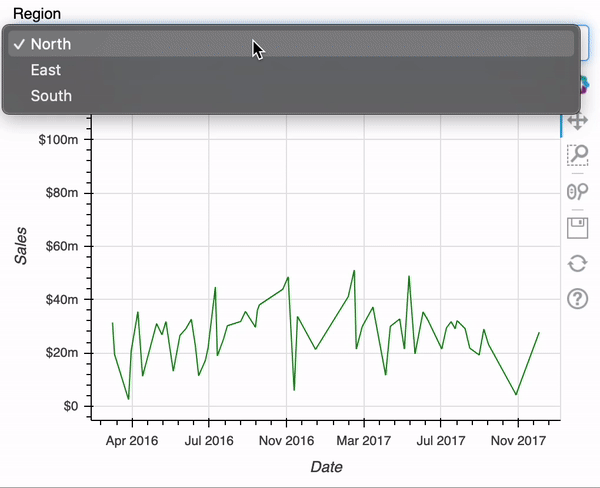
Switching figures
Interactive Data Visualization with Bokeh
George Boorman
Core Curriculum Manager, DataCamp
![]()

