Adding style
Interactive Data Visualization with Bokeh

George Boorman
Core Curriculum Manager, DataCamp
Using themes
Customizing color
fig = figure(x_axis_label="Assists per Game", y_axis_label="Points per Game")fig.circle(x=east["assists"], y=east["points"], color="blue")fig.circle(x=west["assists"], y=west["points"], color="red")output_file(filename="east_vs_west.html") show(fig)
Adding a legend
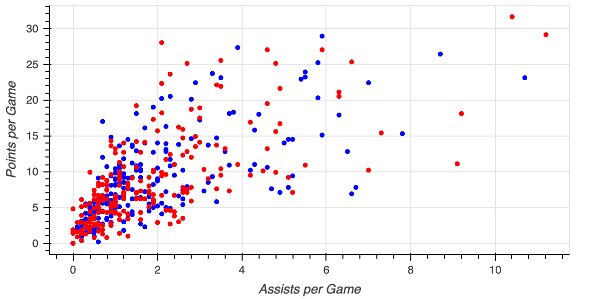
fig = figure(x_axis_label="Assists per Game", y_axis_label="Points per Game")fig.circle(x=east["assists"], y=east["points"], color="blue", legend_label="East")fig.circle(x=west["assists"], y=west["points"], color="red", legend_label="West")output_file(filename="east_vs_west_with_legend.html") show(fig)

Glyph types
- square

- triangle

- diamond

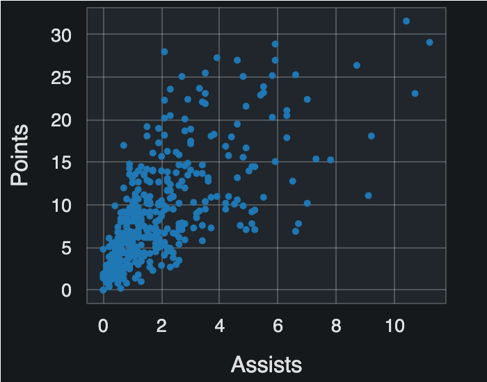
fig = figure(x_axis_label='Minutes Played', y_axis_label="Points Per Game")fig.square(x=nba["minutes_played"], y=nba["points_per_game"])output_file(filename="nba_points.html") show(fig)

Multiple glyphs
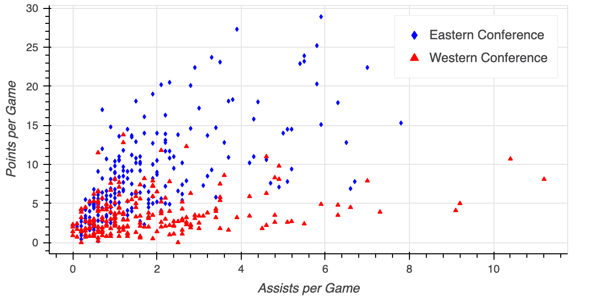
fig = figure(x_axis_label="Assists per Game", y_axis_label="Points per Game")fig.diamond(x=east["assists"], y=east["points"], color="blue", legend_label="Eastern Conference")fig.triangle(x=west["assists"], y=west["points"], color="red", legend_label="Western Conference")output_file(filename="multiple_glyphs.html") show(fig)