Introduction to Bokeh
Interactive Data Visualization with Bokeh

George Boorman
Core Curriculum Manager, DataCamp
What is Bokeh?
Setting up a figure
from bokeh.plotting import figurefrom bokeh.io import output_file, showfig = figure()output_file(filename="empty_figure.html")show(fig)
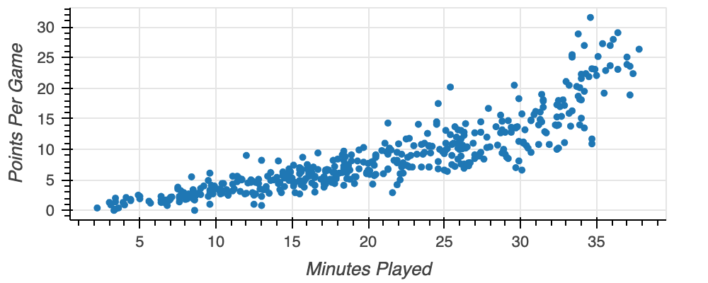
Building a scatter plot
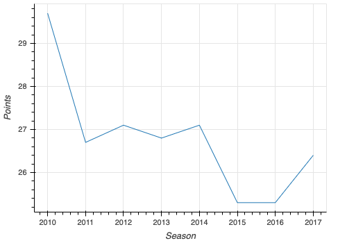
Displaying a line plot
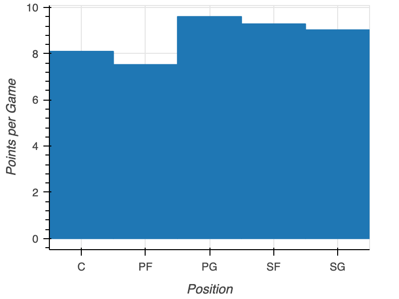
Plotting categorical data
positions = nba.groupby("position", as_index=False)["points"].mean()fig = figure(x_axis_label="Position", y_axis_label="Points per Game",x_range=positions["position"])fig.vbar(x=positions["position"], top=positions["points"])output_file(filename="nba_points_by_position.html") show(fig)