Logistic regression and the ROC curve
Supervised Learning with scikit-learn

George Boorman
Core Curriculum Manager, DataCamp
Logistic regression for binary classification
Logistic regression is used for classification problems
Logistic regression outputs probabilities
If the probability, $ \ p>0.5$:
- The data is labeled
1
- The data is labeled
If the probability, $ \ p<0.5$:
- The data is labeled
0
- The data is labeled
Linear decision boundary
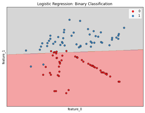
Logistic regression in scikit-learn
from sklearn.linear_model import LogisticRegressionlogreg = LogisticRegression()X_train, X_test, y_train, y_test = train_test_split(X, y, test_size=0.3, random_state=42)logreg.fit(X_train, y_train)y_pred = logreg.predict(X_test)
Predicting probabilities
y_pred_probs = logreg.predict_proba(X_test)[:, 1]print(y_pred_probs[0])
[0.08961376]
Probability thresholds
By default, logistic regression threshold = 0.5
Not specific to logistic regression
- KNN classifiers also have thresholds
What happens if we vary the threshold?
The ROC curve
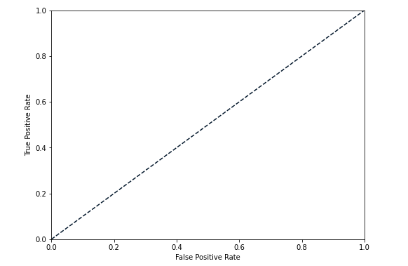
The ROC curve
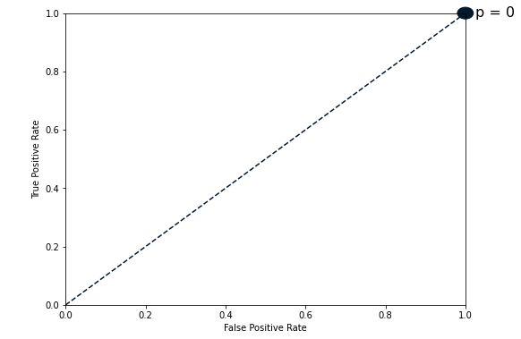
The ROC curve
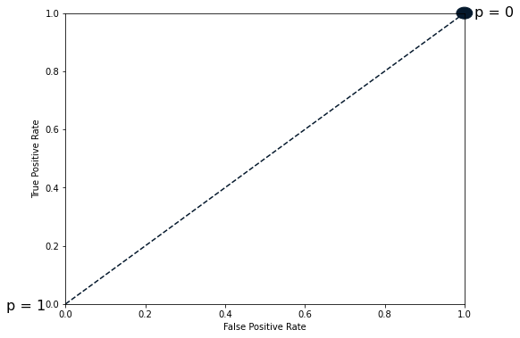
The ROC curve
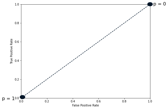
The ROC curve
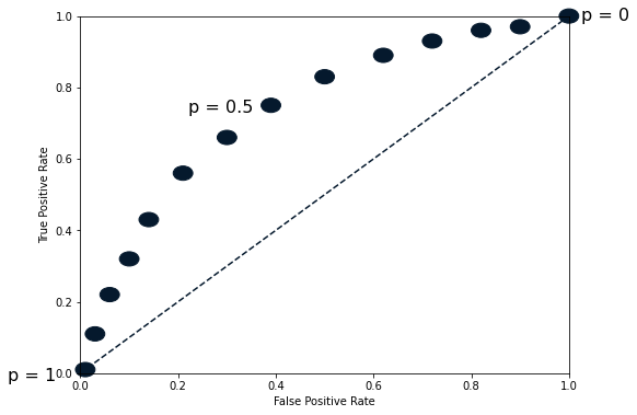
The ROC curve
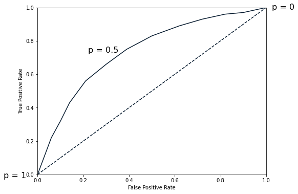
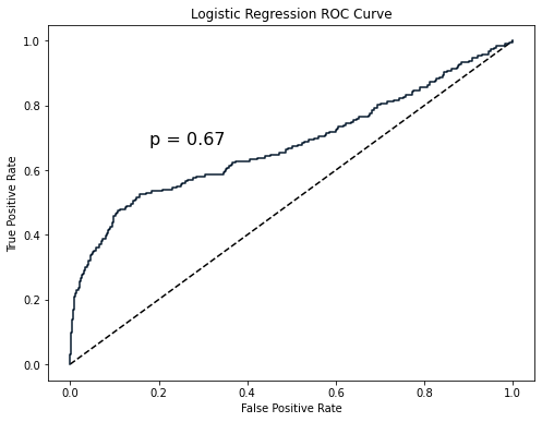
Plotting the ROC curve
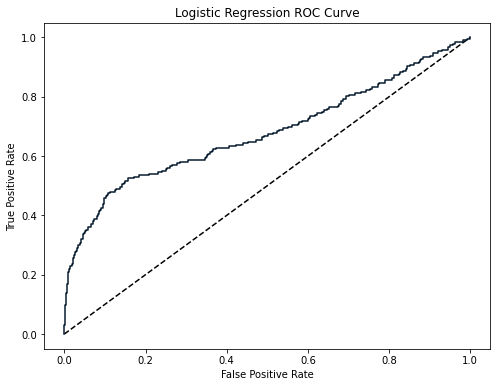
from sklearn.metrics import roc_curvefpr, tpr, thresholds = roc_curve(y_test, y_pred_probs)plt.plot([0, 1], [0, 1], 'k--') plt.plot(fpr, tpr) plt.xlabel('False Positive Rate') plt.ylabel('True Positive Rate') plt.title('Logistic Regression ROC Curve') plt.show()
Plotting the ROC curve
ROC AUC
ROC AUC in scikit-learn
from sklearn.metrics import roc_auc_scoreprint(roc_auc_score(y_test, y_pred_probs))
0.6700964152663693
Let's practice!
Supervised Learning with scikit-learn

