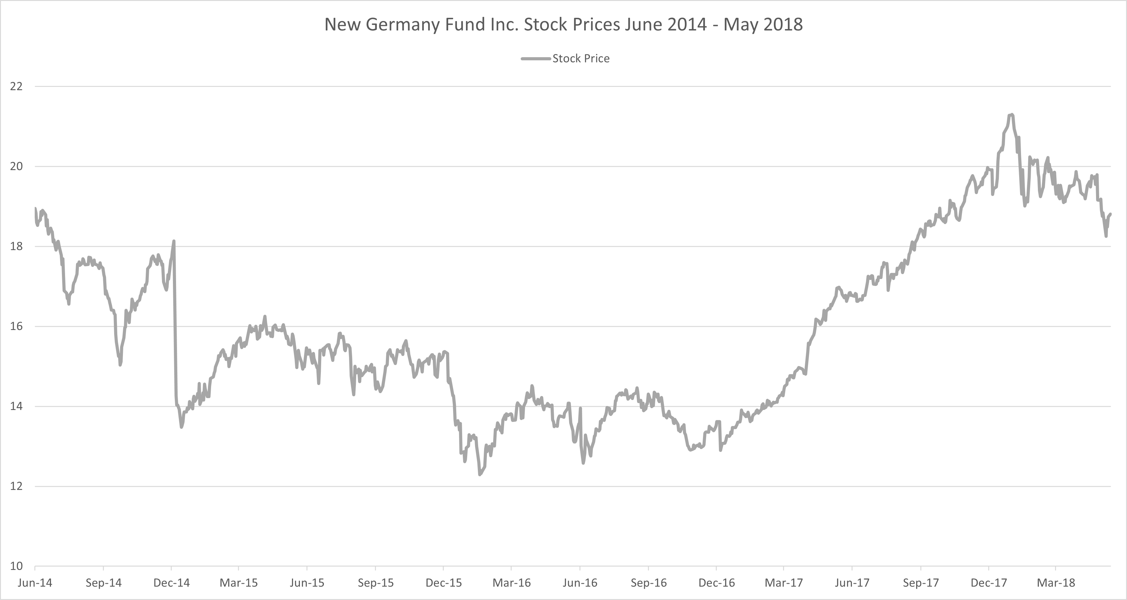
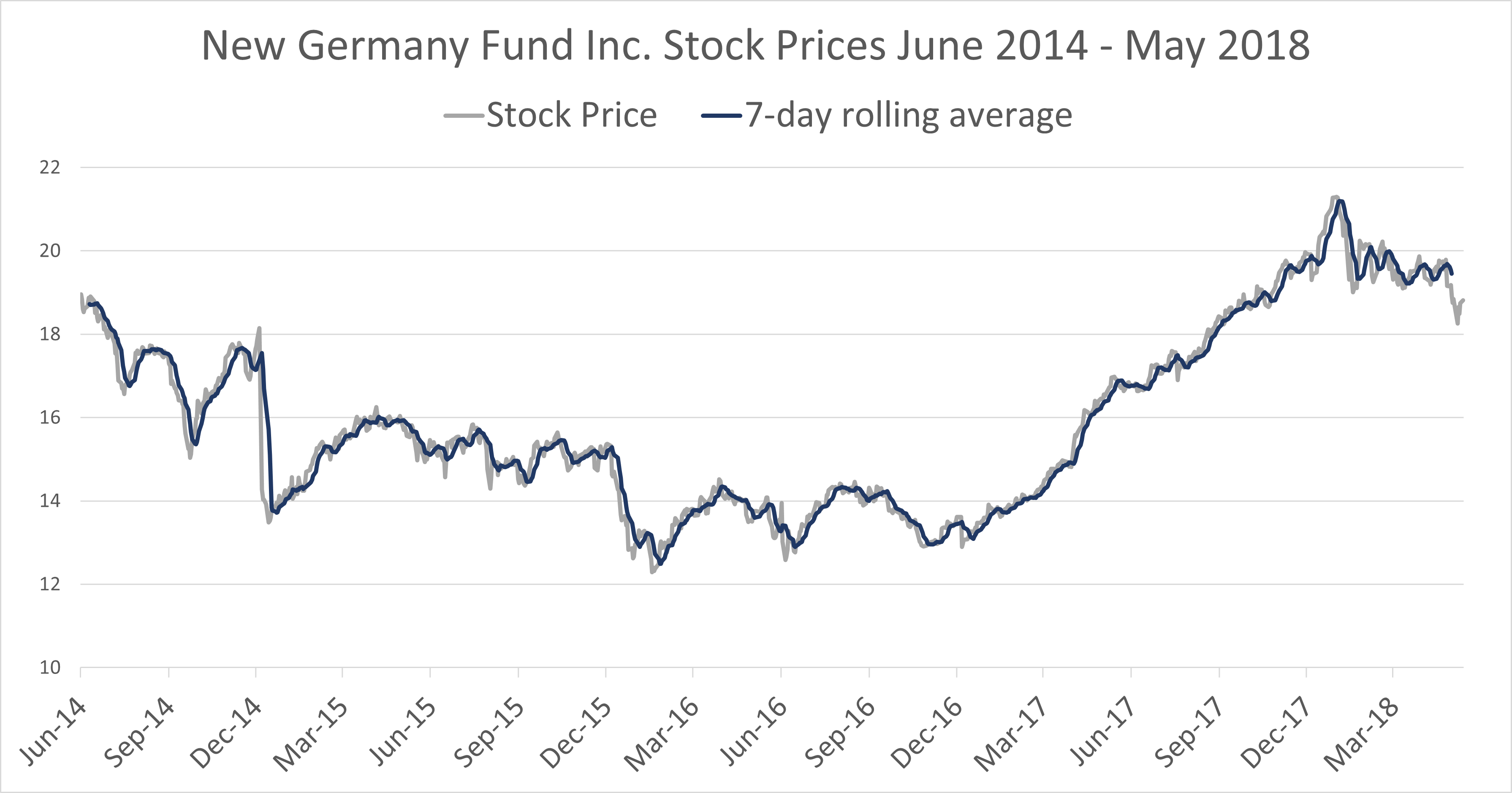
Time series run chart
Trend Analysis in Power BI

Jacob H. Marquez
Data Scientist at Microsoft
Visualizing a time series
Visualizing a time series
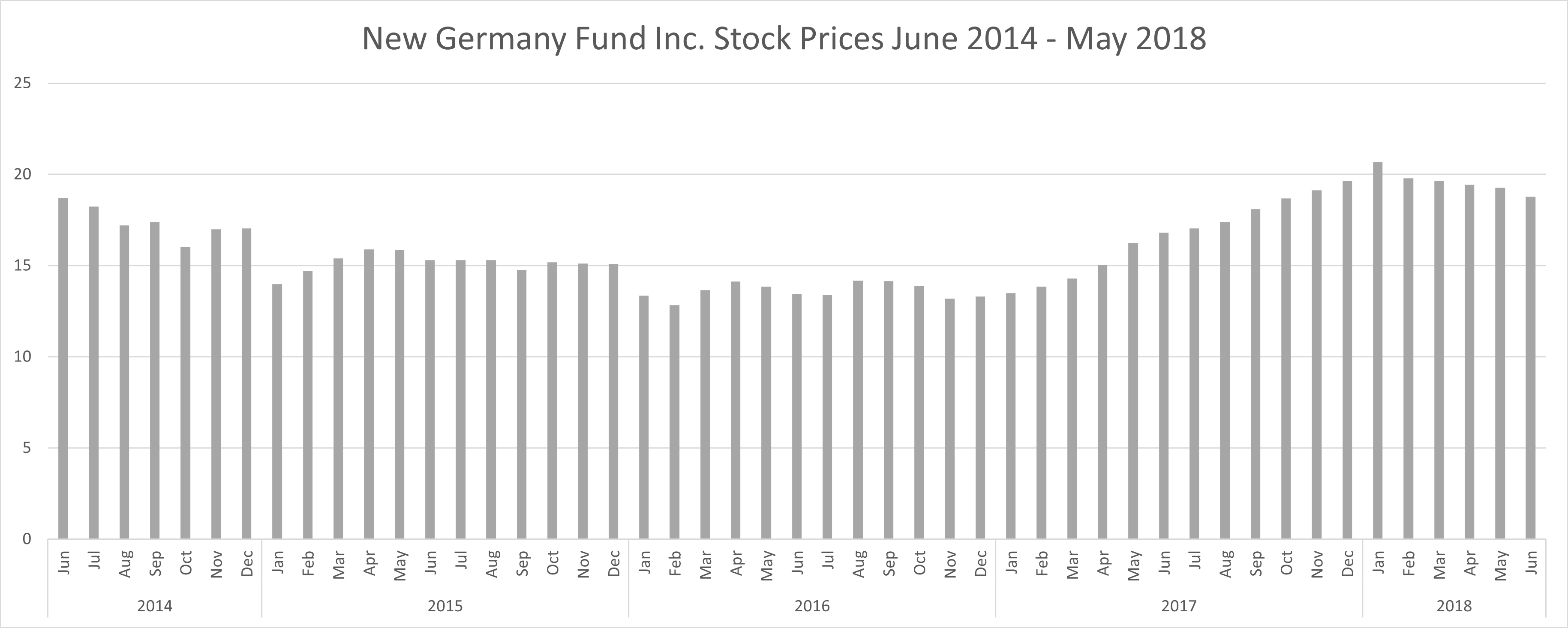
Visualizing a time series
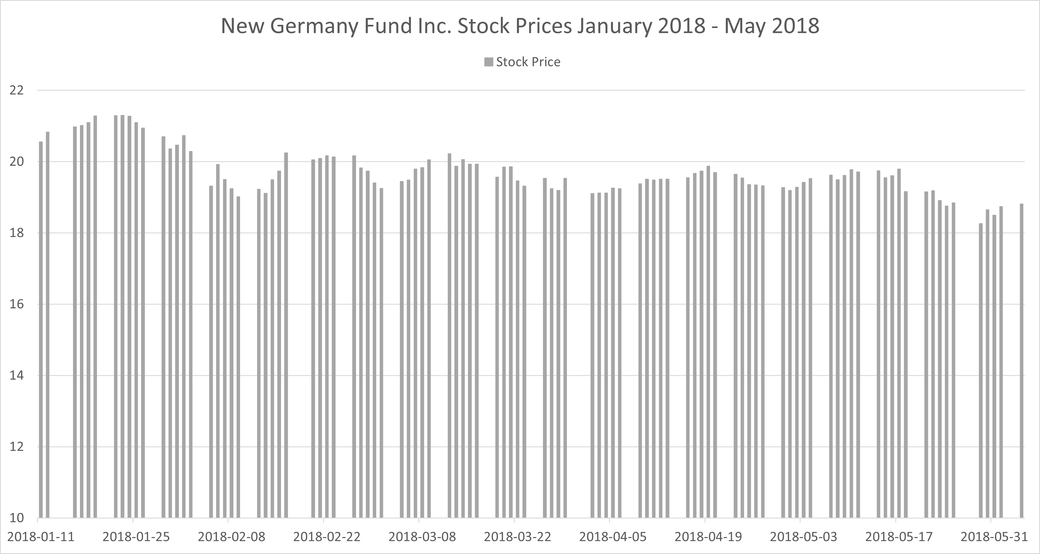
What is a run chart?
Patterns in a time series
Cyclical
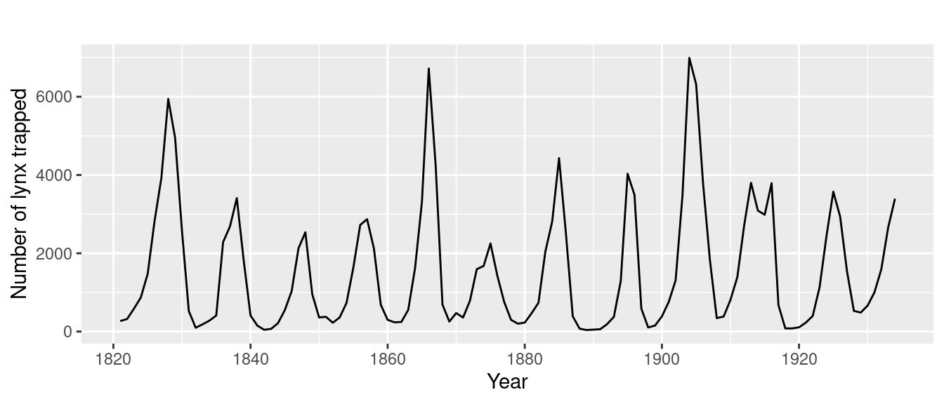
- Rise and fall patterns
- No fixed time period
- Pattern typically longer than a year in length
- Less predictable
Patterns in a time series
Cyclical
- Rise and fall patterns
- No fixed time period
- Pattern typically longer than a year in length
- Less predictable
Seasonality
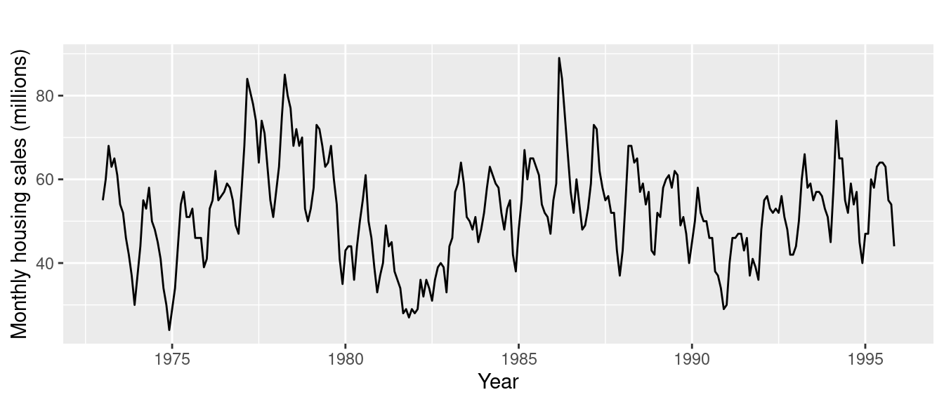
- Pattern is influenced by the season (ex. holiday spending)
- Fixed time periods
- Pattern typically occurs over less than a year
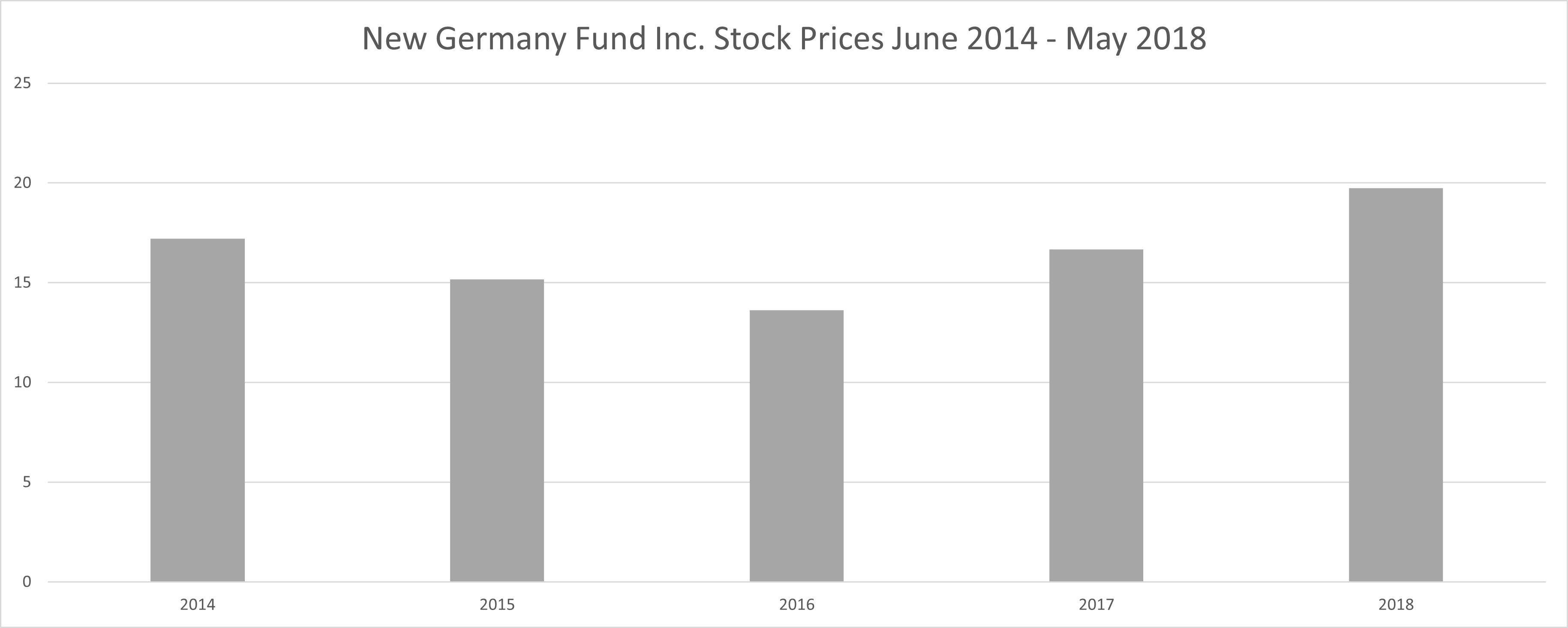
Evaluating the trend in the time series
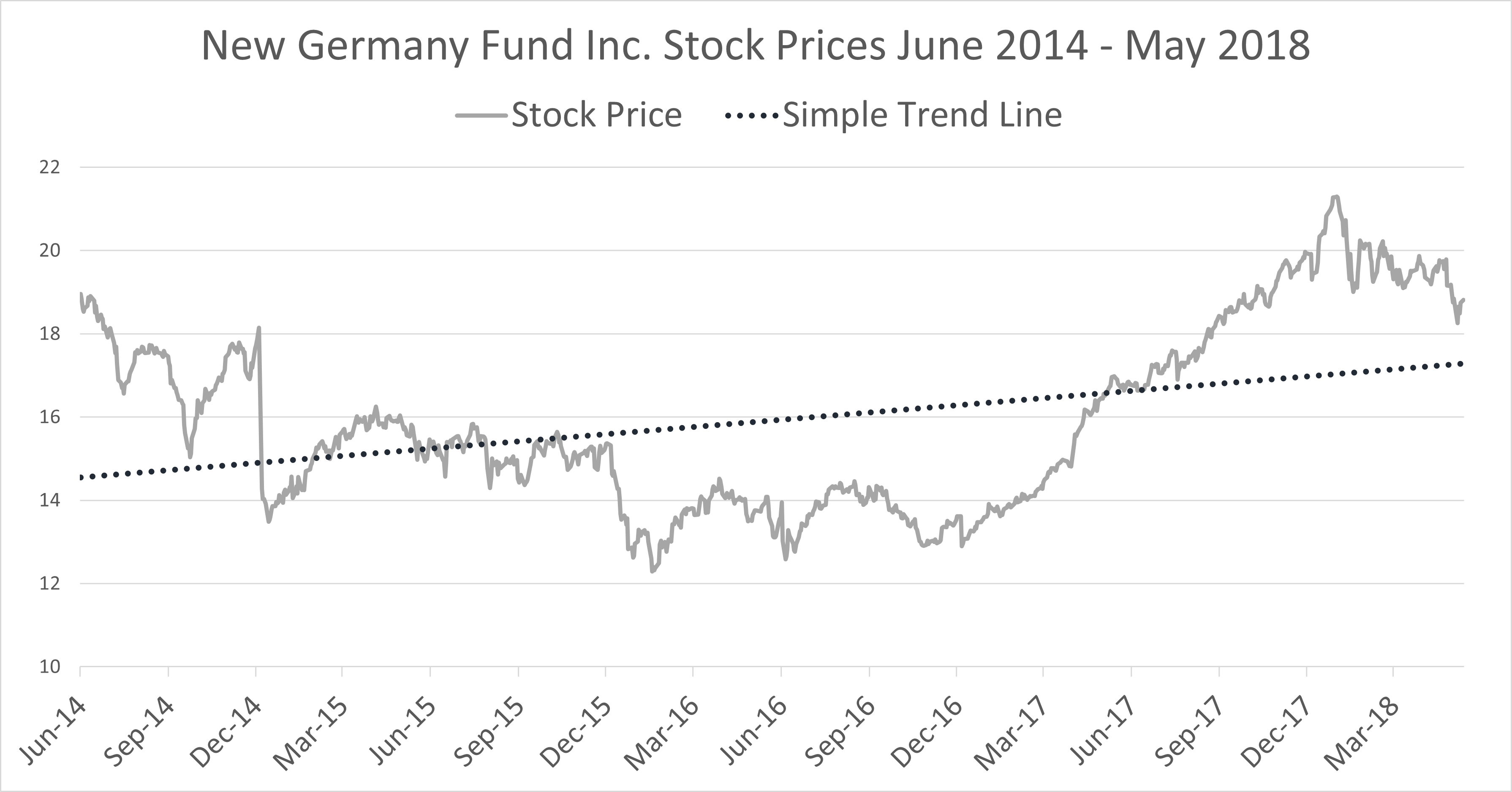
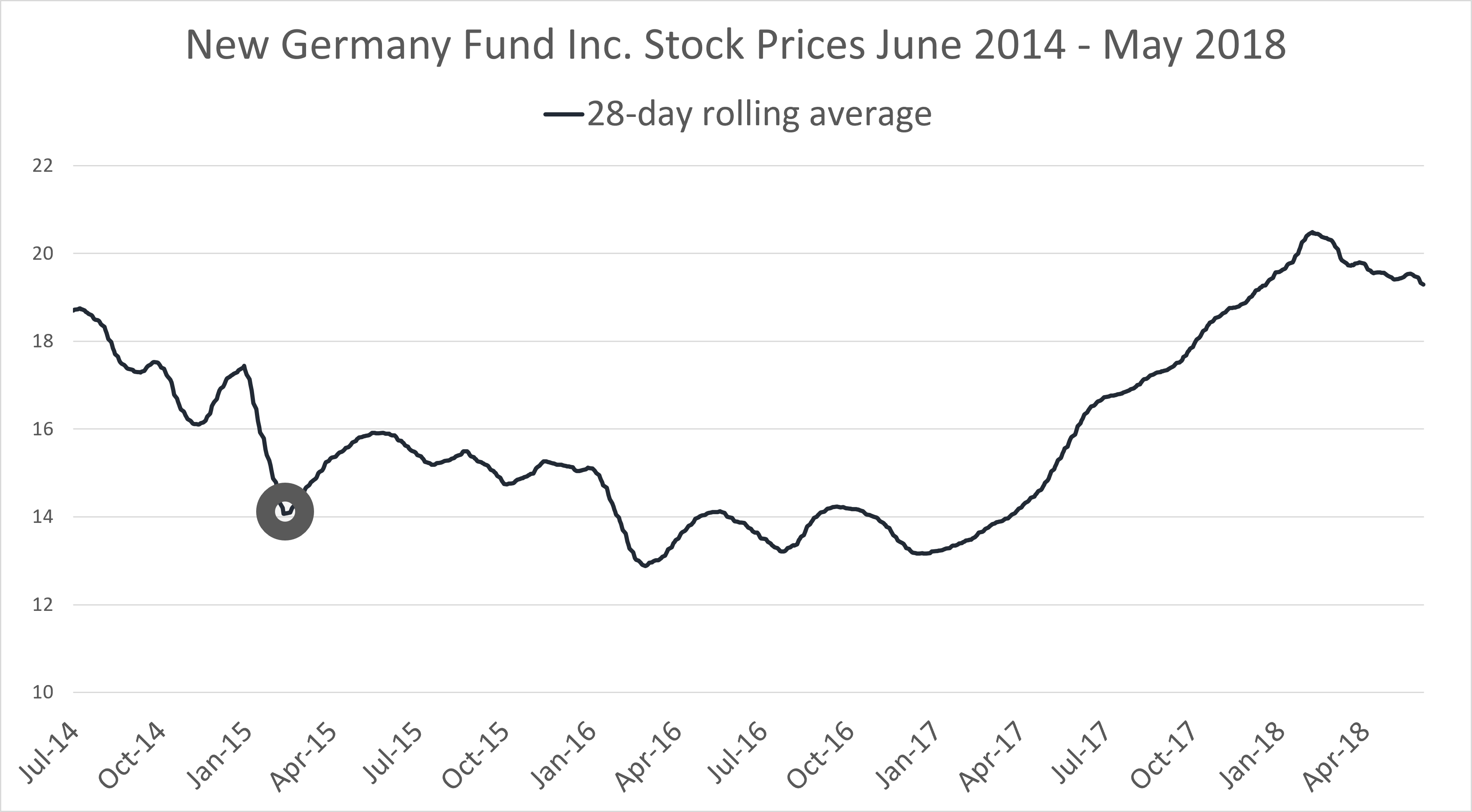
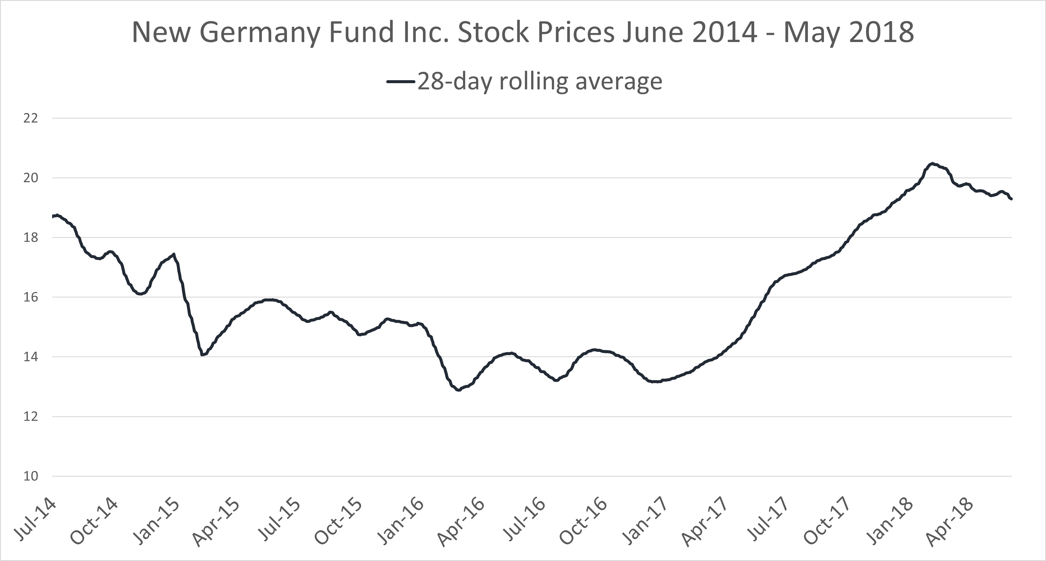
Trends with rolling averages
Smoothing with rolling averages
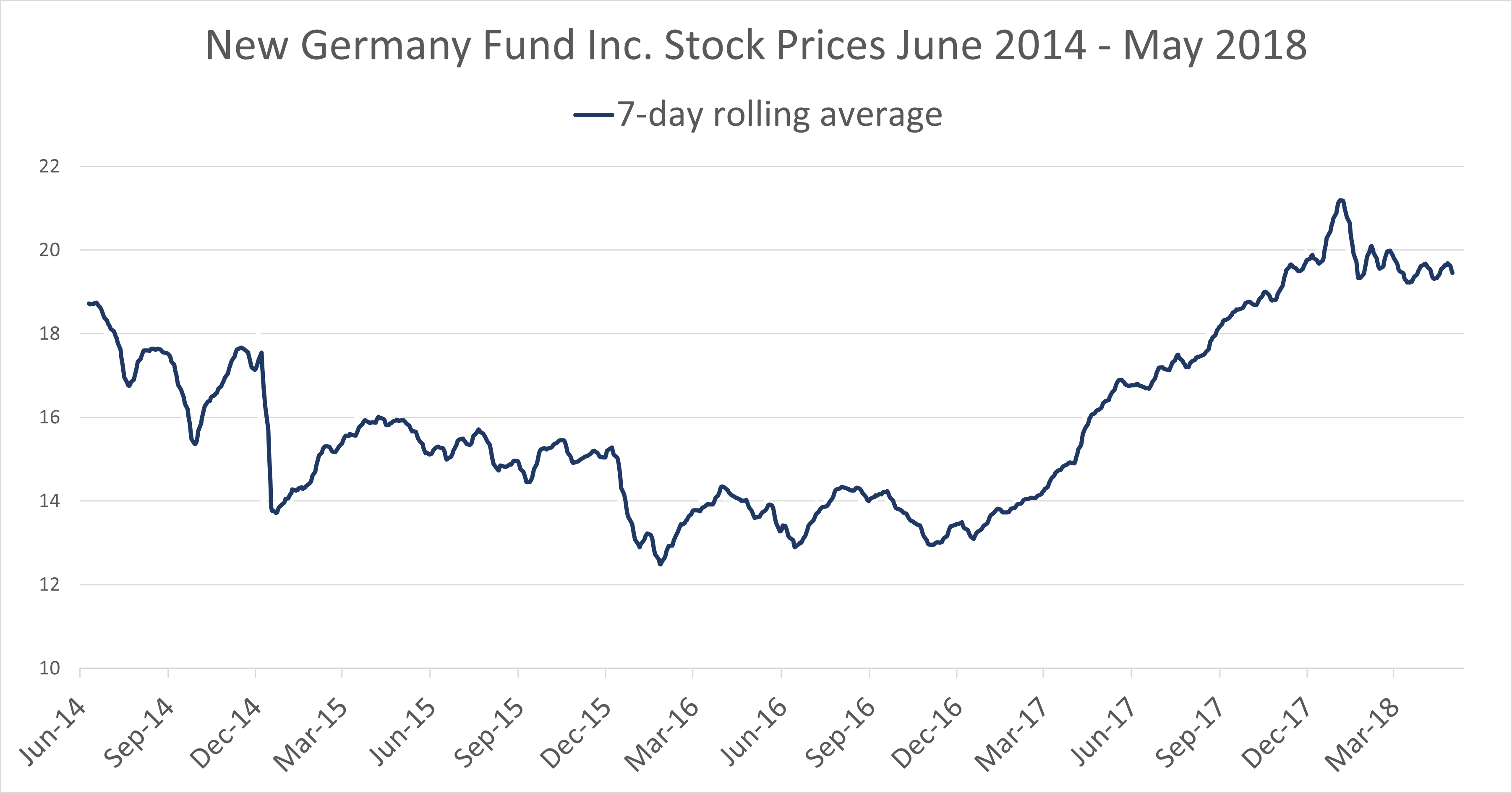
Smoothing with rolling averages
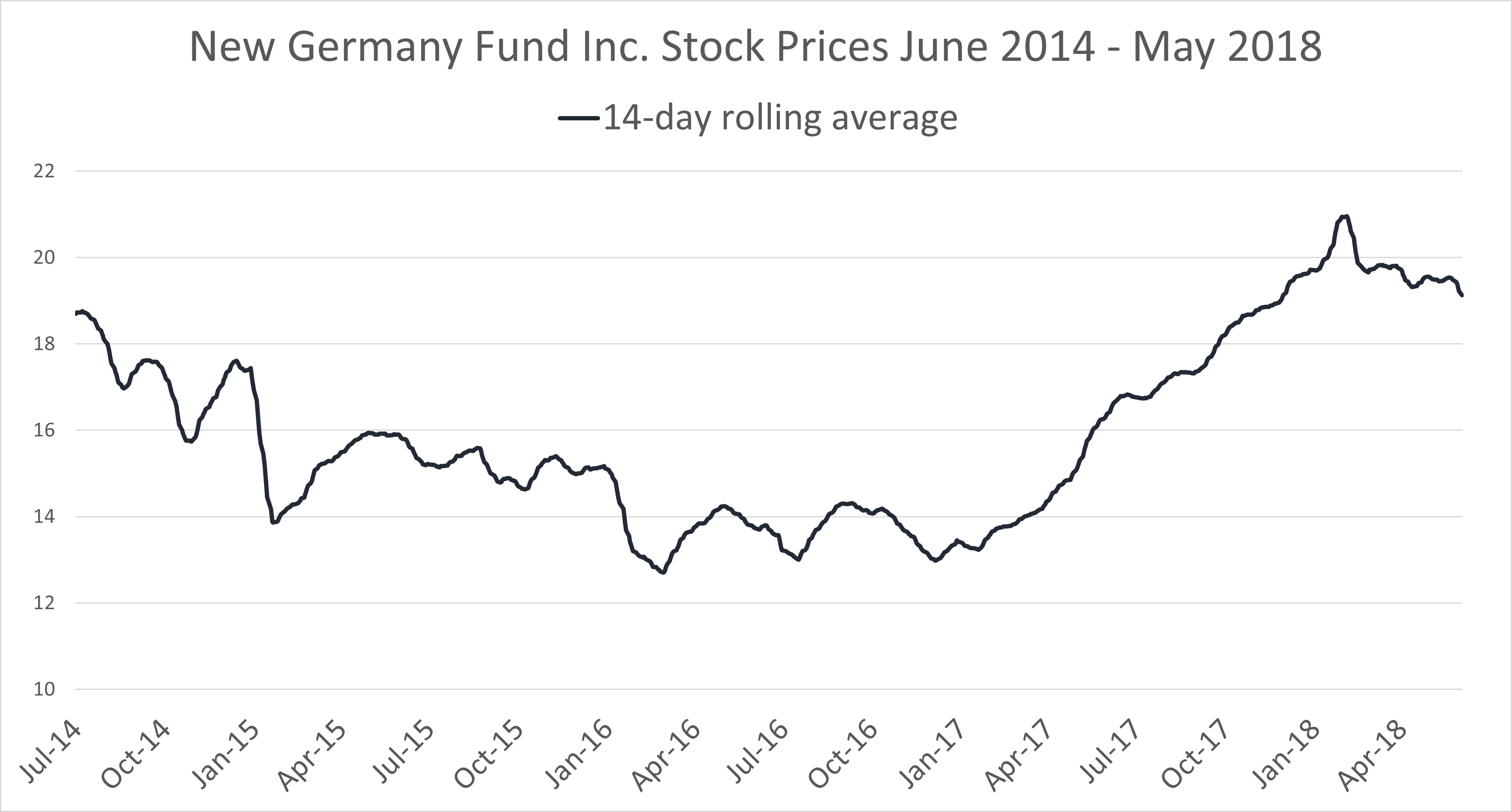
Smoothing with rolling averages
Anomalies in a time series
Anomalies in a time series