Data visualizations

Introduction to Data Literacy

Carl Rosseel

Head of Business Intelligence Curriculum, DataCamp

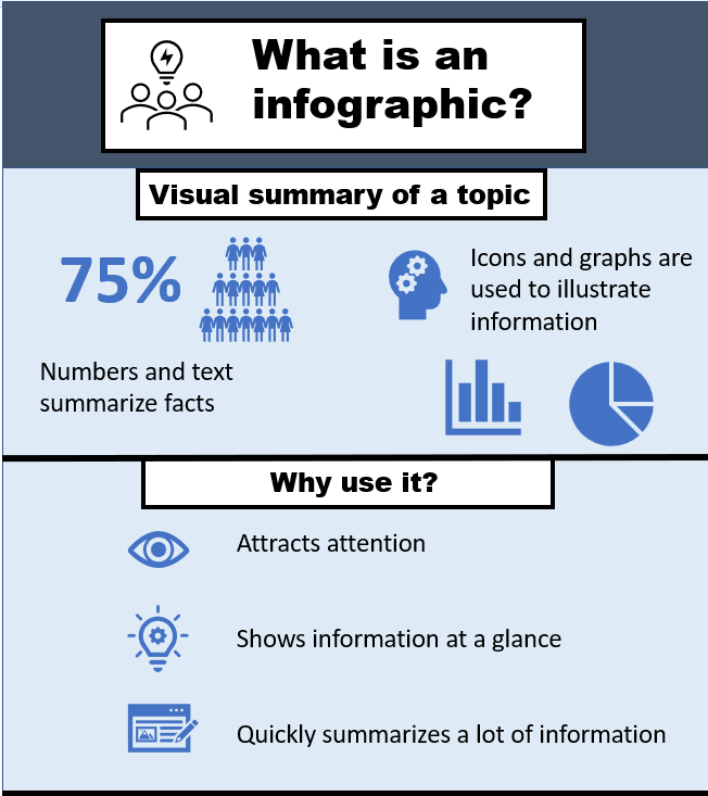
A picture tells a thousand words

  • Visualization helps to understand complex data at a glance
  • Makes it easier to understand insights identified in the data
  • Several data tools and methods rely on visualization:
    • Exploratory data analysis
    • Dashboard
    • Infographic

Example infographic

Introduction to Data Literacy

Common types of visualizations

  • Capture a trend
    • Line chart


  • Visualize relationships
    • Bar chart, scatter plot


  • Visualize distributions
    • Histogram, box plot

Line chart illustration

Bar chart and scatter plot illustration

Histogram and box plot illustration

1 https://www.datacamp.com/cheat-sheet/data-viz-cheat-sheet
Introduction to Data Literacy

What makes a good visualization?

  • Eliminate clutter:

    • Less is more
    • Clarity and readability
  • Focus attention:

    • Link to insights
    • Highlight key aspects
  • Provide context: use the McCandless technique

Example of a visualization about length of hospital stay over time

Introduction to Data Literacy

McCandless technique

  1. Introduce the visualization
  2. Anticipate obvious questions
  3. State the central insight
  4. Provide supporting evidence
  5. Closing statement

Example of a visualization about length of hospital stay over time

1 https://artscience.blog/home/the-mccandless-method-of-data-presentation
Introduction to Data Literacy

Let's practice!

Introduction to Data Literacy

Preparing Video For Download...