Beginning visualization
Communicating Data Insights

Joe Franklin
Senior Curriculum Manager, DataCamp
Objective

Setting the bar
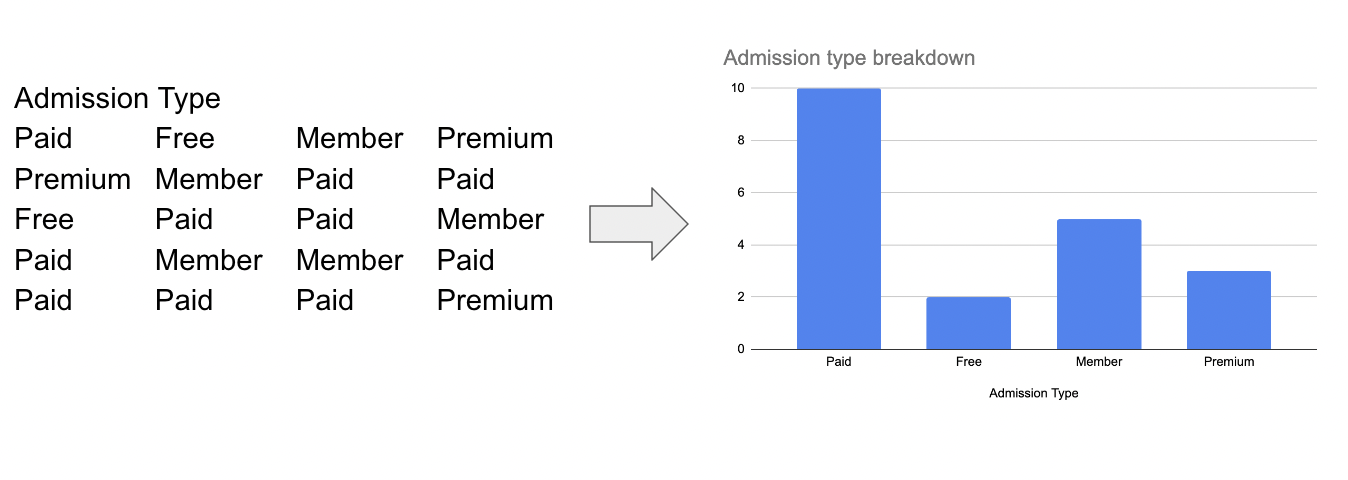
Museum admissions
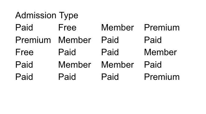
Museum admissions
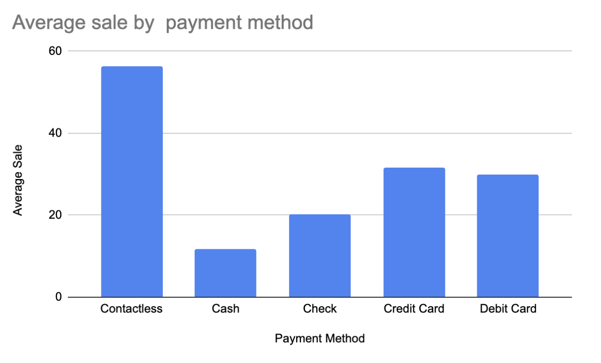
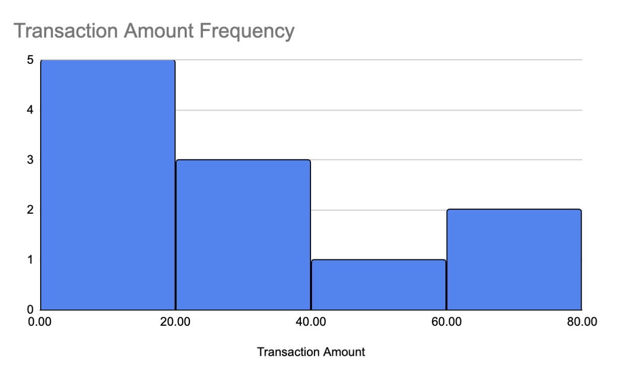
Charting payments
Behind bars

Visualizing sales
No gaps intentional gaps between bars.
Connecting the dots
Don't sit so close
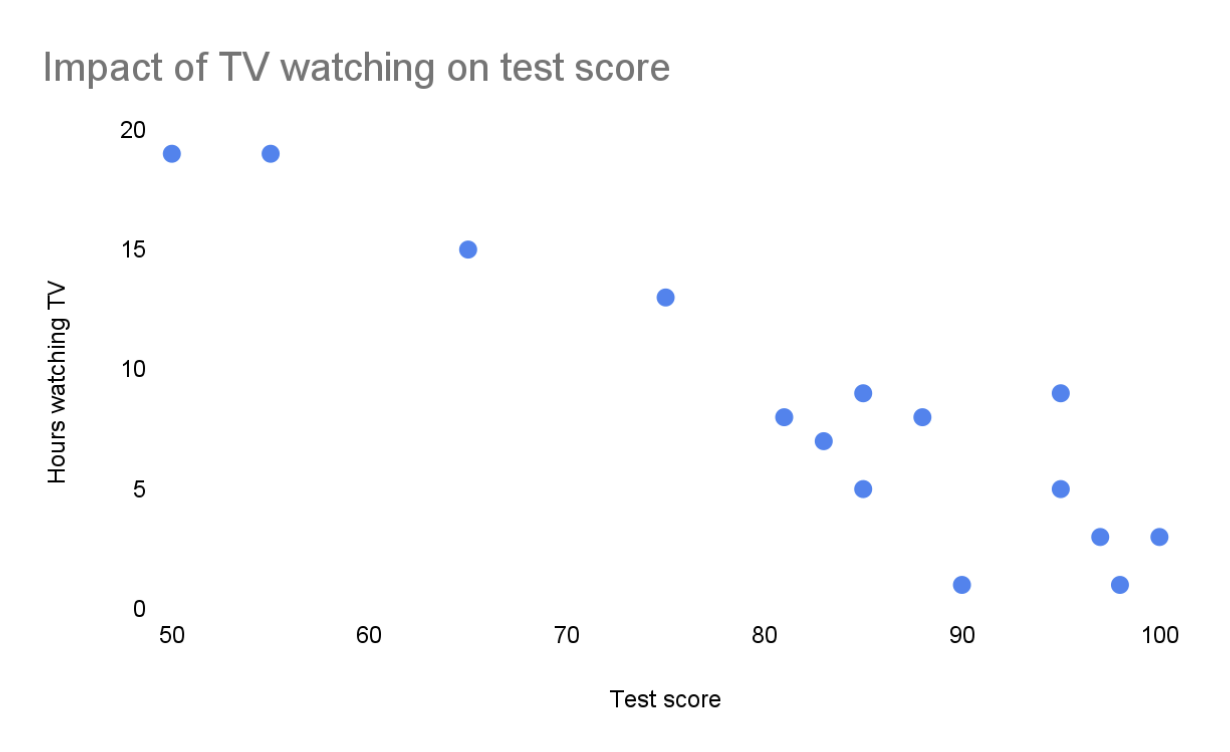
Easily detect potential relationships within a dataset.

