Guiding principles of visualization
Communicating Data Insights

Joe Franklin
Senior Curriculum Manager, DataCamp
Driving success

Getting the right picture

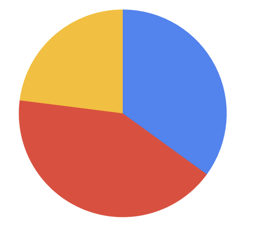
Piece of the pie
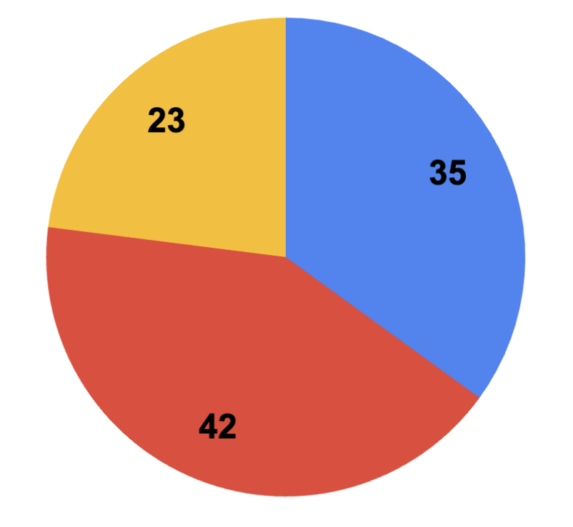
Piece of the pie
Piece of the pie
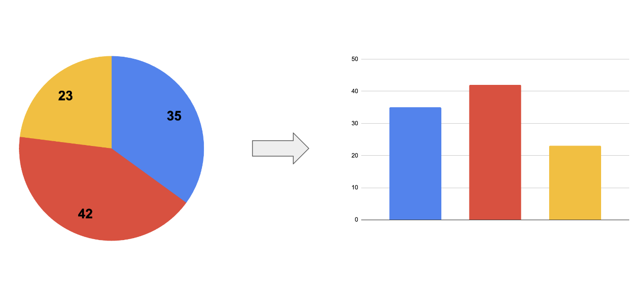
Visualizations are meant to show some information, not all information about a dataset.
Keep it simple

Does it bring you joy?

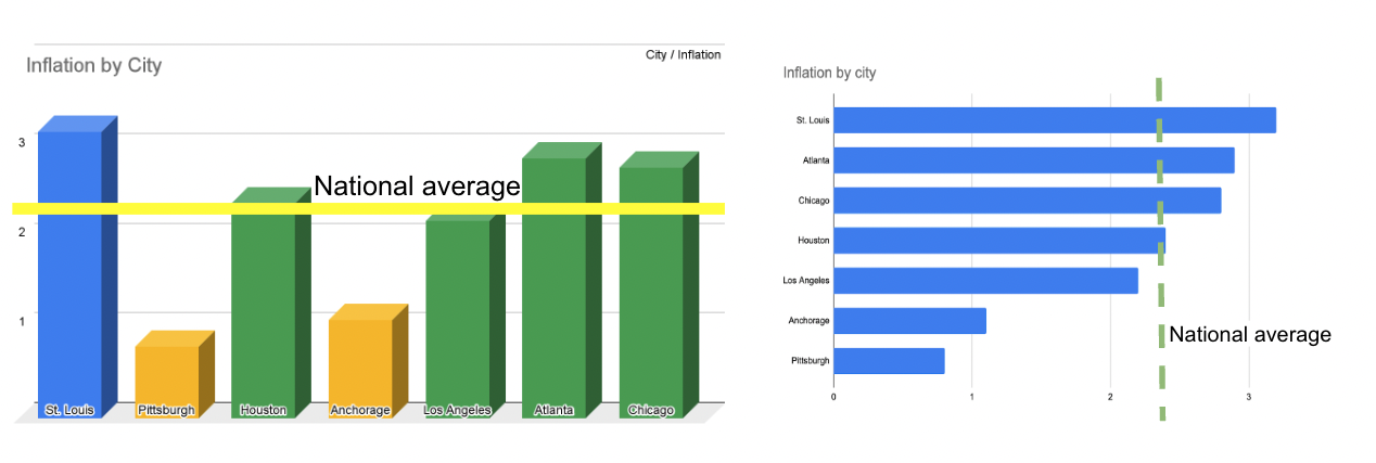
Tale of two charts
Great expectations