More advanced visualizations
Data Visualization in Tableau

Agata Bak-Geerinck
Senior Data Analyst, Telenet
Visualizing for various use cases


Box plot - standardized chart for distribution of data
A five-number summary:
- Minimum
- First quartile (Q1)
- Median
- Third quartile (Q3)
- Maximum
How data is distributed, grouped?
- Is it symmetrical/skewed?
- Are there any outliers?

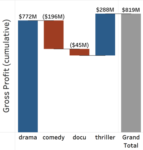
Waterfall (bridge) chart - contribution and change
A chart explaining the net change in value between two points, split over categories.
- Presents category contribution to the total
- Uses color to separate positive versus negative values
- Exposes the complexity hidden behind an aggregated number
- Often used with financial values
- Works well with a limited amount of categories
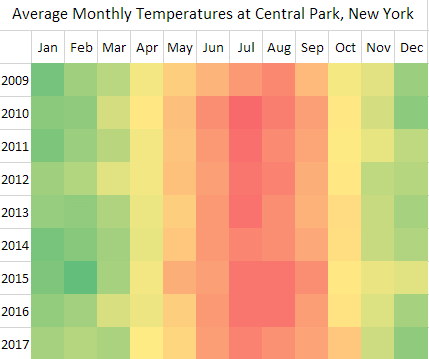
Heat map - density and matrix comparisons
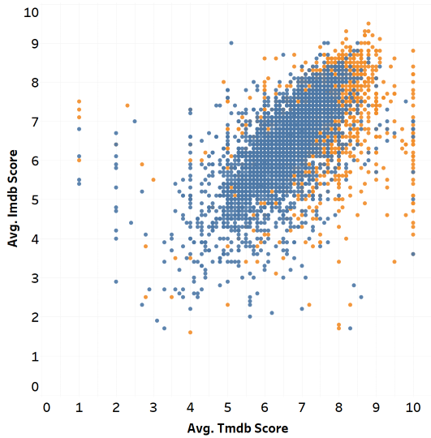
Scatter plot - relationship and correlation
Get inspired - Tableau's Viz of The Day
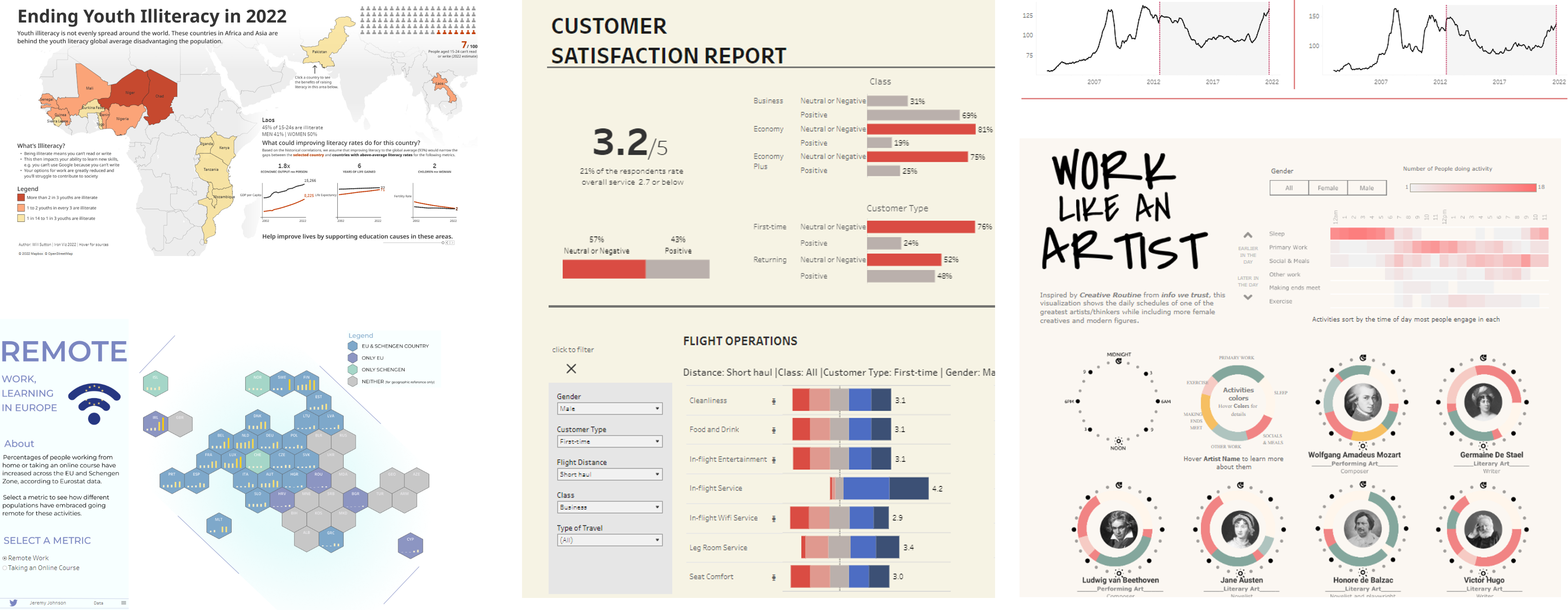
1 https://public.tableau.com/app/discover/viz-of-the-day

