Building user-friendly, interactive visualizations
Data Visualization in Tableau

Maarten Van den Broeck
Content Developer, DataCamp
When less is ... more
I didn't have the time, so I wrote you a long letter (Mark Twain).
Simplicity and synthesis versus complexity and deluge of data points
Love for data analytics versus the impact on our consumers


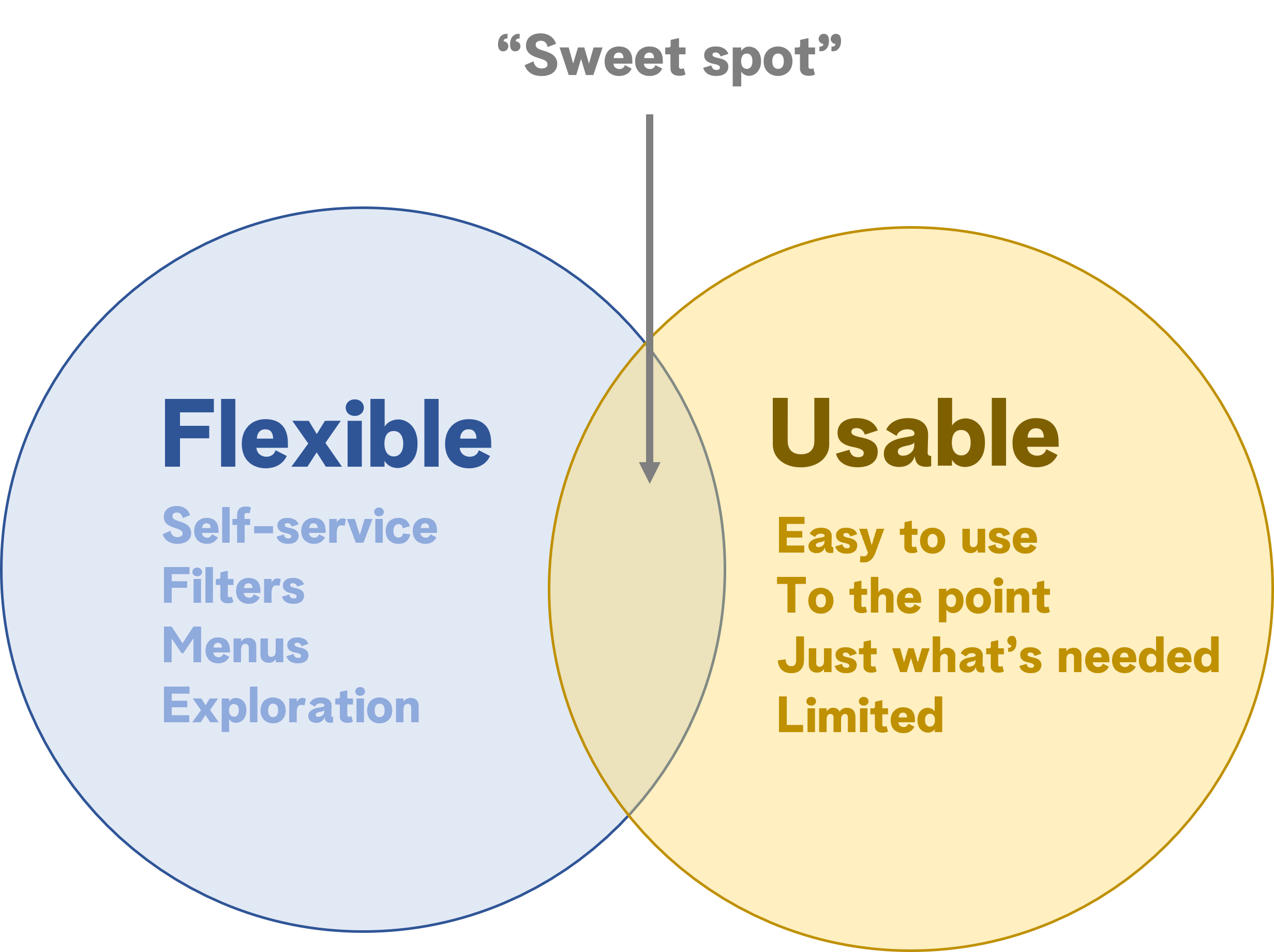
Flexibility vs. usability
- "One dashboard to rule them all"
- Overwhelmed stakeholders
- Cognitive overload:
- New and complex information
- Limited attention --> loss of interest
- Inability to distill the key insights
Design - formatting - interactivity
Design
- Cascading design: from general to detailed
- Keep simple, consistent style
- Foresee enough "white space"
Formatting
- Accentuate what's important
- Use chart elements to your advantage
- Avoid "visual overload", i.e., too many colors, shapes, sizes, labels
Interactivity:
- User-friendly parameters
- Dynamic highlighting, drill-downs
- Animations (if add value)

Keeping it user-friendly
Adaptive titles:
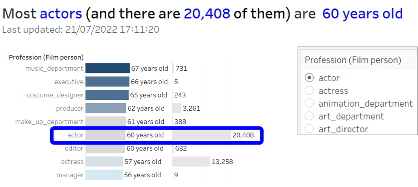
- Impactful titles based on the values of measures, dimensions, and filter values
- Information on last data load date and hour
- Use color and font formatting for emphasis
Viz in tooltip:
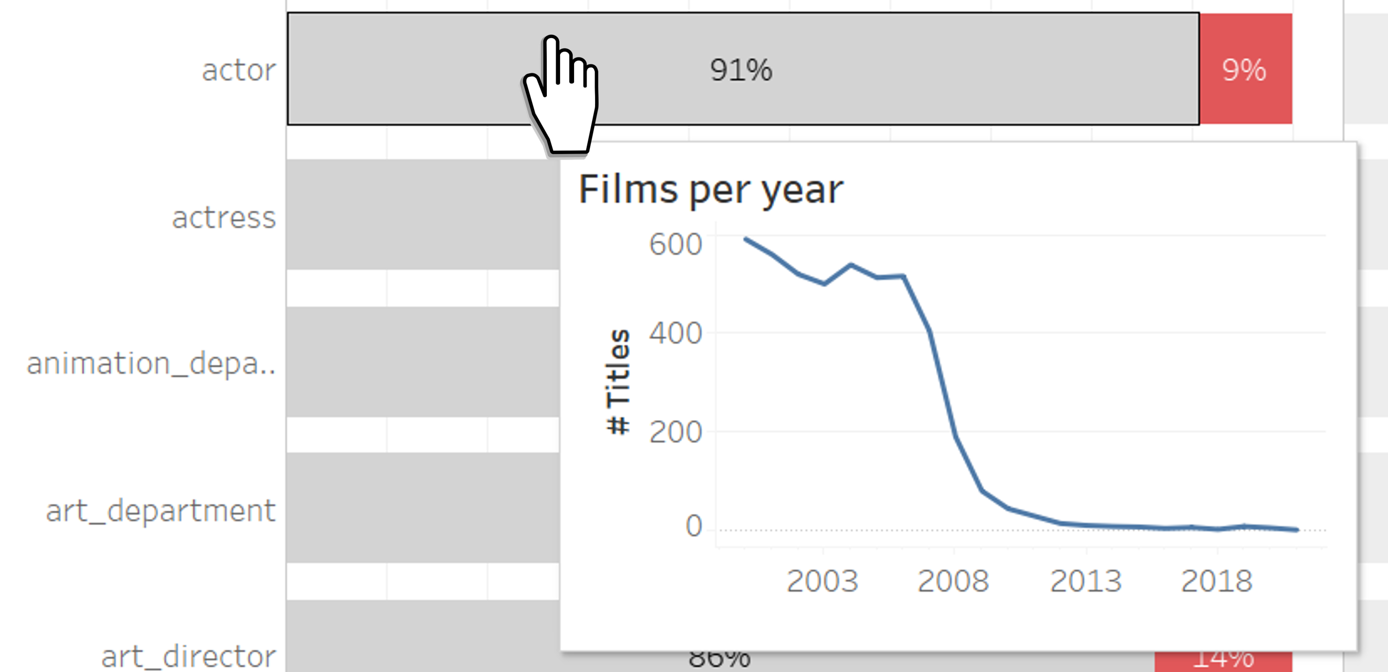
- Embedded visualizations with more detail
- Relevant to a given data point
- Neat way to "hide" extra insights
Making it interactive
Actions:
- Changing a value through
- Clicking
- Hovering
- Selecting a mark on the visualization
- Intuitive design, interaction with data
- Exploration and drill-downs in a few clicks
Tips for stimulating user-adoption
- Design and develop in co-creation with stakeholders
- Short feedback loops (show and try)
- Interactive user training
- Visual documentation (e.g. demos, gifs)
- Usage monitoring of your dashboards