Best practices in visualization

Data Visualization in Tableau

Maarten Van den Broeck

Content Developer, DataCamp

Consequences of bad data visualization

White spacing

  • Ugly charts ("junk charts")

White spacing

  • Loss of interest from your stakeholders

White spacing

  • Unclear, not user-friendly visualization

White spacing

  • Misleading conclusions

White spacing

A few examples of bad data visualization

Data Visualization in Tableau

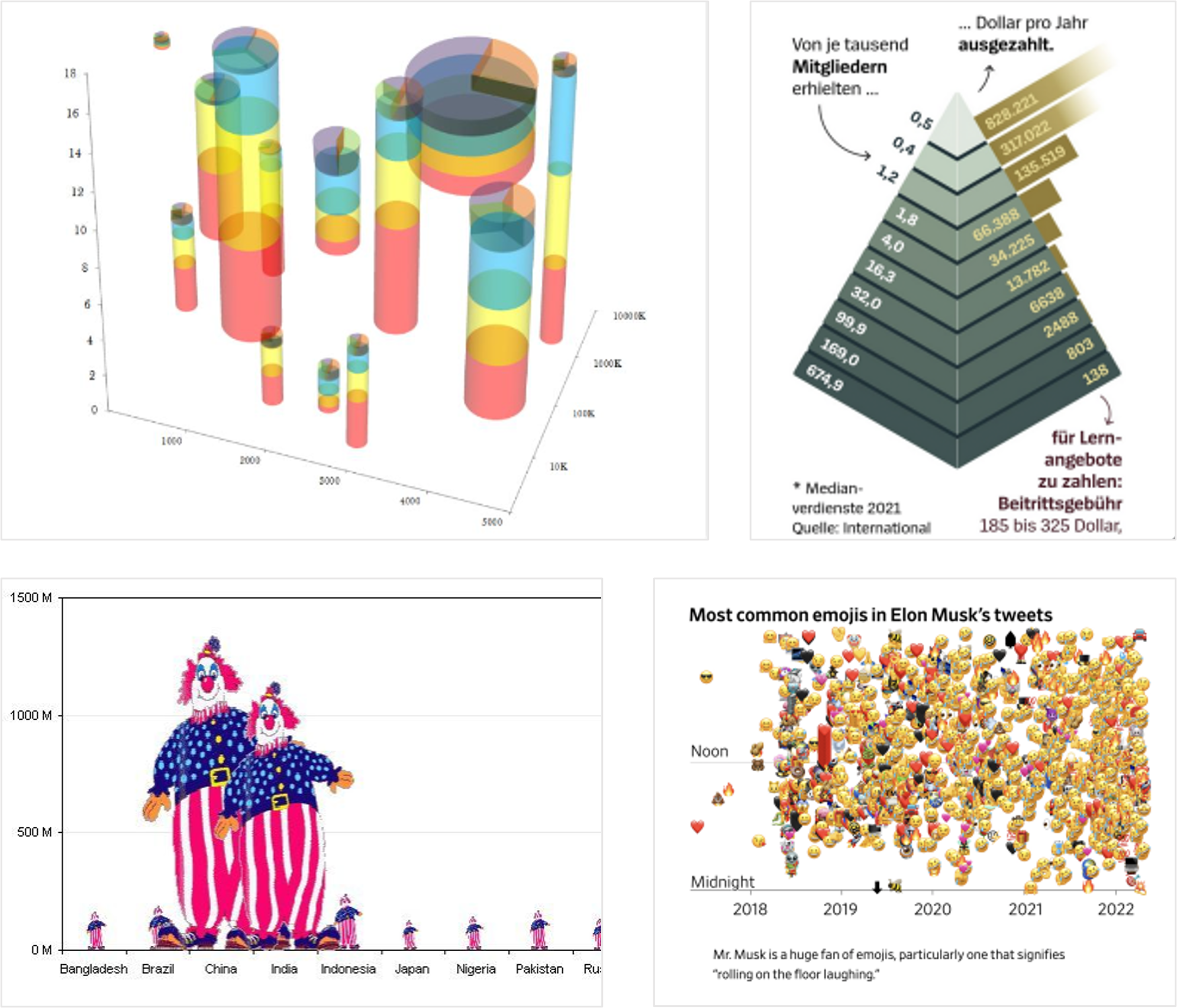
Most common mistakes in data visualization

White spacing

  • Poor choice of a visualization

White spacing

  • Misleading design of chart elements

White spacing

  • Incorrect use of color, shape, and size

White spacing

  • Neglectful formatting of the chart

White spacing

  • Wrong handling of missing data

White spacing

A visual of a person consulting several graphic reports printed out on paper

Data Visualization in Tableau

Choosing the right chart for the use case
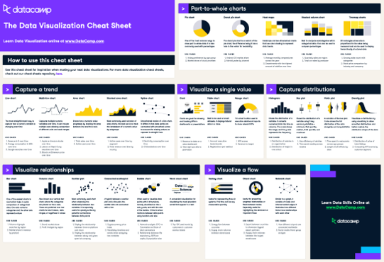
  • To each use case - its chart
    • Comparison - e.g. bar or line chart
    • Relationship - e.g. scatter plot
    • Distribution - e.g. histogram or box plot
    • Composition - e.g. stacked column chart
  • Amount of variables, categories?
  • Static or evolving over time?
  • Absolute (#) or relative (%) numbers?

Snapshot of DataCamp data visualization cheat sheet

  • But also:
    • The goal of the visualization
    • Audience's level of data literacy
1 https://www.datacamp.com/cheat-sheet/data-viz-cheat-sheet
Data Visualization in Tableau

Correct design of chart elements

An example of a line chart with a few chart design errors

The same chart, corrected with title, axes names and 0 baseline

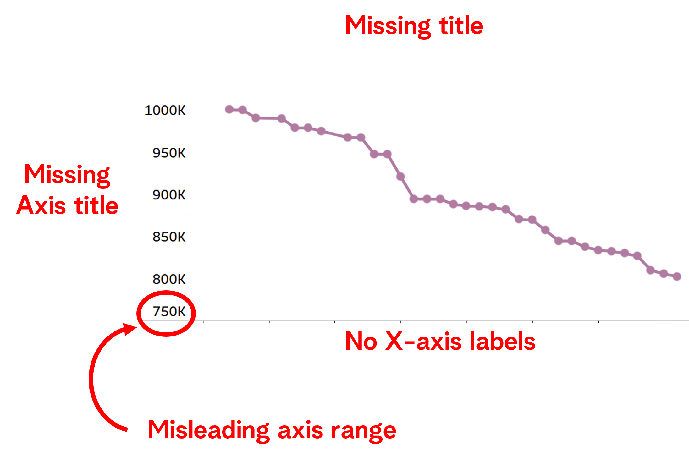
  • Add titles to the chart and axes
  • If there are no numeric marks on the chart - apply clear axes labels
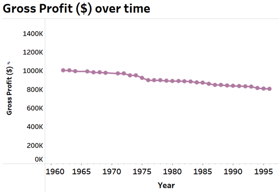
  • Keep the axes starting point at 0
Data Visualization in Tableau

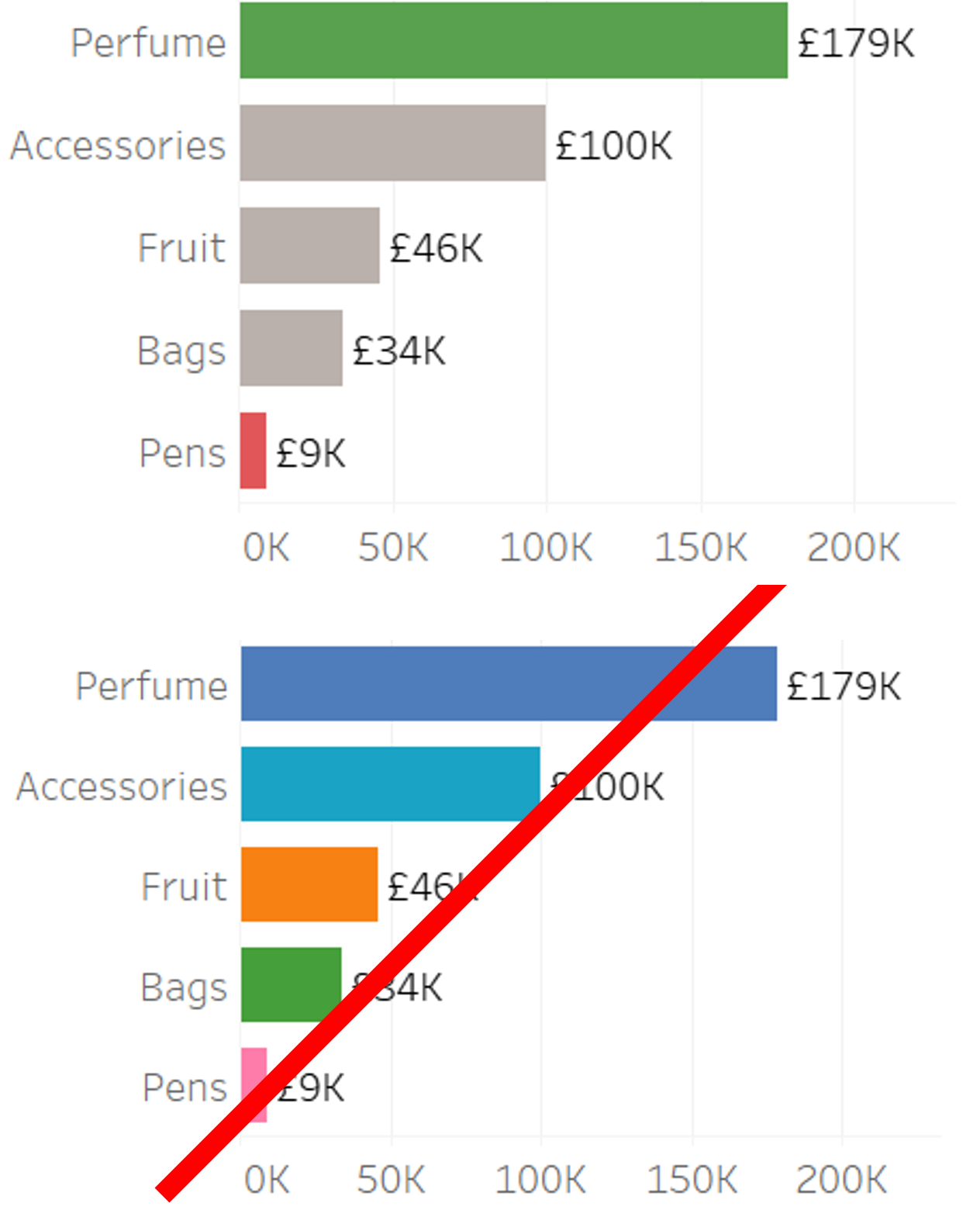
Conscious use of color

  • Do:

    • Use sparingly
    • Use to highlight key data points
    • Use clear, distinctive colors (consider color blind)
    • Consider matching palettes, company branding, etc.
  • Don't:

    • Use red, amber and green unless to indicate progression (bad ->good)
    • Color every data point, bar, category

Example of good and bad use of color

Data Visualization in Tableau

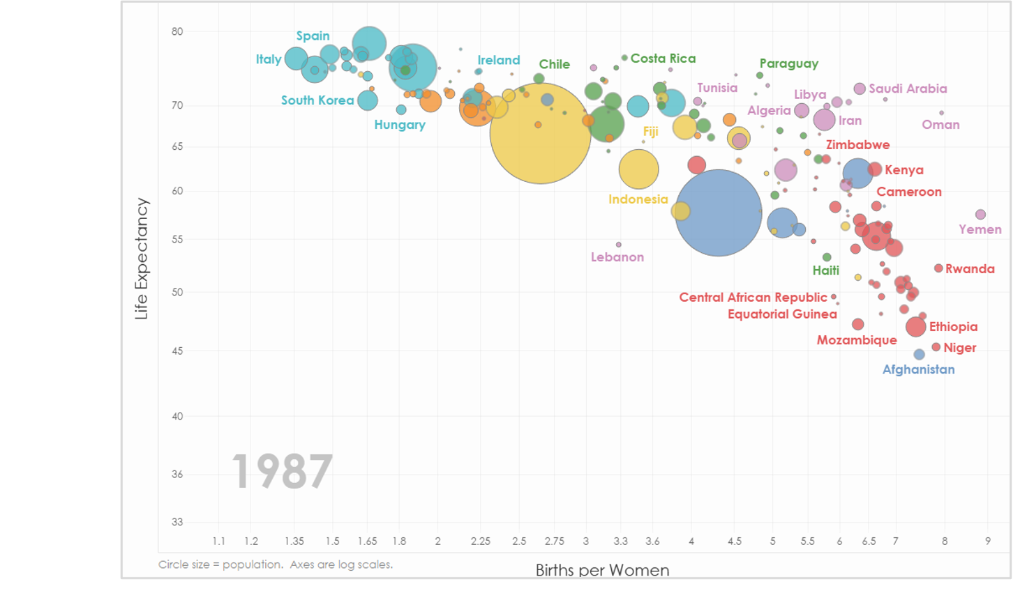
Conscious use of shape and size

  • Do:
    • Use as an extra variable but only when adding value.
    • Select shapes that can identify categories.

White spacing

  • Don't:
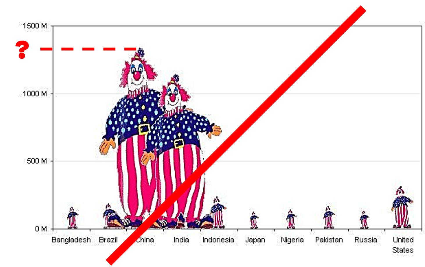
    • Avoid using symbols as bars or columns.
    • Use if it distracts attention or renders the chart illegible.

Example of a bad use of shape and size

Example of a bad use of shape and size

Data Visualization in Tableau

(Un)told story behind the nulls

White spacing

"Happy" story:

A line chart visualizing sales

White spacing

Full story:

A line chart visualizing sales, with null values

Data Visualization in Tableau

Let's practice!

Data Visualization in Tableau

Preparing Video For Download...