Exploring Data with Visualizations
Data Manipulation in Julia

Katerina Zahradova
Instructor
Why we visualize?
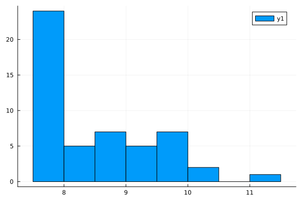
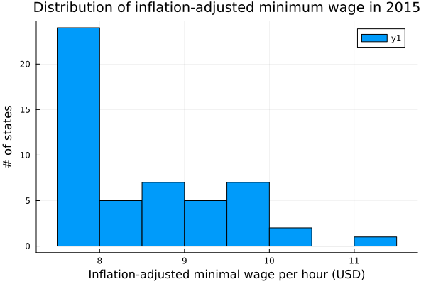
Histogram
# Make a histogram with default bins
wages_2015 = filter(wages.year == 2015, wages)
histogram(wages_2015.eff_min_wage_2020_dollars)
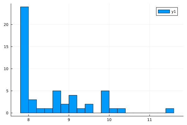
# Specifying the number of bins
wages_2015 = filter(wages.year == 2015, wages)
histogram(wages_2015.eff_min_wage_2020_dollars,
          bins = 25)
Labeling our plot
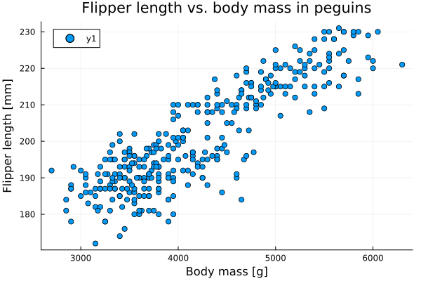
Scatter plot
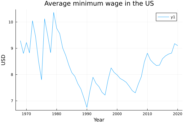
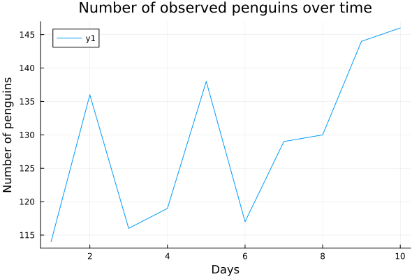
Line plot
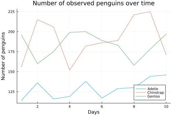
Multiple lines
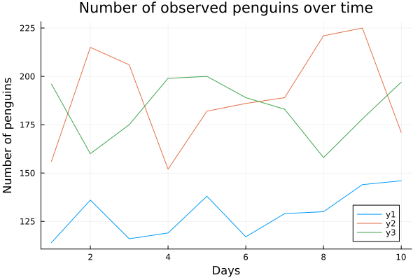
Multiple lines with legend