Good UI/UX practices
Building Dashboards with shinydashboard

Png Kee Seng
Researcher
2. Choose appropriate visualizations
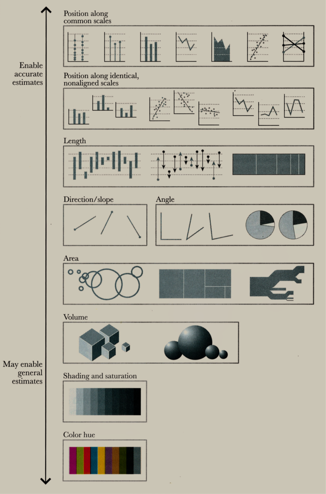
1 Cairo, Alberto. The truthful art: Data, charts, and maps for communication. New Riders, 2016
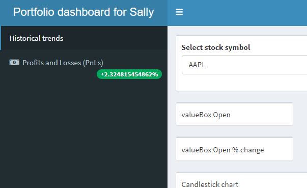
3. Use colors effectively/intuitively
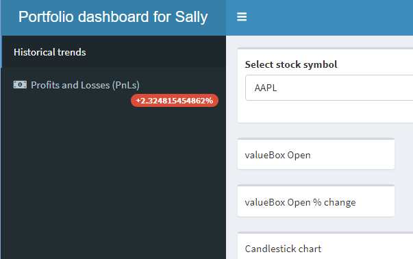
3. Use colors effectively/intuitively
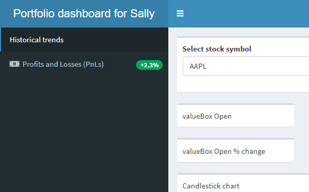
4. Truncate large values
5. Avoid too many interactive elements

1 Image by Freepik

