Plotting regression
A/B Testing in R

Lauryn Burleigh
Data Scientist
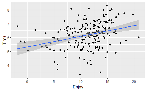
Linear line
cor.test(~ Enjoy + Time, data = pizza,
method = "pearson")
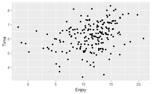
library(ggplot2)
ggplot(pizza, aes(x = Enjoy,
y = Time)) +
geom_point()
ggplot(pizza, aes(x = Enjoy,
                  y = Time)) +
  geom_point() +
  geom_smooth(method = "lm")
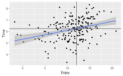
Linear prediction
Denoting groups
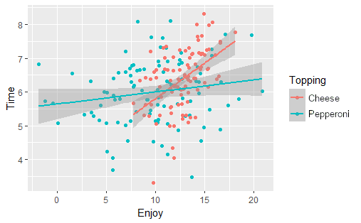
Denoting groups

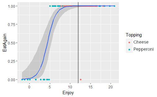
Logistic line
Logistic prediction