Reporting A/B test results
A/B Testing in R

Lauryn Burleigh
Data Scientist
A/B visualizations
Bar plots
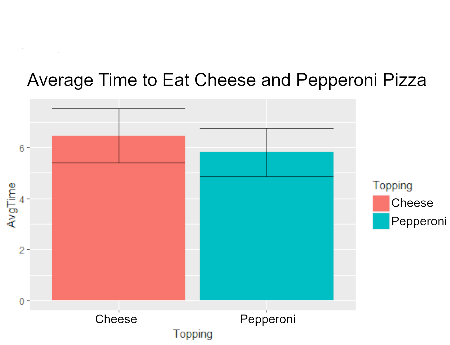
Using bar plots
Box plots
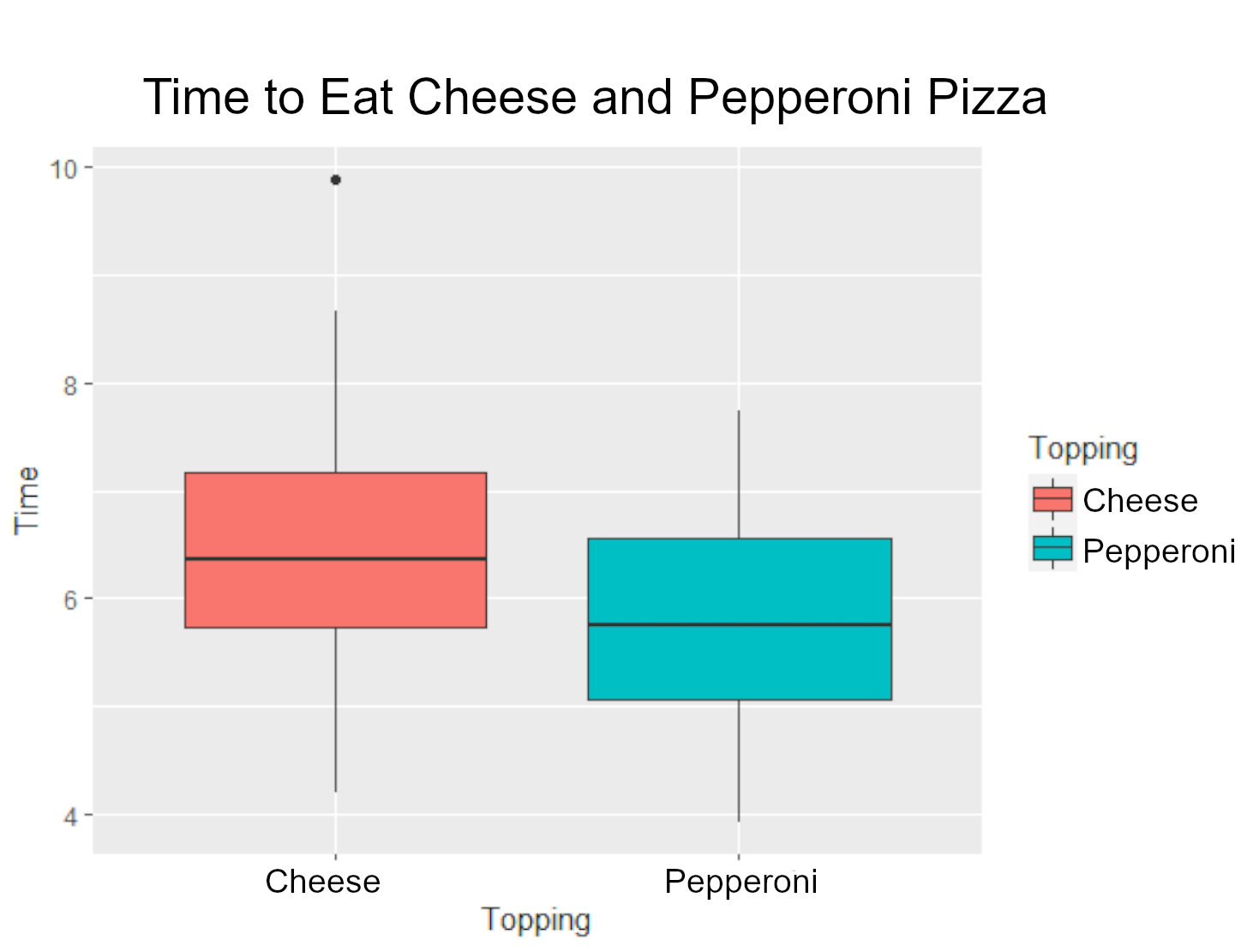
Using box plots
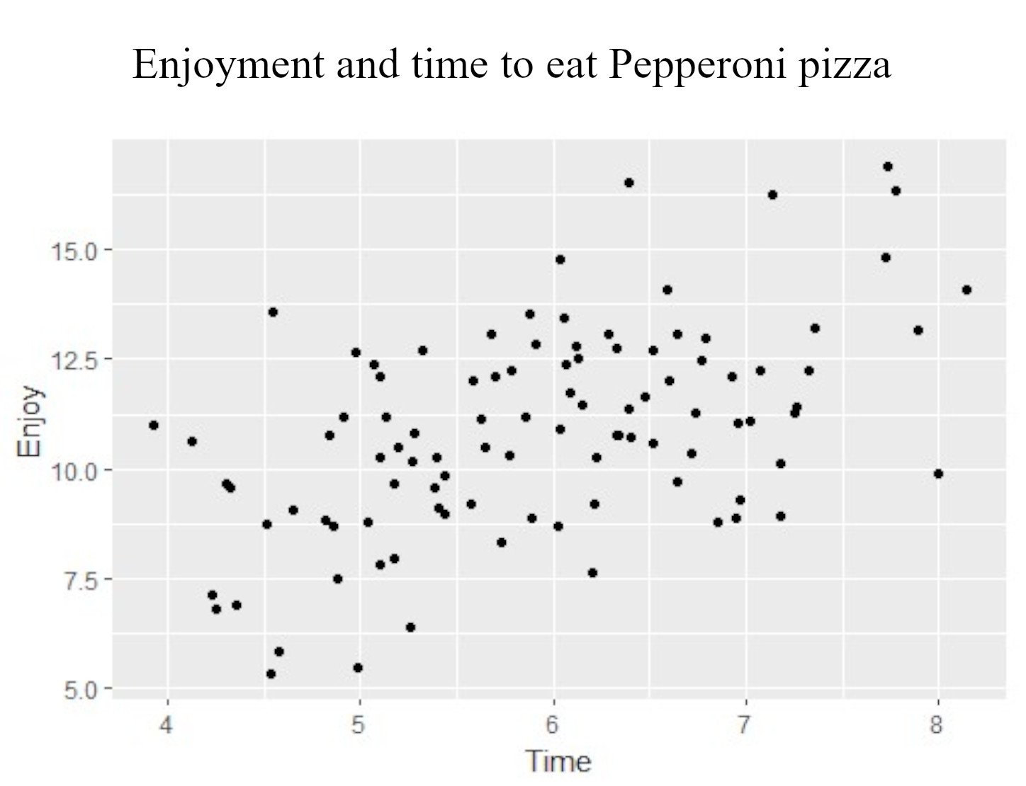
Scatter plots
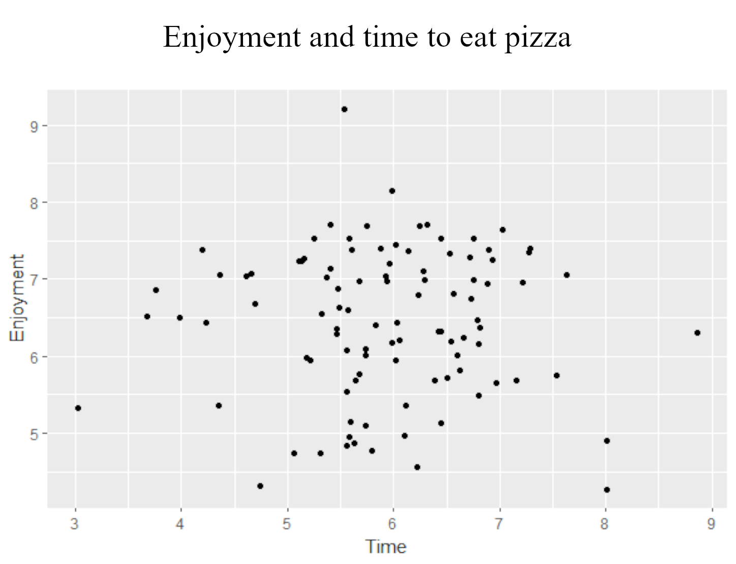
Using scatter plots
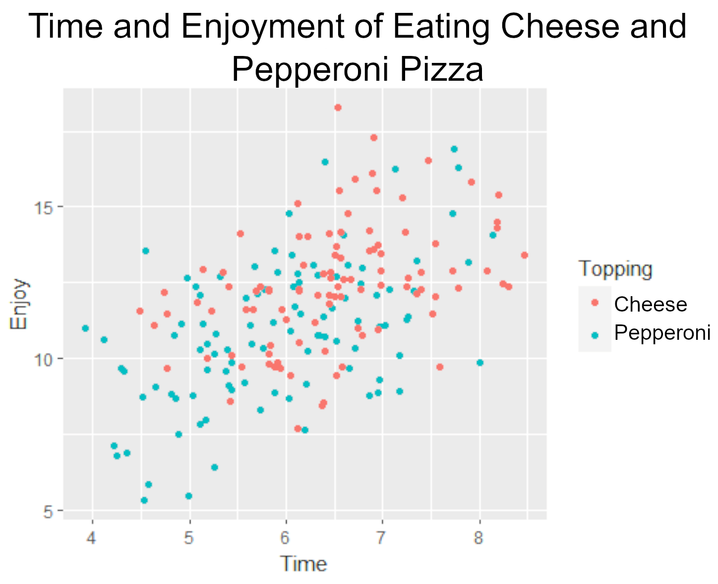
Using scatter plots
Presenting data

Presenting data example
A/B Testing in R
Lauryn Burleigh
Data Scientist

