Dropping Bars
Introduction to Data Visualization with Julia

Gustavo Vieira Suñe
Data Analyst
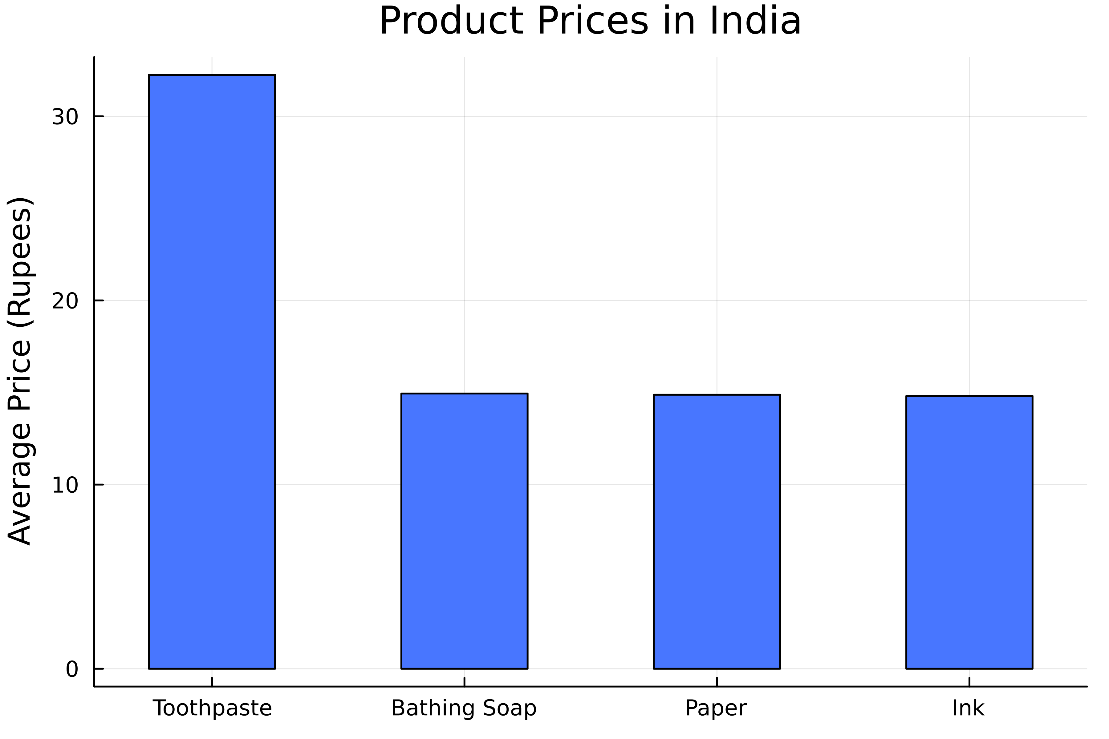
Bar charts
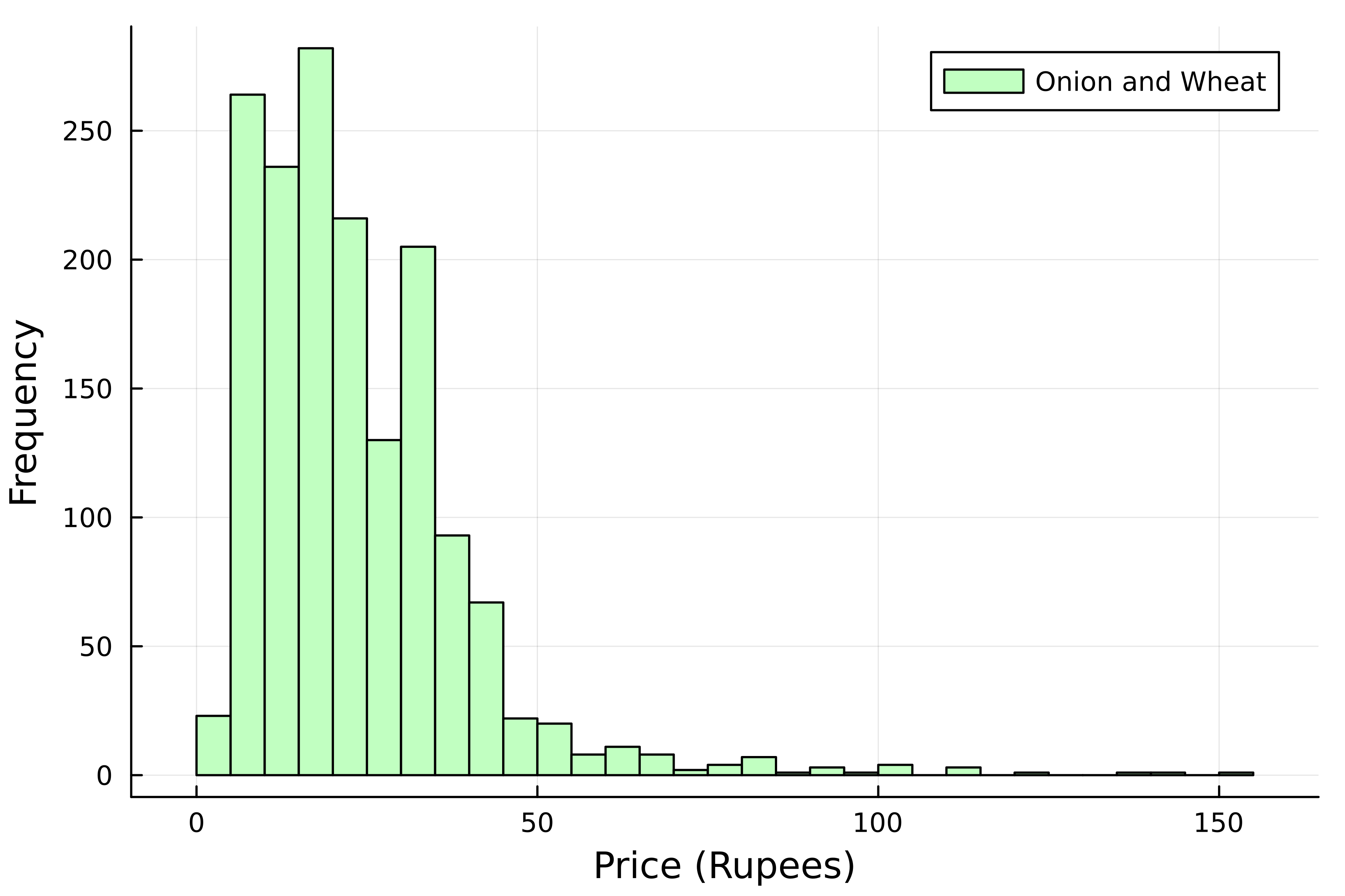
Bar charts vs histograms
- Distributions of numerical data
- Comparison of categories
Creating bar charts
Horizontal bar charts

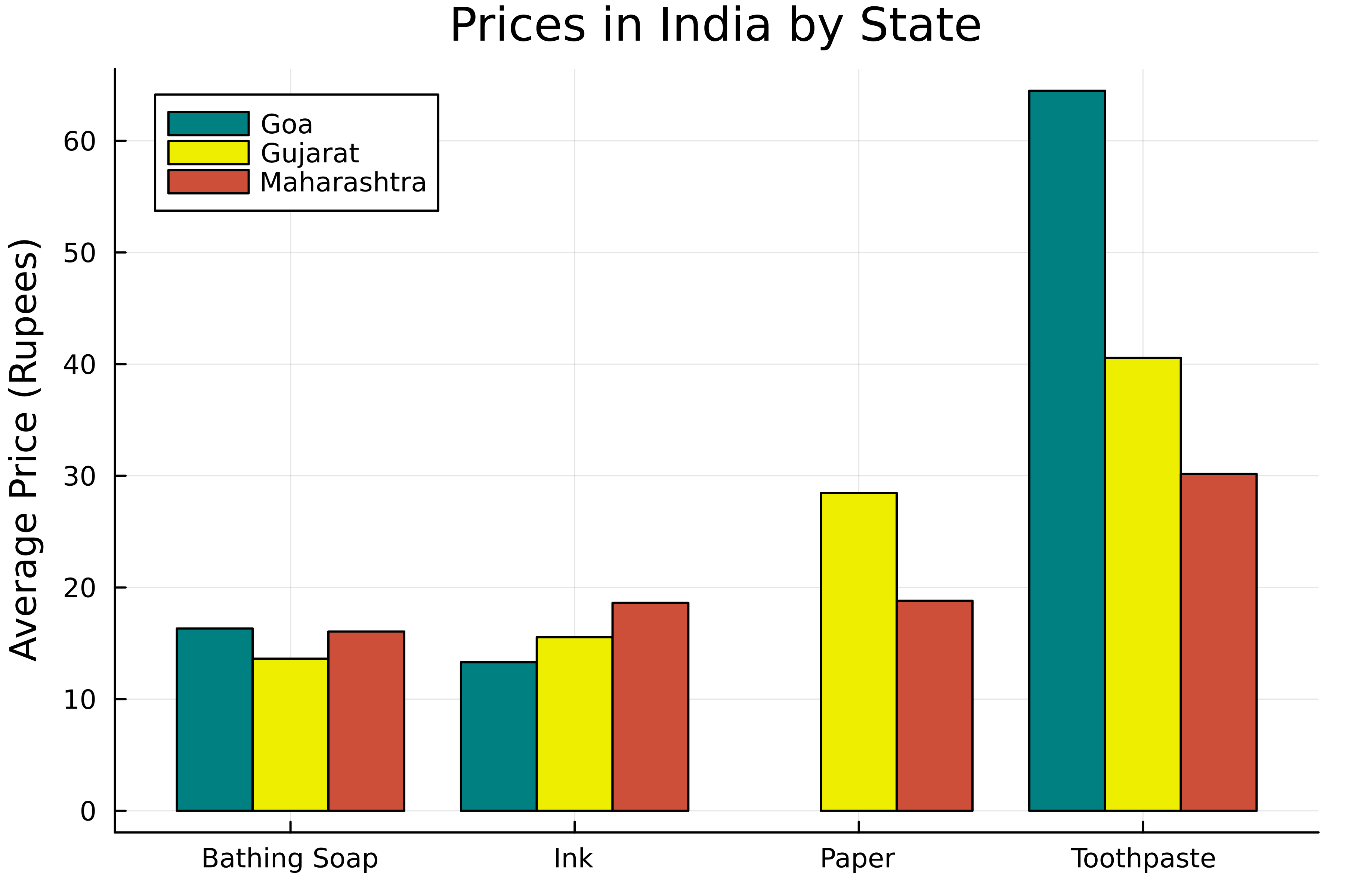
Grouped bar charts
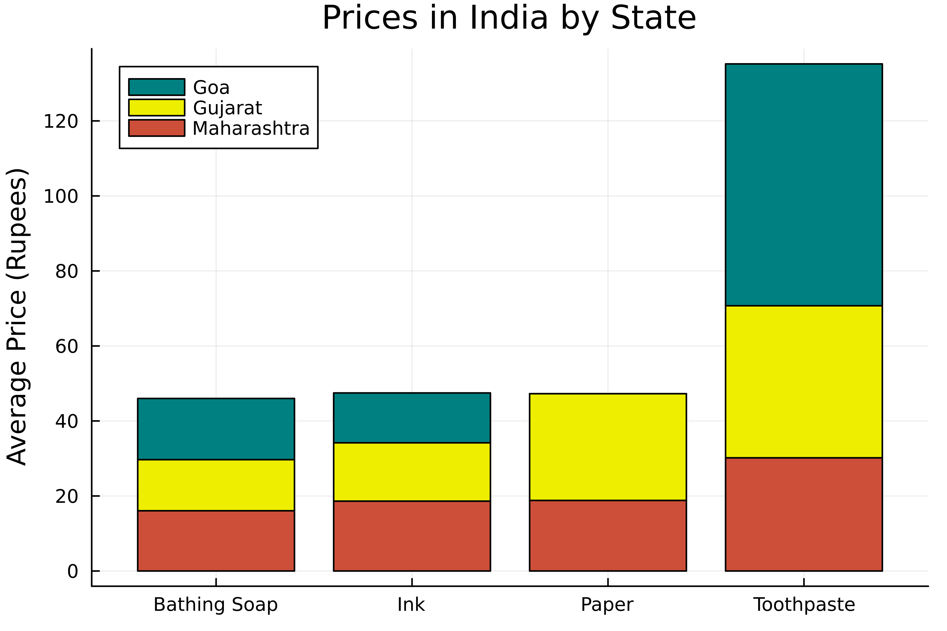
Stack the bars