Customizing with themes
Introduction to Data Visualization with Julia

Gustavo Vieira Suñe
Data Analyst
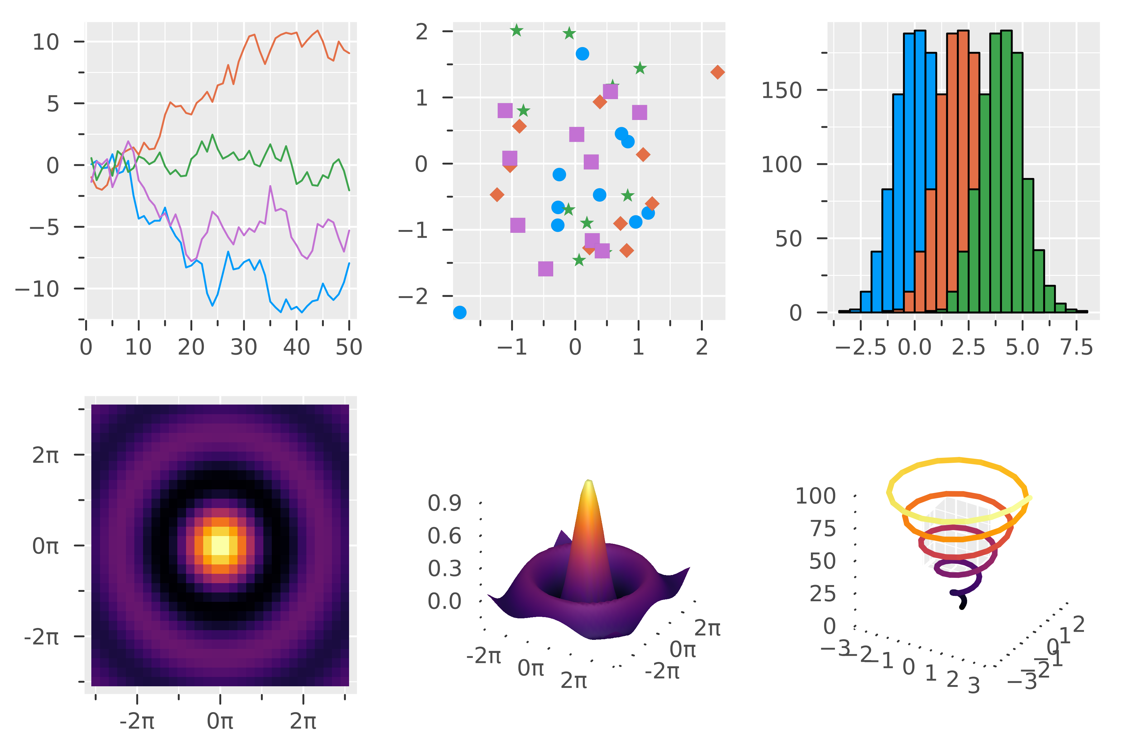
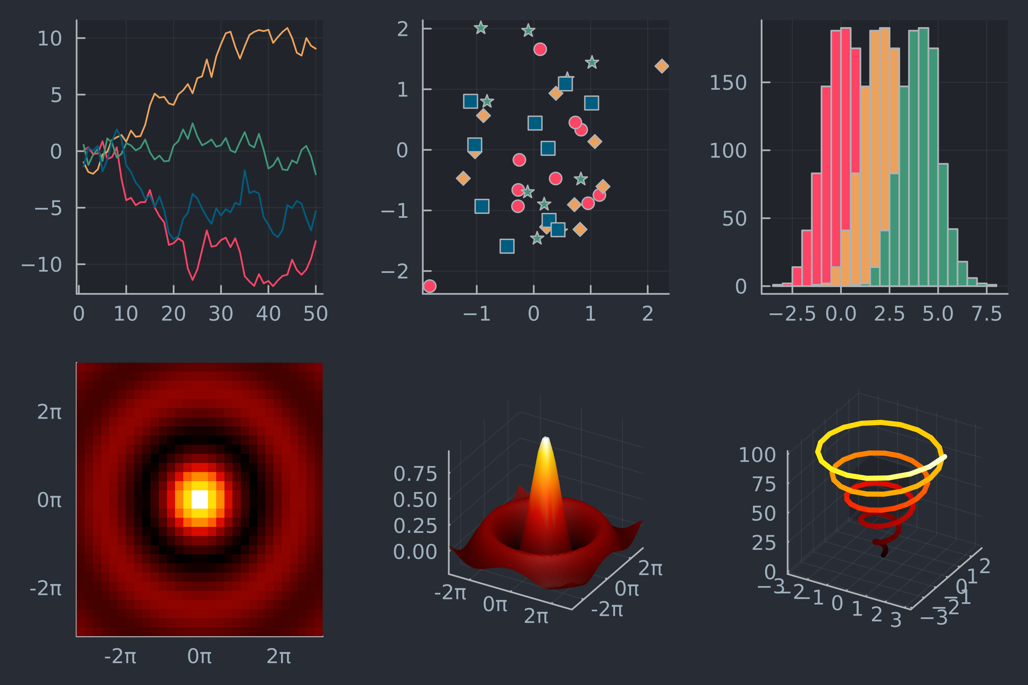
Previewing themes
showtheme(:ggplot2)
showtheme(:juno)
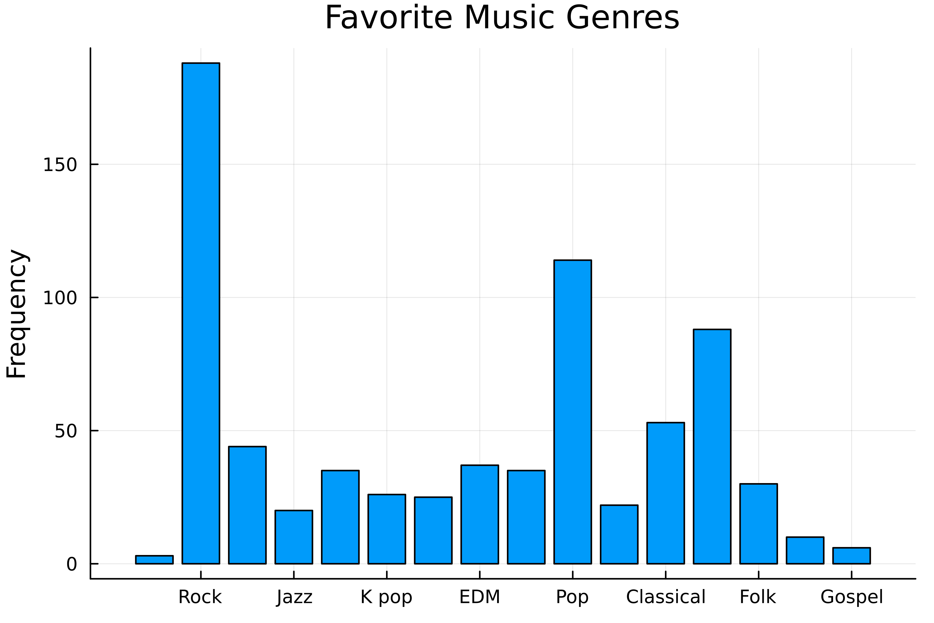
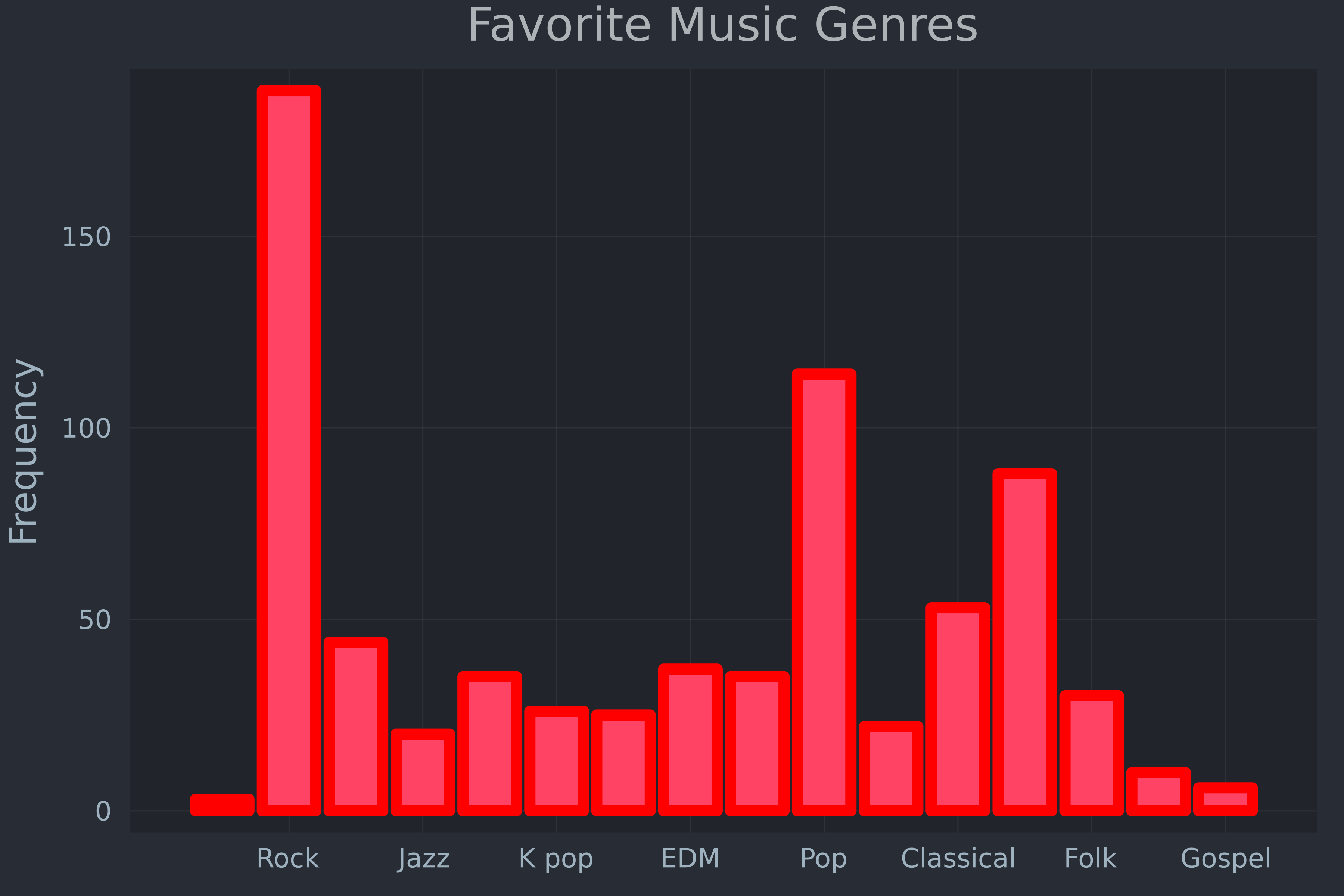
Default-themed bar chart
Try a different theme
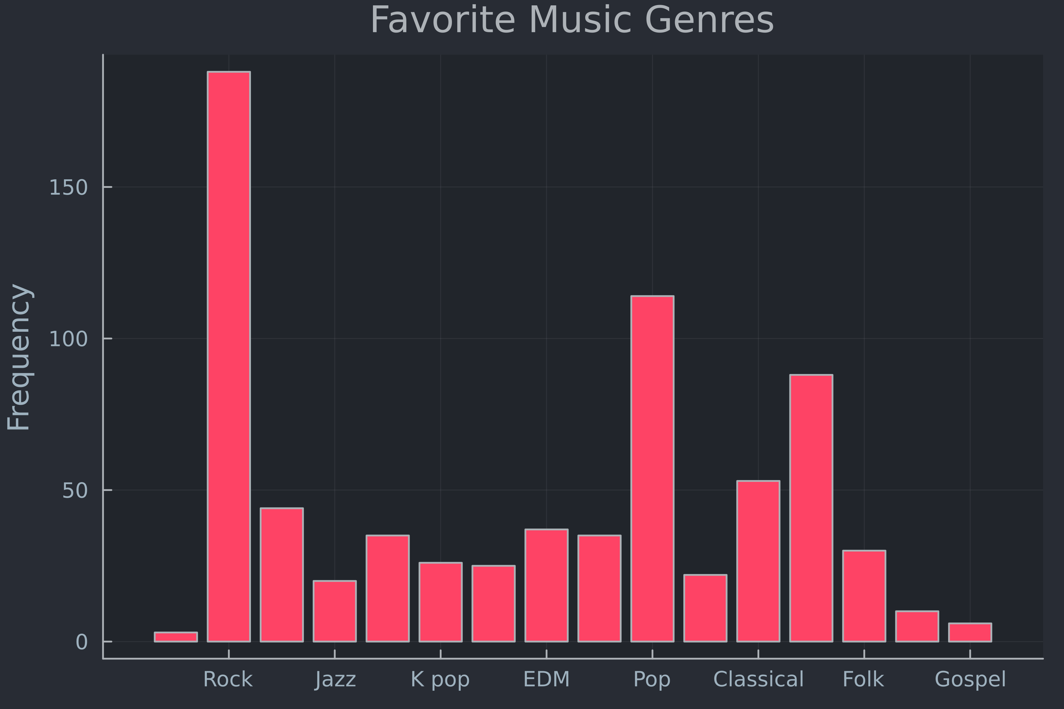
Make it pop!
- Save to file:
savefig("genres.png")

