Boxes and violins
Introduction to Data Visualization with Julia

Gustavo Vieira Suñe
Data Analyst
Histograms with many categories
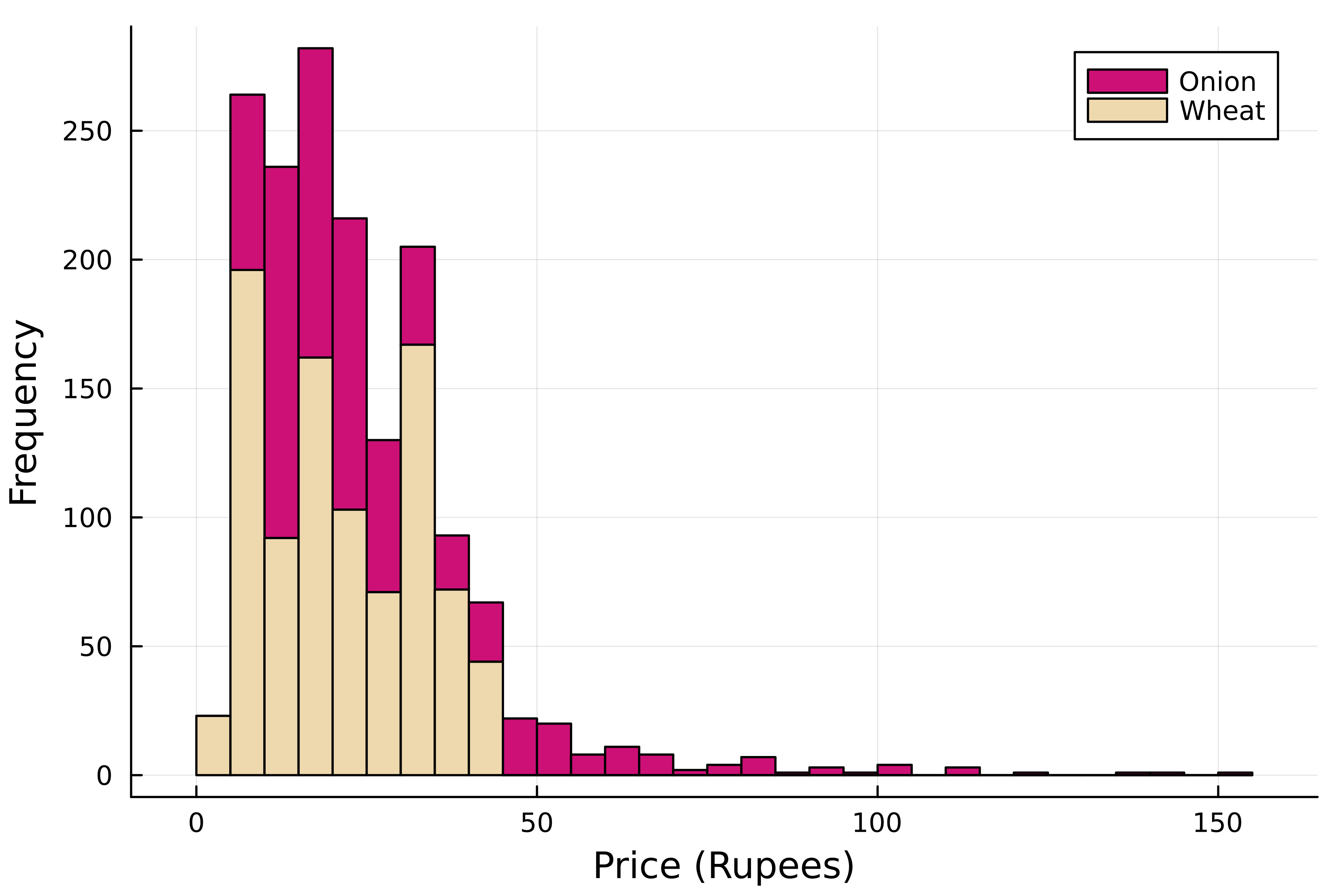
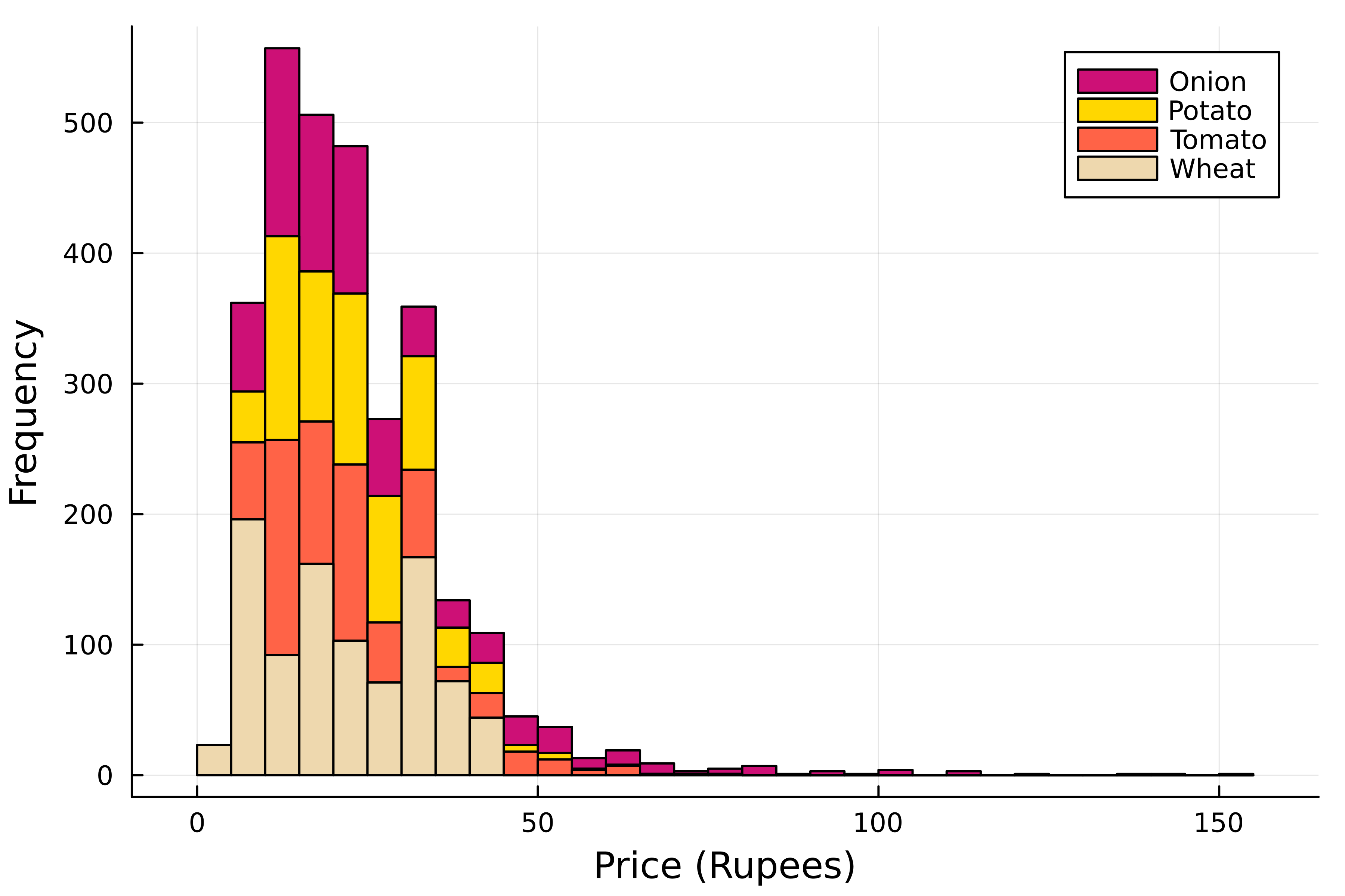
- Hard to compare many categories
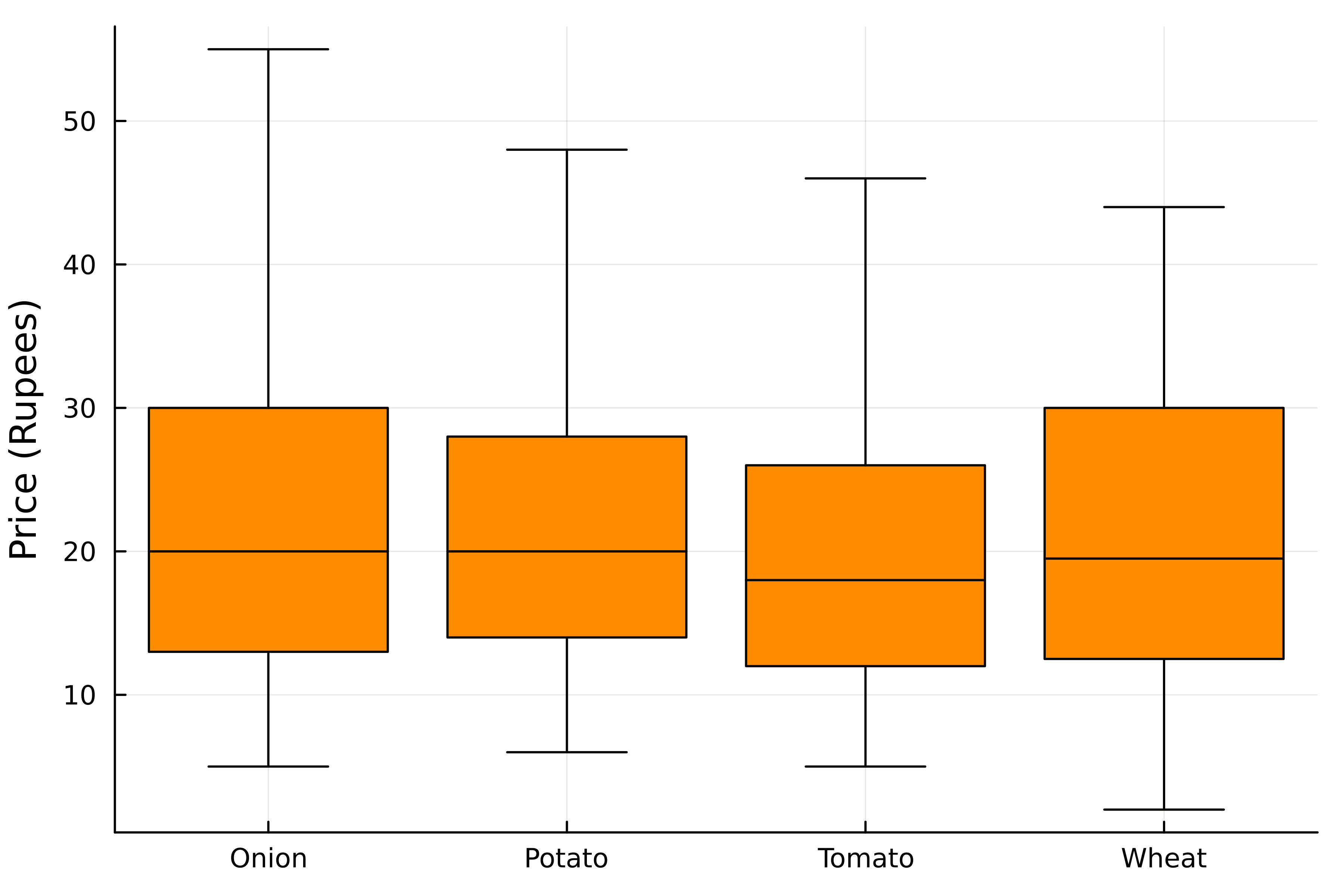
Box plots
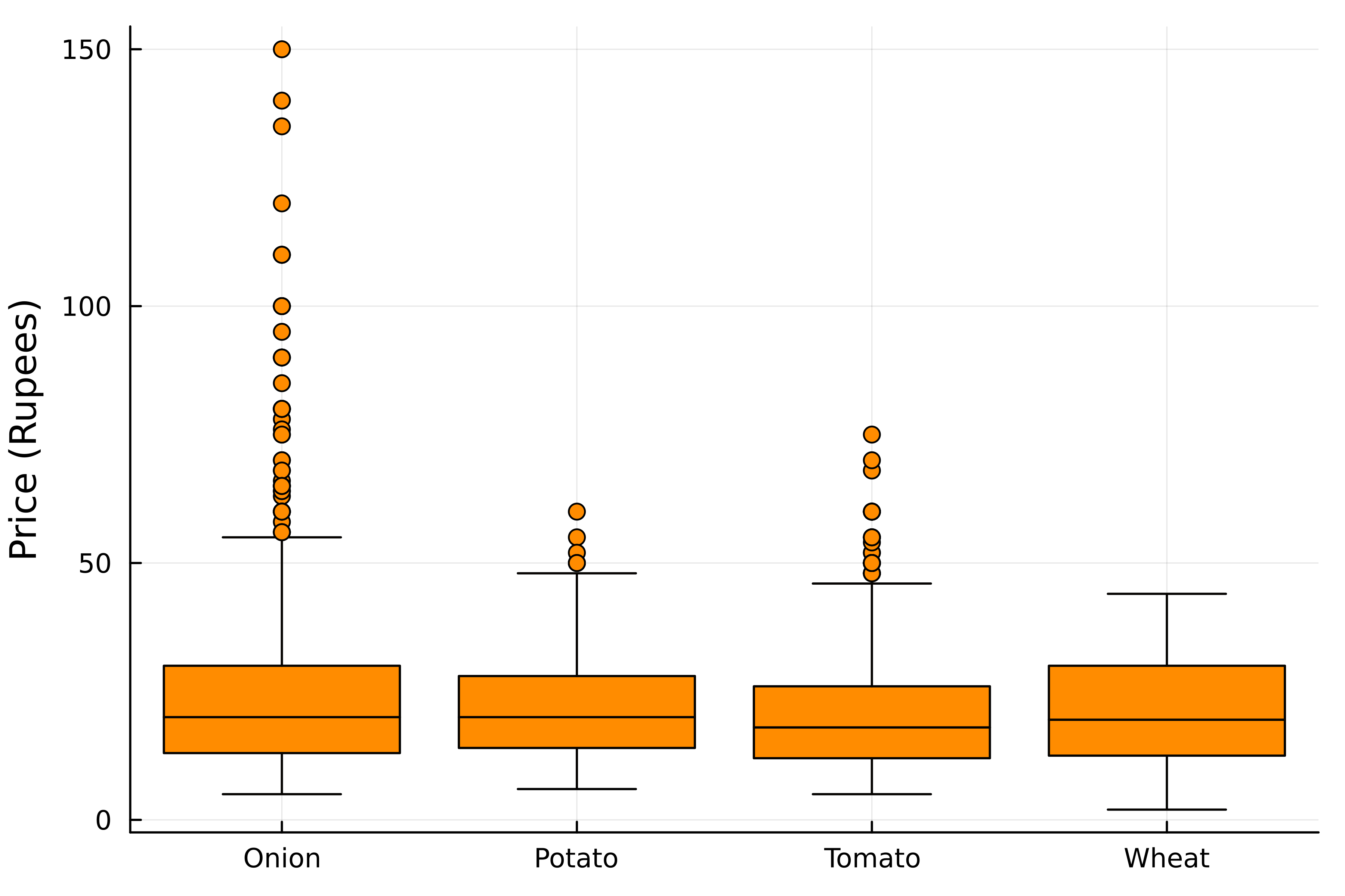
Boxes of product
Hiding outliers
Violin plots
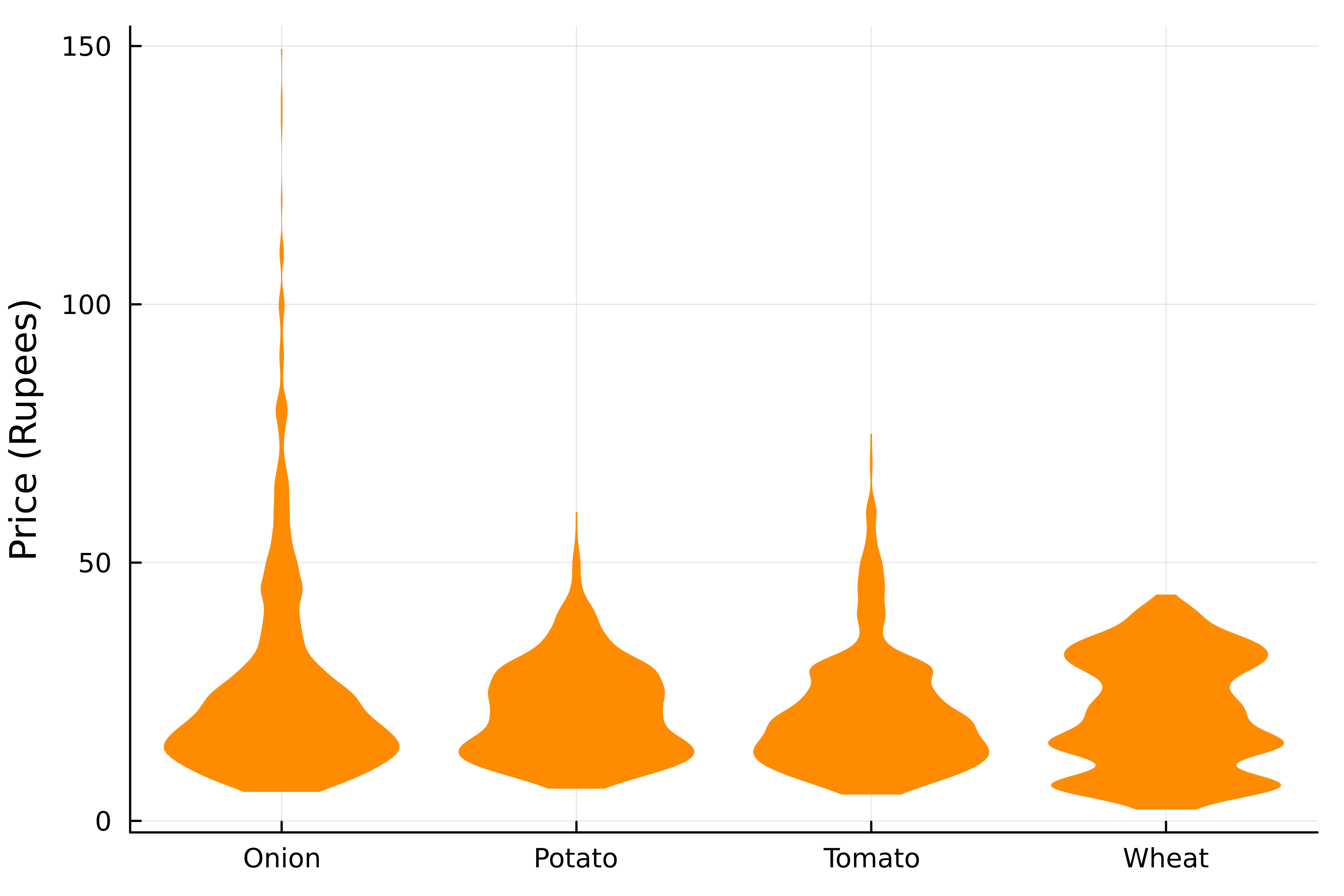
Distributions with violin plot
Boxes or violins?
- Box plots
- Central tendency, spread & skewness
- Emphasize outliers
- Violin plots
- Details of distribution
- Shape is relevant (e.g., multimodal)

