Multiple plots from DataFrames
Introduction to Data Visualization with Julia

Gustavo Vieira Suñe
Data Analyst
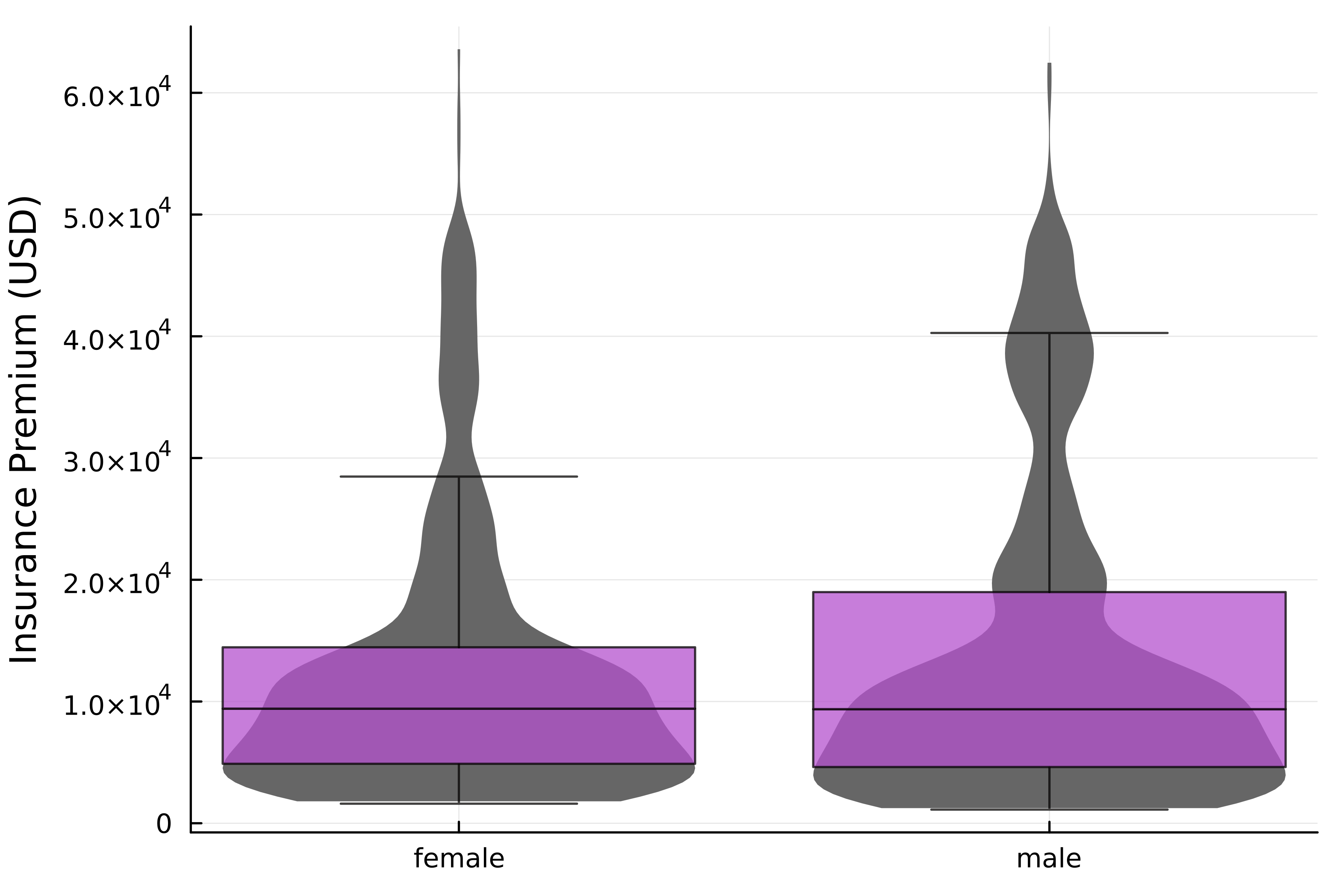
Multiple variables in a plot
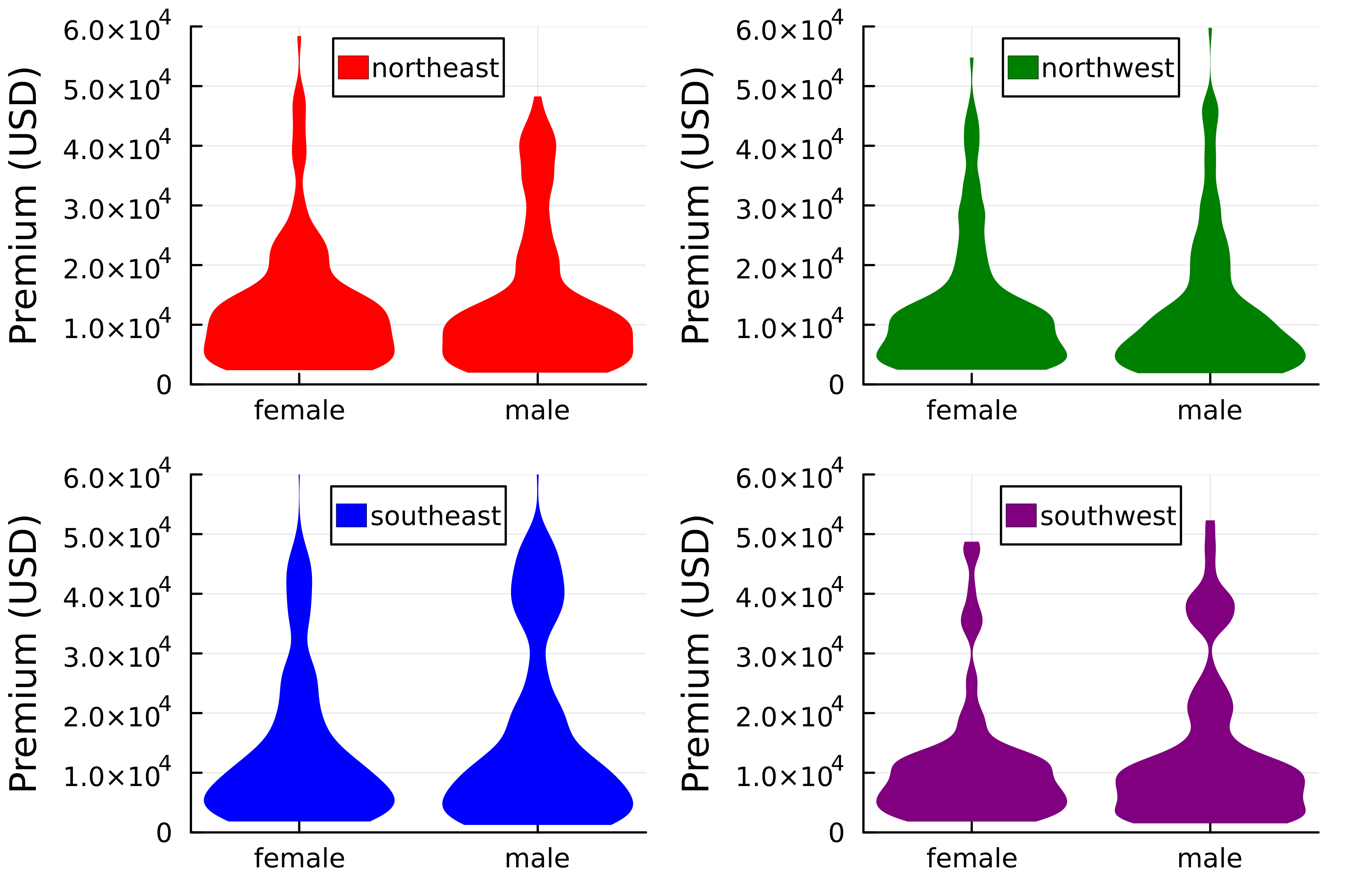
Layouts with DataFrames
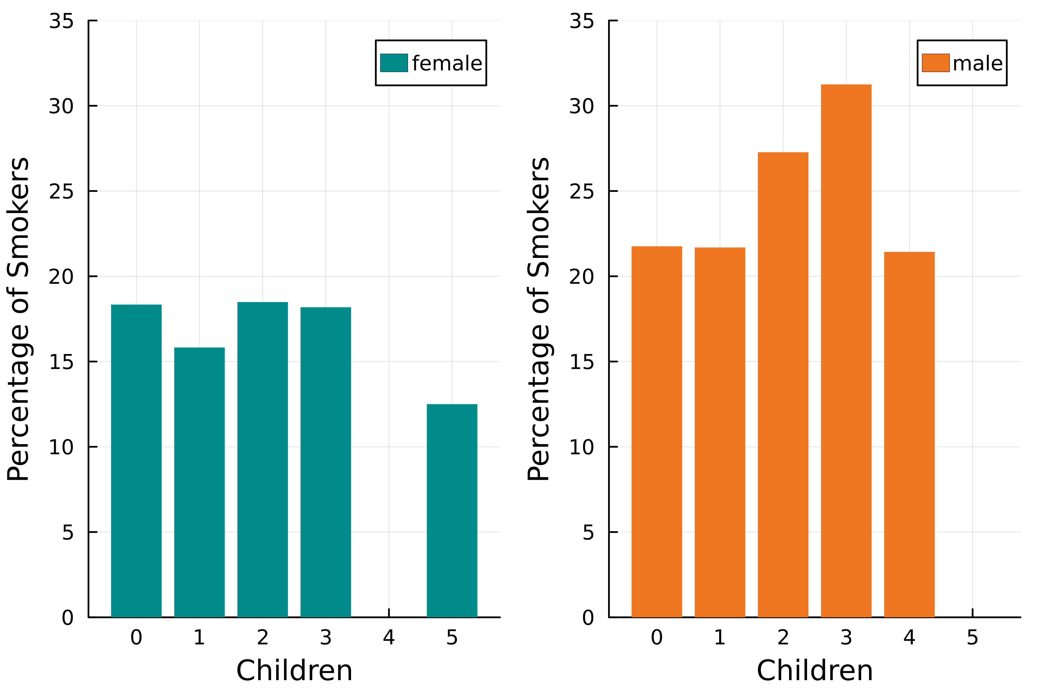
Adding chains to the mix
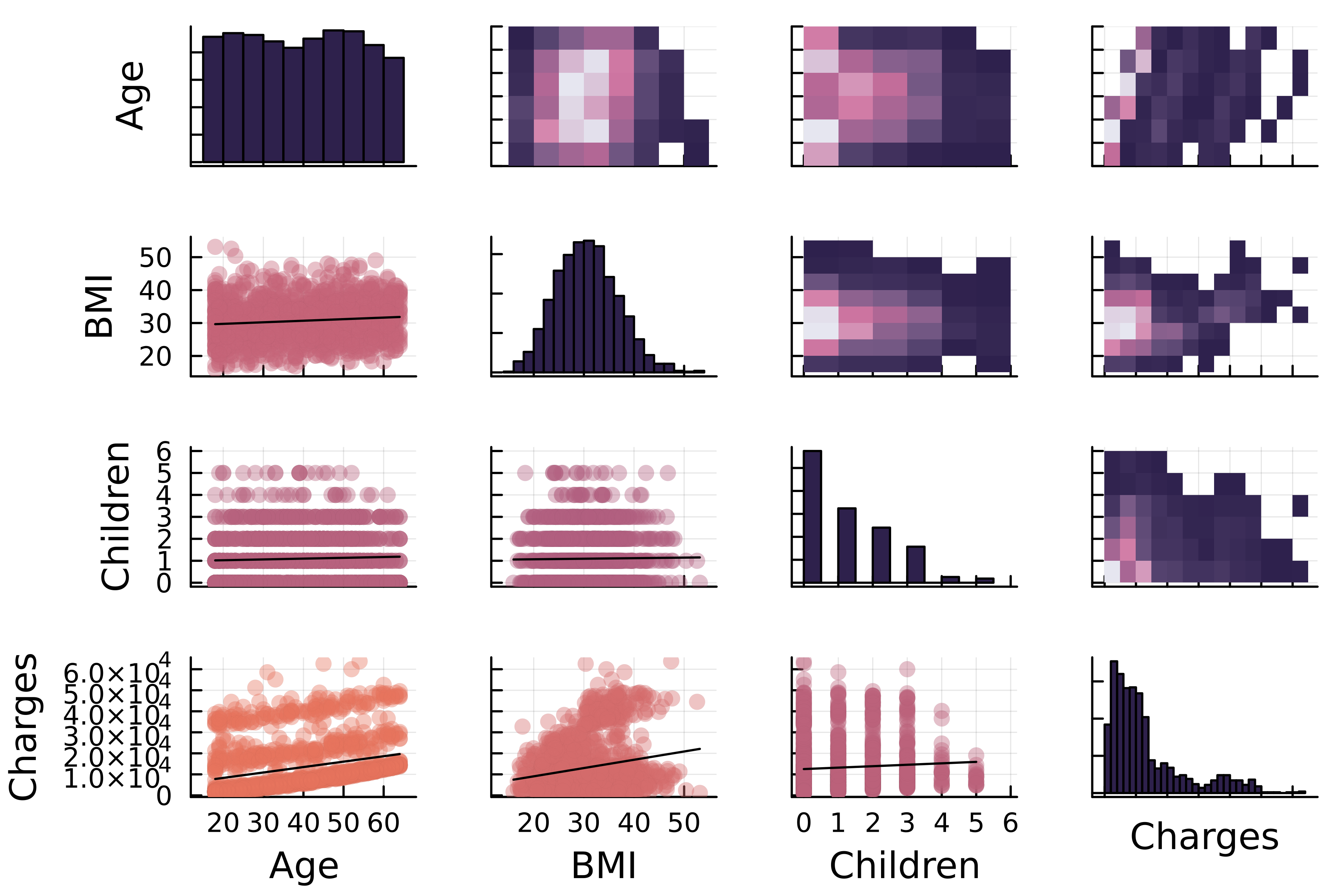
Correlation matrix plots
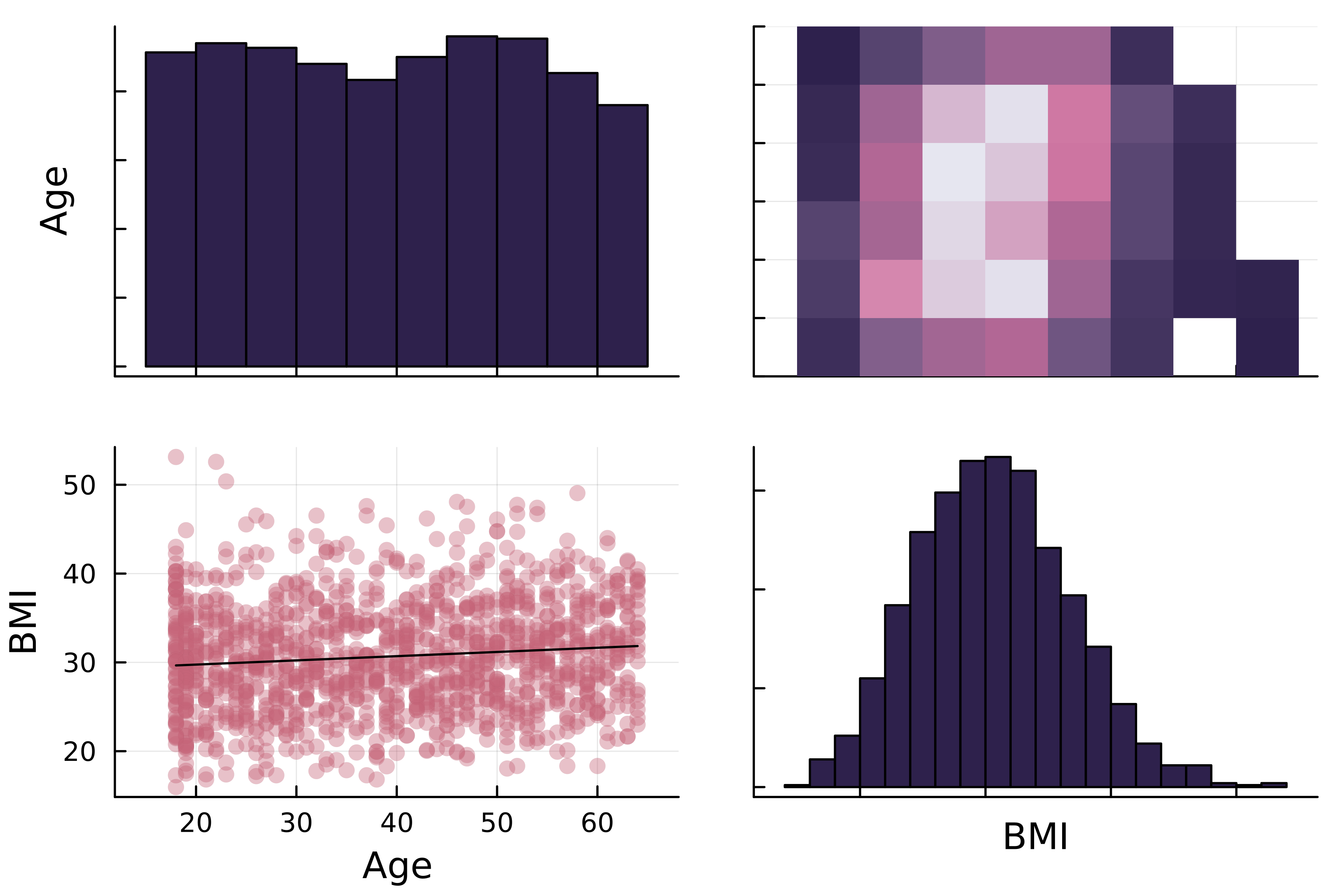
Correlation matrix plots
Correlation matrix plots in StatsPlots.jl
1 https://docs.juliaplots.org/latest/generated/colorschemes/
Correlation matrix plots in StatsPlots.jl