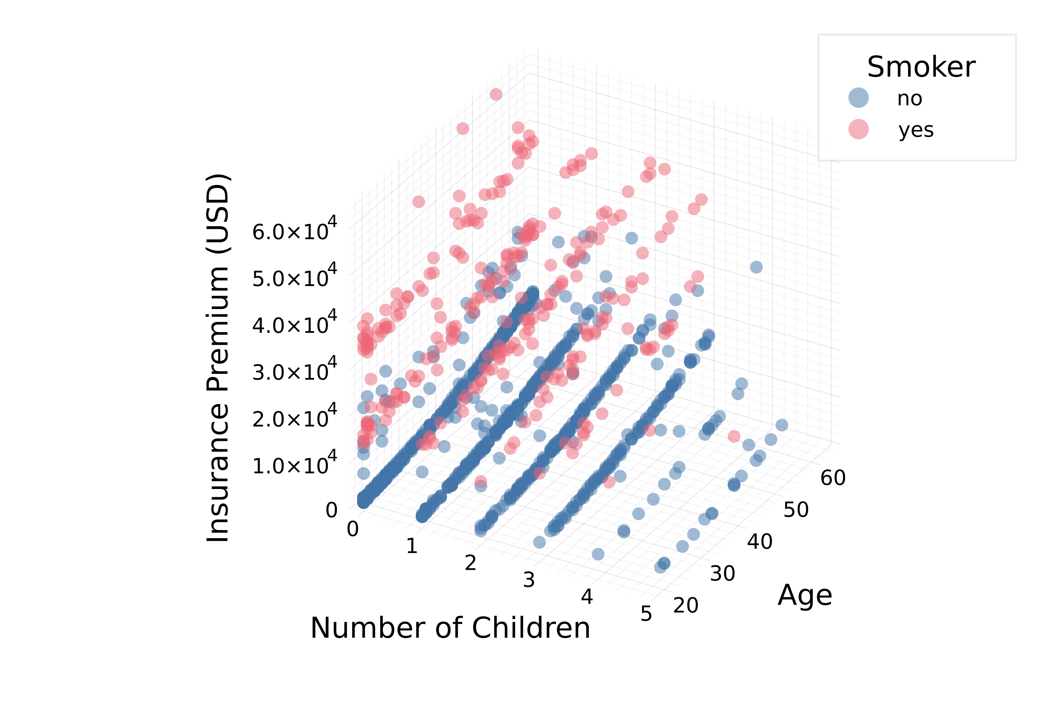
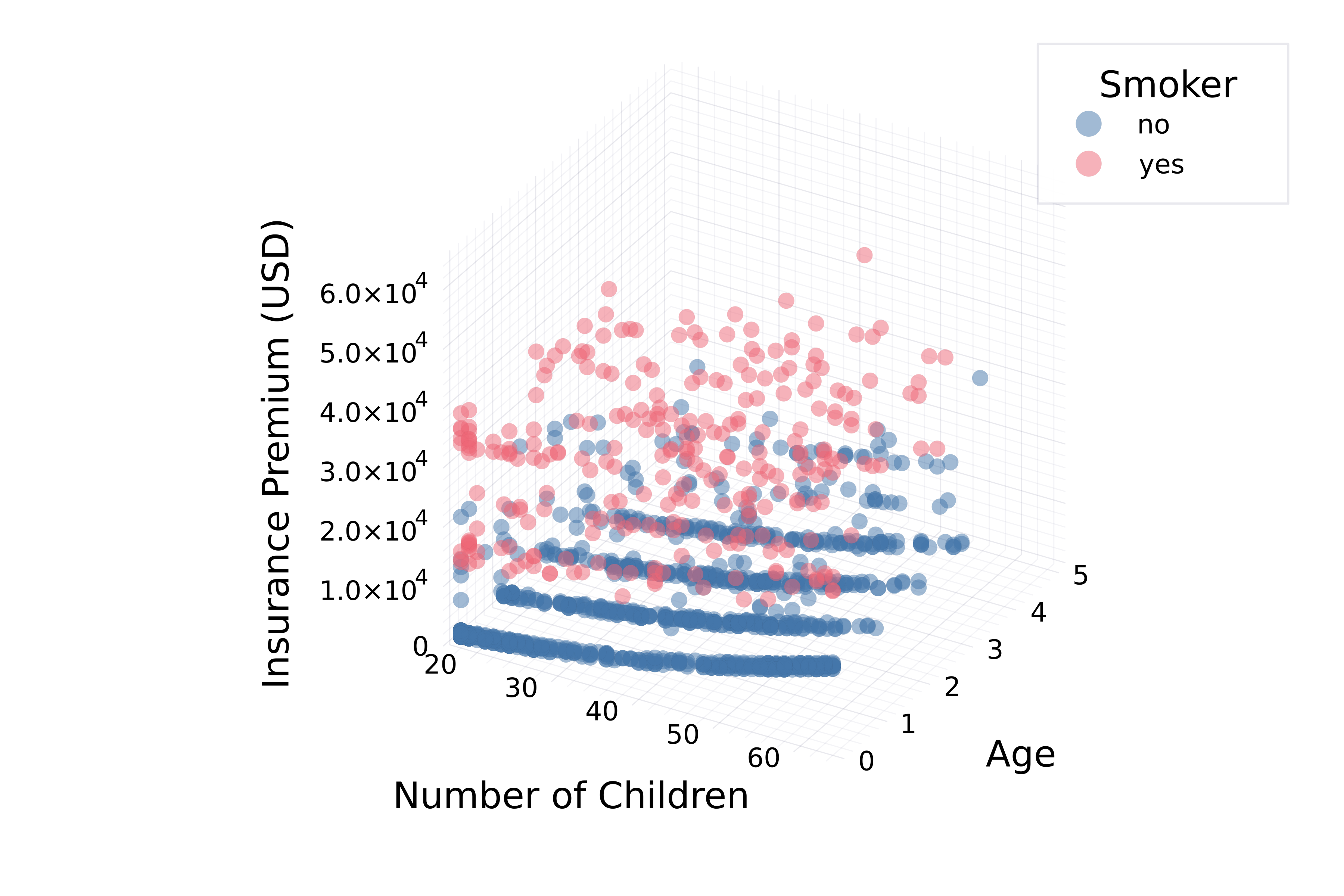
Plotting in More Dimensions

Introduction to Data Visualization with Julia

Gustavo Vieira Suñe

Data Analyst

Why more dimensions?

  • Recognize underlying patterns and trends
  • Analyze relationships between multiple variables simultaneously
  • Identify clusters
  • Clear and immersive presentation
  • Feature engineering
Introduction to Data Visualization with Julia

Will clusters persist?

A scatter plot showing the insurance premium versus age of policyholders. It shows three distinct clusters.

  • Are these clusters present for any number of children?
Introduction to Data Visualization with Julia

Plotting a slice

theme(:bright)

# Filter data
no_children = filter(
    row -> row.Children == 0, insurance)

# Plot a slice @df no_children scatter( :Age, :Charges, group=:Smoker, markersize=4, alpha=0.5, legend_title="Smoker") xlabel!("Age") ylabel!("Insurance Premium (USD)")

A scatter plot showing the insurance premium versus age of policyholders with no children. It shows three distinct clusters.

Introduction to Data Visualization with Julia

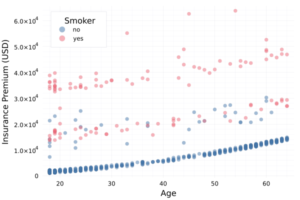
Using another dimension

theme(:bright)
@df insurance scatter(
    # Pass three columns
    :Children,
    :Age,
    :Charges,

group=:Smoker, markersize=4, alpha=0.5, legend_title="Smoker" ) # Axis labels xlabel!("Number of Children") ylabel!("Age") zlabel!("Insurance Premium (USD)")

A three-dimensional scatter plot showing the insurance premium versus age and number of children of policyholders. It shows the same cluster structure for points with different numbers of children.

Introduction to Data Visualization with Julia

Axis order

theme(:bright)
@df insurance scatter(

# Swap :Age and :Children :Age, :Children, :Charges, group=:Smoker, markersize=4, alpha=0.5, legend_title="Smoker" ) # Axis labels xlabel!("Number of Children") ylabel!("Age") zlabel!("Insurance Premium (USD)")

Introduction to Data Visualization with Julia

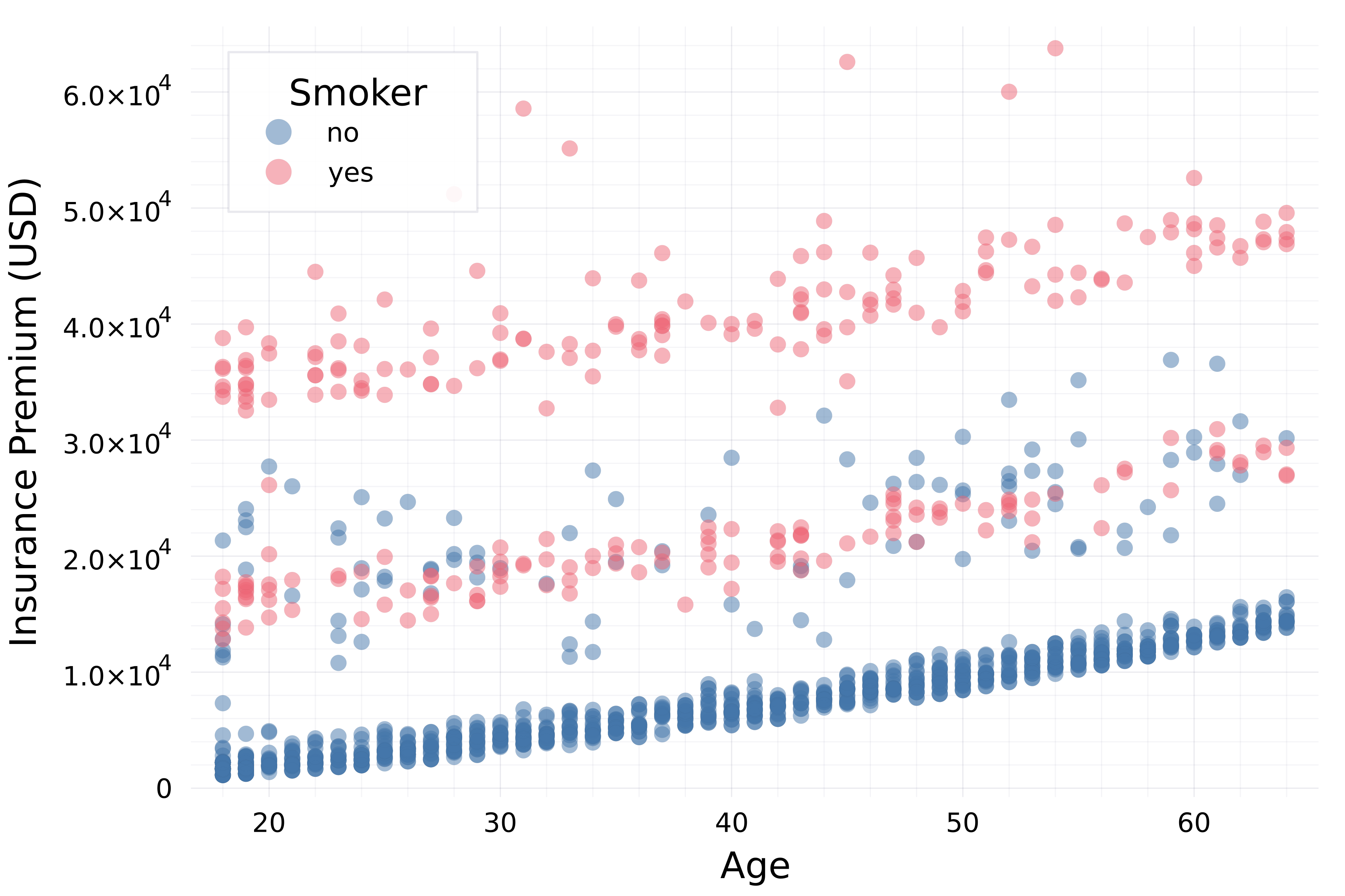
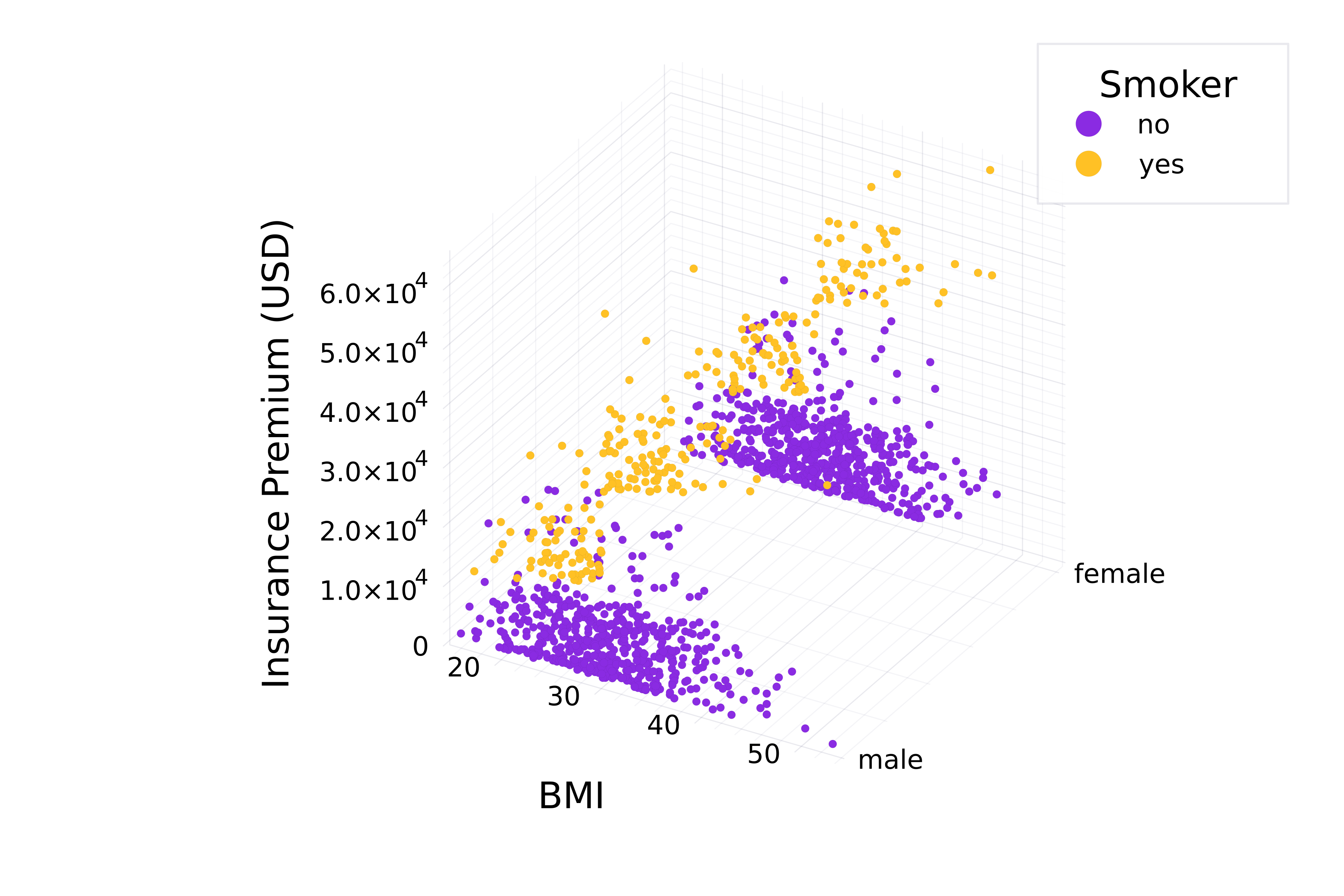
Grouping by another category

A scatter plot displaying the insurance charges versus body mass index, with points colored by smoking status.

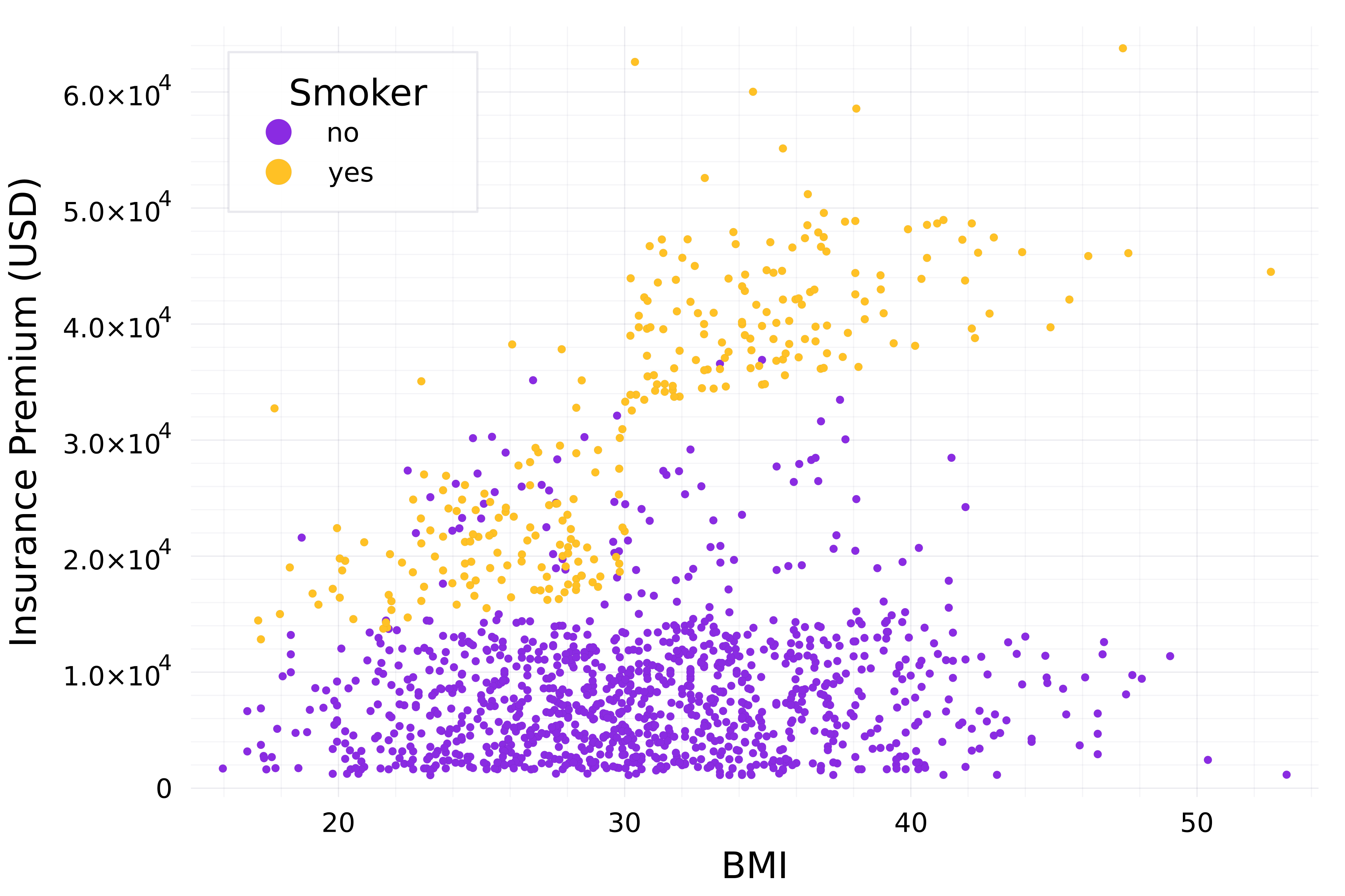
  • Can we group by smoker status and sex?
Introduction to Data Visualization with Julia

Add a categorical dimension

theme(:vibrant)

@df insurance scatter(
    :BMI,

# Pass categorical column :Sex,
:Charges, group=:Smoker, markersize=2, legend_title="Smoker", color=[:blueviolet :goldenrod1]) xlabel!("BMI") zlabel!("Insurance Premium (USD)")

A three-dimensional scatter plot displaying the insurance charges versus body mass index and sex, with points colored by smoking status.

Introduction to Data Visualization with Julia

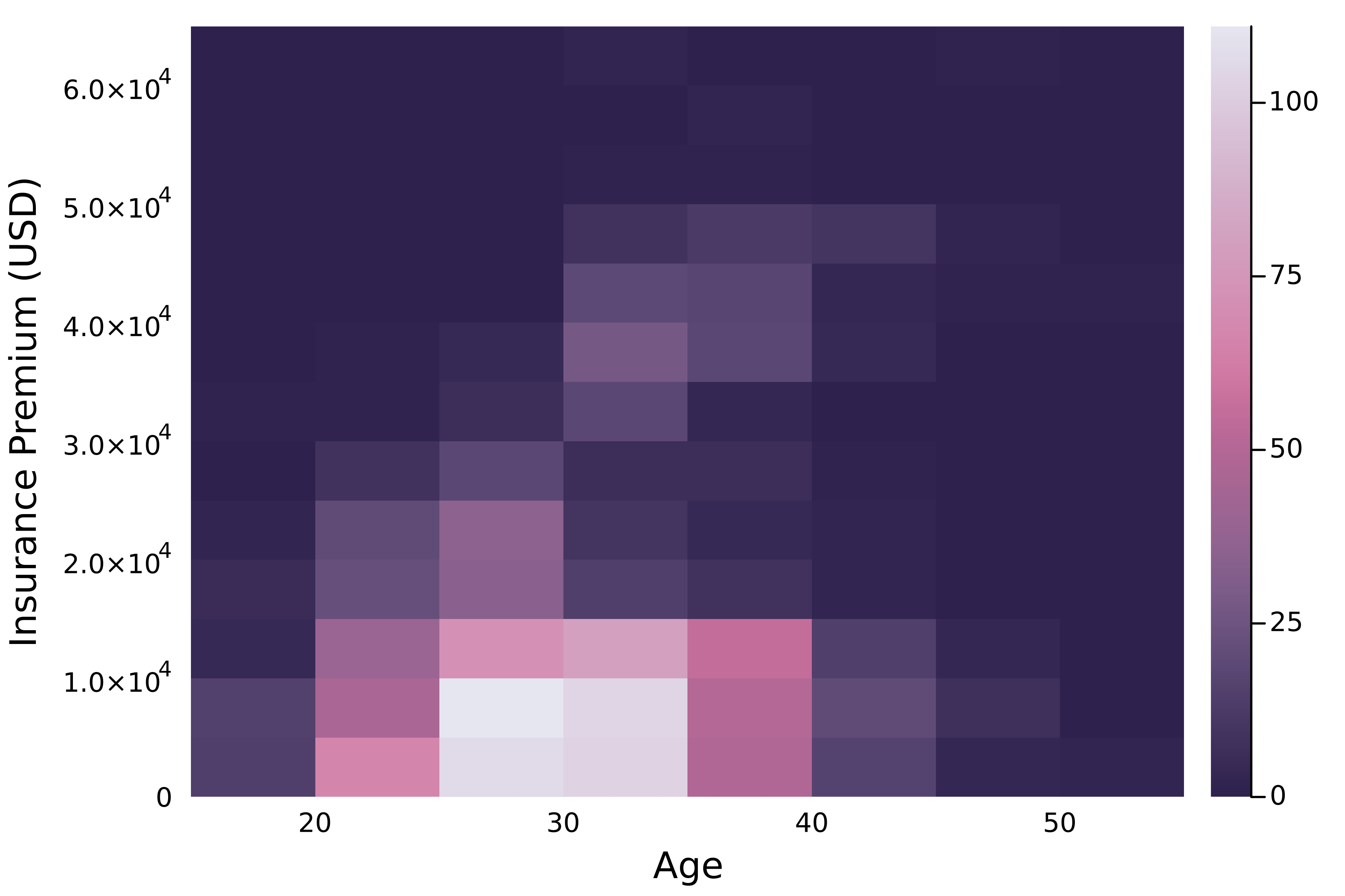
Visualize point density

A scatter plot displaying the insurance charges versus body mass index, with points colored by smoking status.

  • Can we visualize the point density more clearly?
Introduction to Data Visualization with Julia

Two-dimensional histograms

# 2d histogram
@df insurance histogram2d(

:BMI, :Charges,
# Fill color scheme fillcolor=:acton,
# Fill empty bins show_empty_bins=true,
) xlabel!("Age") ylabel!("Insurance Premium (USD)")

A two-dimensional histogram displaying the distribution of insurance charges and body mass index.

Introduction to Data Visualization with Julia

Let's practice!

Introduction to Data Visualization with Julia

Preparing Video For Download...