Visualizing time series
Introduction to Data Visualization with Julia

Gustavo Vieira Suñe
Data Analyst
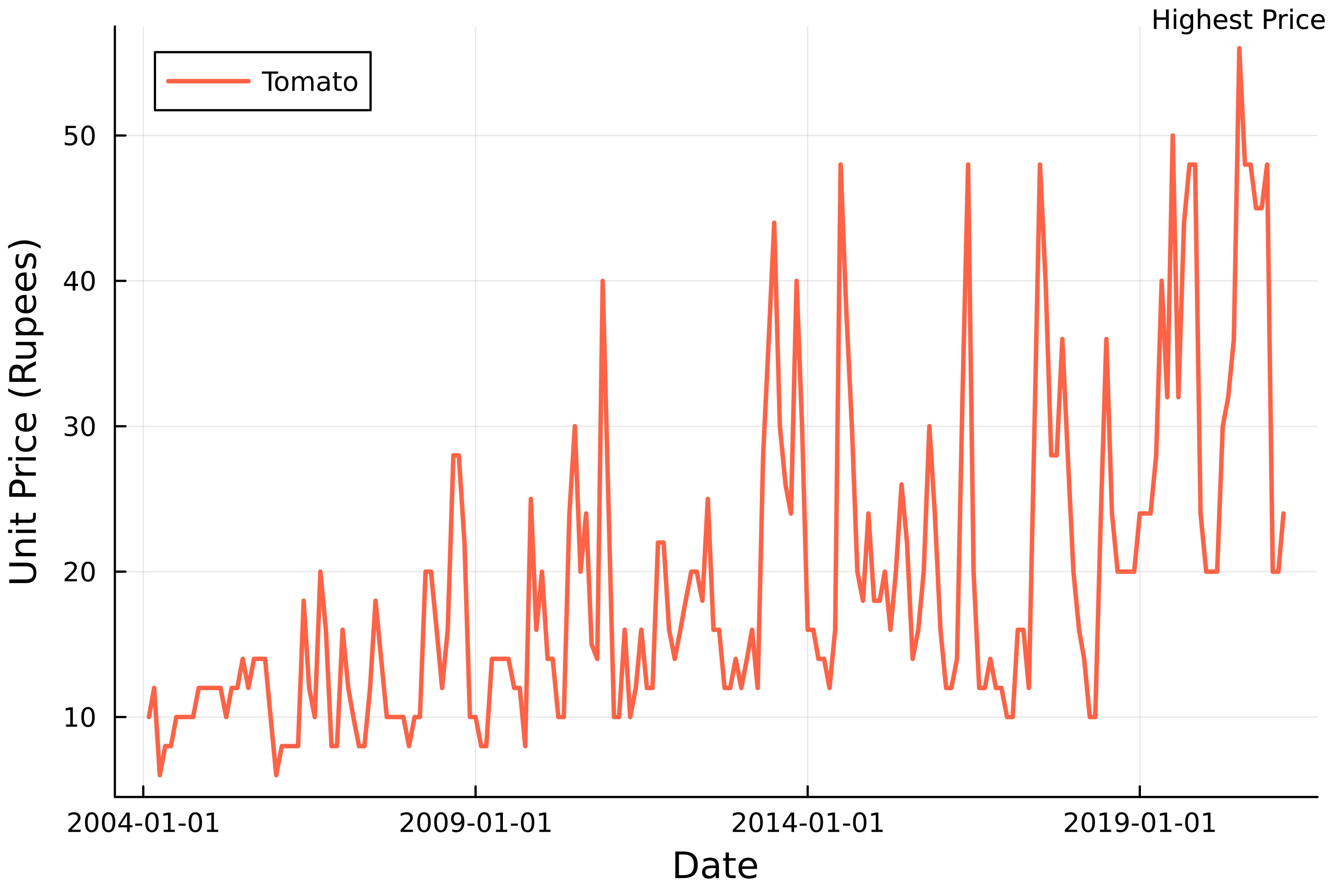
Time series
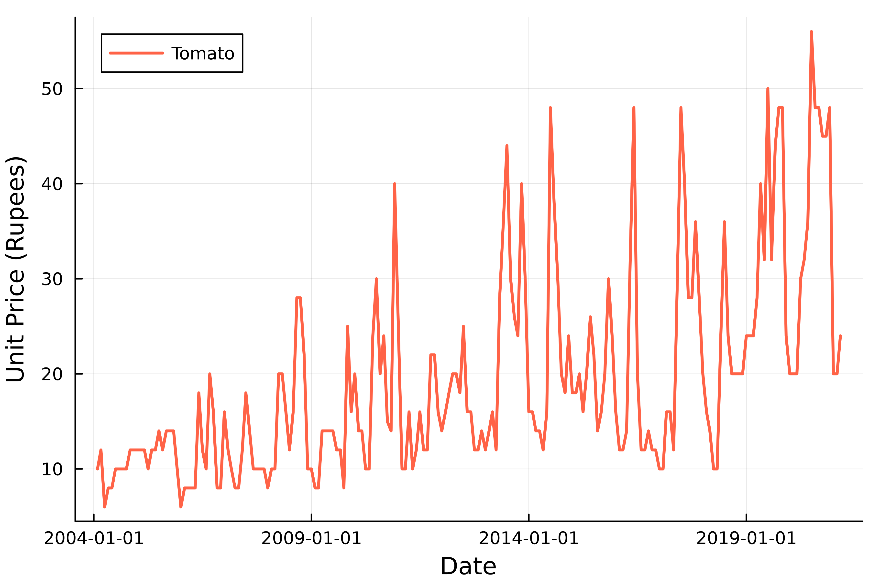
Tomato prices
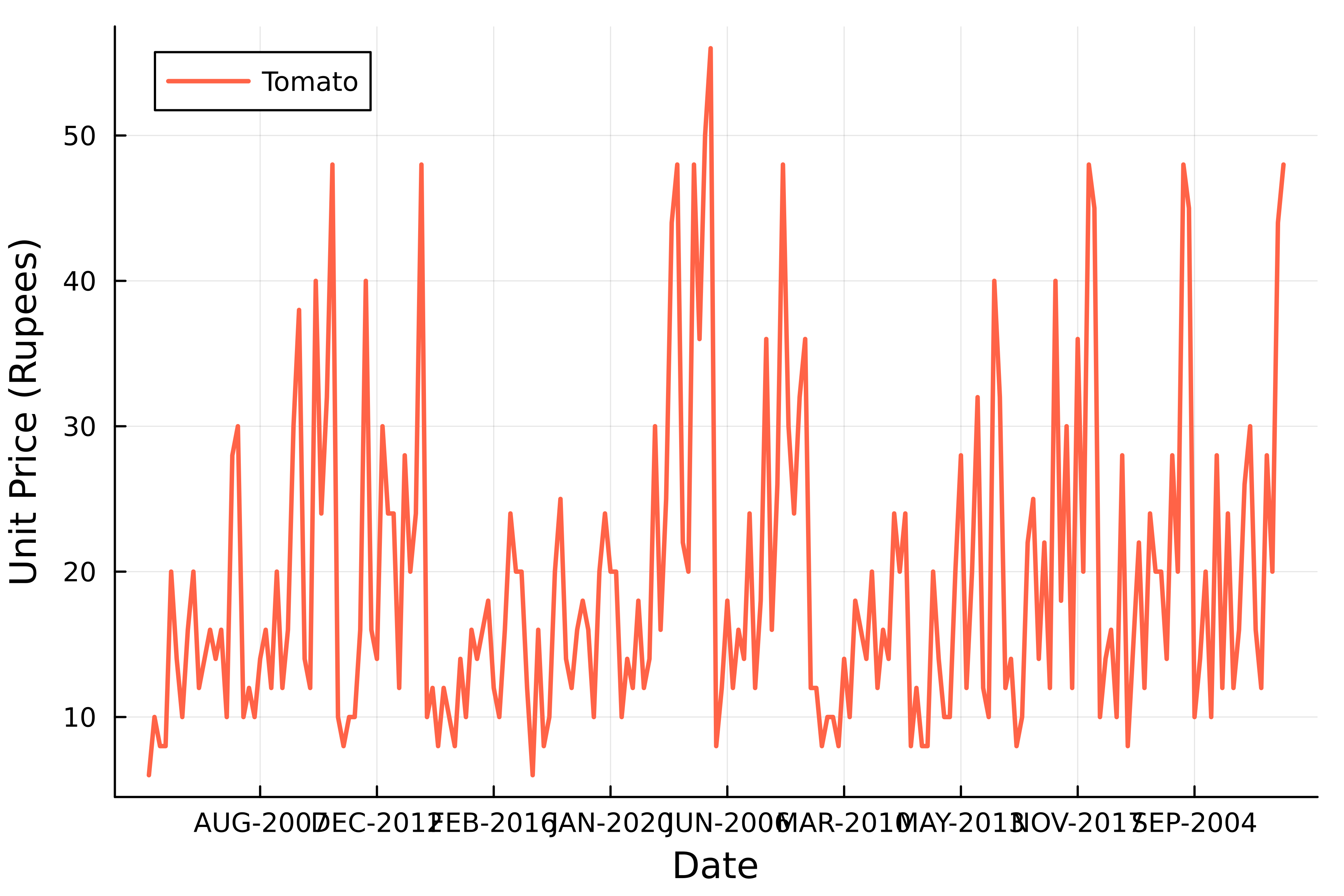
Tomato price time series
Annotating a plot
Introduction to Data Visualization with Julia
Gustavo Vieira Suñe
Data Analyst

