Plot Attributes and Color Palettes
Introduction to Data Visualization with Julia

Gustavo Vieira Suñe
Data Analyst
Color palettes
- Many color palettes, including
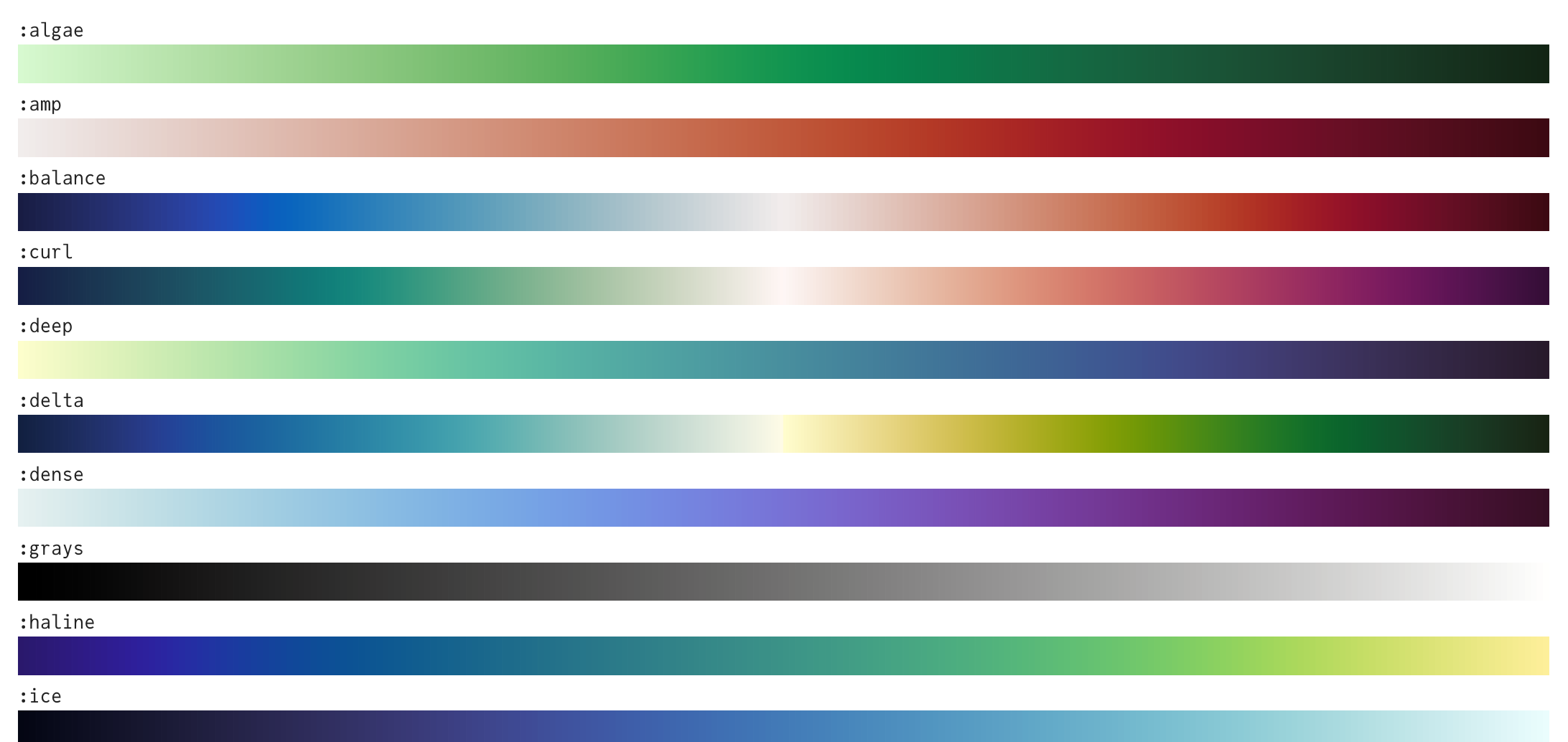
1 https://juliagraphics.github.io/ColorSchemes.jl/stable/catalogue/
Using palettes
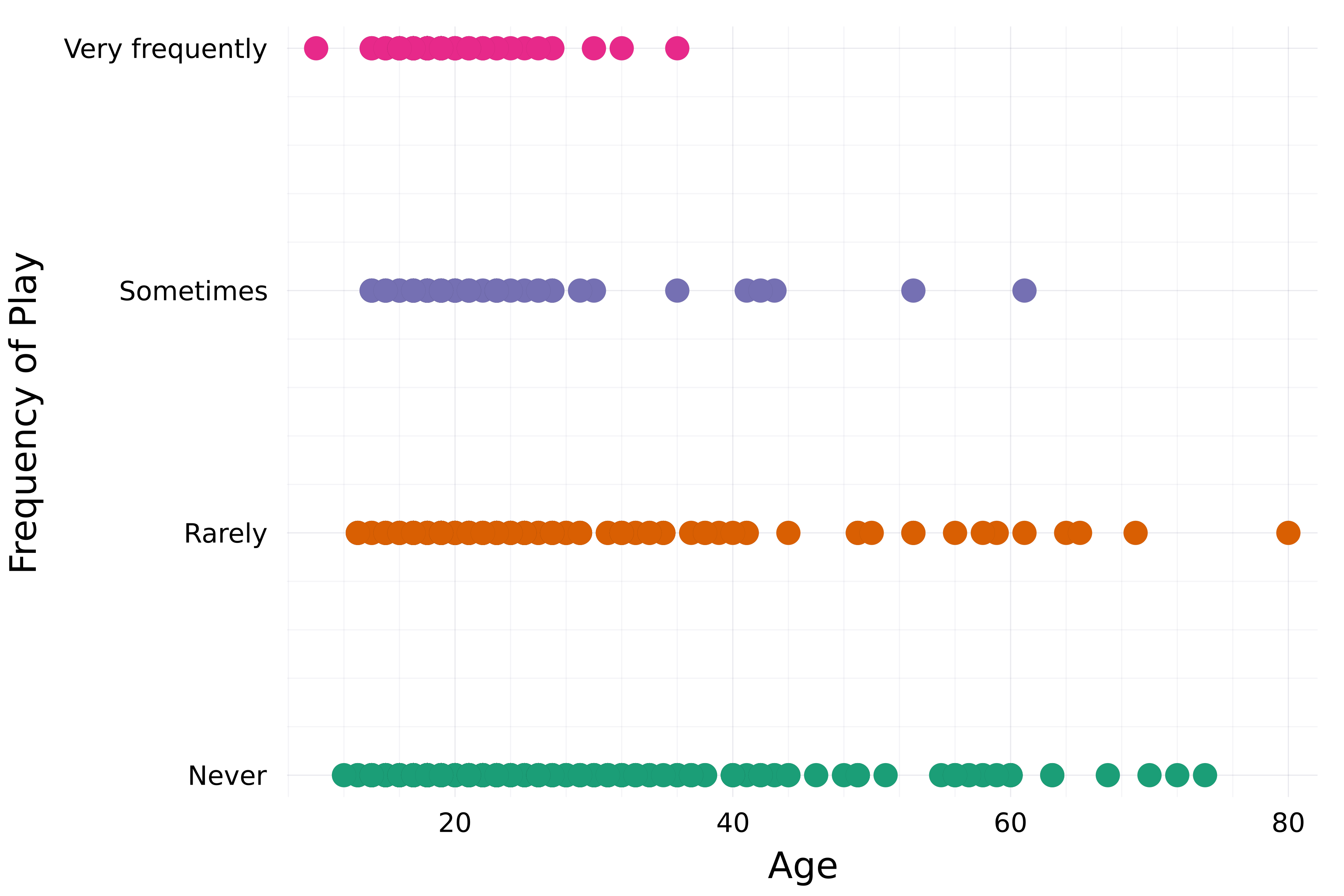
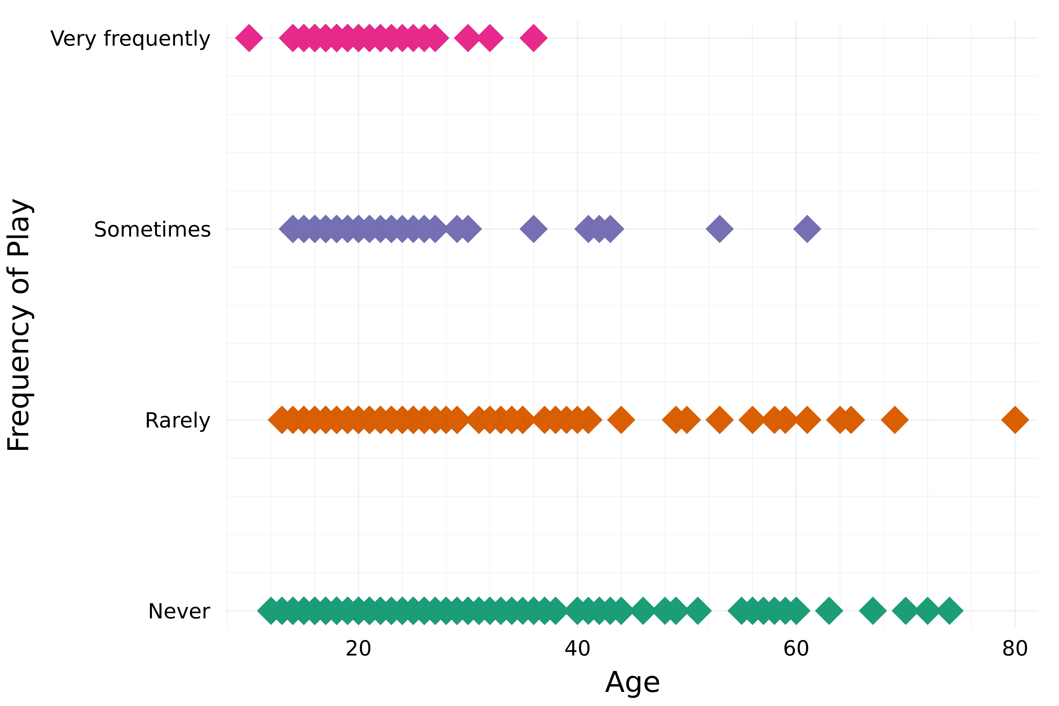
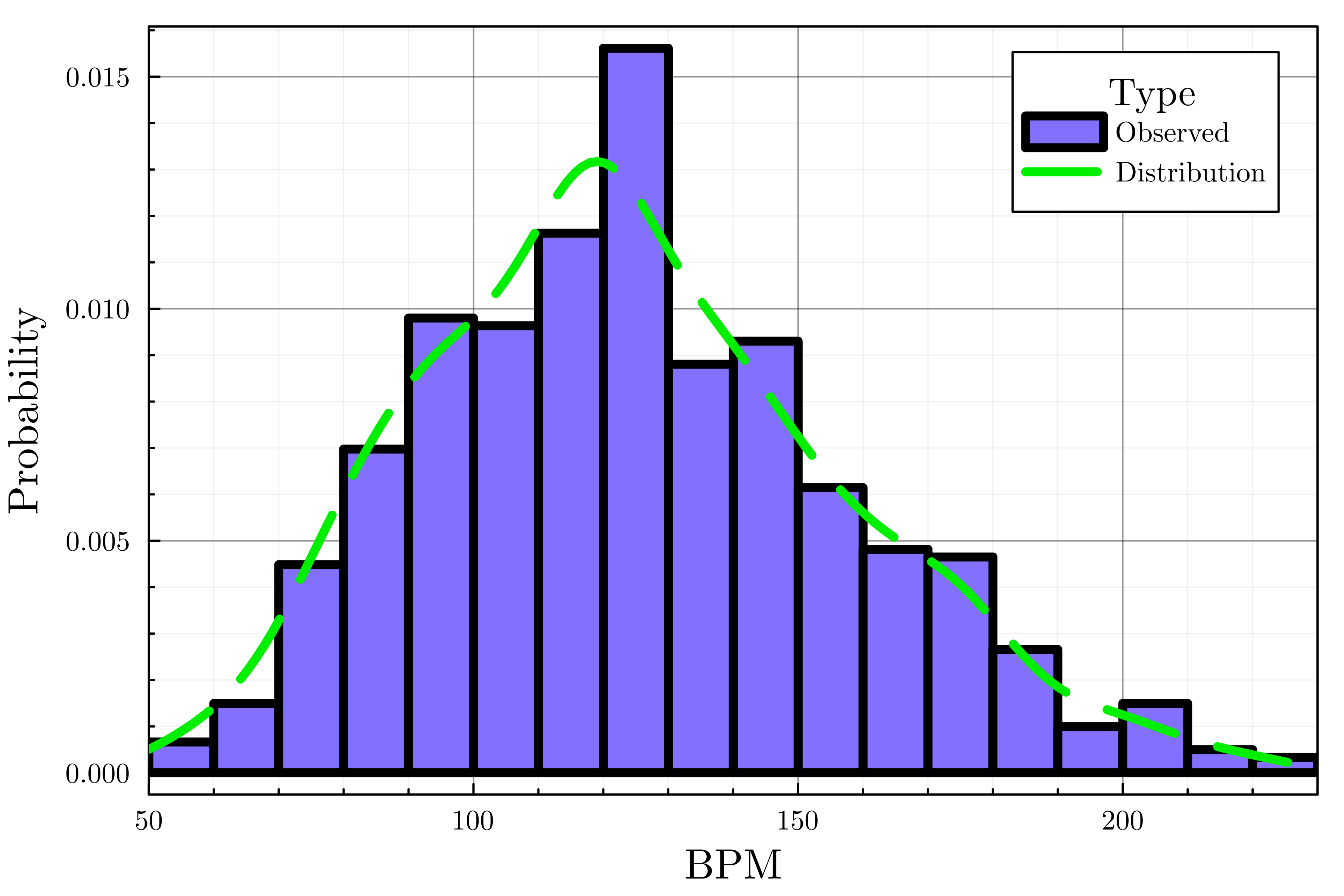
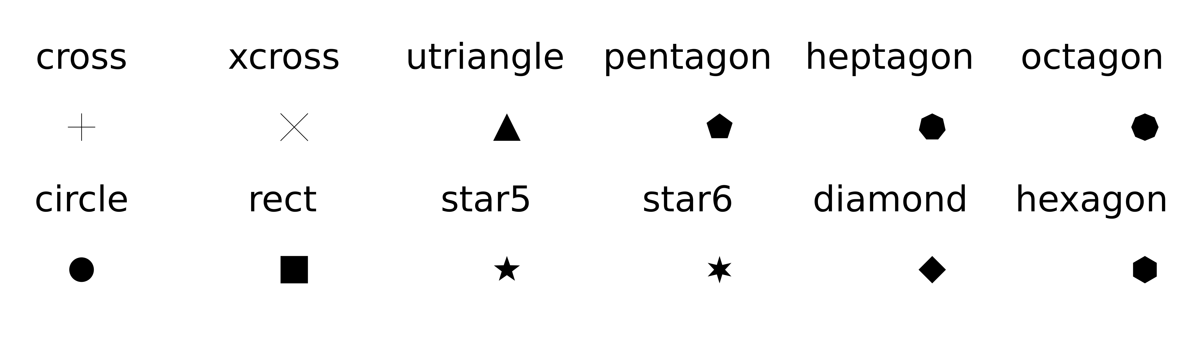
Marker attributes
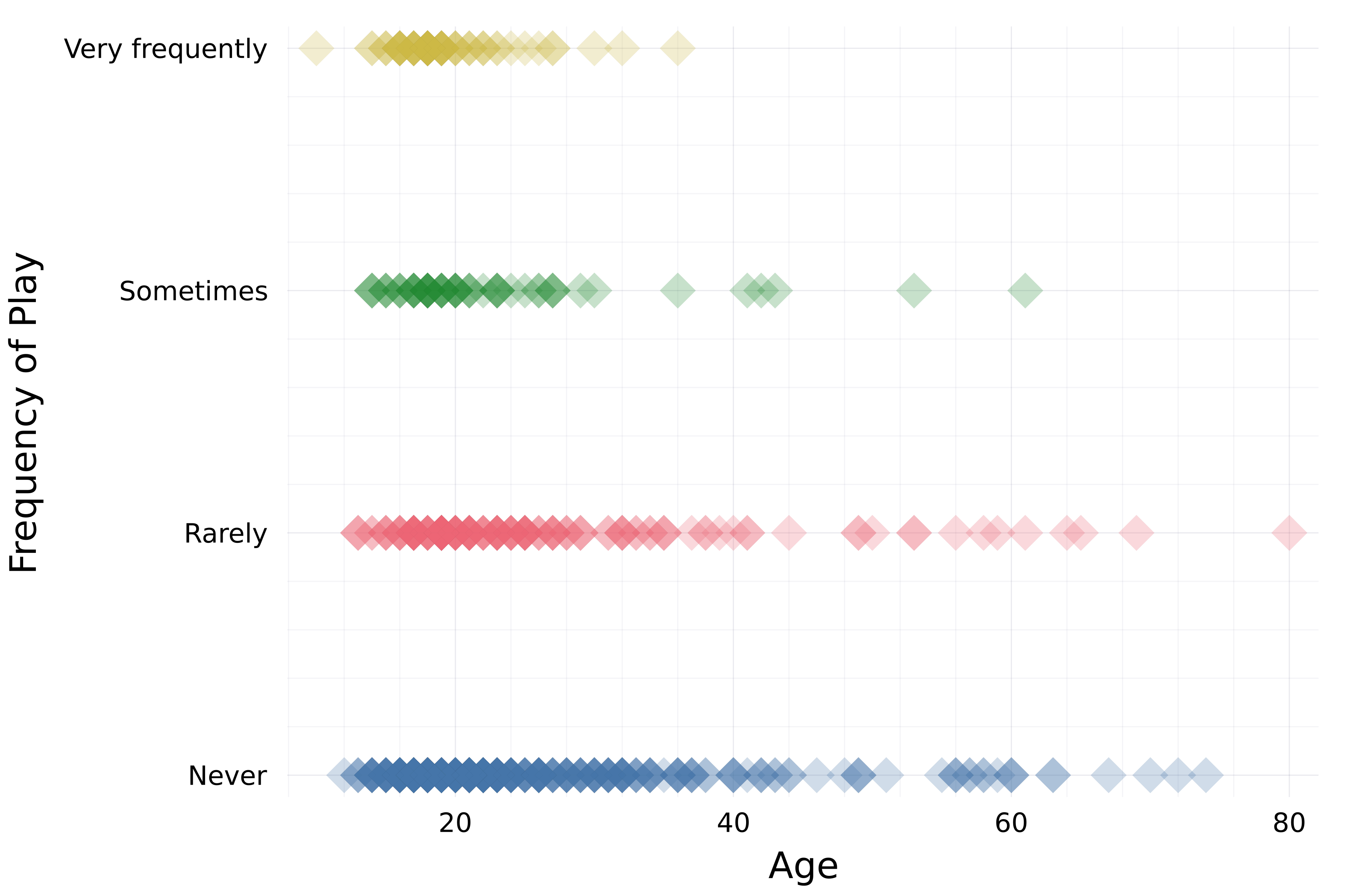
Opacity/Transparency
Line attributes
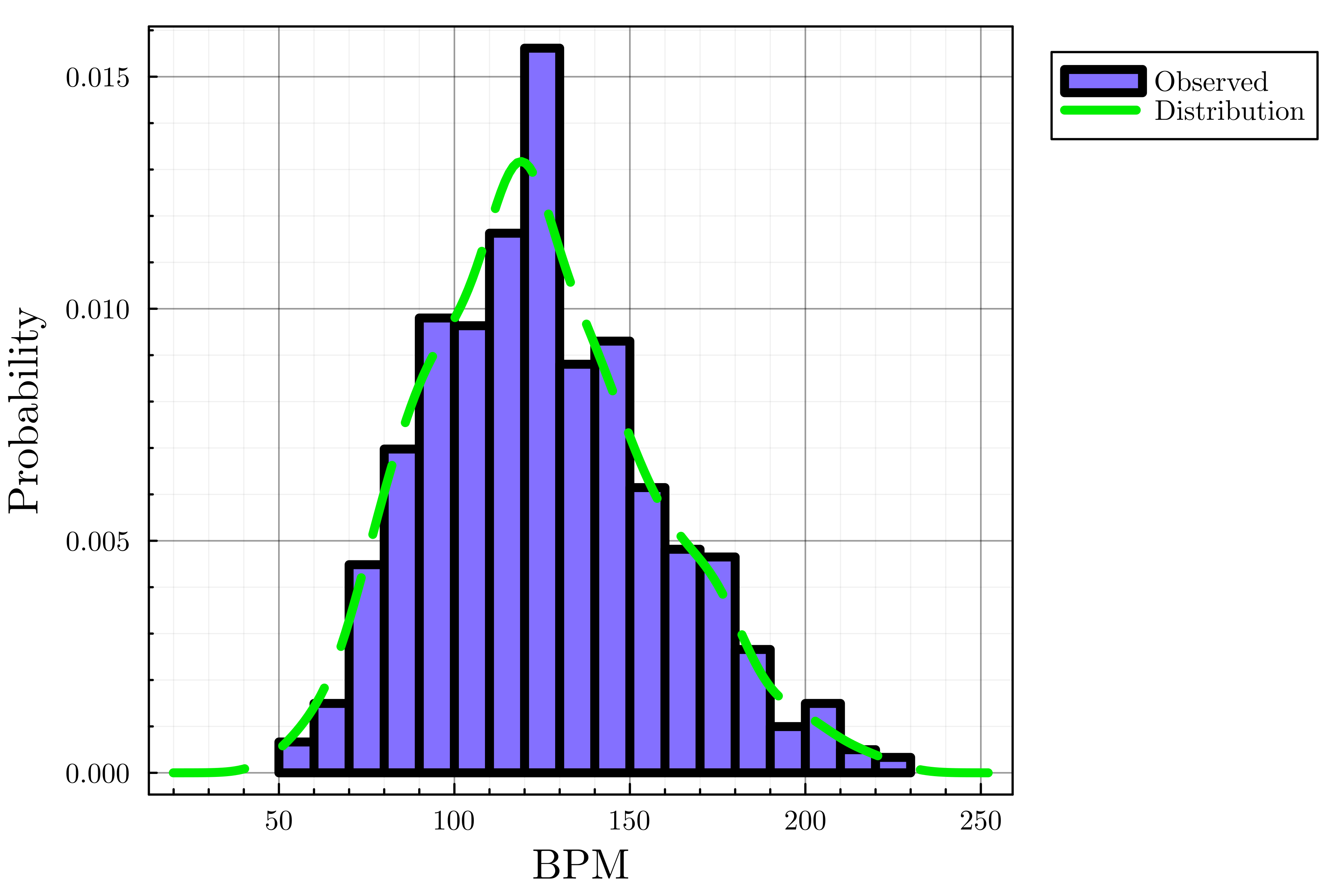
Axis bounds and legend attributes
Cheat sheet
- Color palettes
plot(..., palette=palette_symbol)
- Marker attributes
markersizemarkershape
- Opacity:
alpha=opacity_value - Axis bounds:
xlims!(),ylims!()
Line attribute:
linetyle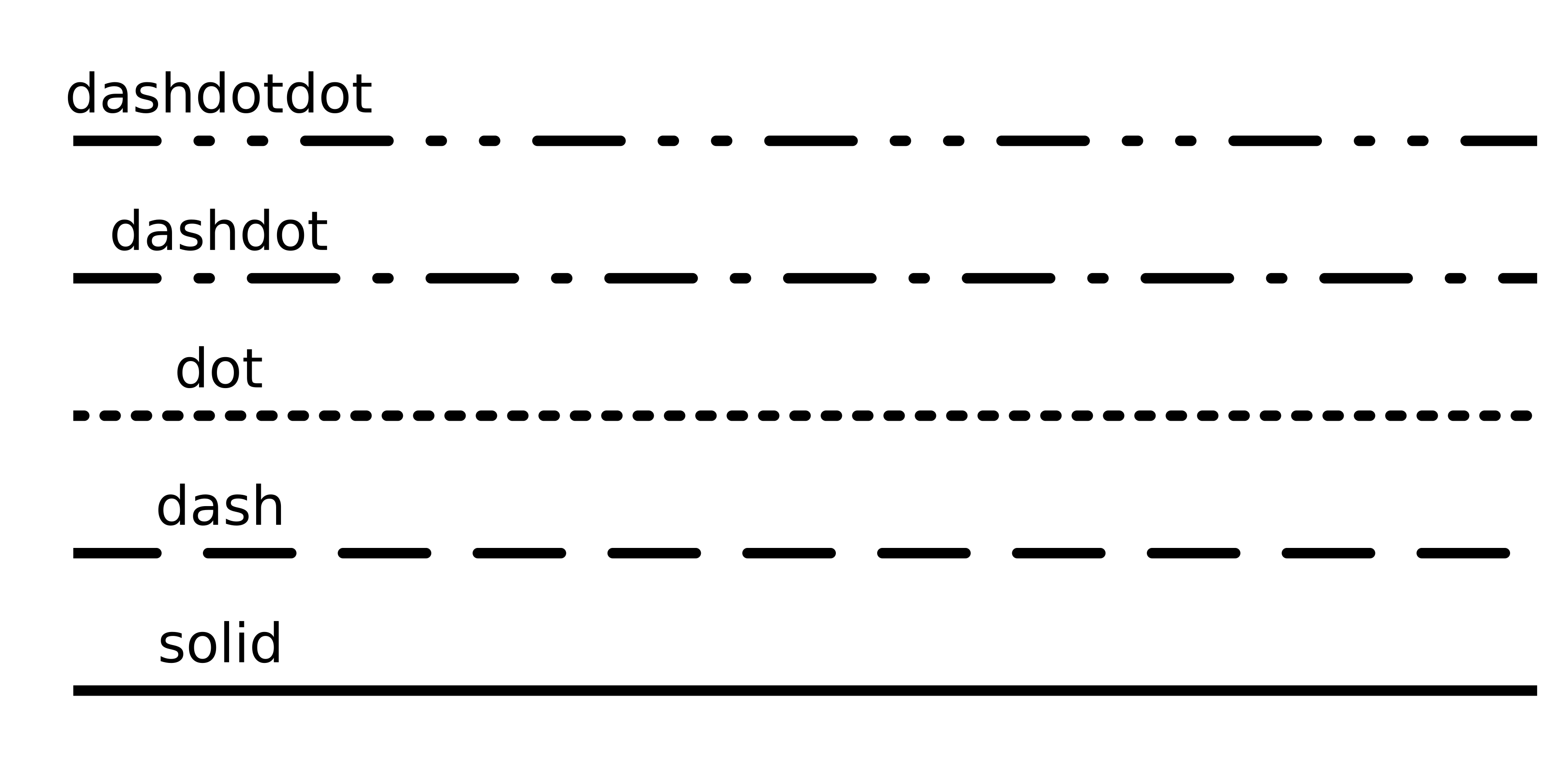
Legend attributes
legend_titlelegend_position(:right,:left,:top,:bottom,:topright,:topleft, ...)

