Plotting multiple variables
Introduction to Data Visualization with Julia

Gustavo Vieira Suñe
Data Analyst
Customizing a scatter plot
Commonly used colors: :blue, :red, :green, :yellow, :black, :gray, :white
1 http://juliagraphics.github.io/Colors.jl/stable/namedcolors/
Exclamation mark notation
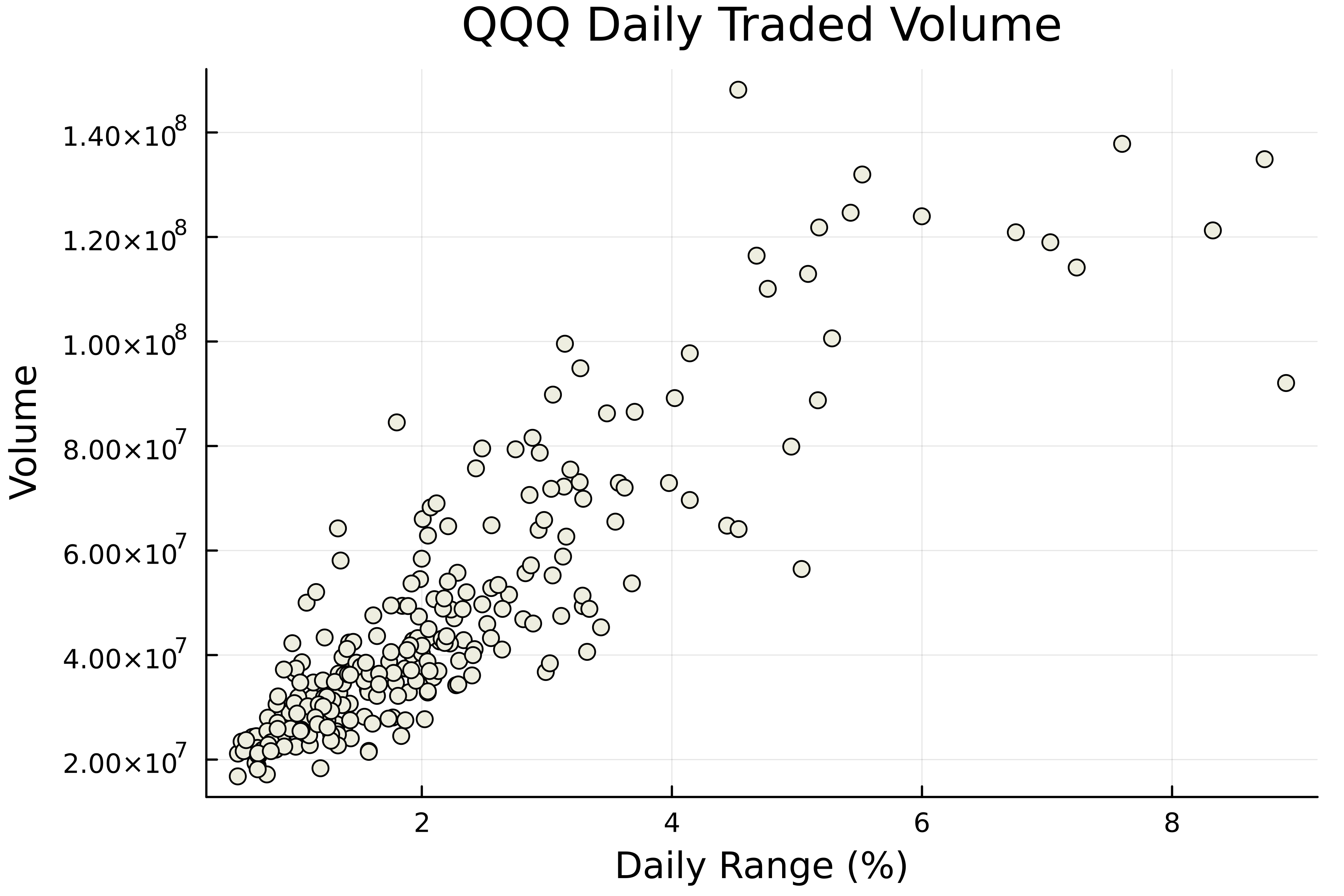
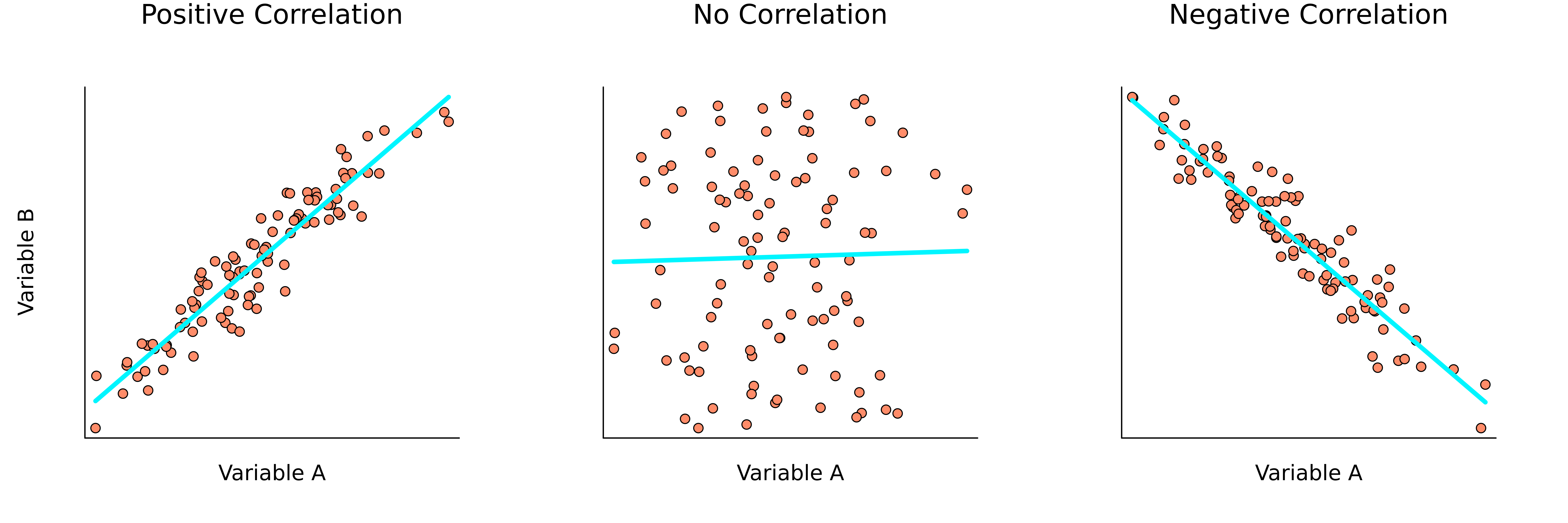
Correlation
- Relationship between variables
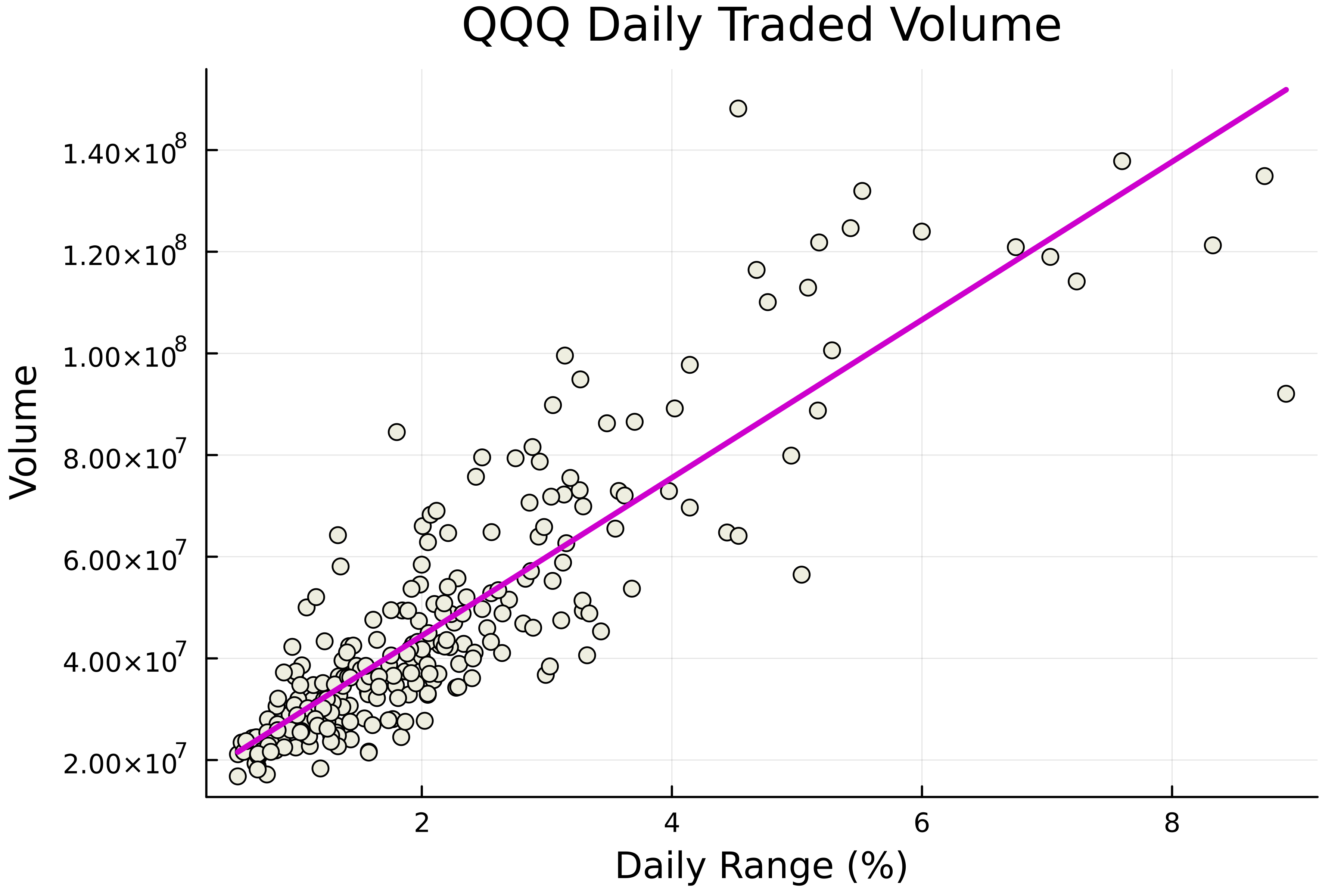
Adding a regression line
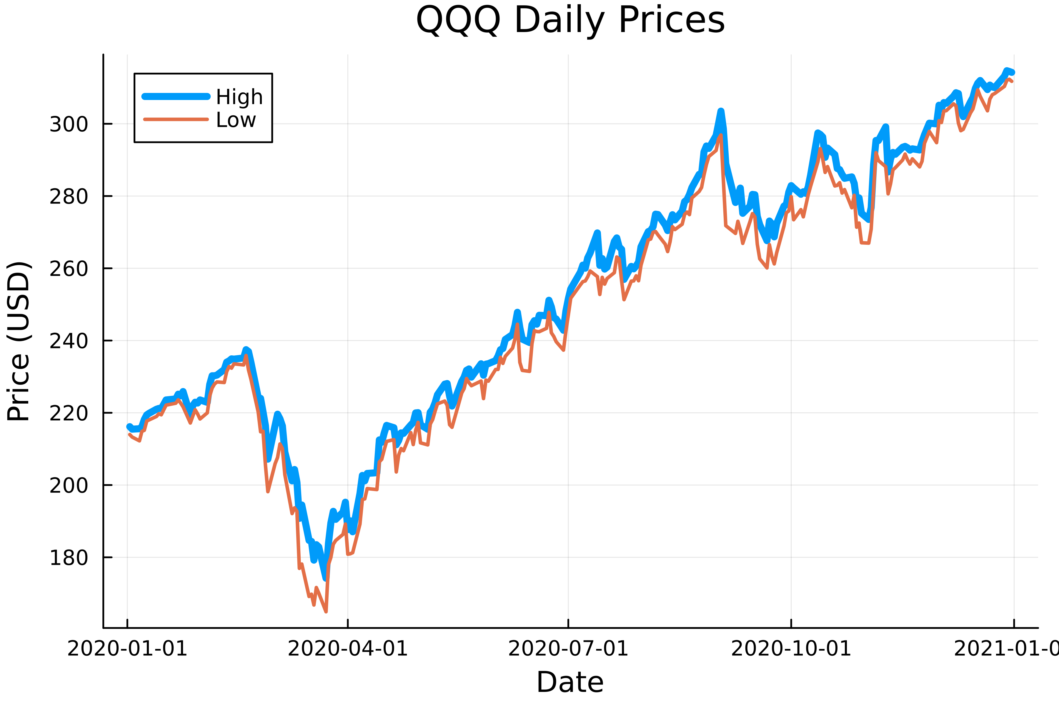
Multiple line plots
Multiple plots done differently

