Wrap-up
Introduction to Data Visualization with Julia

Gustavo Vieira Suñe
Data Analyst
Chapter 1: Basics of Plots.jl
- Why visualize data?
- Plotting with Plots.jl
- Line plots
- Scatter plots
- Adding title and axis labels
- Multiple variables in a plot

Chapter 2: Advanced plot types
- Advanced plotting with StatsPlots.jl
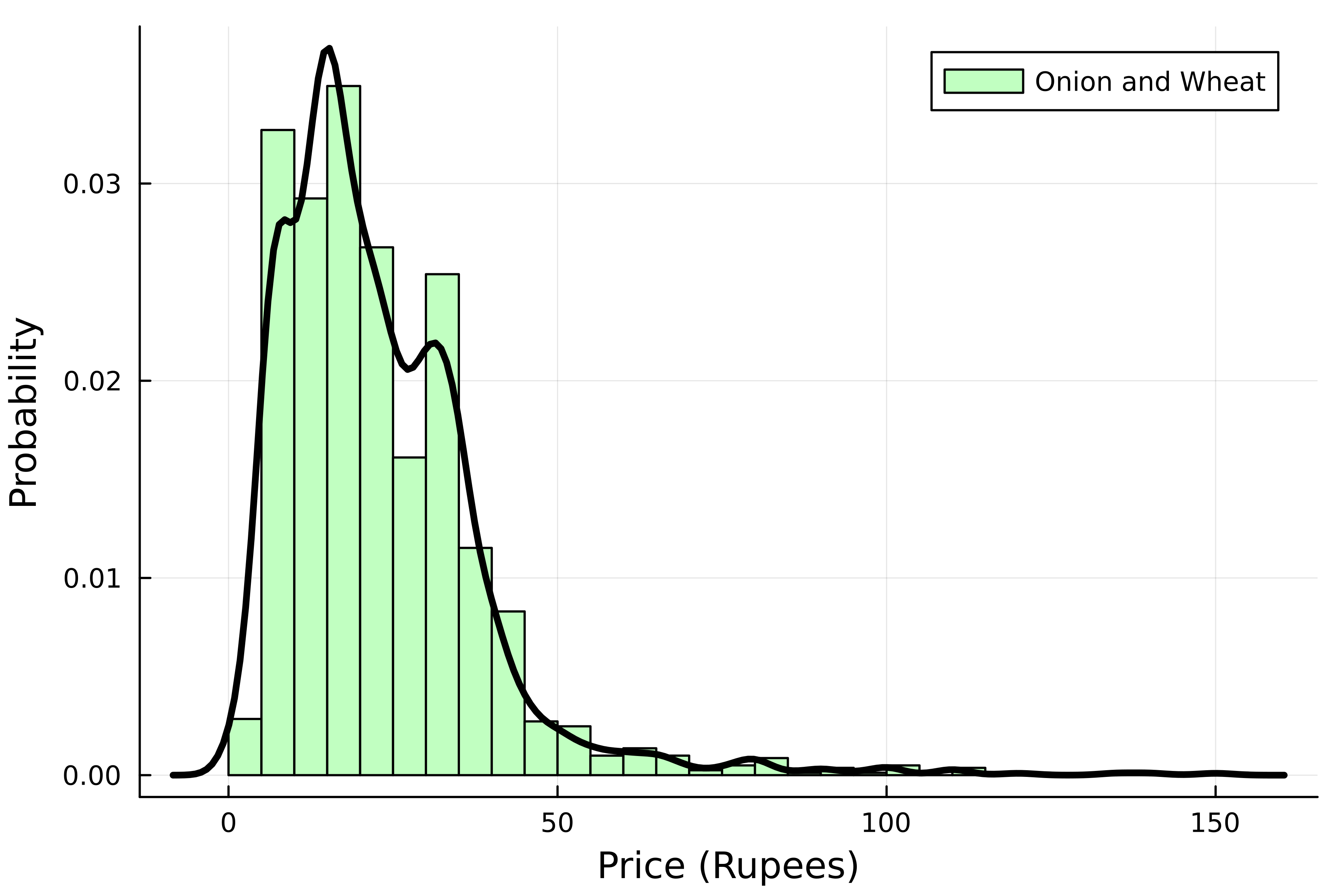
- Histograms, grouped histograms and density plots
- Bar chars and grouped bar charts
- Box plots and violin plots
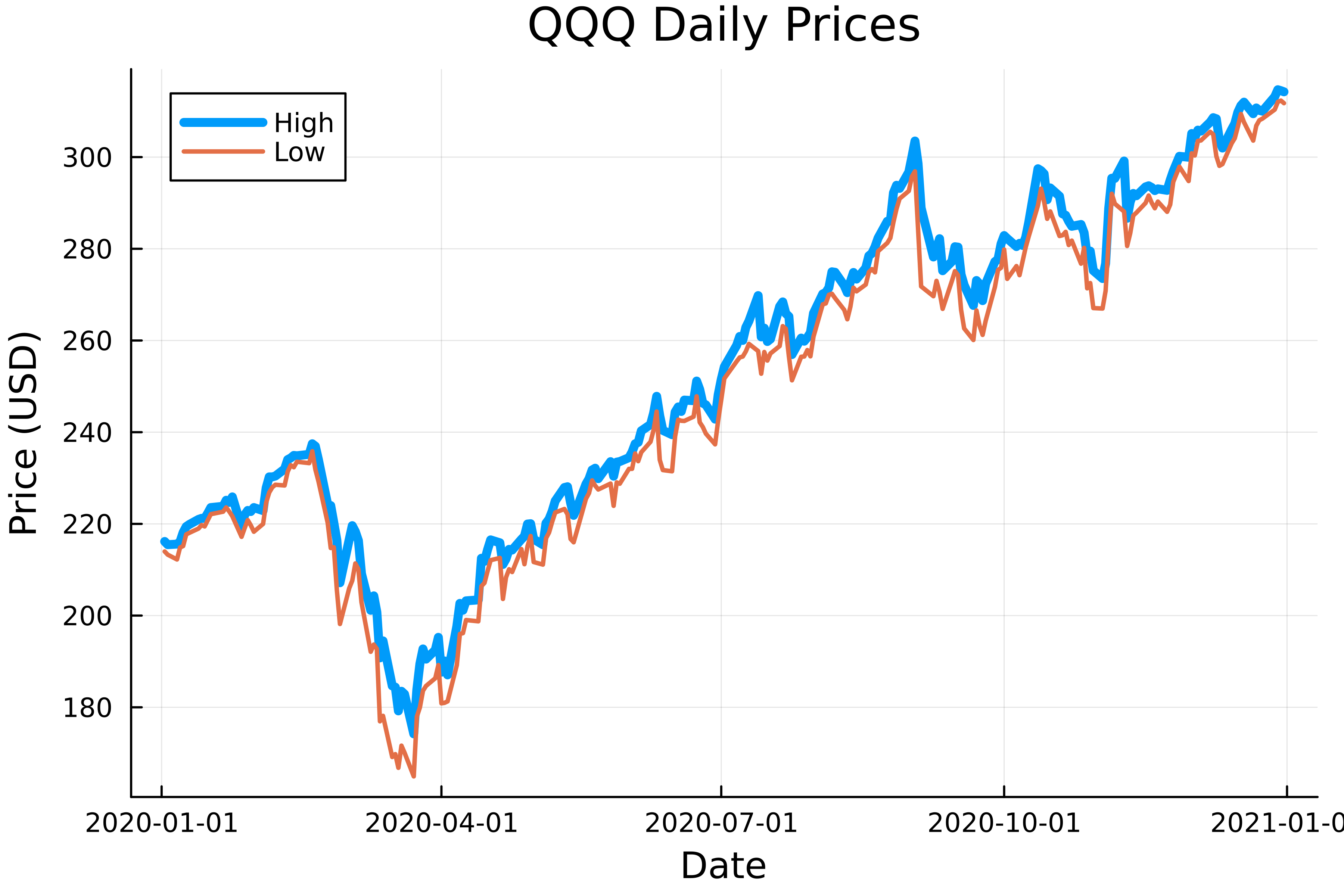
- Plotting time series
- Dealing with dates
- Adding annotations to a plot

Chapter 3: Mastering customization
- Saving visualizations to file
- Using themes
- Customizing plot attributes
- Line attributes
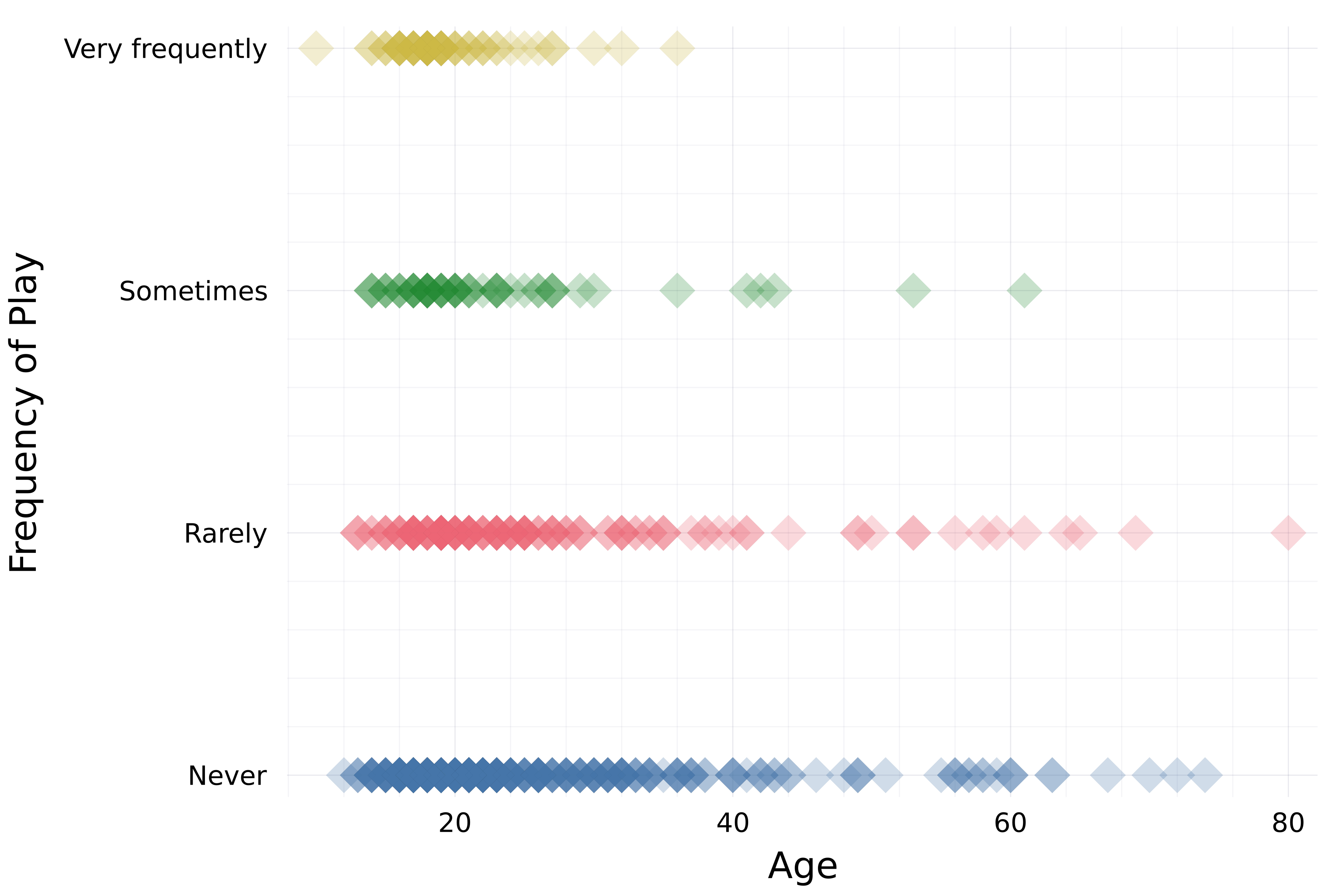
- Marker attributes
- Axis bounds
- Legend title and position
- Transparency
- Layouts
- Series recipes

Chapter 4: Plotting from DataFrames
- Using the StatsPlots.jl DataFrame plotting recipe
- Creating plotting chains with Chain.jl
- Plotting data in more dimensions
- Three-dimensional scatter plots
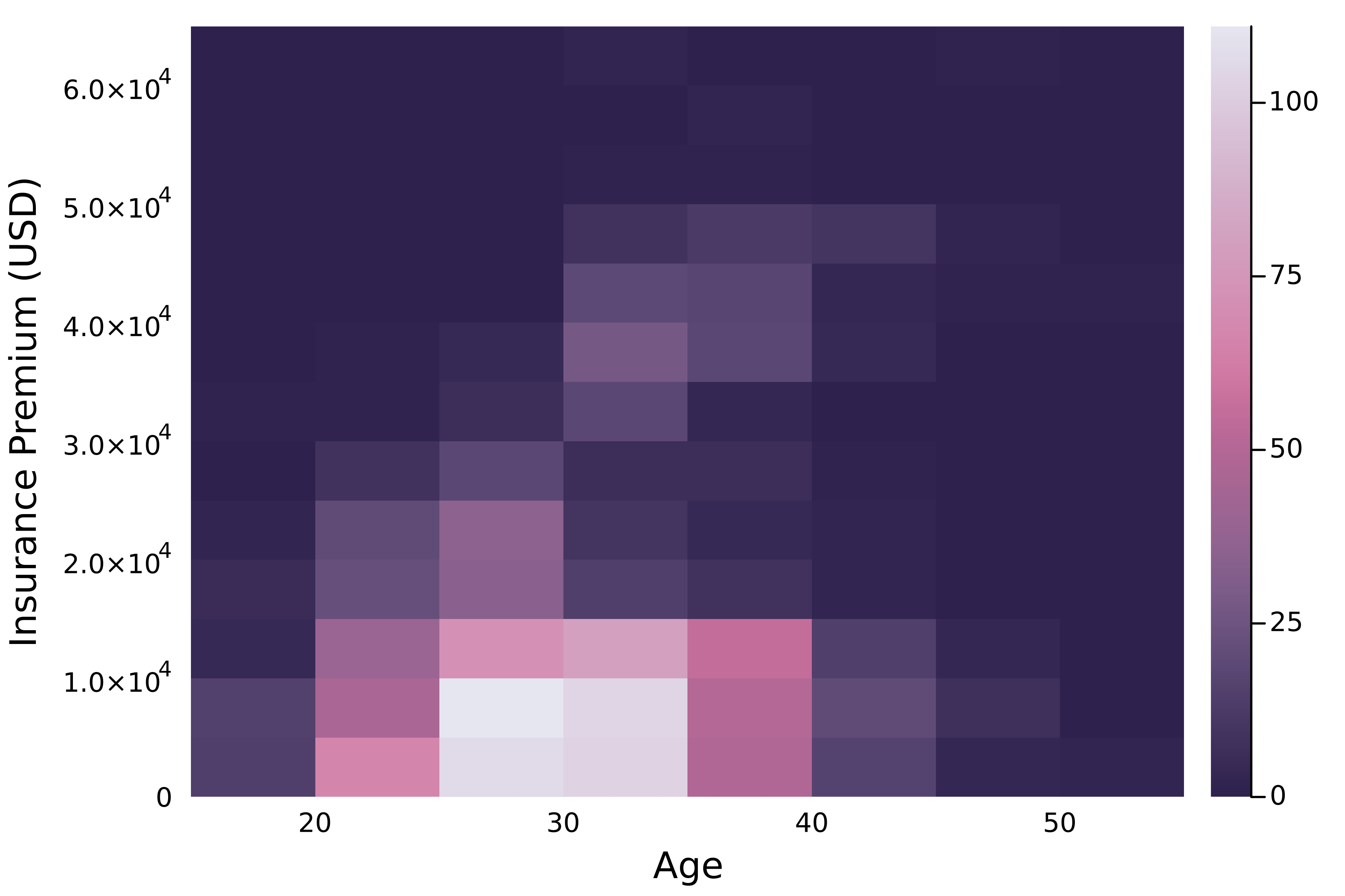
- Two-dimensional histograms
- Layouts and DataFrames
- Correlation matrix plots

Next steps
Congratulations!
Introduction to Data Visualization with Julia

