Visualizing distributions
Introduction to Data Visualization with Julia

Gustavo Vieira Suñe
Data Analyst
Visualizing distributions with histograms
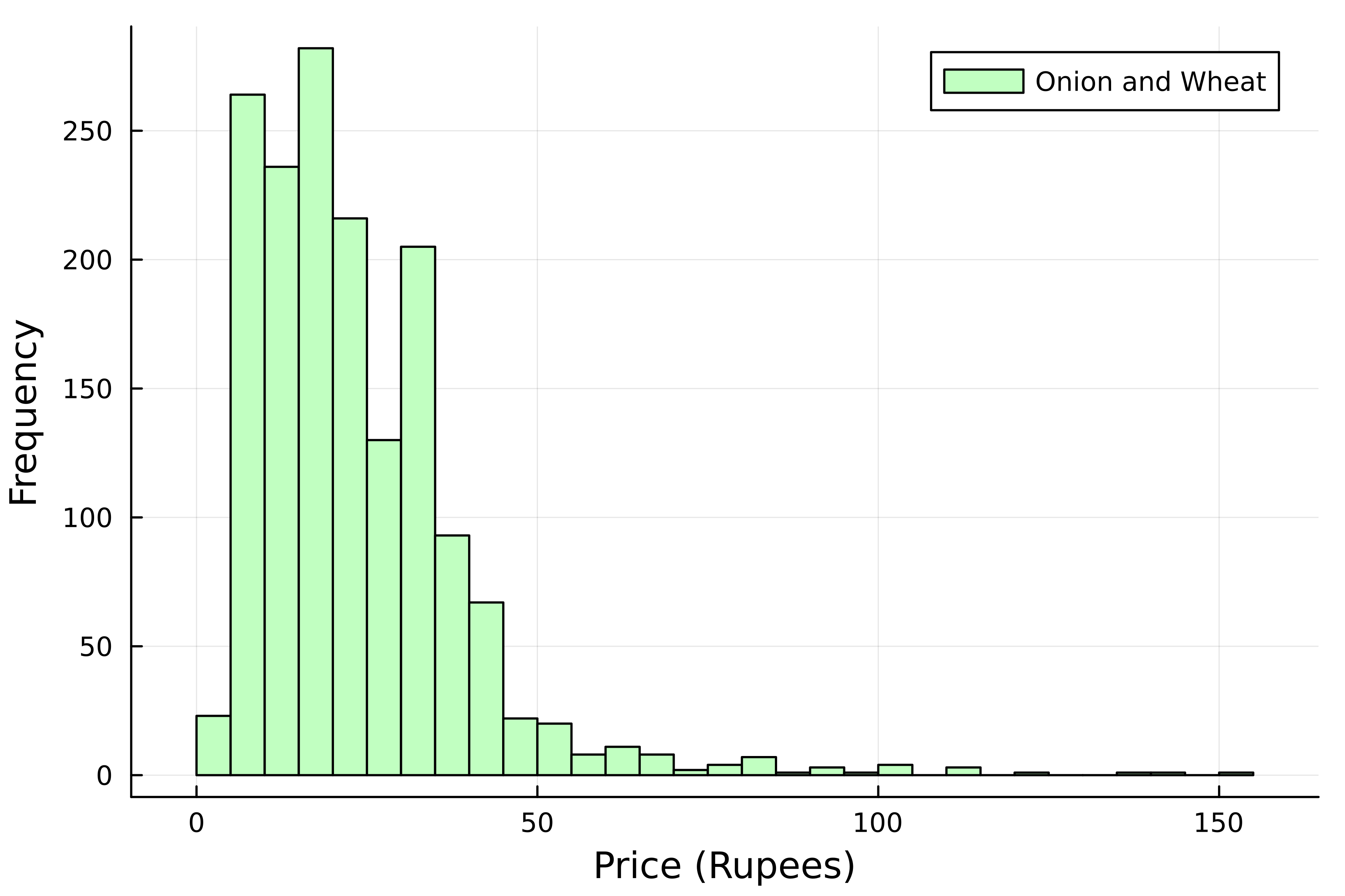
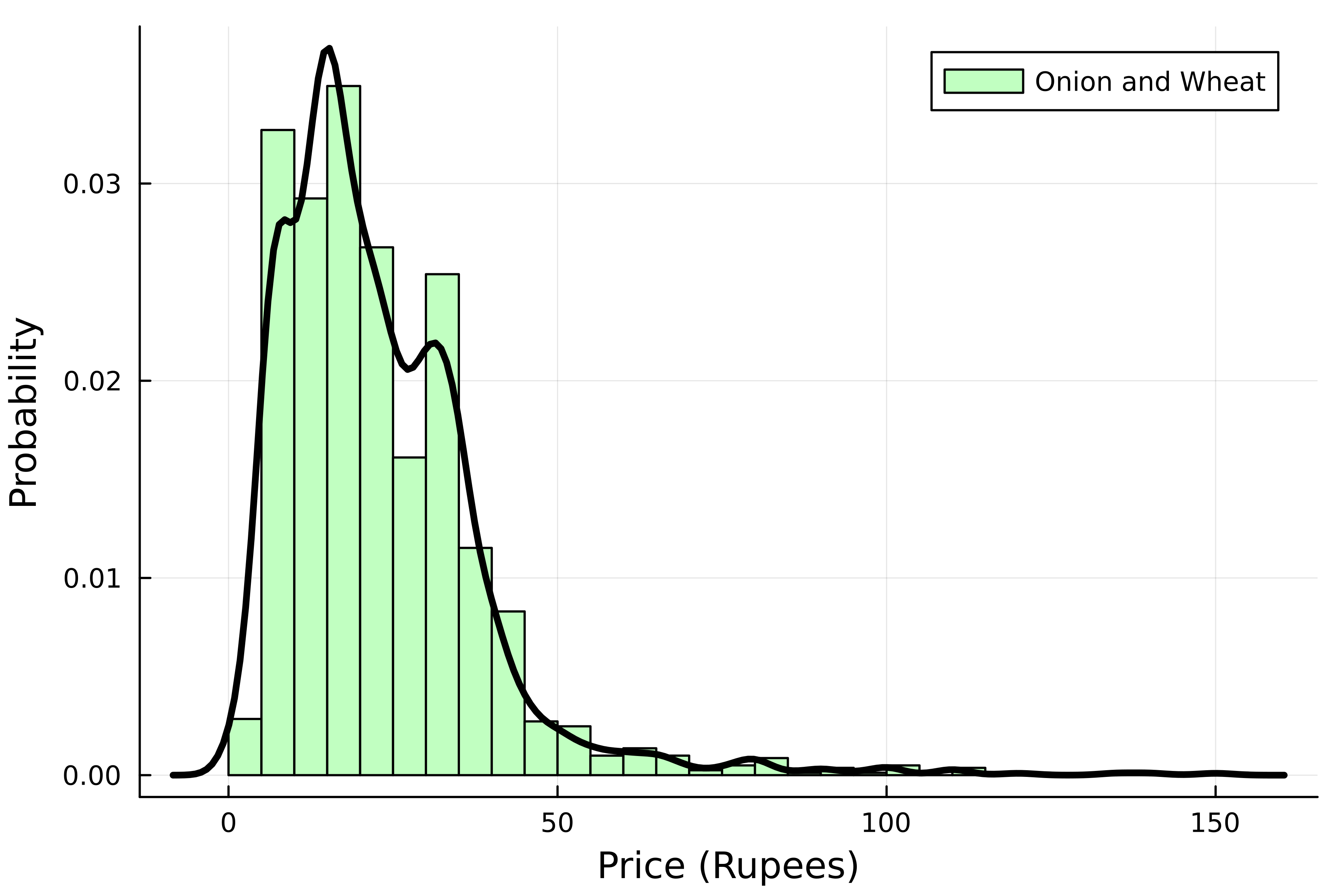
Distribution of onion and wheat prices
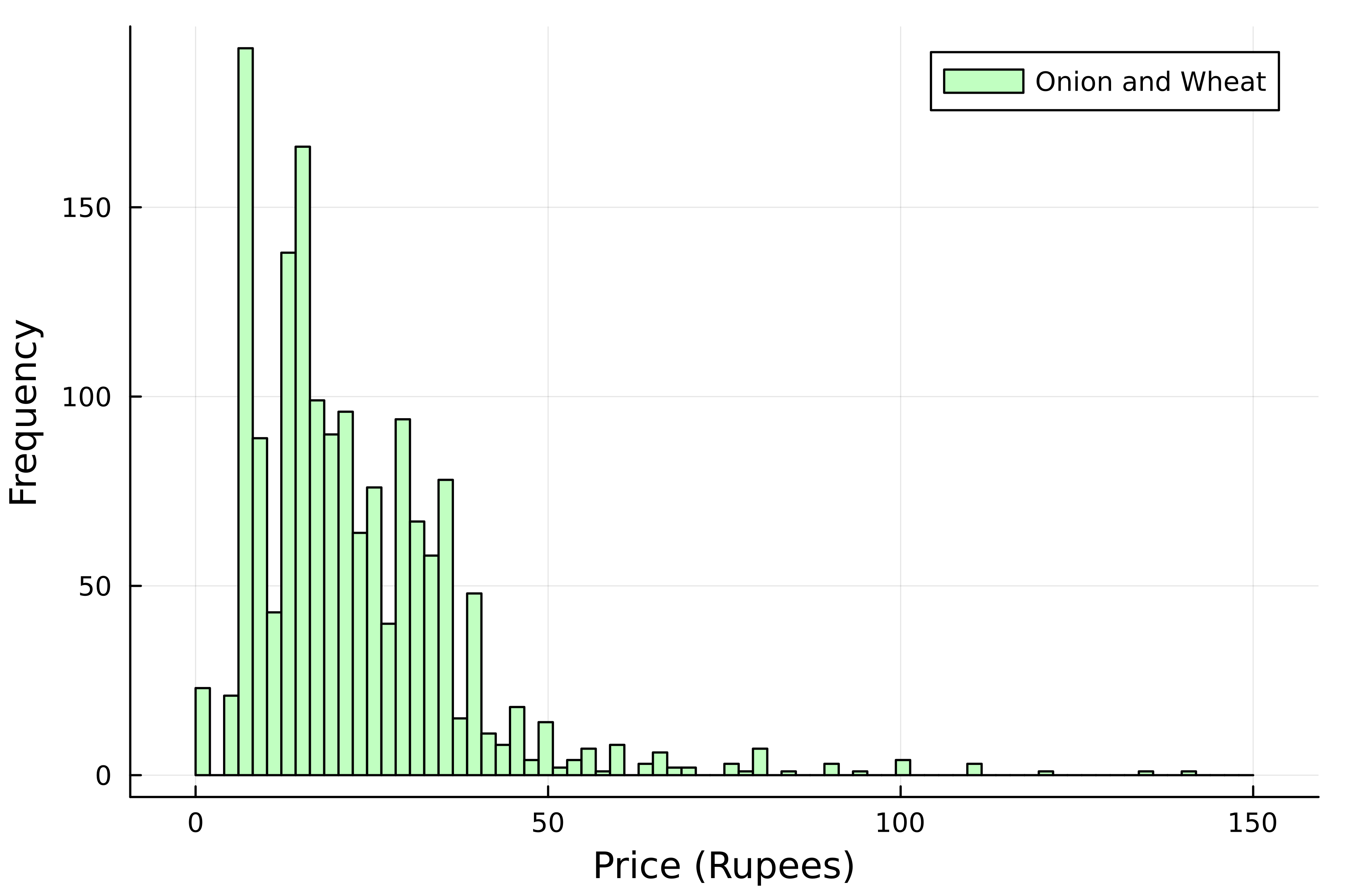
Number of bins
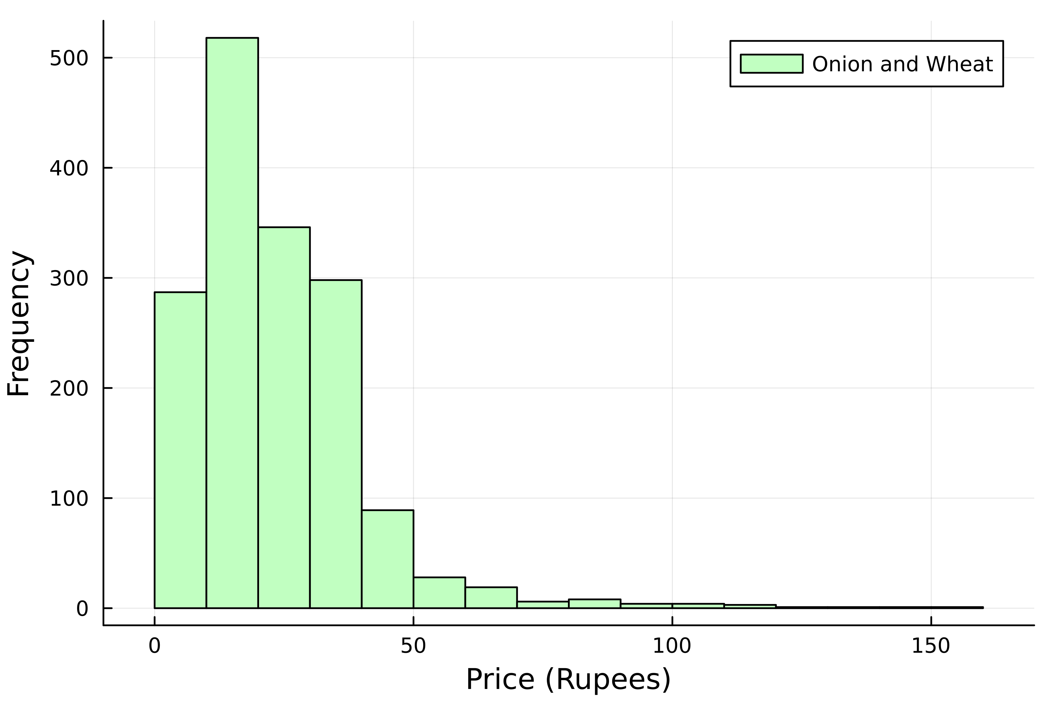
Number of bins
Normalized histogram
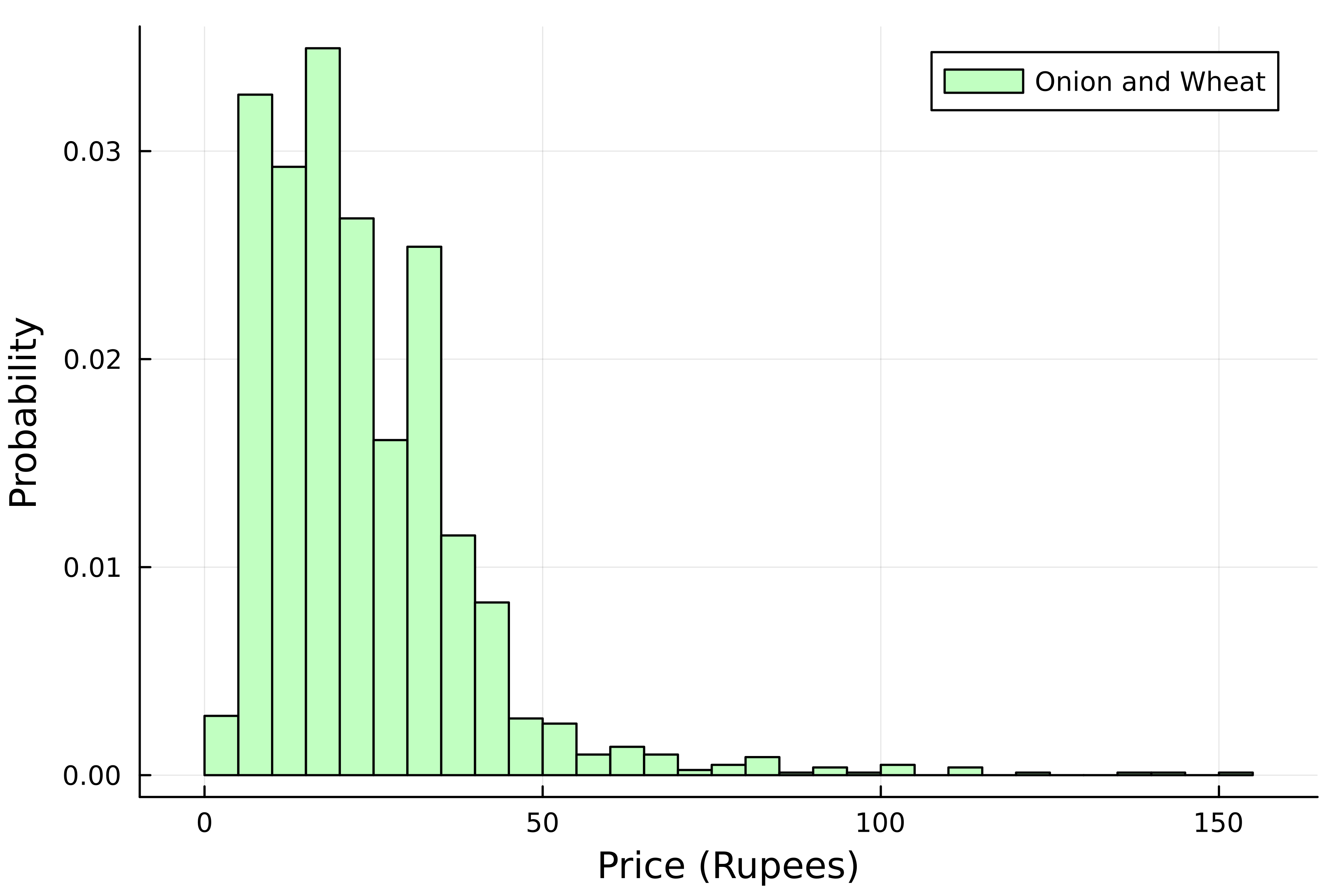
Probability distribution
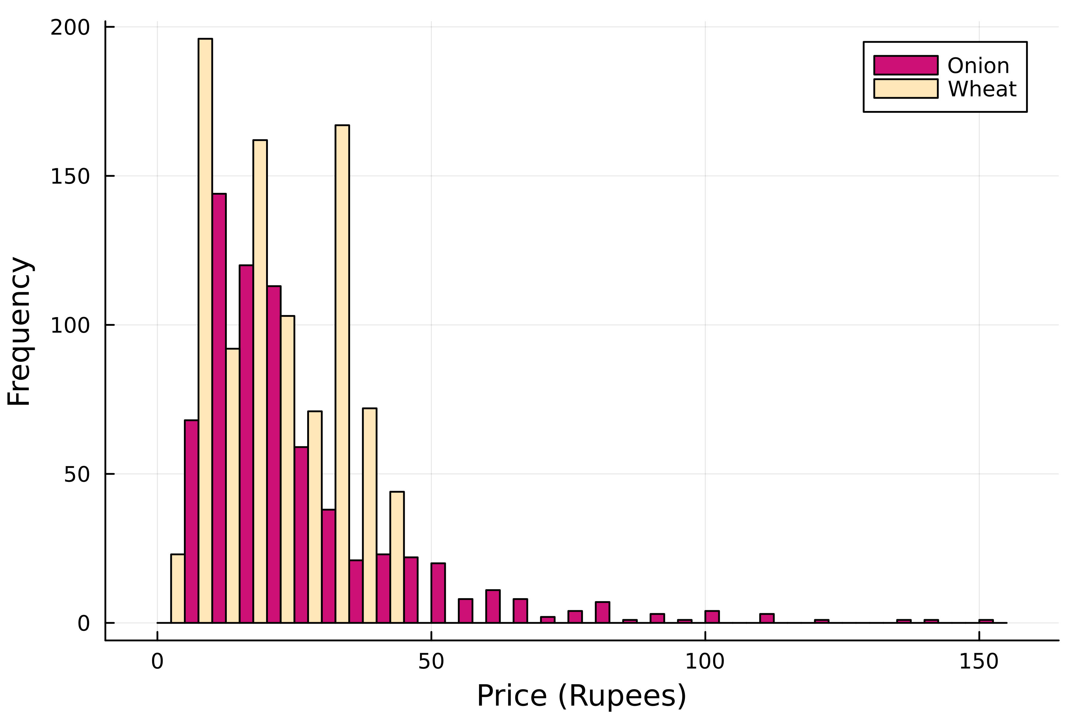
Prices per commodity
Stacked histogram
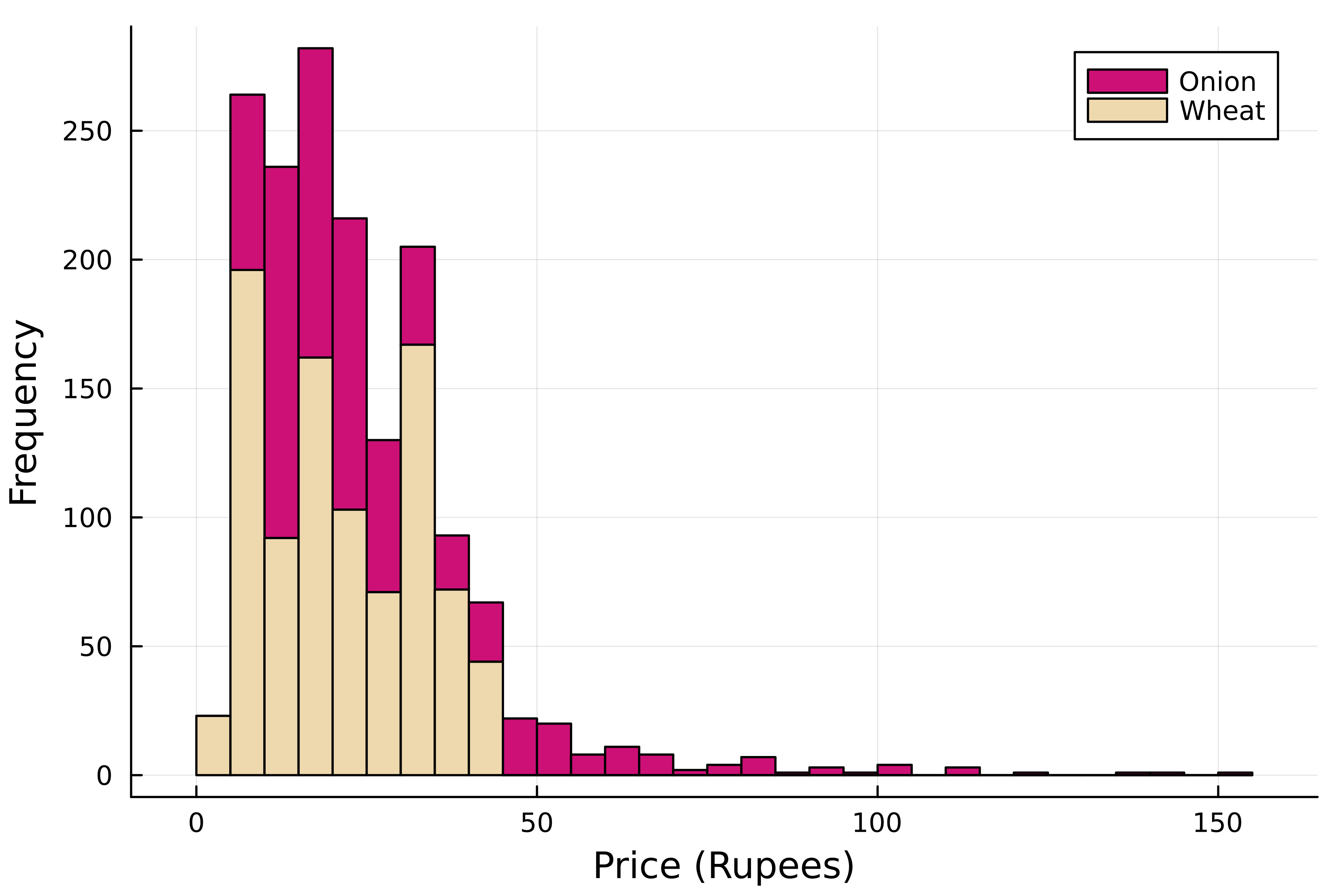
A subtle difference

