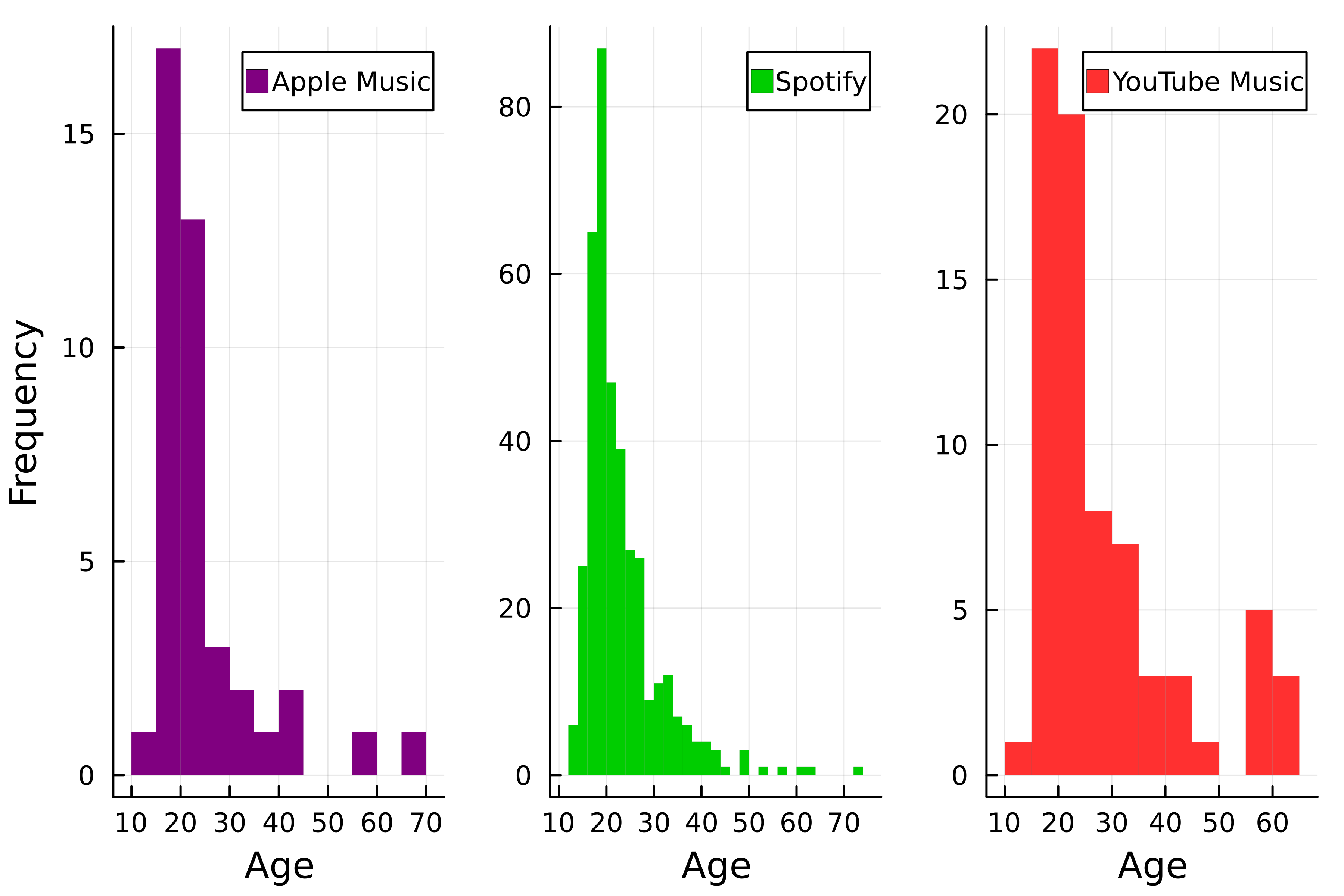
Efficient visualizations with layouts
Introduction to Data Visualization with Julia

Gustavo Vieira Suñe
Data Analyst
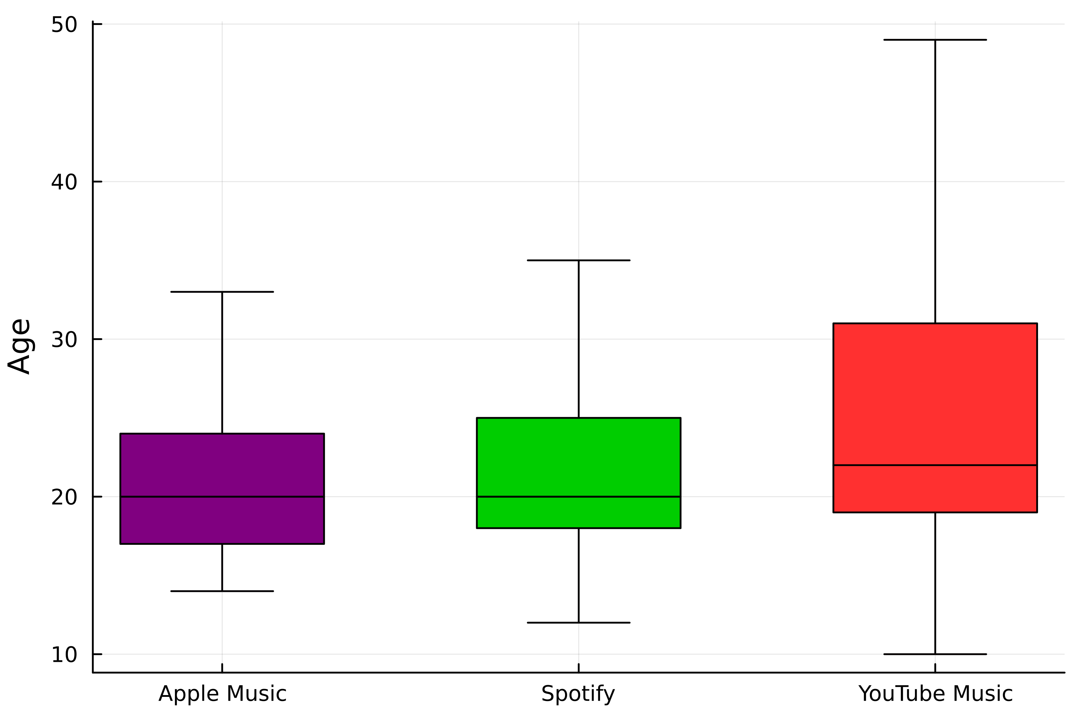
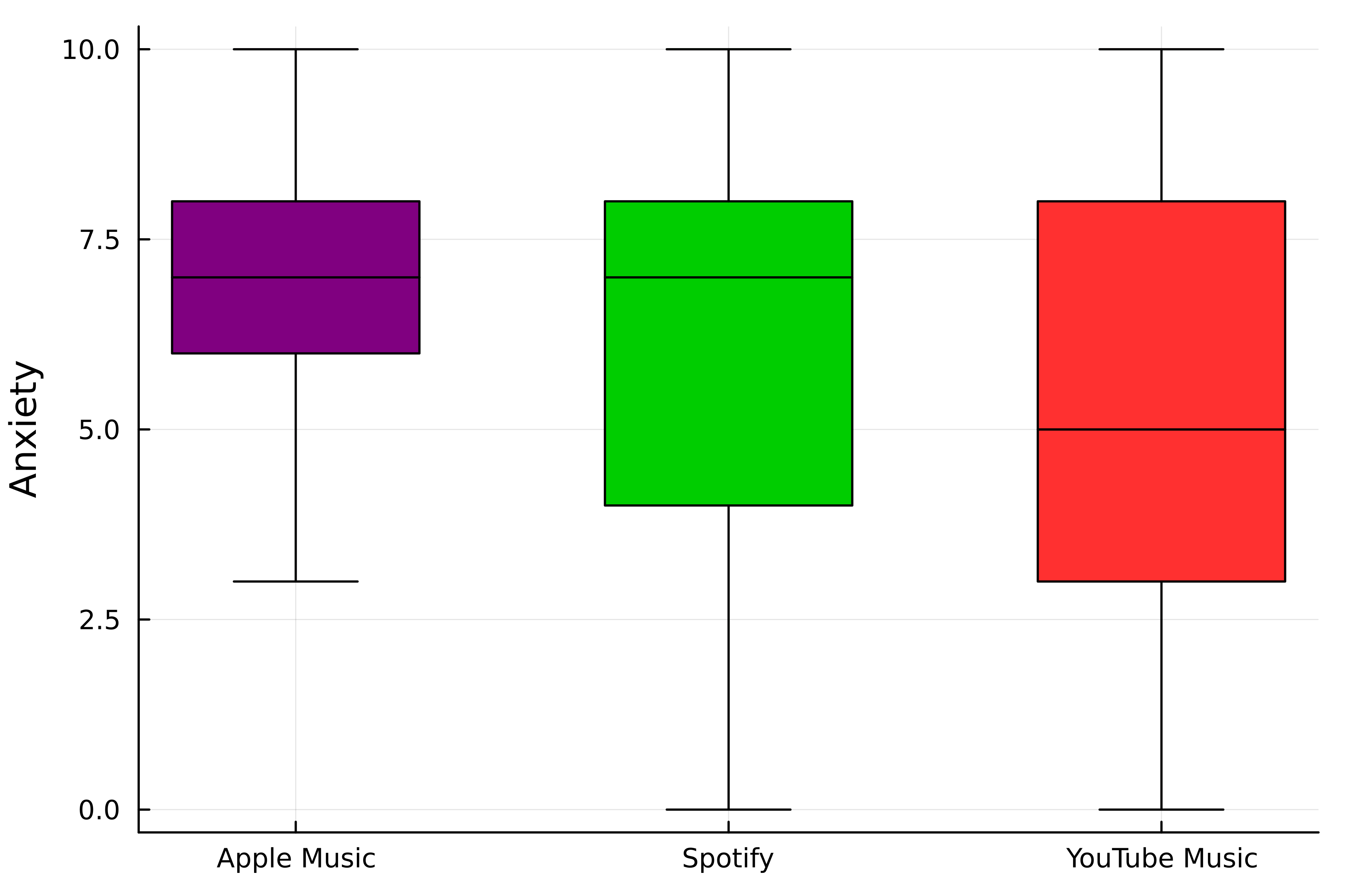
Layouts
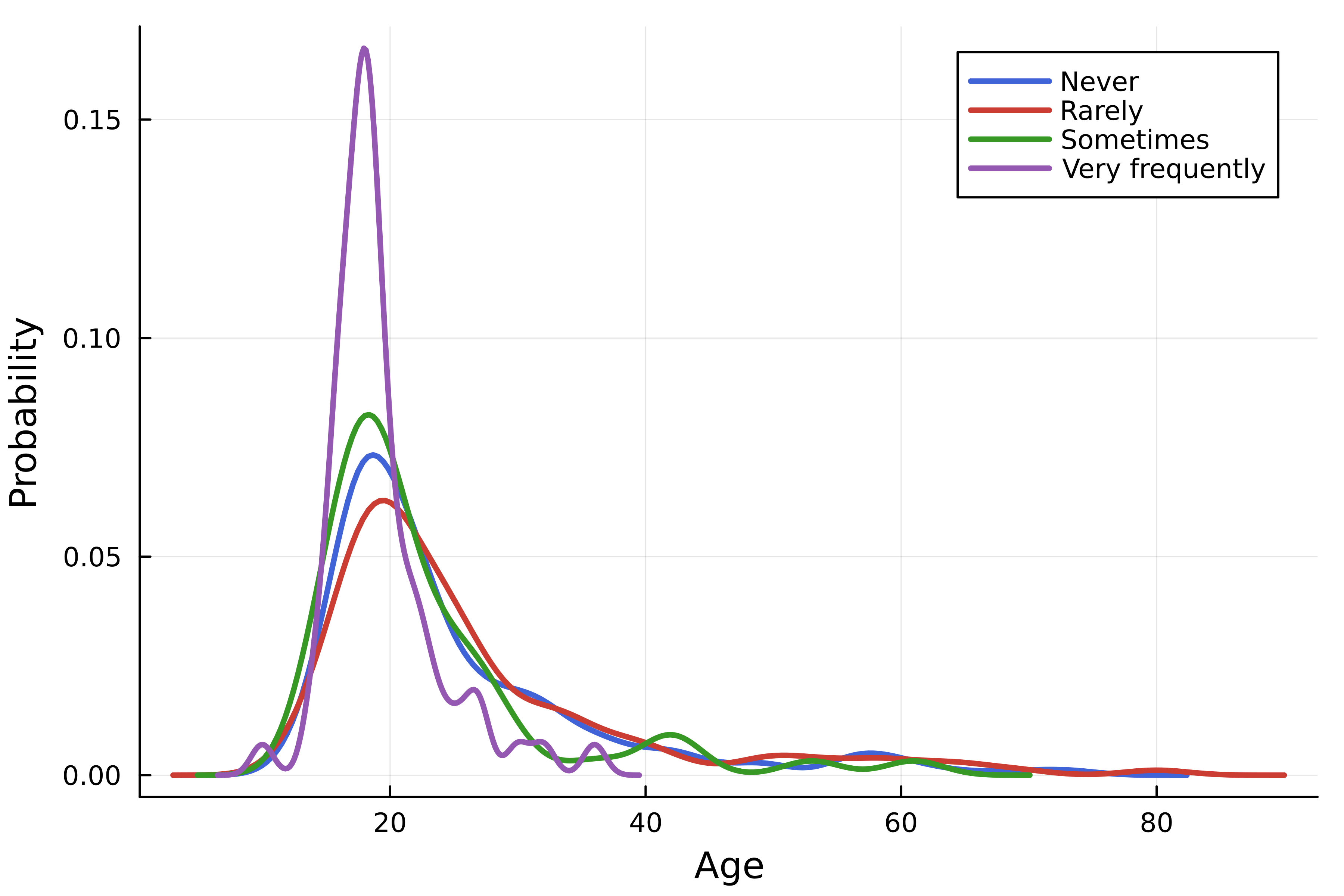
- Multiple curves in one figure
- Plot grid (
layout)
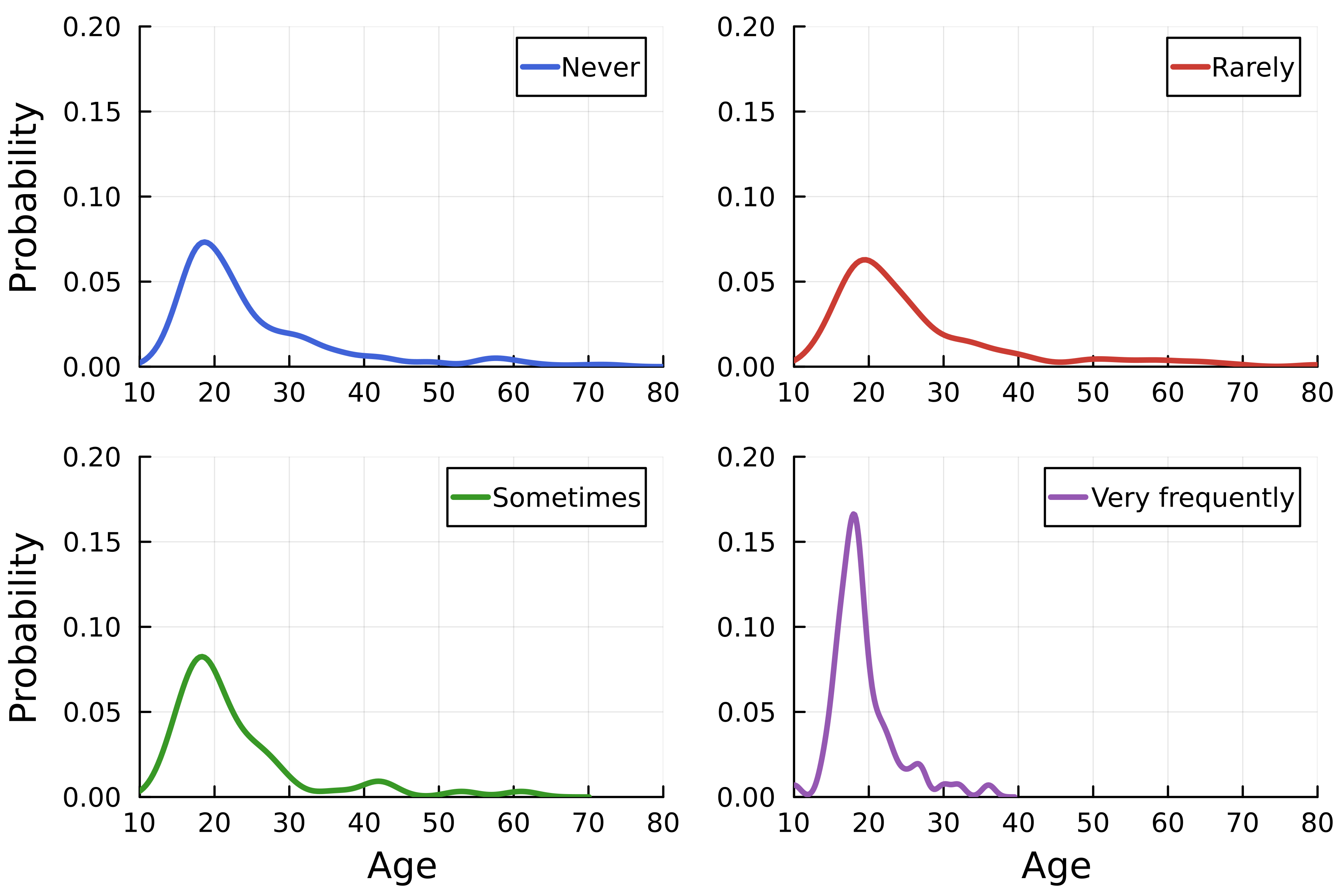
The grid
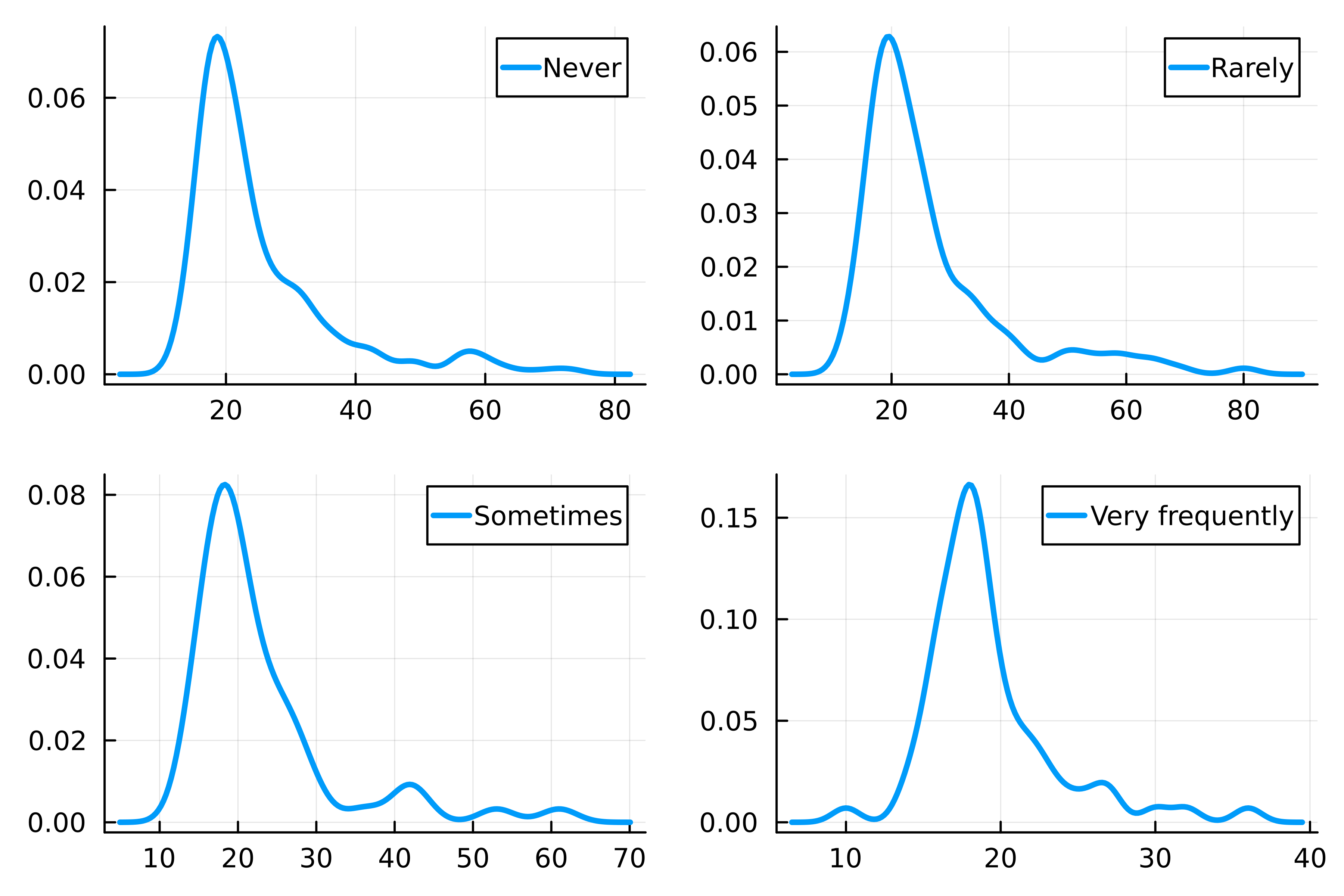
Customizing grid elements
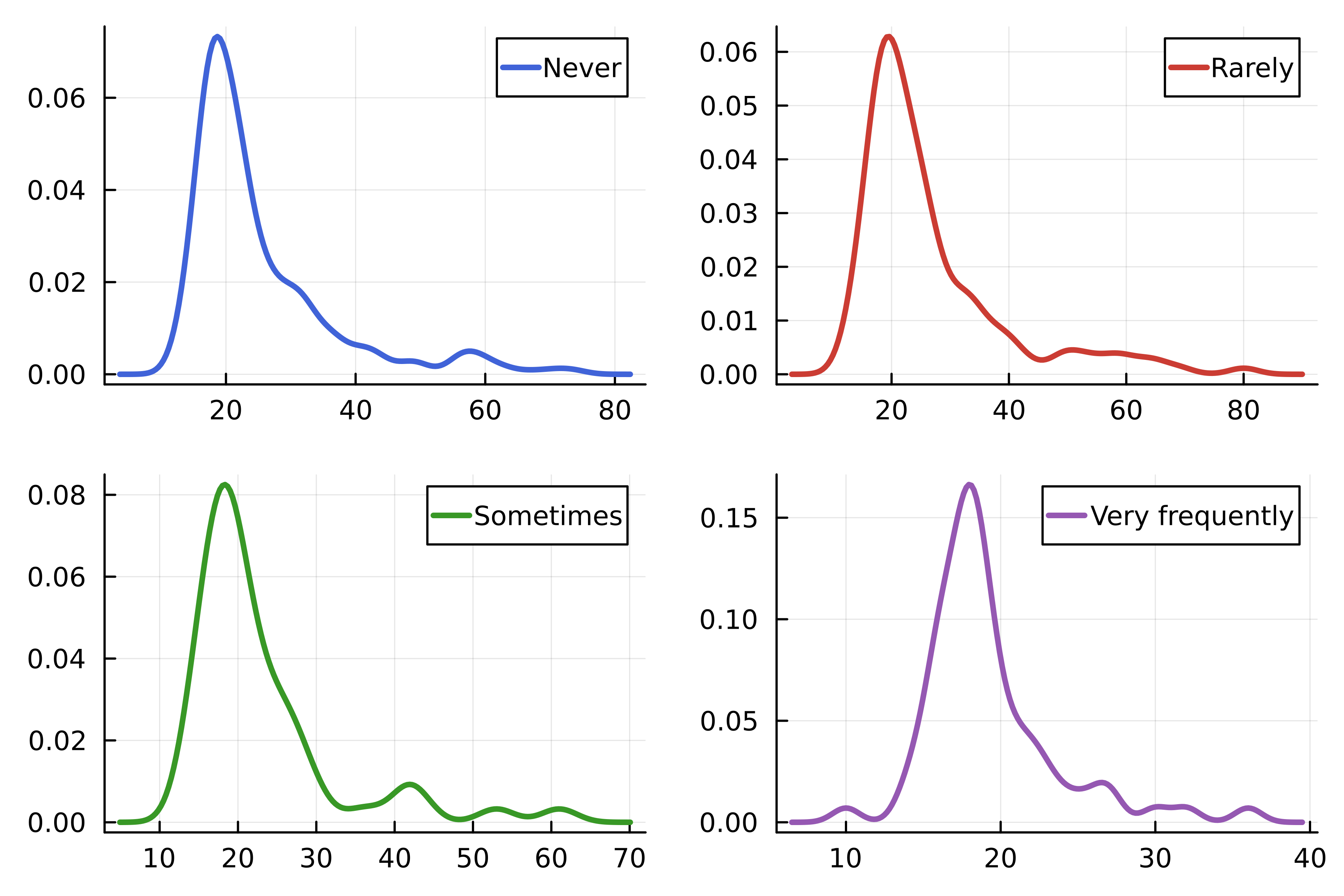
Controlling the grid layout
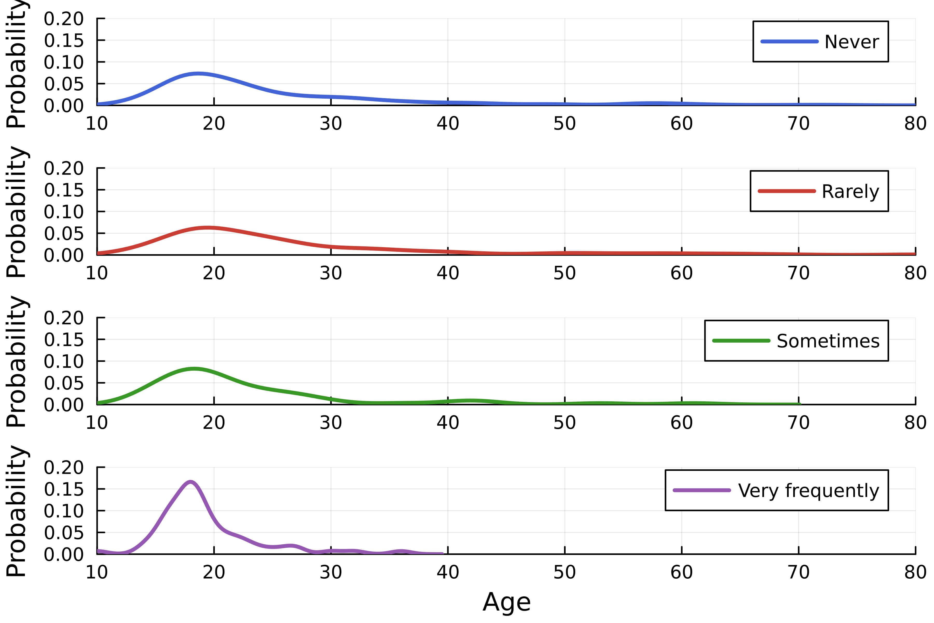
Advanced layouts
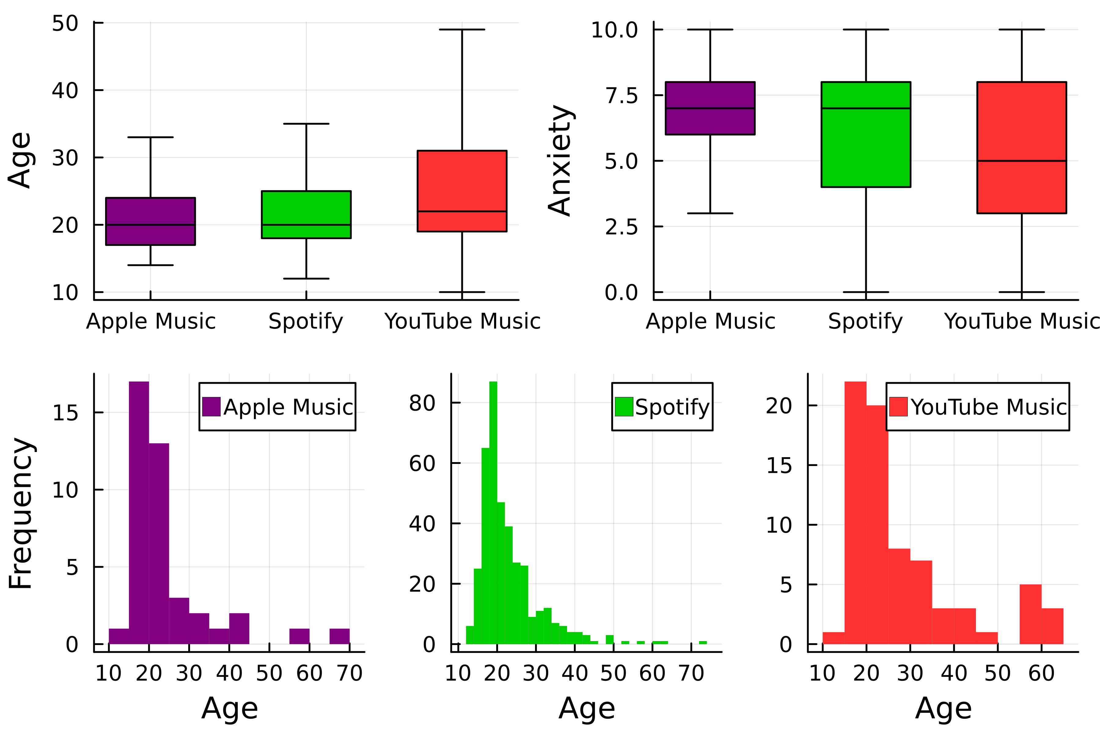
Step-by-step
Step-by-step
Step-by-step
Joining the plots
# Select layout
layout = @layout [a b; c]
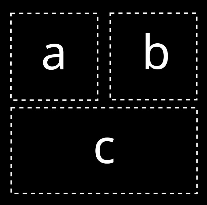
# Join the plots
plot(p1, p2, p3, layout=layout)

