Choosing a visualization
Data Storytelling Case Study: Green Businesses

Camilo Martínez Burgos
Data analysis and public policy consultant
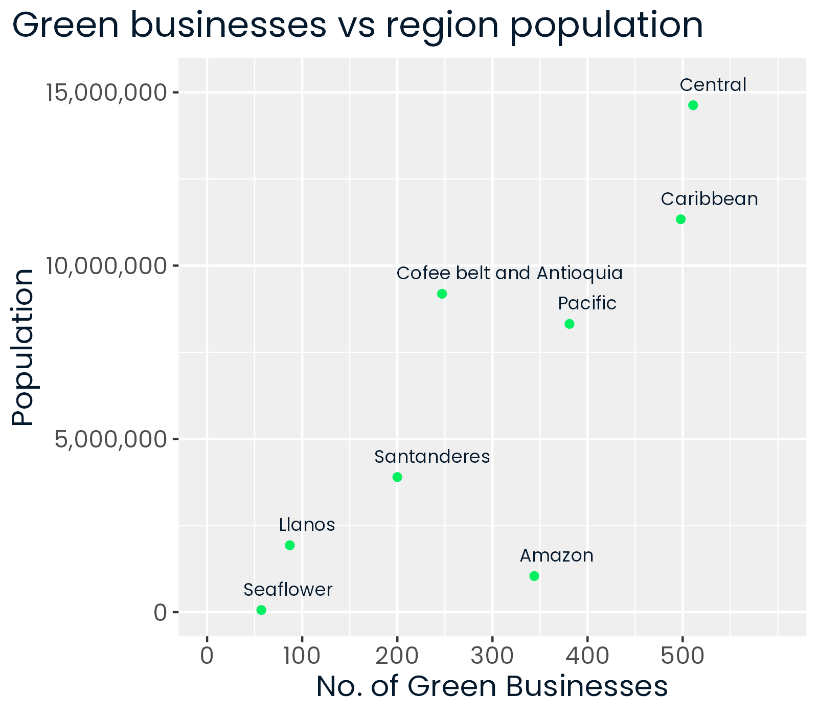
Scatter plots
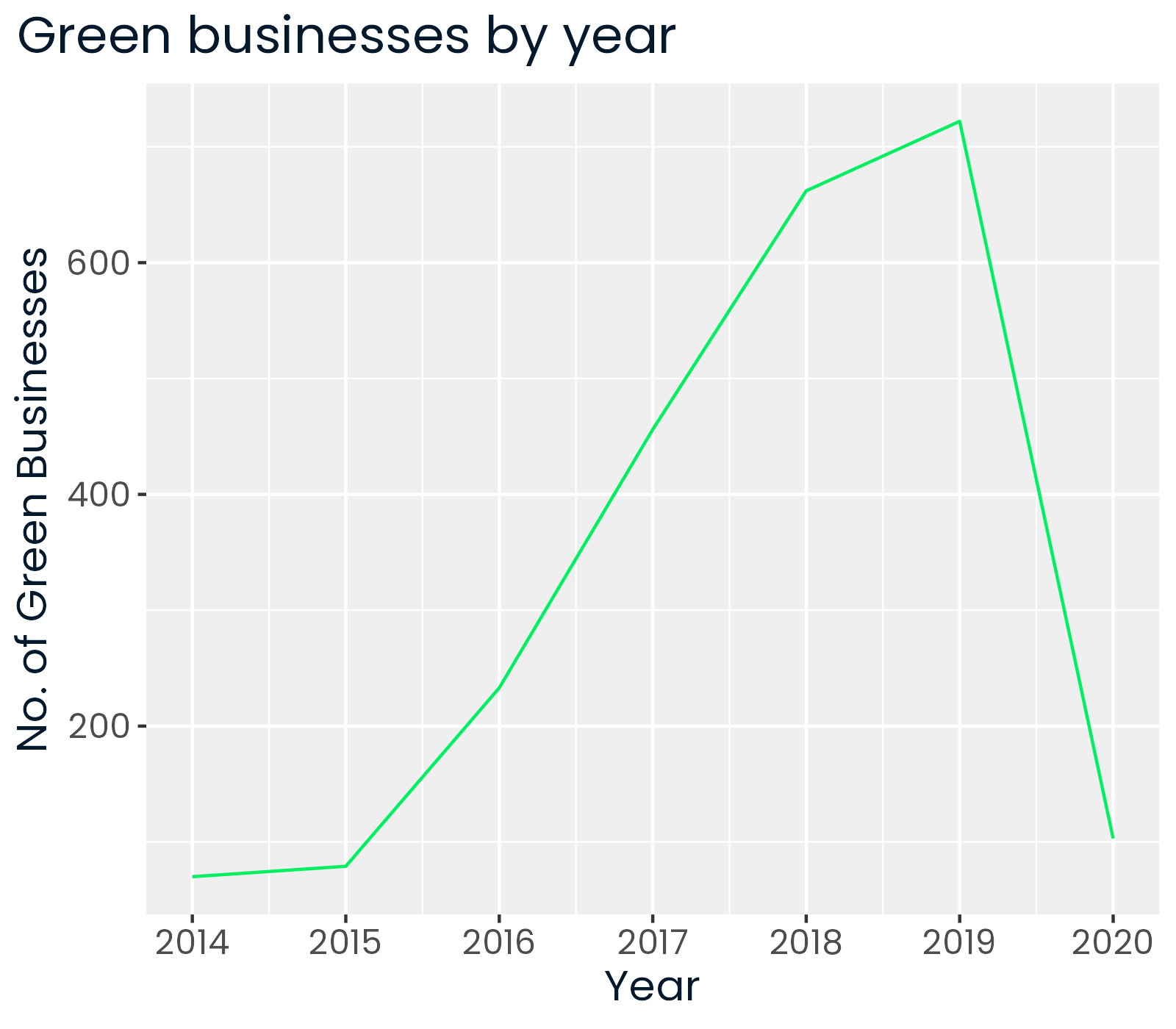
Line plots
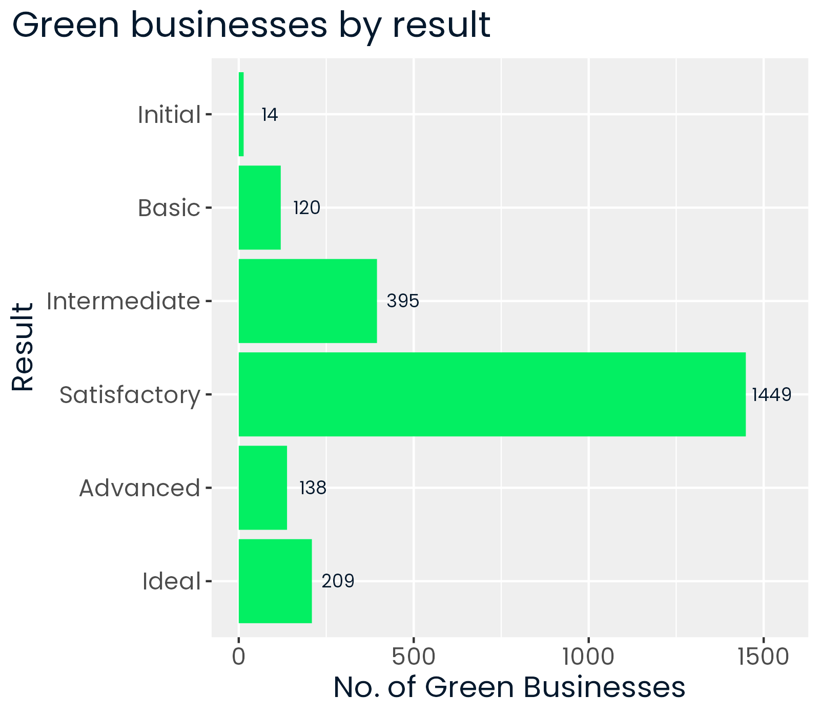
Bar plots
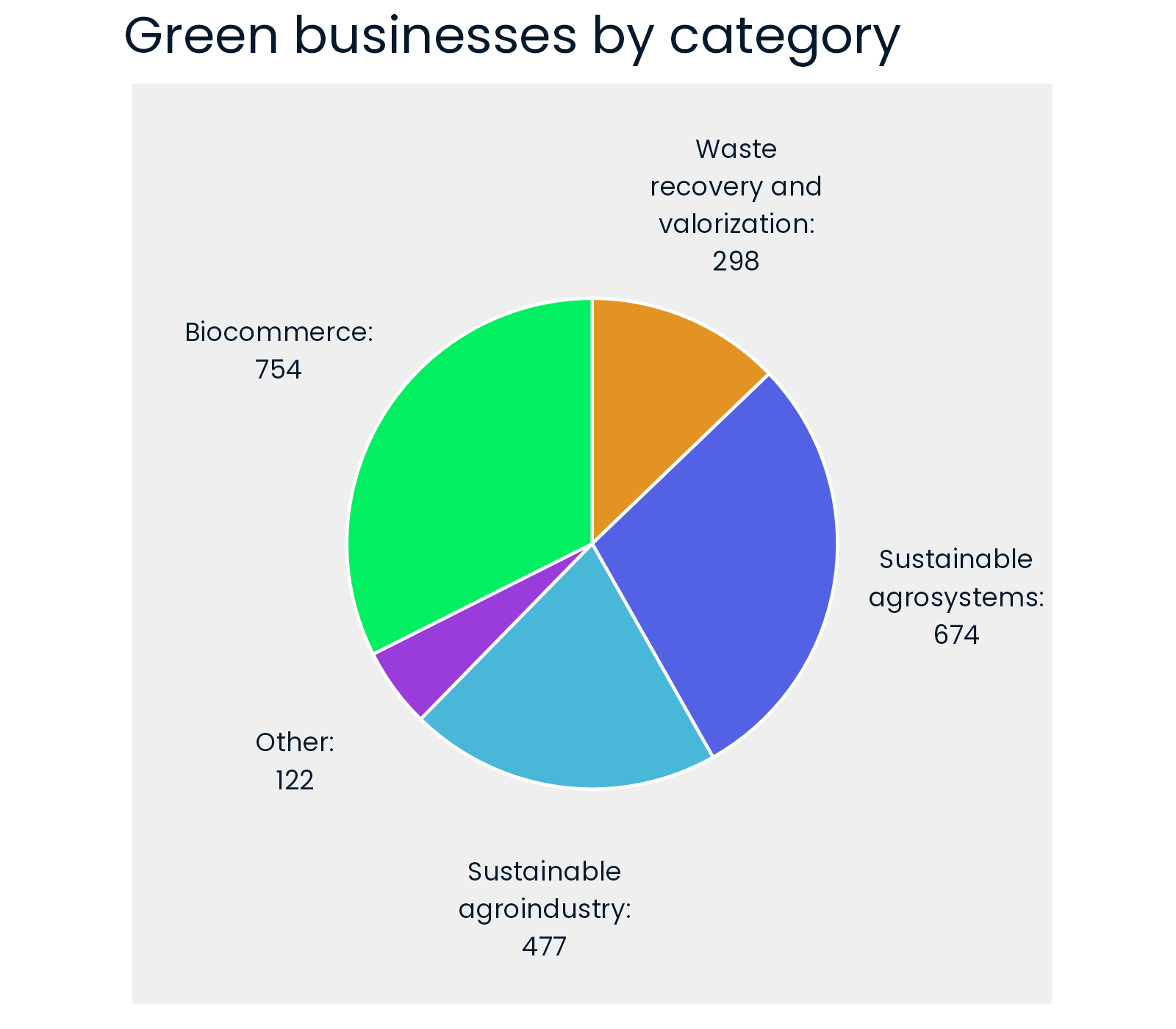
Pie charts
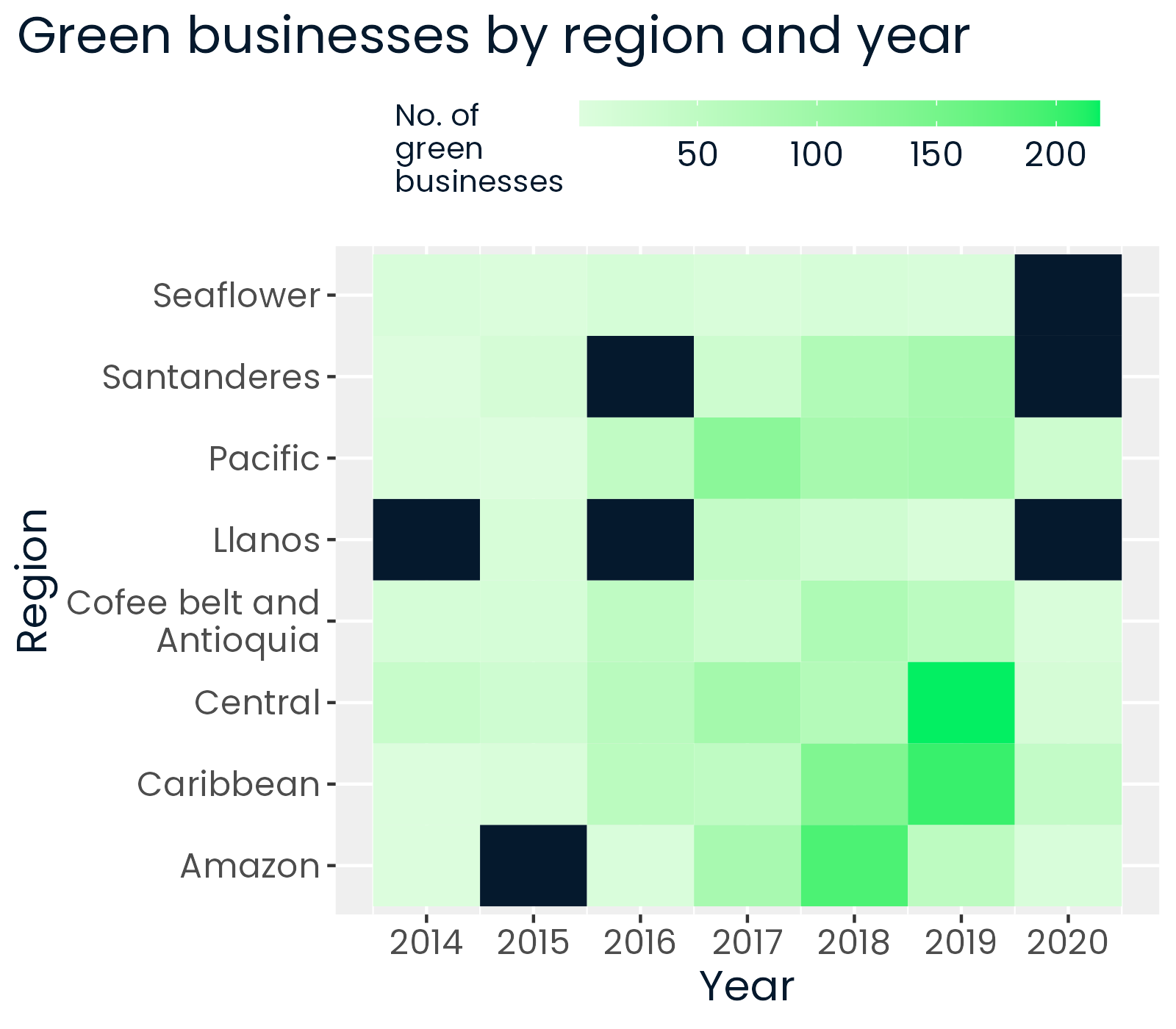
Heat maps
Data Storytelling Case Study: Green Businesses
Camilo Martínez Burgos
Data analysis and public policy consultant

