Exploratory Data Analysis

End-to-End Machine Learning

Joshua Stapleton

Machine Learning Engineer

The EDA process

  • Examine and analyse the dataset
  • Understand the dataset
  • Visualize the dataset
  • Characterize / classify the dataset

A diagram showing various components of EDA as applied to the patient heart disease dataset

End-to-End Machine Learning

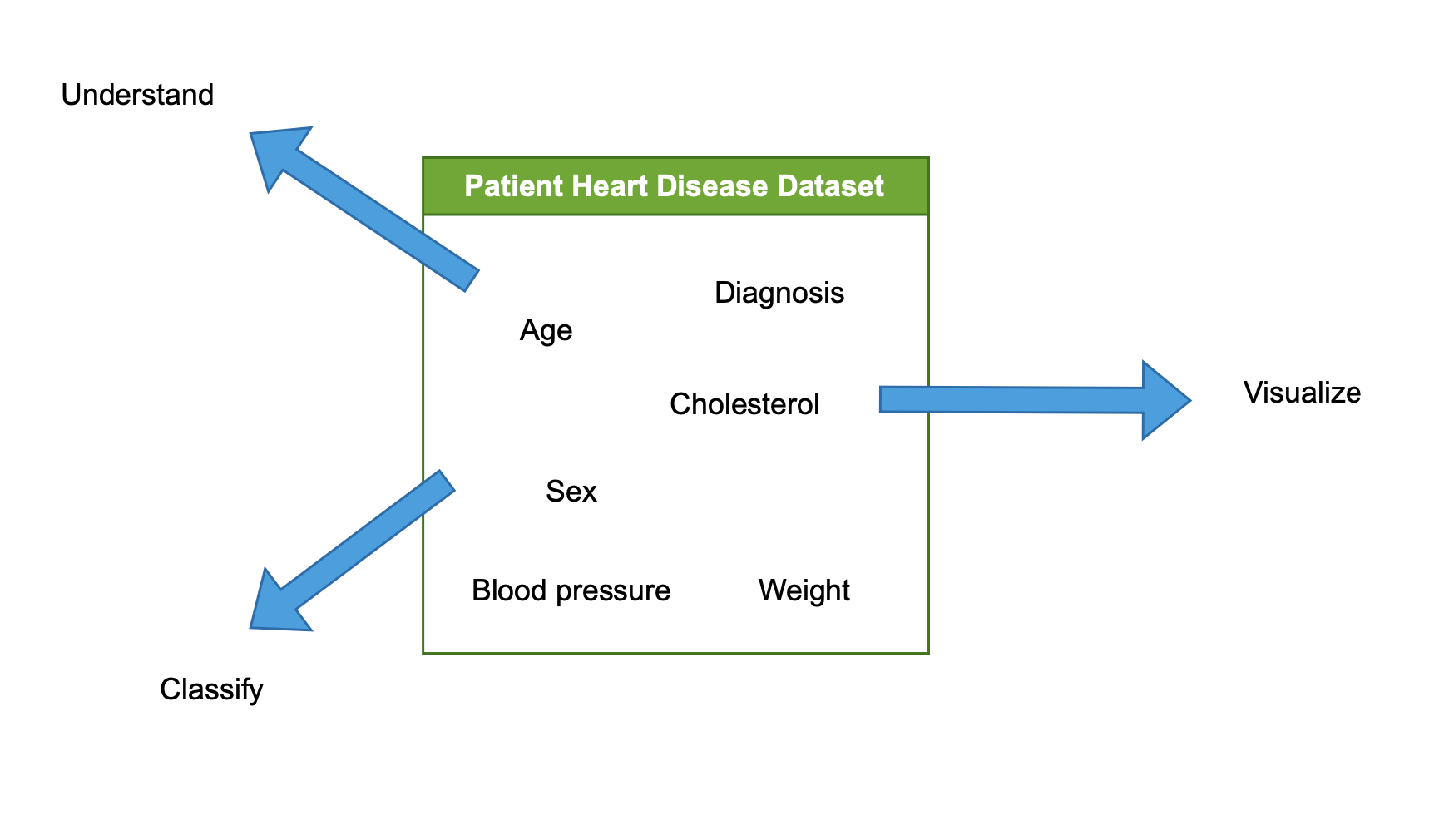
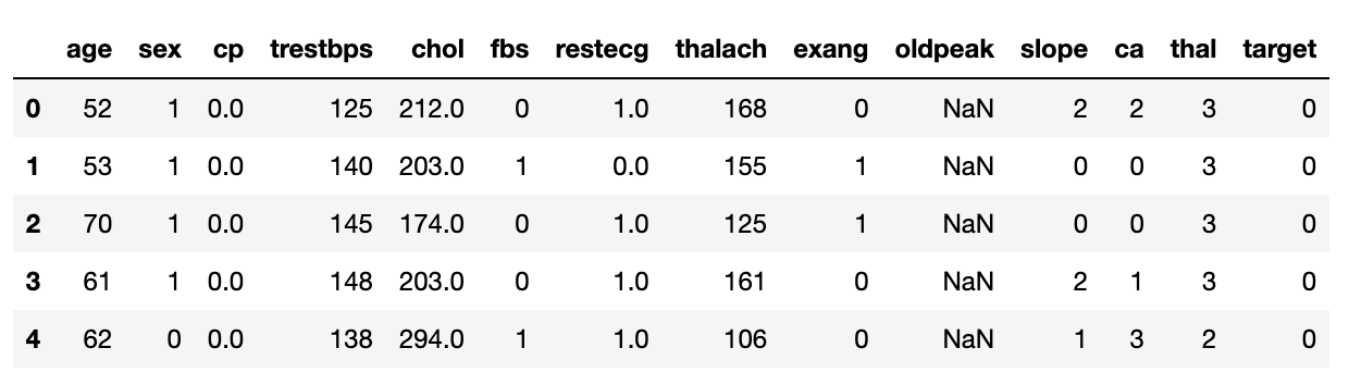
Understanding our data

df.head()

  • Shows first rows of the dataset
  • Provides snapshot of data's structure
# Print the first 5 rows
print(heart_disease_df.head())
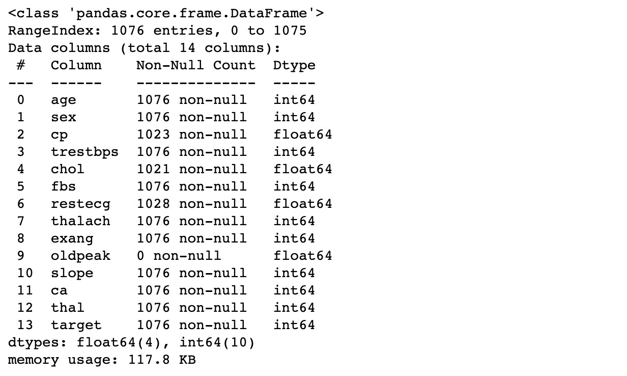
The first 5 rows of our heart disease DataFrame. Results of calling the df.head() operation.

df.info()

  • Summarizes features
  • Shows non-null entries and feature types
# Print out details
print(heart_disease_df.info())
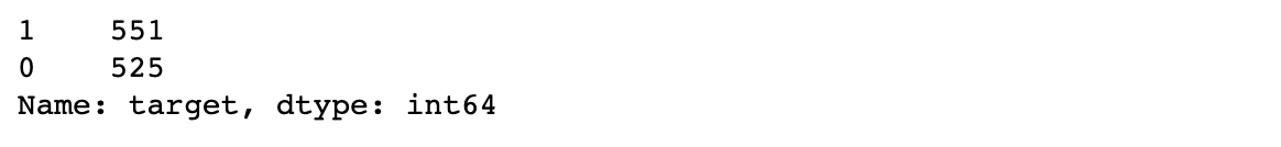
Summary information about our heart disease DataFrame. Results of calling the df.info() operation.

End-to-End Machine Learning

Class (im)balance

df.value_counts()

  • Counts number of unique occurrences of each class
  • Class: binary presence of heart disease (1/0)
  • Important for modeling
# print the class balance
print(heart_disease_df['target'].value_counts(normalize=True))
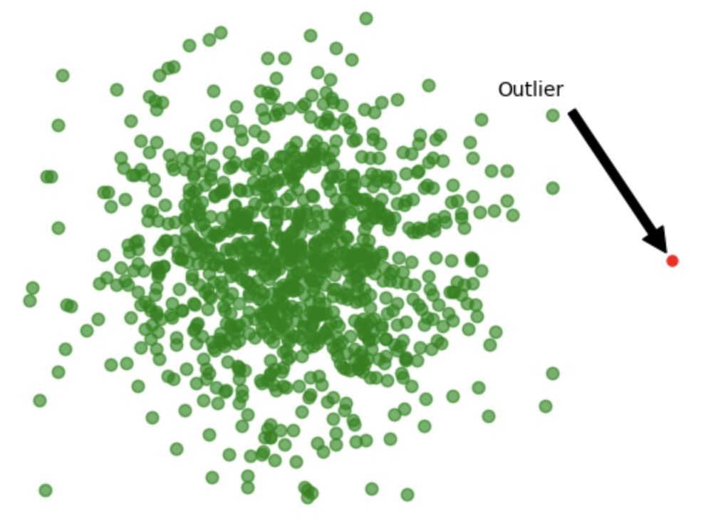
The class balance of the target column of our heart disease DataFrame. Results of calling the .value_counts() operation on the target column.

End-to-End Machine Learning

Missing values

  • Can lead to errors
  • Unrepresentative, biased results

Use df.isnull()

  • Checks for null/empty/missing values
  • Applied to column or collection of columns

Usage

# check whether all values in a column are null
print(heart_disease_df['oldpeak'].isnull().all())
True
End-to-End Machine Learning

Outliers

  • Anomalous values

    • Measurement errors
    • Data entry errors
    • Rare events
  • Can skew model performance

    • Model learns based on extreme values
    • Doesn't capture general data trend
  • Sometimes can be useful:

    • Rare values
    • Detection: use boxplot, or IQR

A visualization showing an outlier.

End-to-End Machine Learning

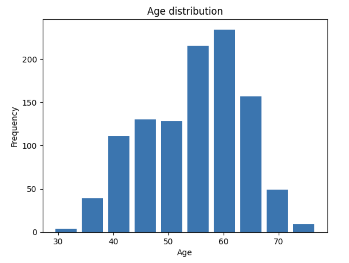
Visualizing our data

Visualizations show:

  • General trends
  • Missing values and outliers

Other types of visualizations:

  • Kernel density estimation
  • Empirical cumulative distributions
  • Bivariate distributions
df['age'].plot(kind='hist')
plt.xlabel('Age')
plt.ylabel('Frequency')
plt.show()

A visualization showing the distribution of age in our dataset.

1 https://seaborn.pydata.org/tutorial/distributions.html, https://app.datacamp.com/learn/courses/intermediate-data-visualization-with-seaborn
End-to-End Machine Learning

Goals of EDA

Understand the data

  • Are there any patterns?
  • Eg: do men have higher rate of heart disease?

Detect outliers

  • Does any data fall outside what is acceptable?
  • Are there incorrect or missing values?

Formulate hypotheses

  • What should we expect from the data?

Check assumptions

  • Does what we expect line up with reality?
End-to-End Machine Learning

Let's practice!

End-to-End Machine Learning

Preparing Video For Download...