Date transformations and visualizations

Time Series Analysis in Tableau

Chris Hui

VP of Product, Tracked
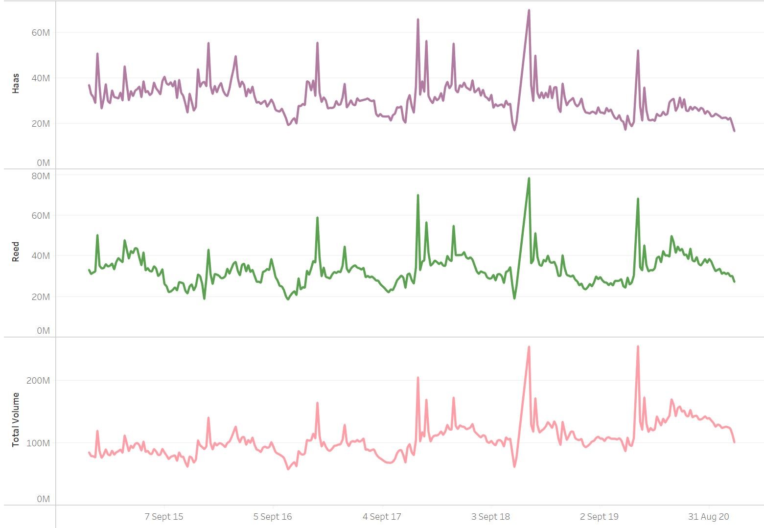
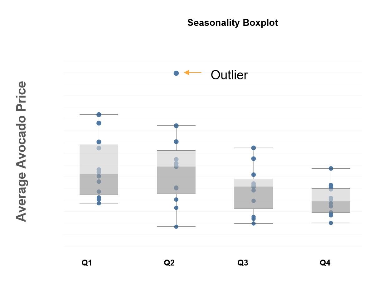
What's seasonality?

  • Seasonality is when time series data experiences regular and predictable changes that recur every calendar year

  • Examples include tourism or fruiting seasons that have variable prices based off timing

  • Seasonal behaviour allows business to effectively plan around peaks and troughs to optimize their business

3 line charts depicting different price points for different avocado categories

Time Series Analysis in Tableau

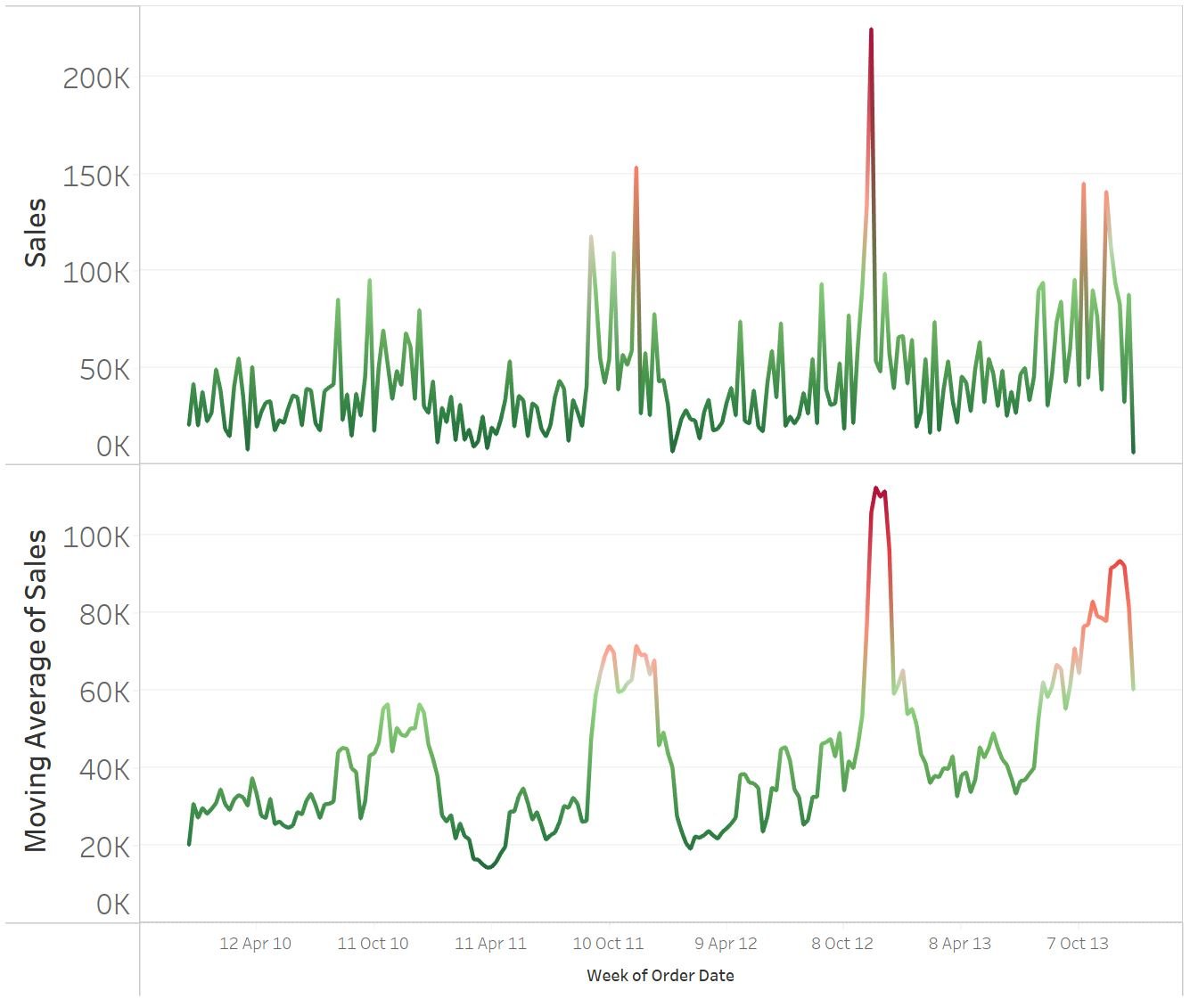
Treating seasonality with moving averages

Common methods to treat seasonality:

  • Moving averages
    • Technique to smooth out short term fluctuations (peaks/troughs) in the data over a specific time window
    • Used to filter out noise while preserving the underlying signal

A line chart showing the average sales compared against a moving average which helps to smooth the peaks in the data

Time Series Analysis in Tableau

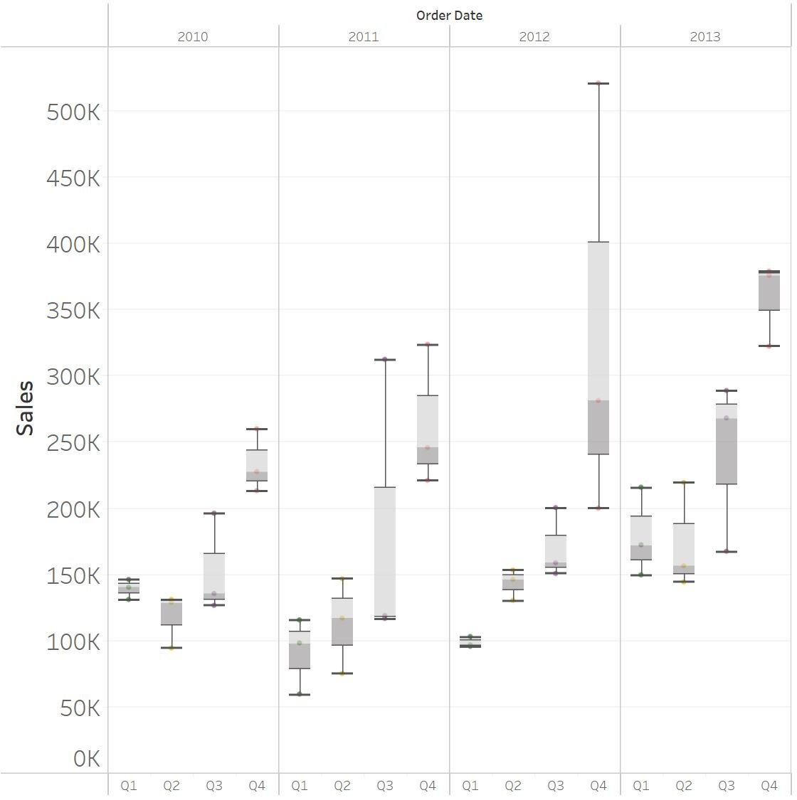
Identifying seasonality with seasonal boxplots
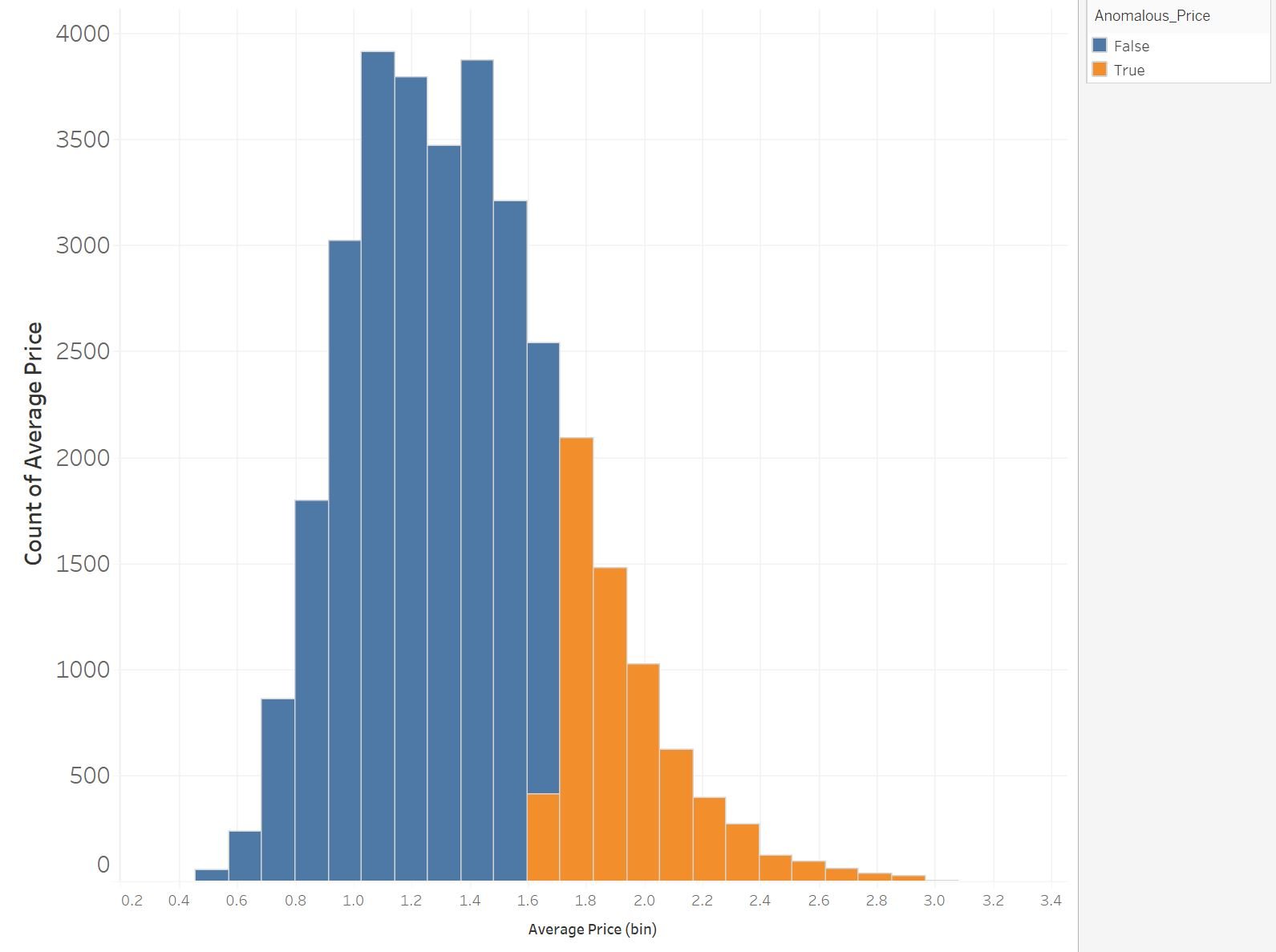
Common methods to identify seasonality:

  • Seasonal boxplots (quarterly analysis)
    • Segments the data quarterly to enable visualization of seasonal (quarterly) fluctuations
    • Consistent volatility across quarters are an indicator of seasonal behavior

A box plot visualization showing varying interquartile ranges by quarter and year

Time Series Analysis in Tableau

What's an anomaly?

  • Anomalous values (outliers), are values that deviate outside the normal distribution

  • Outliers can be considered to be:

    • Any value outside +- 3 standard deviations away from the mean
    • More than 1.5 x IQR below Q1 or more than 1.5 x IQR above Q3

A box plot showing the sales variance between seasons

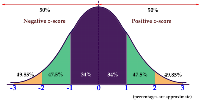
(Standard deviation is a measure of how far any value is from the population mean)

Time Series Analysis in Tableau

Z-score and the normal distribution

  • The Z-score is the number of standard deviations a given data point lies above or below mean

  • Z-scores within +-3 means ~99.7% of the population values lies within this range

  • Subsequently, any Z-score outside the +-3 range can be considered an outlier

A normal distribution showing the range of Z-Scores from -3 to +3

Time Series Analysis in Tableau

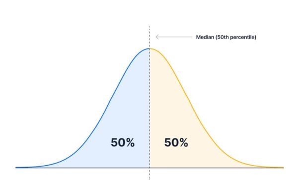
Unpacking percentiles in Tableau

  • Percentiles determine where a value stands relative to other values
    • Median (50th Percentile)
    • Upper & Lower Quartiles (75th / 25th percentiles)

A normal distribution visualizing split into below the 50th percentile and above the 50th percentile

  • Provides a flexible approach to outlier detection beyond the traditional Z-score methodology

A histogram showing the cut off threshold for whether a value is anomalous or not

Time Series Analysis in Tableau

Let's practice!

Time Series Analysis in Tableau

Preparing Video For Download...