Building interactive dashboards
Case Study: Supply Chain Analytics in Tableau

Agata Bak-Geerinck
Senior Data Analyst
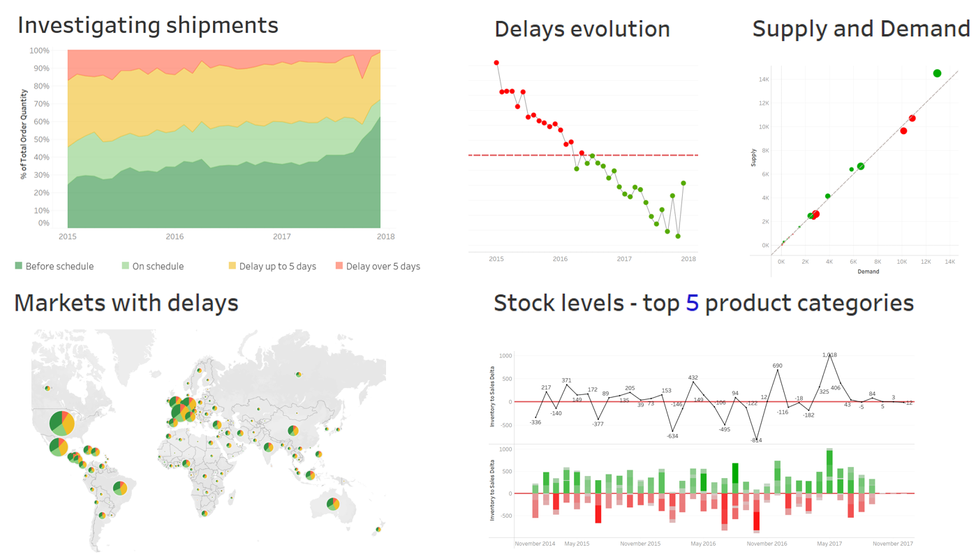
Our visualizations and insights so far...

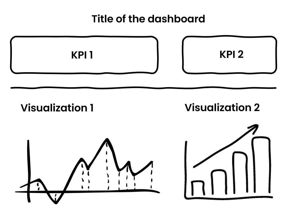
The characteristics of a good dashboard
- Cohesive collection of related and relevant visualizations
- Visualizations reinforce the message such as KPI numbers, charts, and tables, depending on the use case
- Good use of space: incl. white space, avoiding cognitive overload$^1$
- Consistent look and feel across visualizations and dashboards
1 Cognitive overload = situation where one is given too much information at once
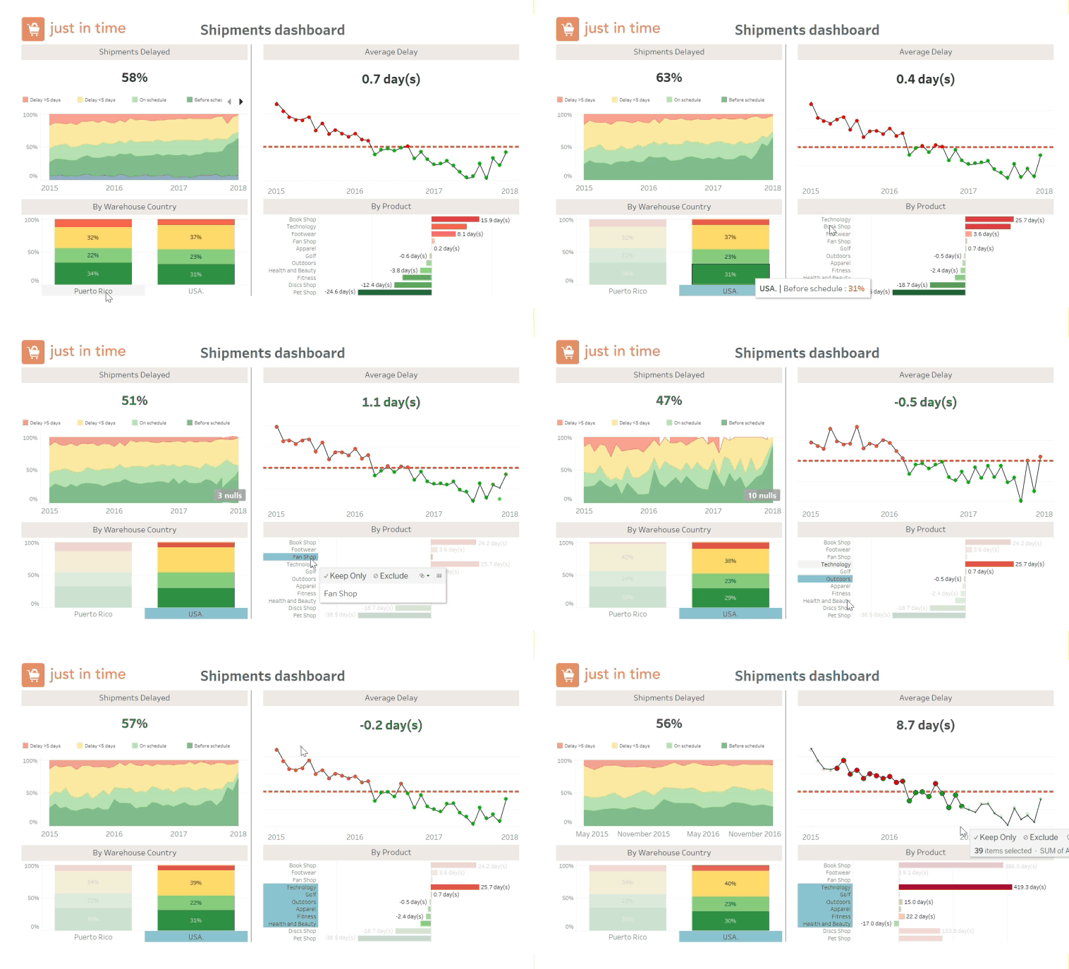
Dashboard interactivity
A good data model allows seamless interactivity between various worksheets:

Dashboard Actions allow control for specific outcomes:
- Source sheet - where we click, hover-over
- Target sheet - where the action happens
Example:
Hover-over on a source visualization applies filter only on one target sheet
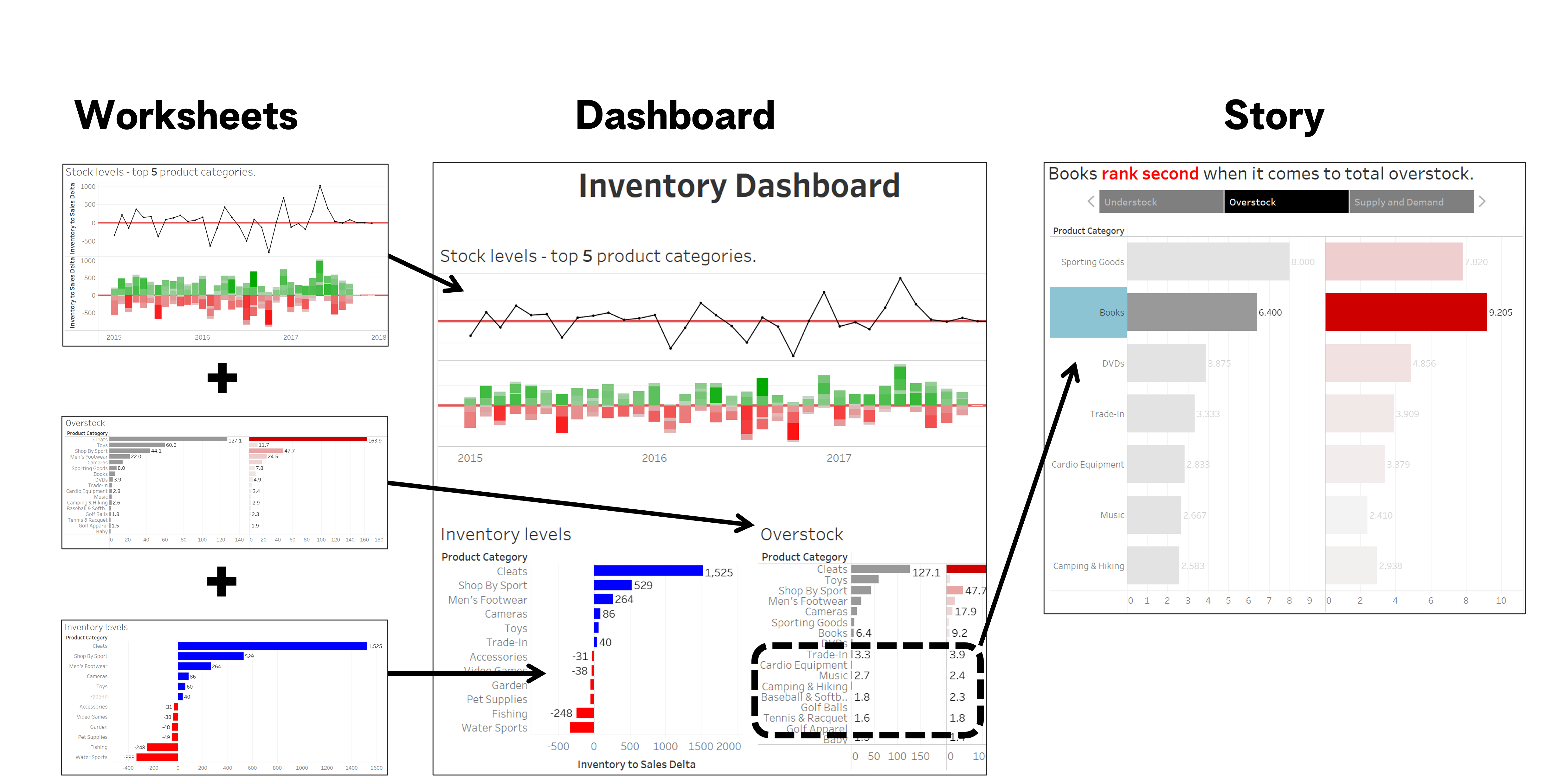
Organizing insights with stories
Our two dashboards
Exploring data is not dashboarding
Shipments dashboard
- Reporting major shipment KPIs
- Investigating the evolution of these shipments KPIs
Inventory dashboard
- Visualizing supply and demand
- Providing an interactive exploration tool per Product Category

Let's practice!
Case Study: Supply Chain Analytics in Tableau


