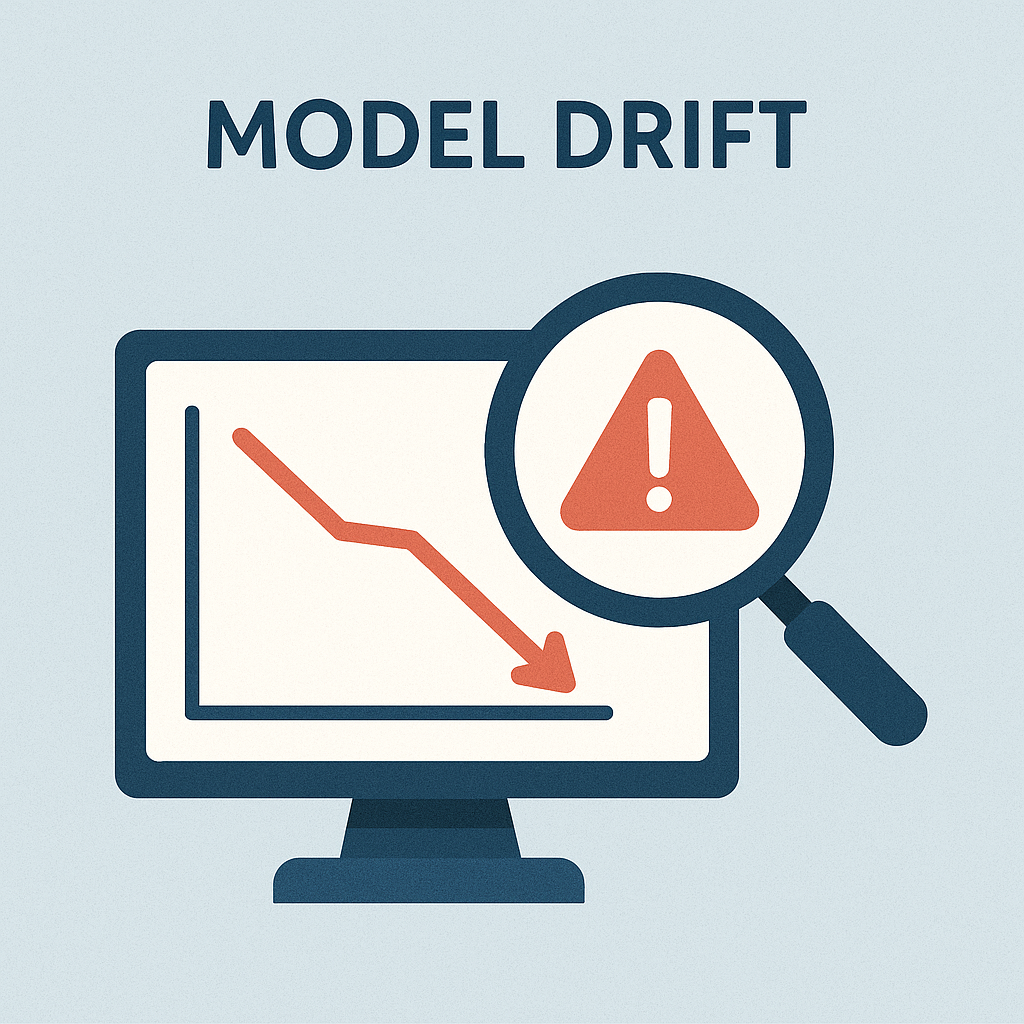
Model Drift
Designing Forecasting Pipelines for Production

Rami Krispin
Senior Manager, Data Science and Engineering
Model drift
Concept drift
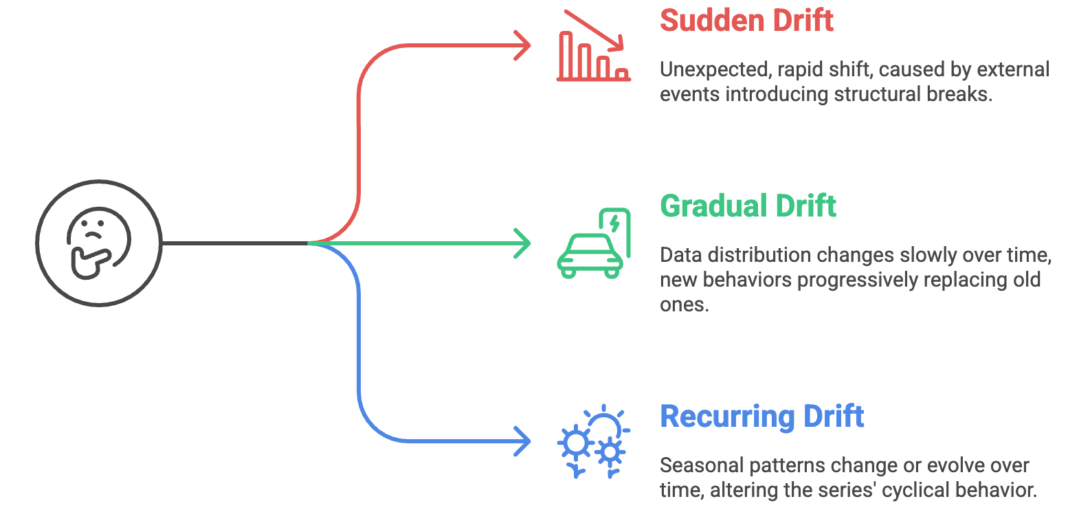
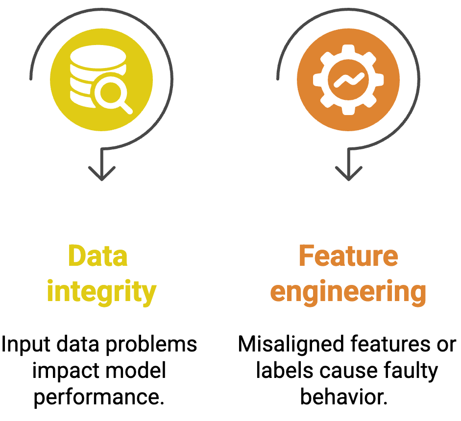
Other causes of model drift
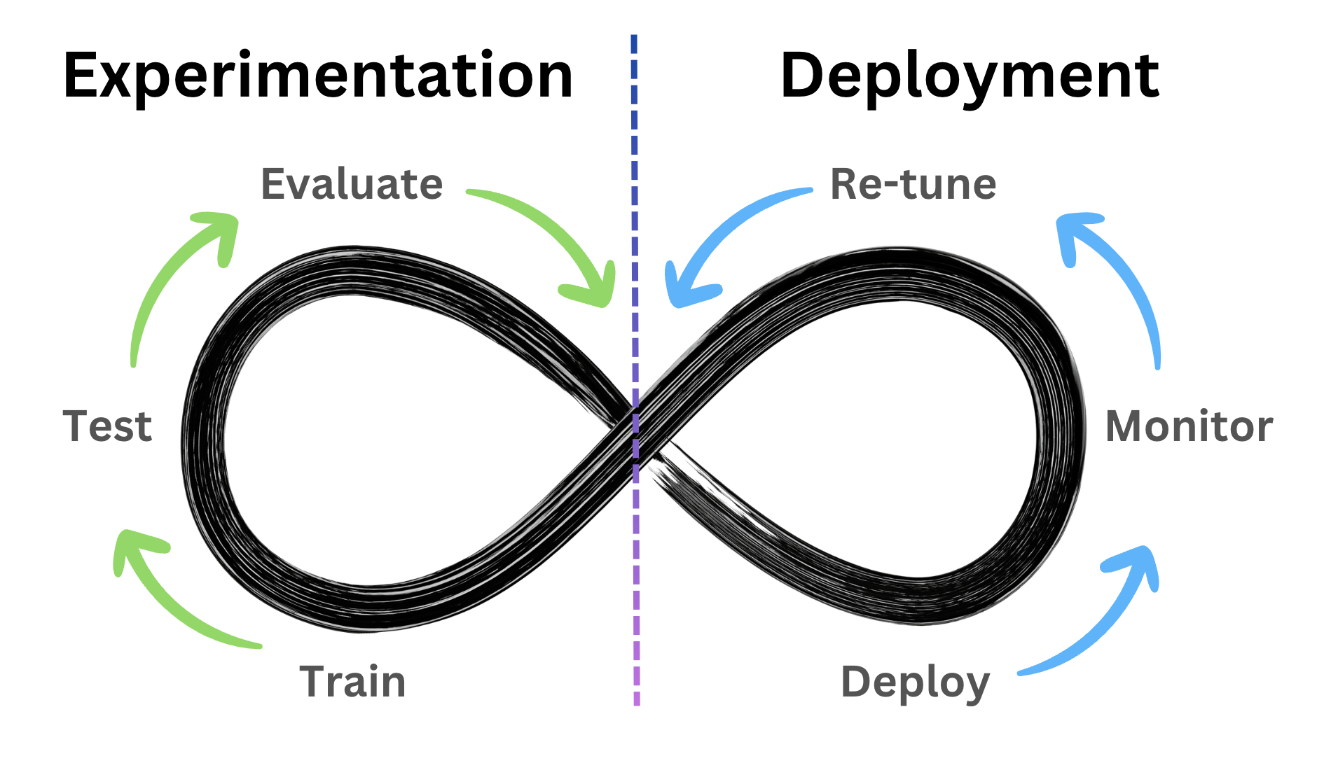
Model life cycle
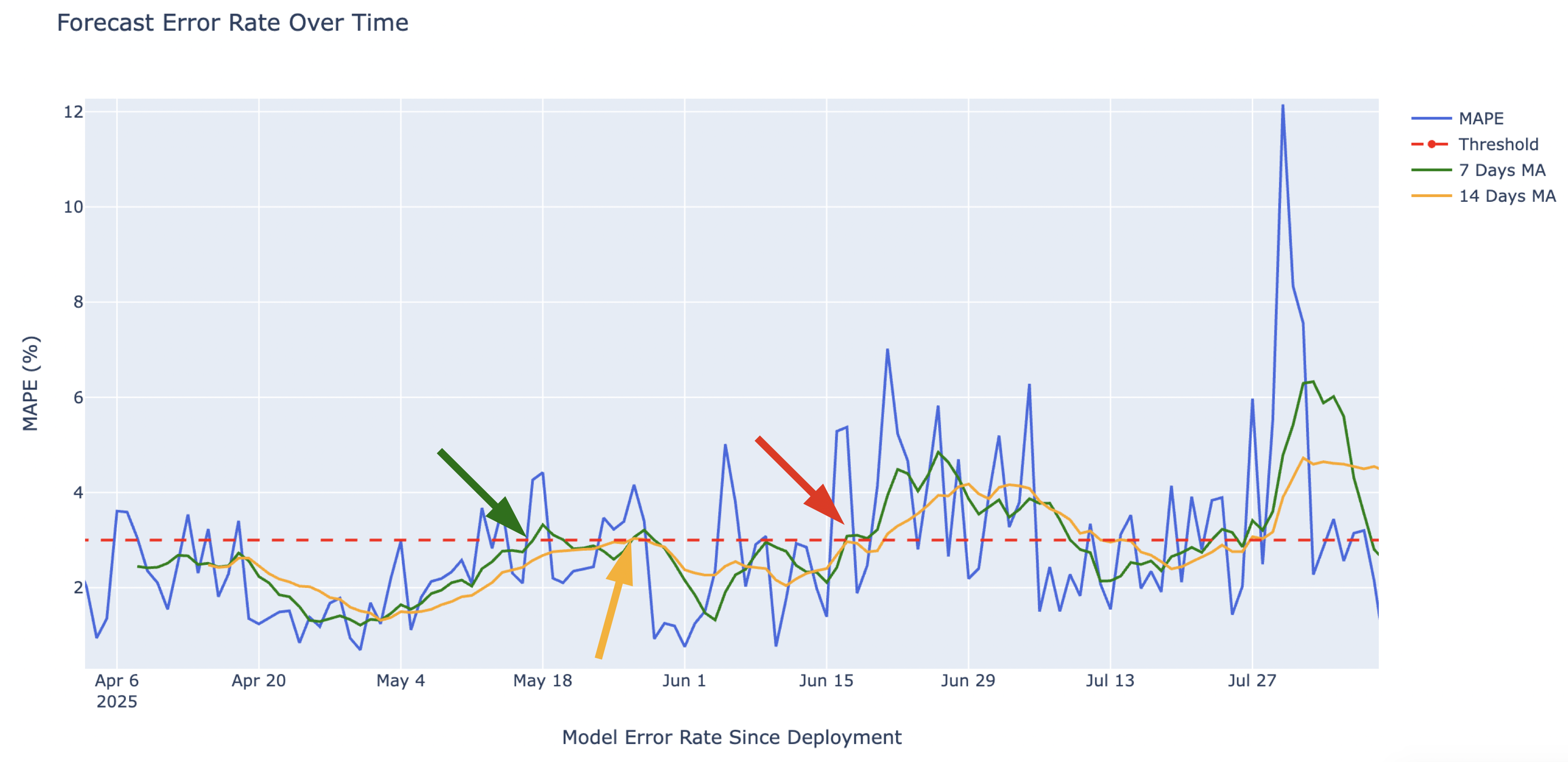
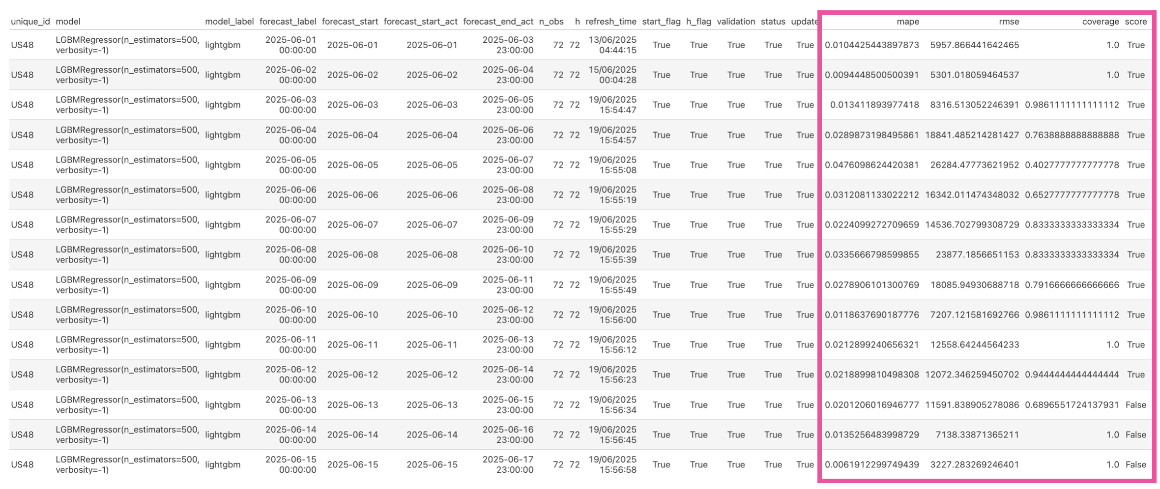
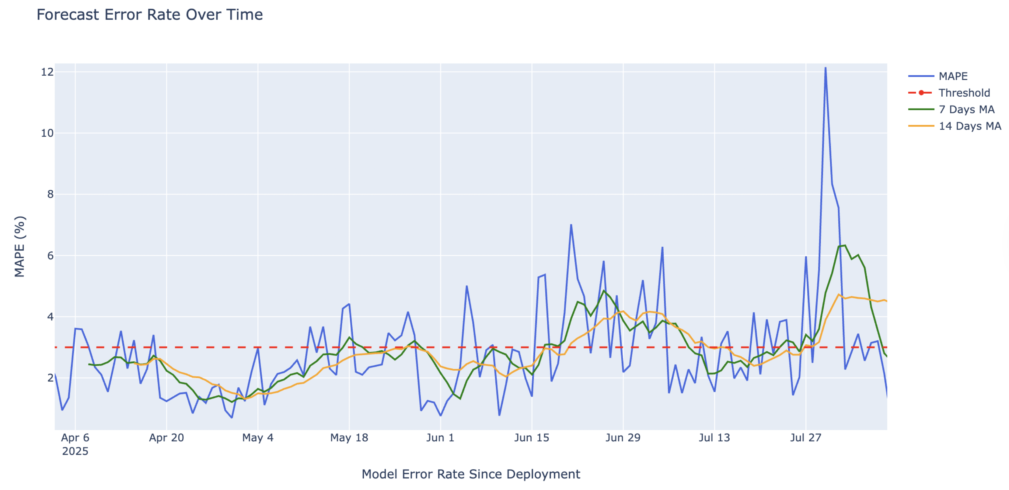
Detect model drift
$$
Detect model drift
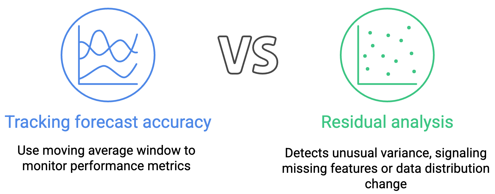
Identify drift
Identify drift
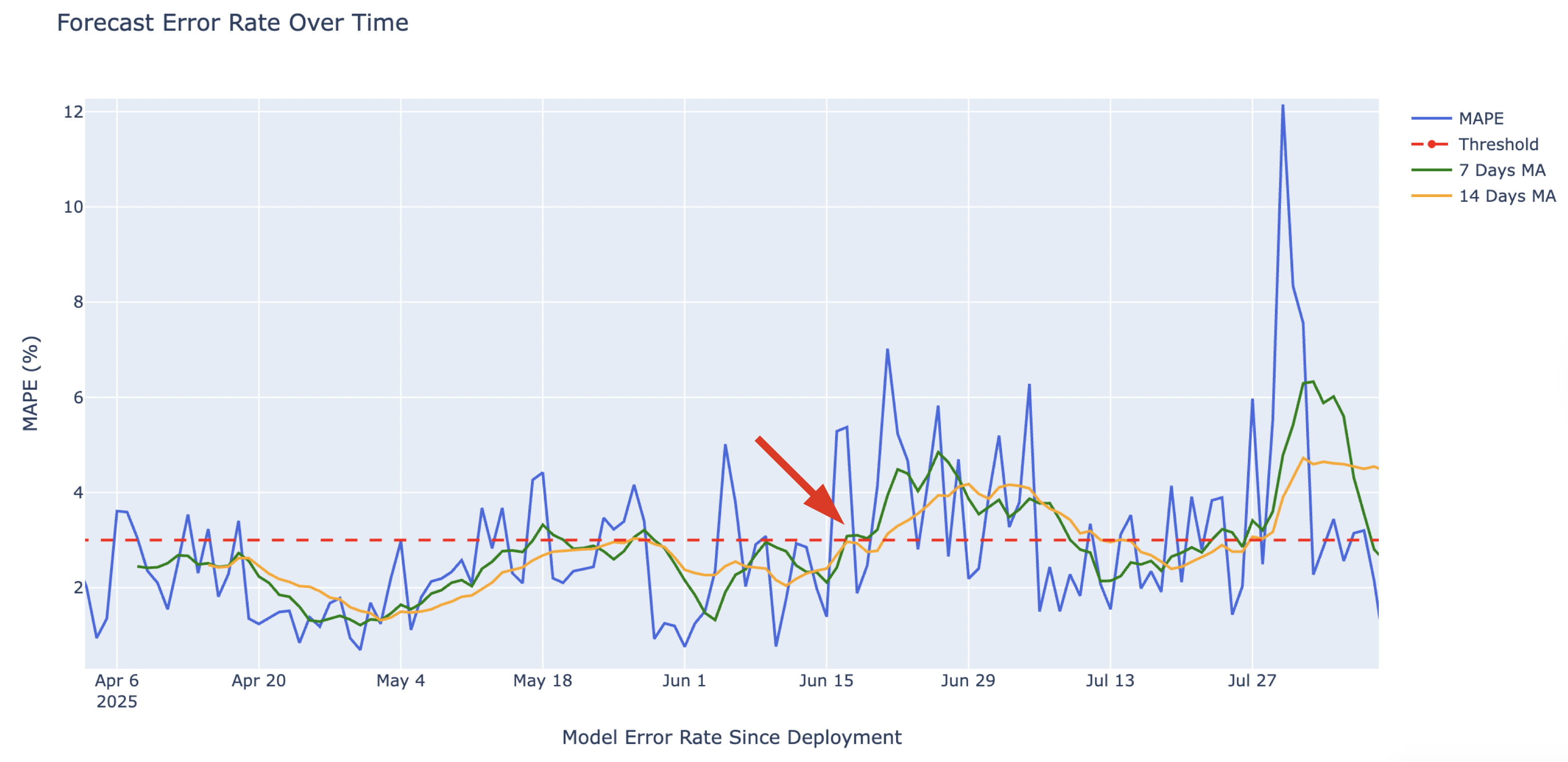
Identify drift
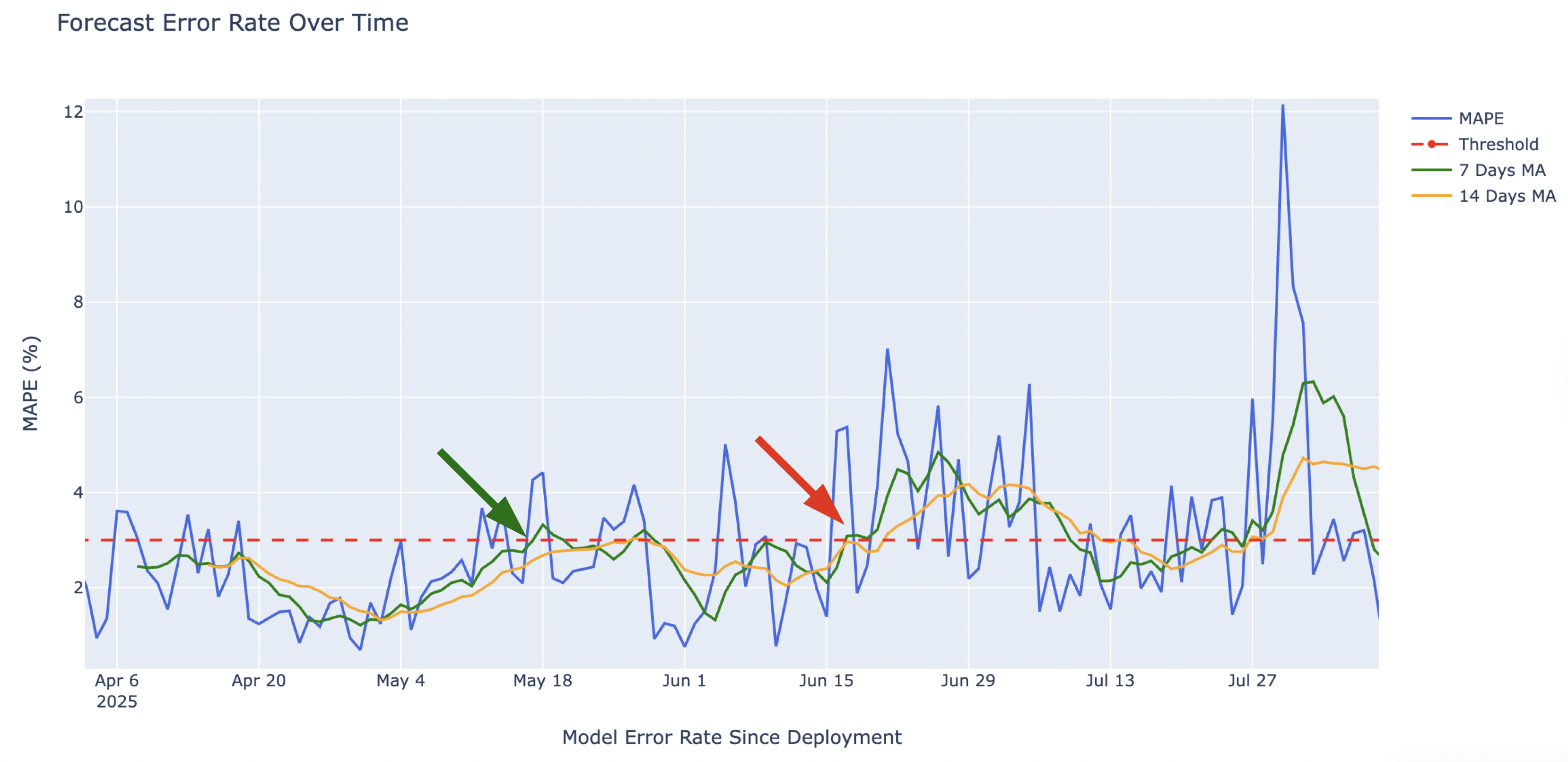
Identify drift