Múltiplos pequeños
Introducción a la visualización de datos con Matplotlib

Ariel Rokem
Data Scientist
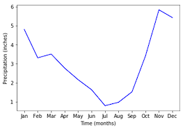
Añadir datos
ax.plot(seattle_weather["MONTH"],
        seattle_weather["MLY-PRCP-NORMAL"],
        color='b')
ax.set_xlabel("Time (months)")
ax.set_ylabel("Precipitation (inches)")
plt.show()
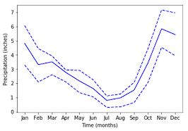
Añadir más datos
ax.plot(seattle_weather["MONTH"], seattle_weather["MLY-PRCP-25PCTL"],
        linestyle='--', color='b')
ax.plot(seattle_weather["MONTH"], seattle_weather["MLY-PRCP-75PCTL"],
        linestyle='--', color=color)
plt.show()
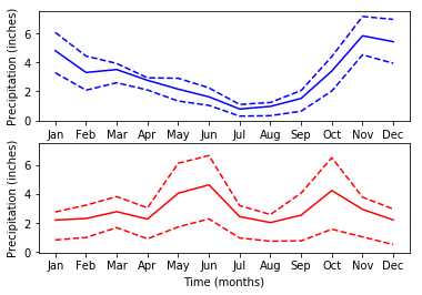
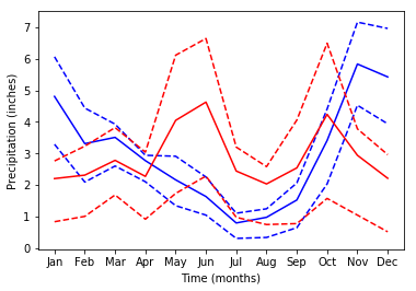
¡Demasiados datos!
Múltiplos pequeños con plt.subplots
fig, ax = plt.subplots()
fig, ax = plt.subplots(3, 2)plt.show()
Añadir datos a subgráficos
ax.shape
(3, 2)
ax[0, 0].plot(seattle_weather["MONTH"], seattle_weather["MLY-PRCP-NORMAL"], color='b')plt.show()
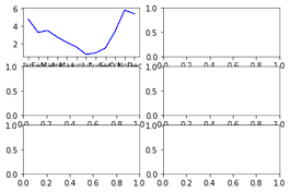
Subgráficos con datos

Compartir el intervalo del eje Y
fig, ax = plt.subplots(2, 1, sharey=True)