Eliminate clutter and focus attention

Data Storytelling Concepts

Joe Franklin

Senior Curriculum Manager, DataCamp

Cluttered charts are counter-productive


  • More design elements does not mean "better"
  • Clutter distracts and promotes miscommunication
  • Absorb your audience in the problem without unnecessary effort on their part

  an overcomplicated chart attempts to show the relationships between financial markets and COVID-19

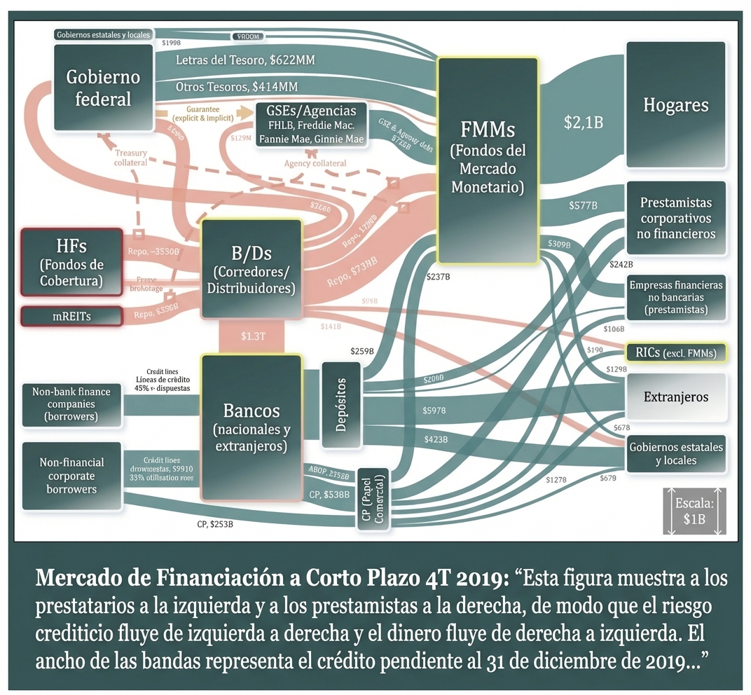
1 https://www.sec.gov/files/US-Credit-Markets_COVID-19_Report.pdf
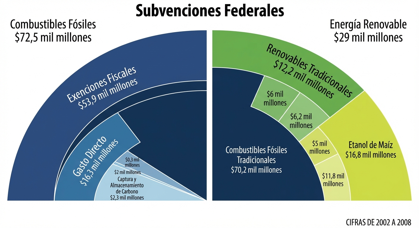
Data Storytelling Concepts

Sensory overload


  • Sometimes you want to share aggregate data

  • Tables can help but should be used sparingly and almost never on slides

  • Get started by making a "bad" chart and refine that with help as necessary

  A complicated data table that is difficult to read because of too many columns and rows

Data Storytelling Concepts

Can I have your attention please?


  • A visual hierarchy signals where to look
  • Size, hue, and spatial position signal relative importance
  • People follow charts the way that they read documents; for English, left to right

  poor visual hierarchy is shown with a website full of items with no relative importance, while good visual hierarchy uses hue, size and spatial relationship that promotes comprehension

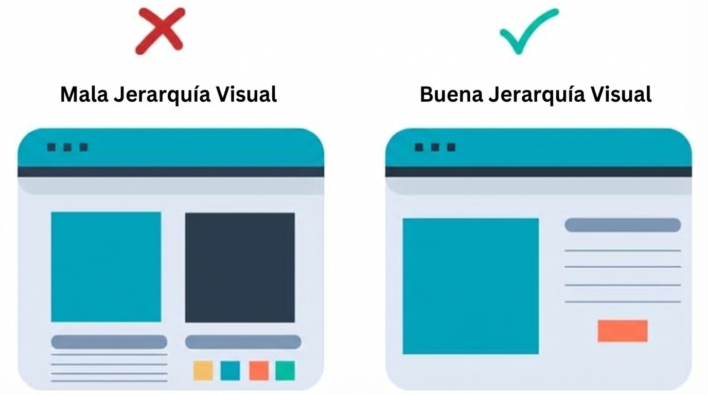
1 https://blog.hubspot.com/marketing/visual-hierarchy
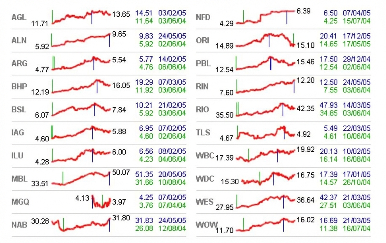
Data Storytelling Concepts

I just don't follow you


  • Don't include unnecessary information or design elements
  • Pointless objects invite distraction
  • Just because a visualization is interesting does not mean it is helpful
  • Information can be split up into more than one chart

A circular chart shows labels where unnecessary and muted colors that don't communicate with the viewer

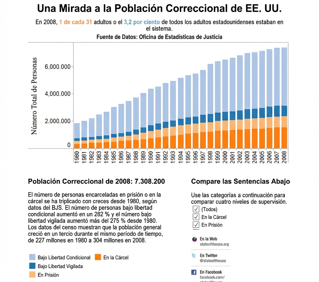
1 http://junkcharts.typepad.com/junk_charts/2011/04/worst-statistical-graphic-nominated.html
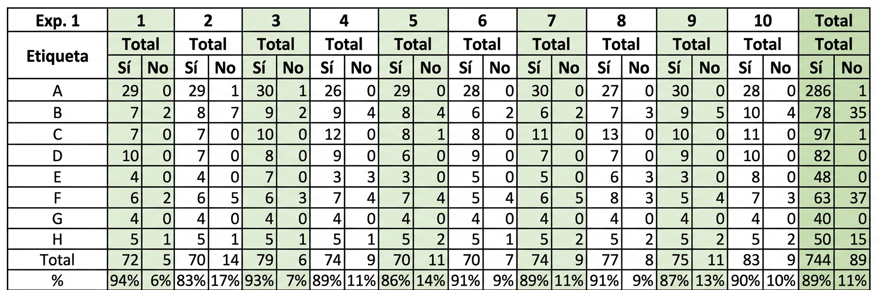
Data Storytelling Concepts

Data density


  • Data density is the ratio of the information displayed to how much space it occupies
  • The ideal data density in a visualization is around 50%-60%
  • Proper data density makes visual details memorable
  • Higher density charts communicate a lot of information but are not always appropriate

  a graphic shows relative stock price and activity using facets and compressed information

1 edwardtufte.com
Data Storytelling Concepts

Never just casually colorful


  • Color should emphasize only specific insights
  • Multiple colors are for highlighting different trends
  • Orange and blue are a color-blind friendly palette

  map shows decreasing population in blue and increasing in orange

Data Storytelling Concepts

Let's practice!

Data Storytelling Concepts

Preparing Video For Download...