Empezar con inteligencia con los gráficos
Conceptos de narración de datos

Joe Franklin
Senior Curriculum Manager, DataCamp
Asigna tus datos a un gráfico

Gráfico circular
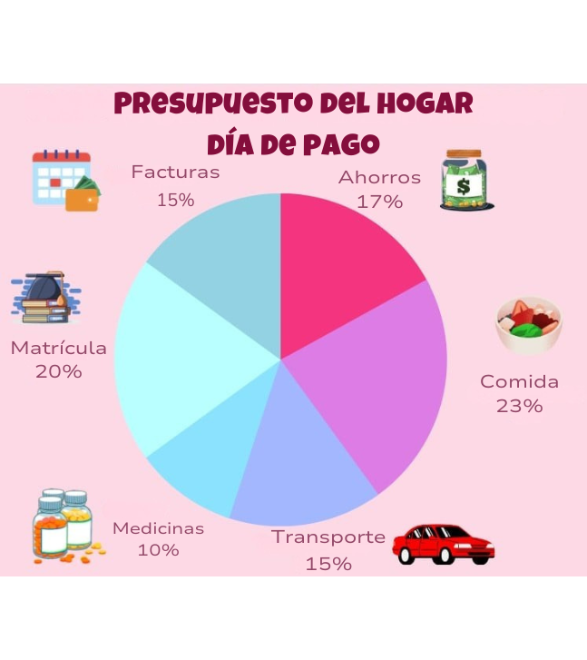
Gráfico de barras
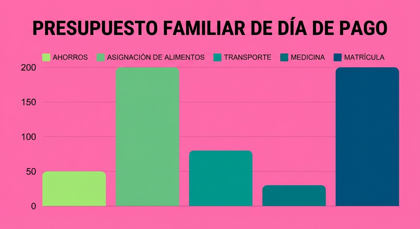
Diagrama de dispersión
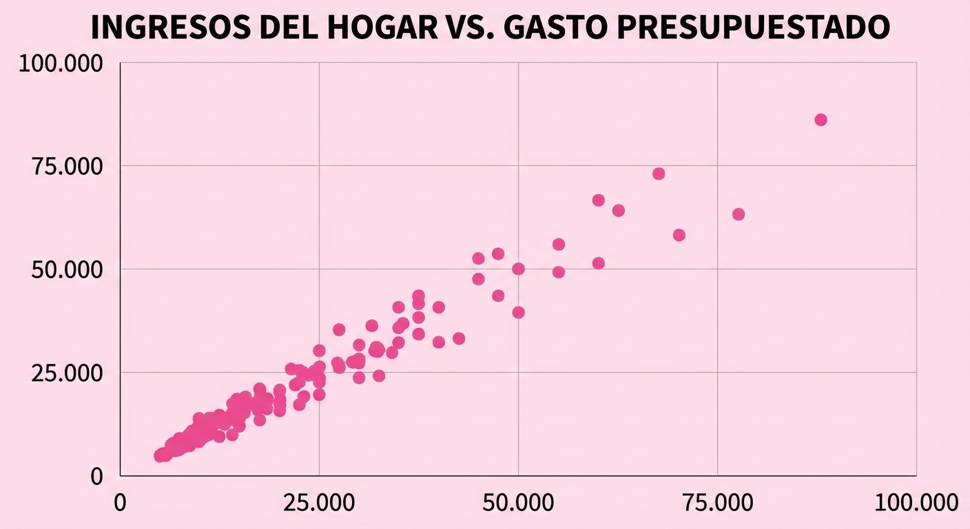
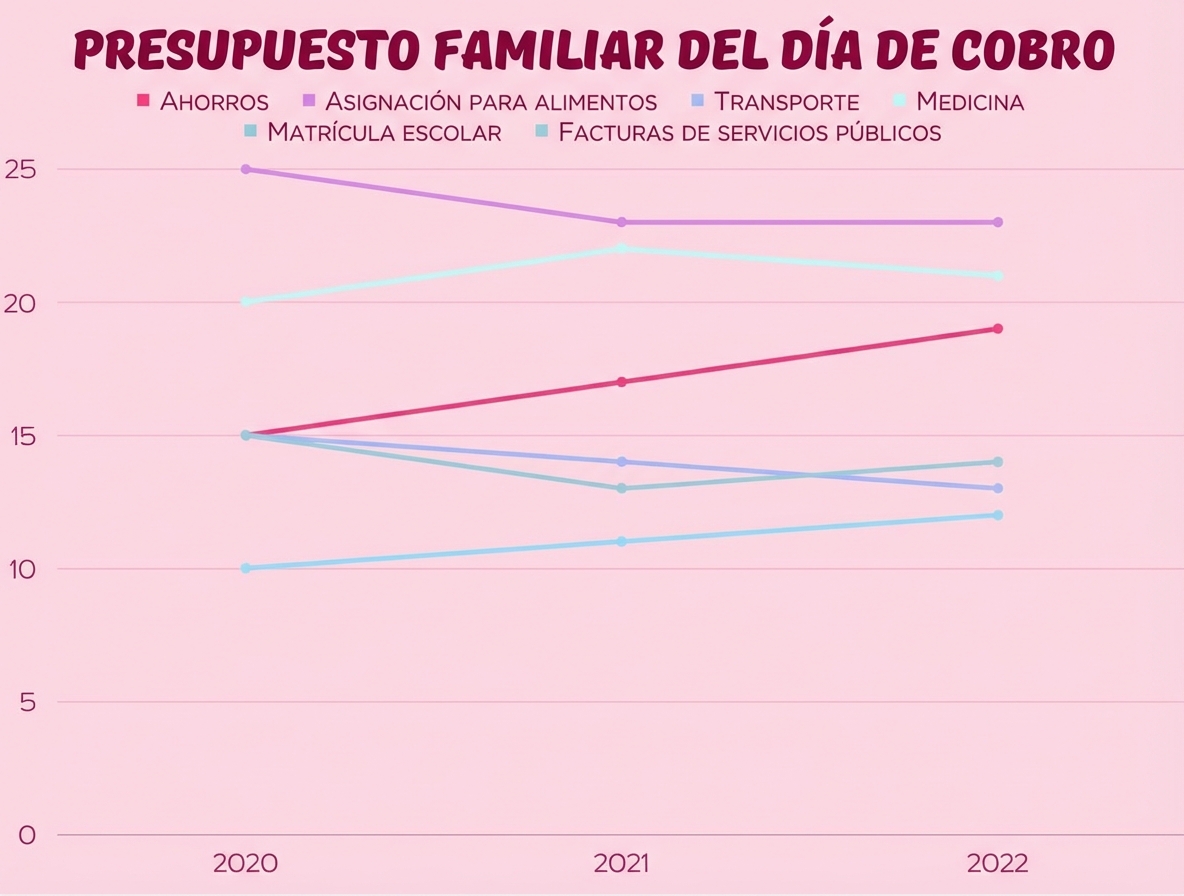
Gráfico lineal
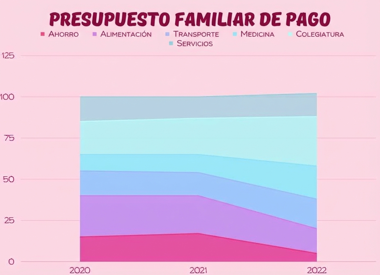
Gráficos de área