Histogramas
Introducción a la visualización de datos con ggplot2

Rick Scavetta
Founder, Scavetta Academy
Histogramas
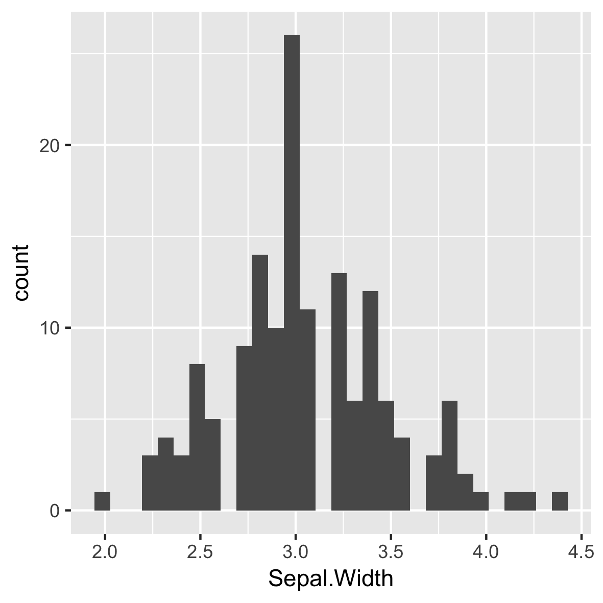
Predeterminado de 30 ubicaciones pares
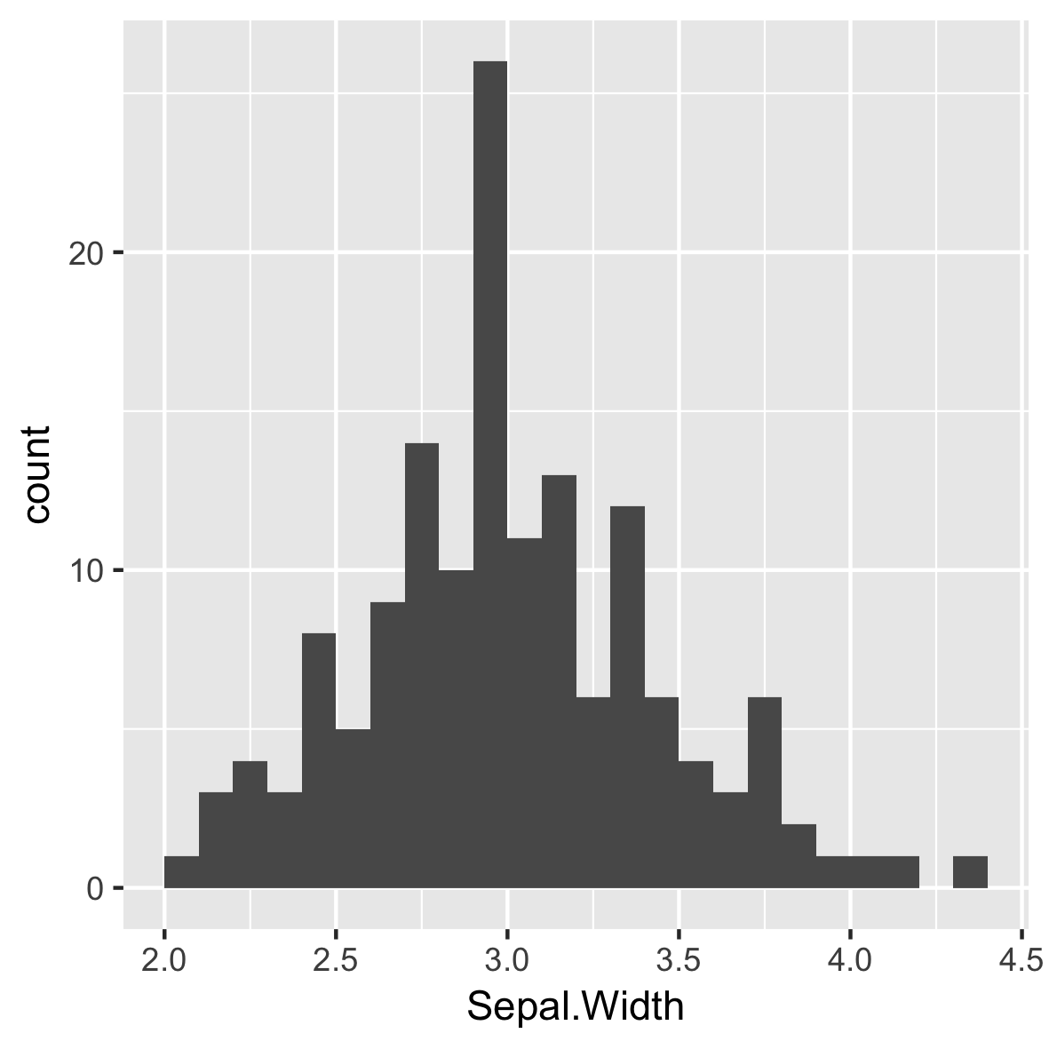
Anchos de contenedor intuitivos y significativos
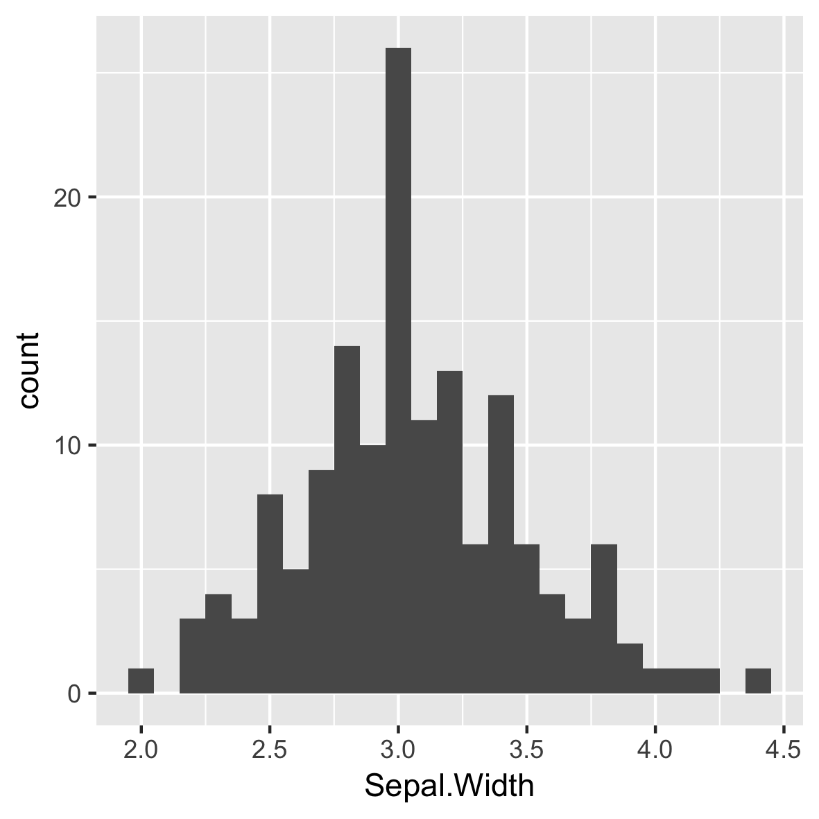
Reposicionar marcas de graduación
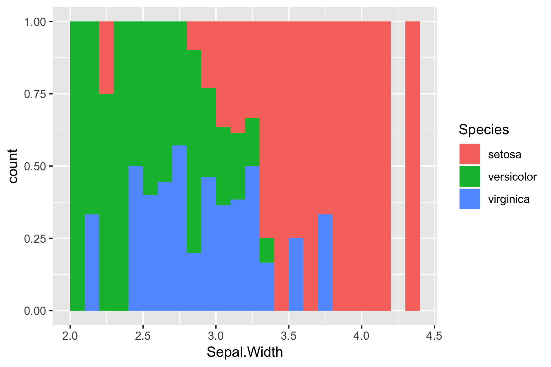
Especies diferentes
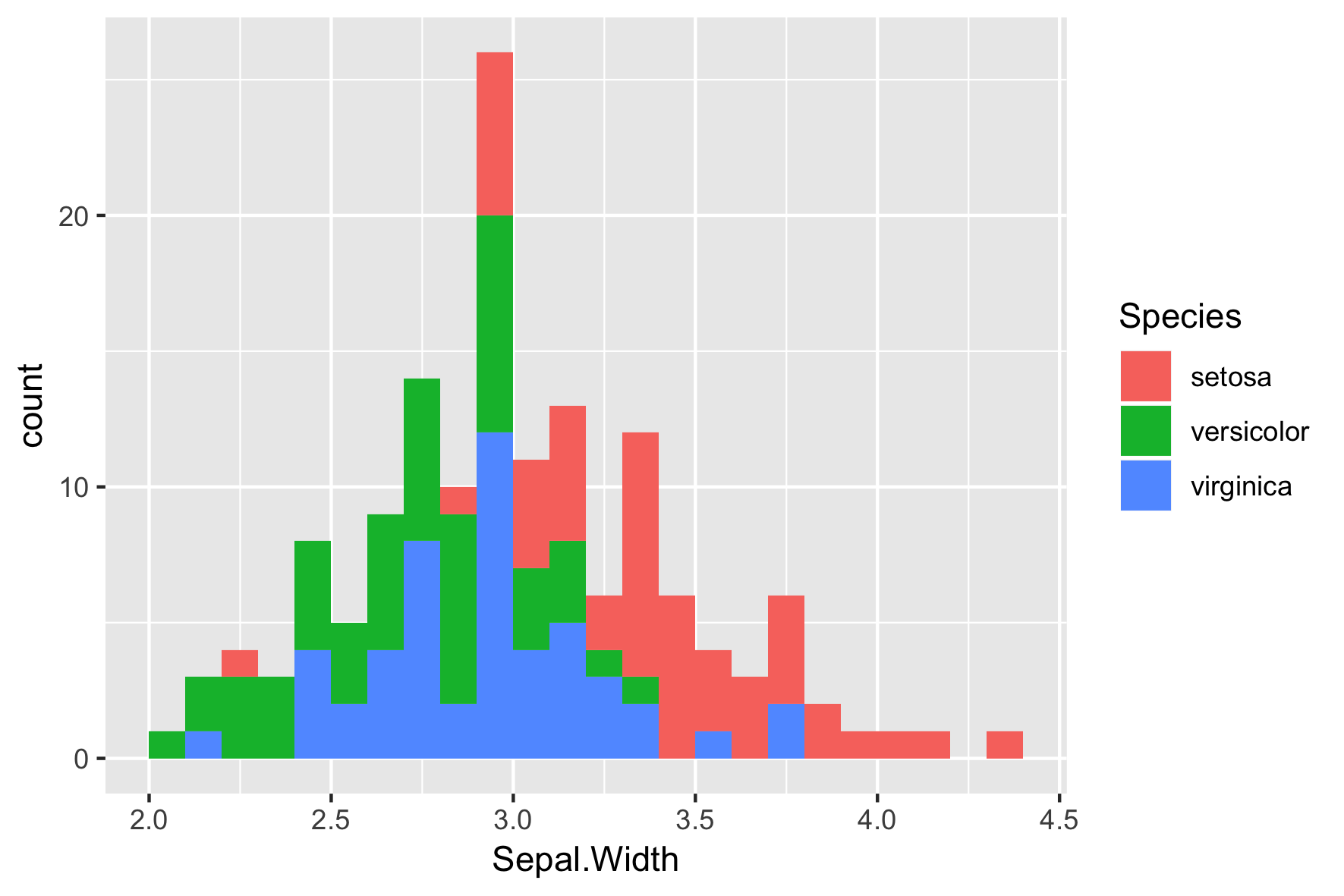
La posición por defecto es "stack"
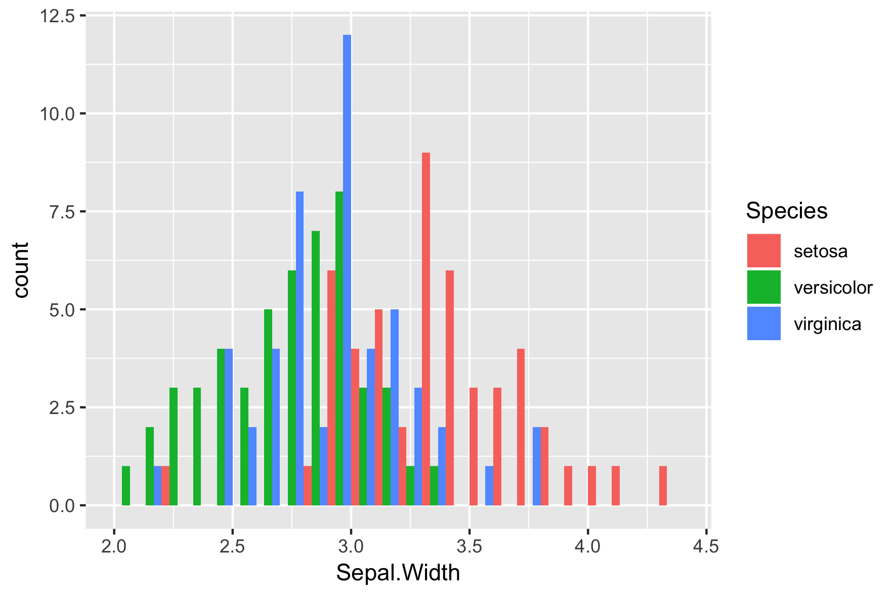
position = "dodge"
position = "fill"