Painéis interativos
Introdução à ciência de dados

Hadrien Lacroix
Content Developer at DataCamp
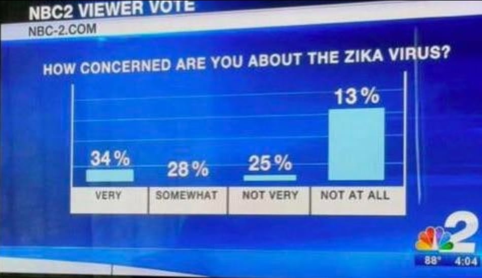
Use cores propositalmente
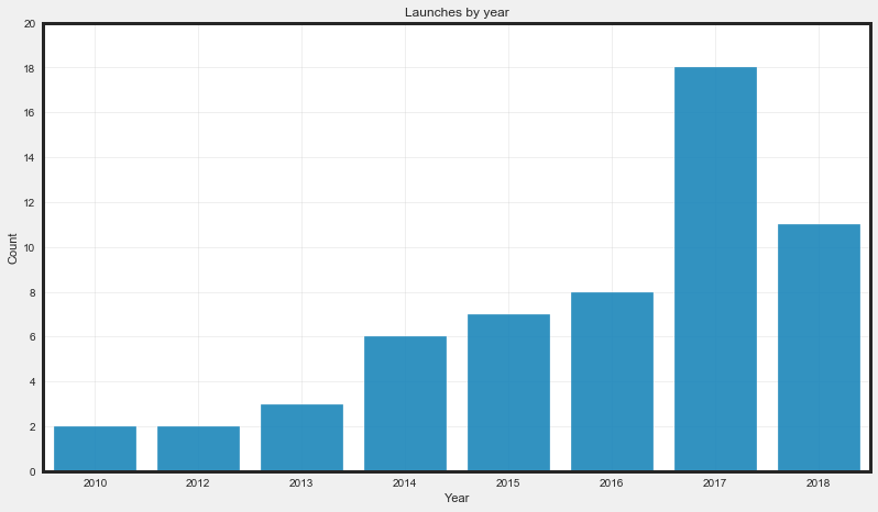
Use cores propositalmente
Use cores propositalmente
Use cores propositalmente
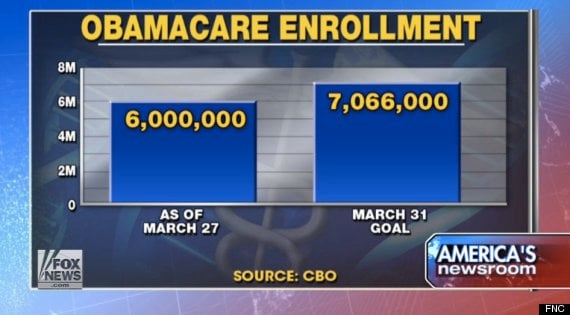
Eixos
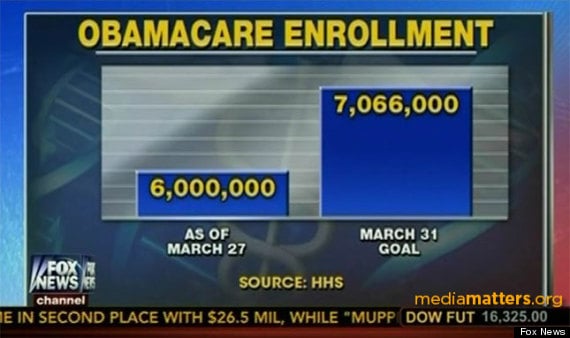
Eixos
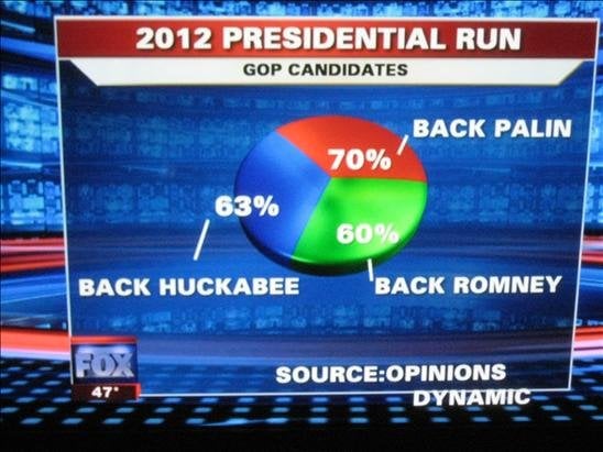
E o prêmio vai para...
Menção honrosa
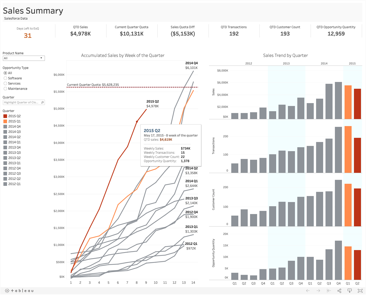
Um painel de controle!
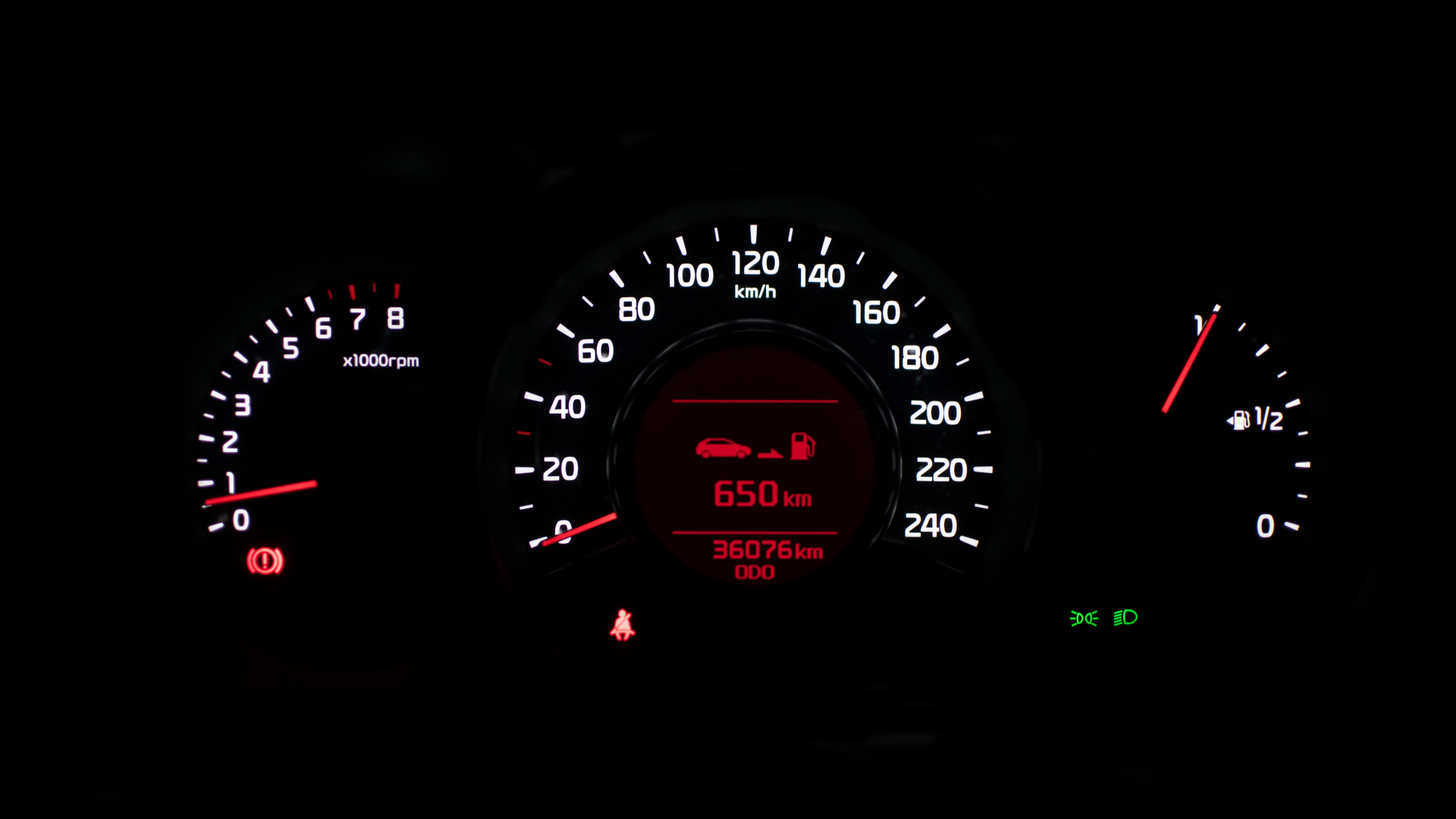
1 Foto de Marek Szturc no Unsplash
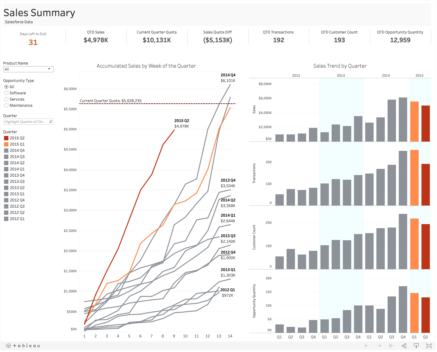
Ferramentas de BI
![]()
![]()
![]()
Próximo nível