Criando um gráfico de barras
Introdução à Ciência de Dados em Python

Hillary Green-Lerman
Lead Data Scientist, Looker
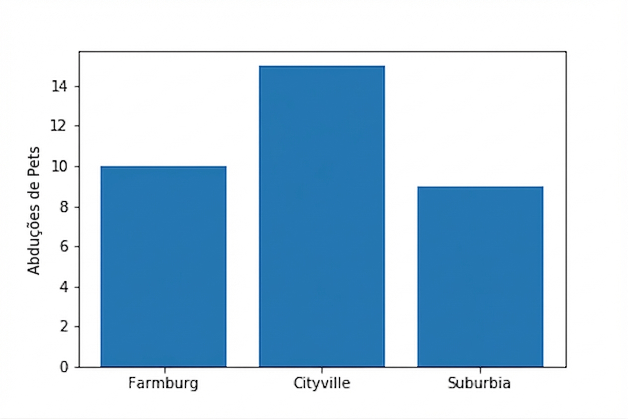
Comparando crimes com pets
plt.bar(df.precinct,
        df.pets_abducted)

plt.ylabel('Pet Abductions')
plt.show()
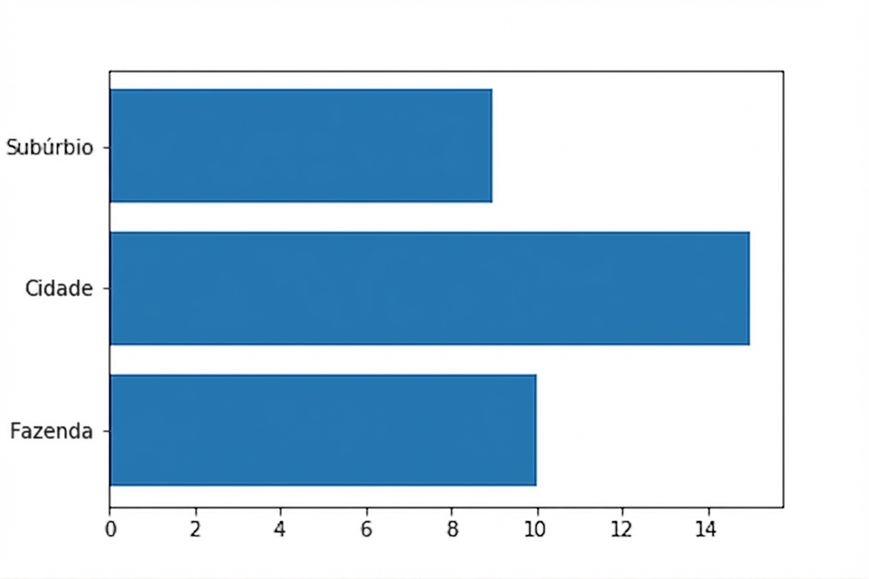
Gráficos de barras horizontais
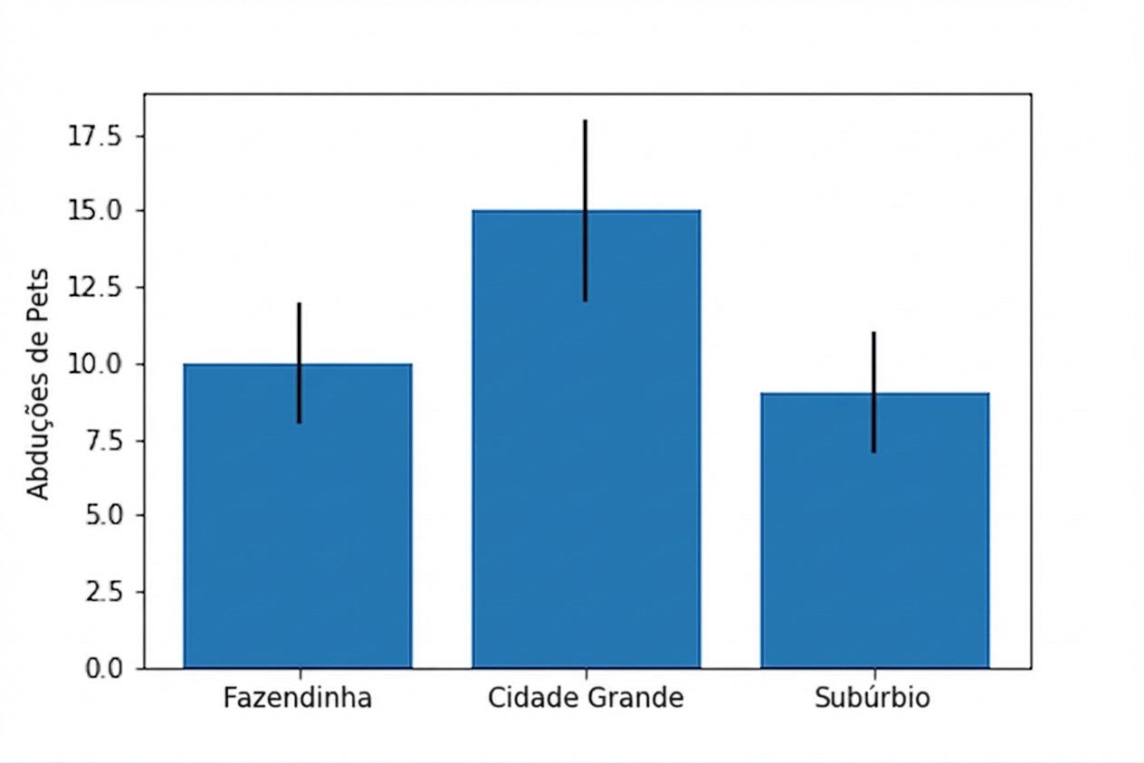
Adicionando barras de erro
plt.bar(df.precinct, df.pet_abductions,
        yerr=df.error)

plt.ylabel('Pet Abductions')
plt.show()
Barras empilhadas
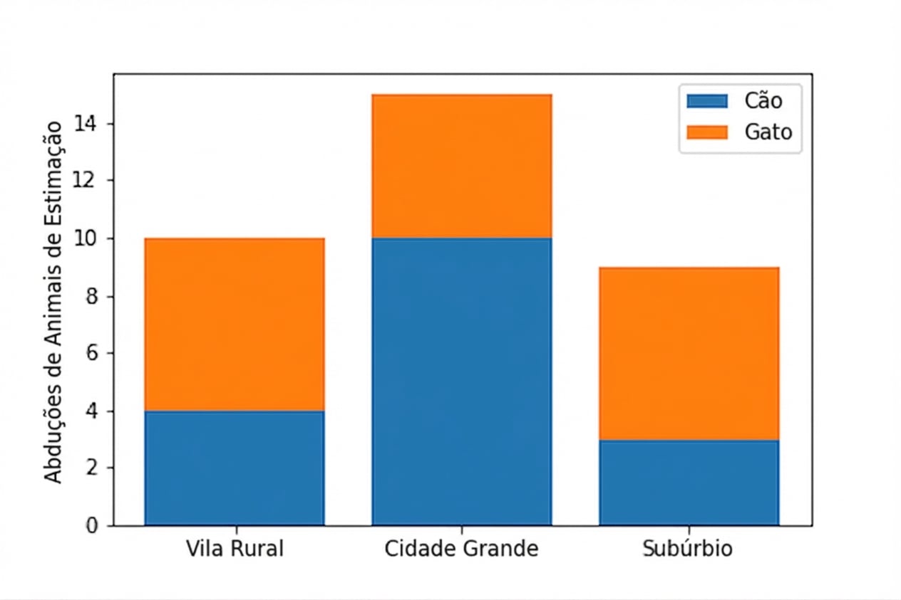
Barras empilhadas
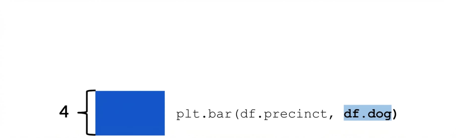
Barras empilhadas
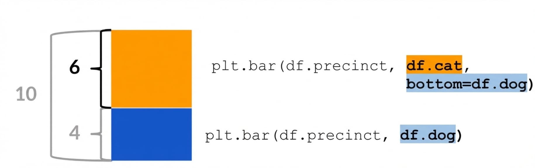
Barras empilhadas

