Relaciones entre variables continuas
Análisis exploratorio de datos en Power BI

Maarten Van den Broeck
Content Developer at DataCamp
¿Qué es un diagrama de dispersión?
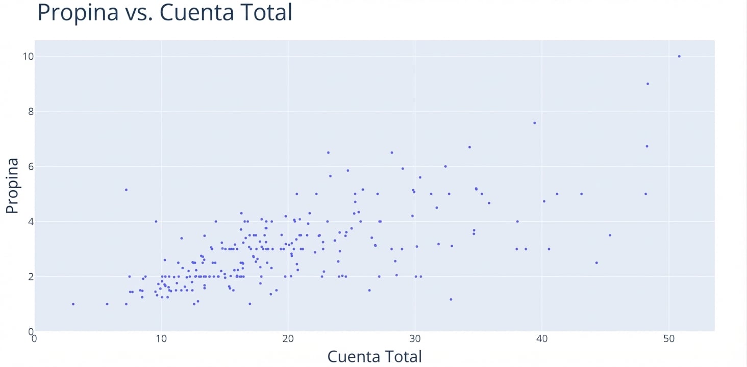
¿Qué es un diagrama de dispersión?
¿Qué es un diagrama de dispersión?
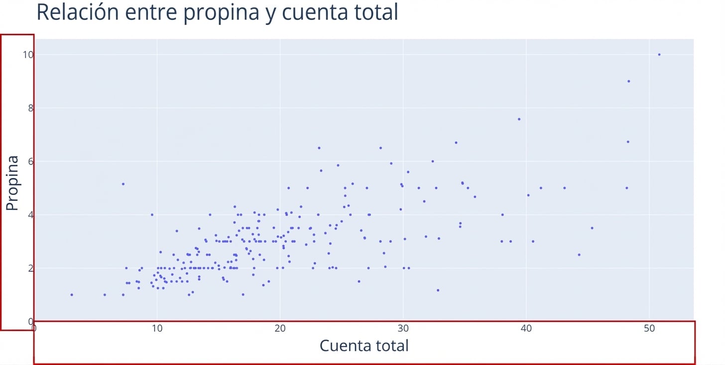
Cómo interpretar un diagrama de dispersión
Cómo interpretar un diagrama de dispersión
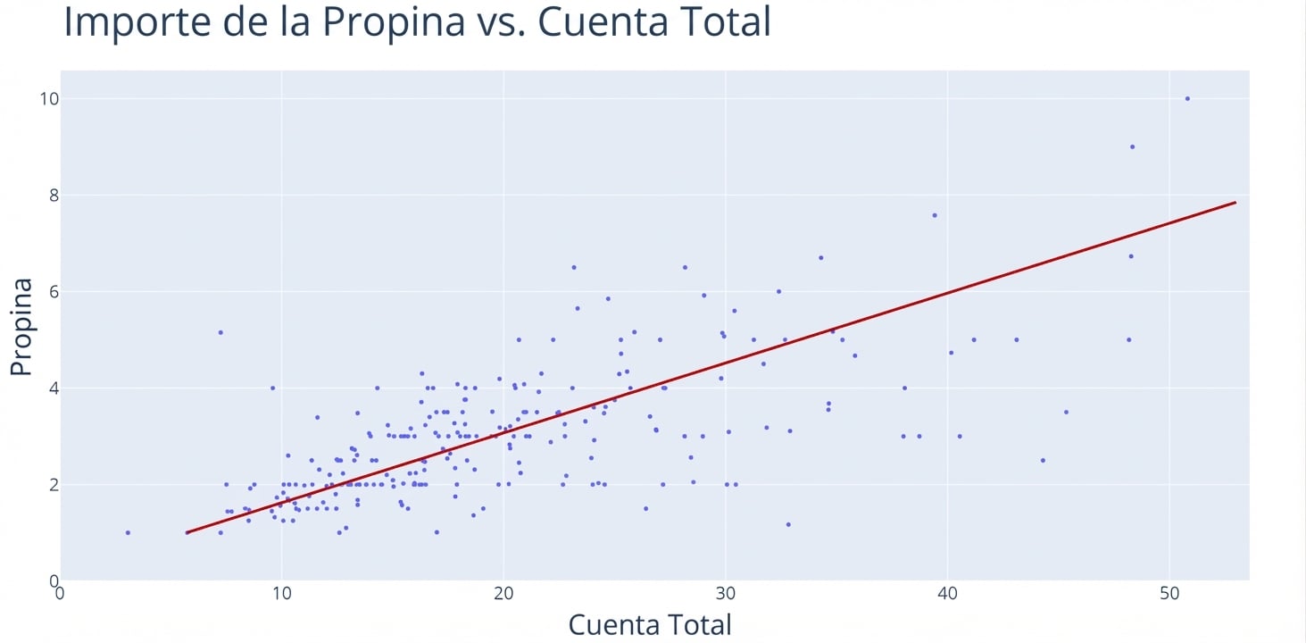
Cómo interpretar un diagrama de dispersión
Cómo interpretar un diagrama de dispersión
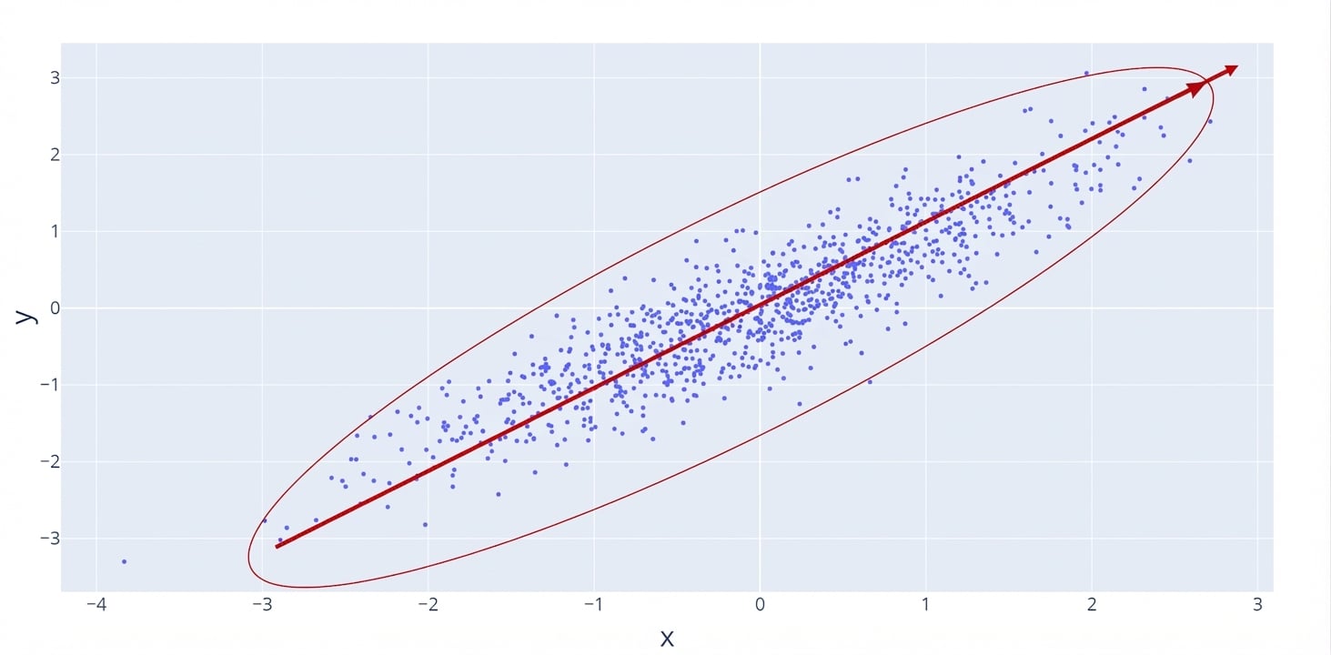
Fuerte-positiva
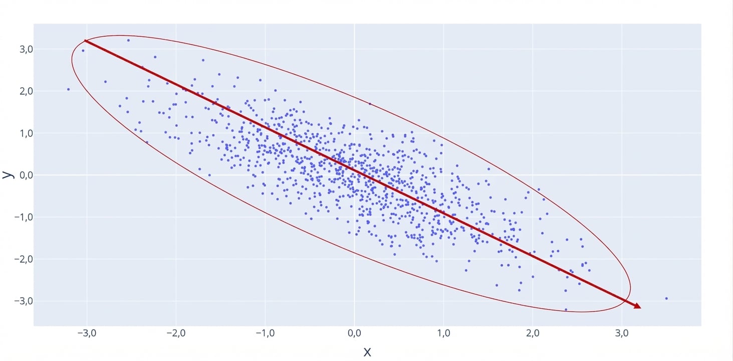
Fuerte-negativa
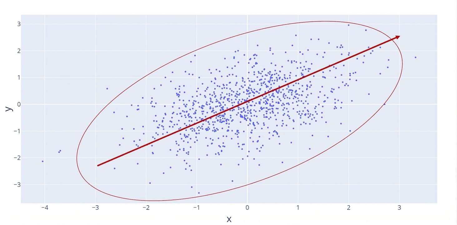
Débil-positiva
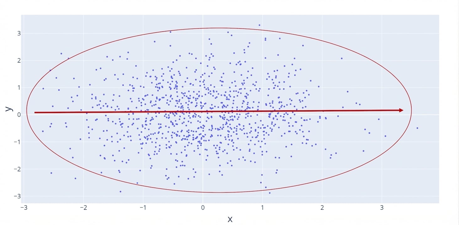
Sin relación
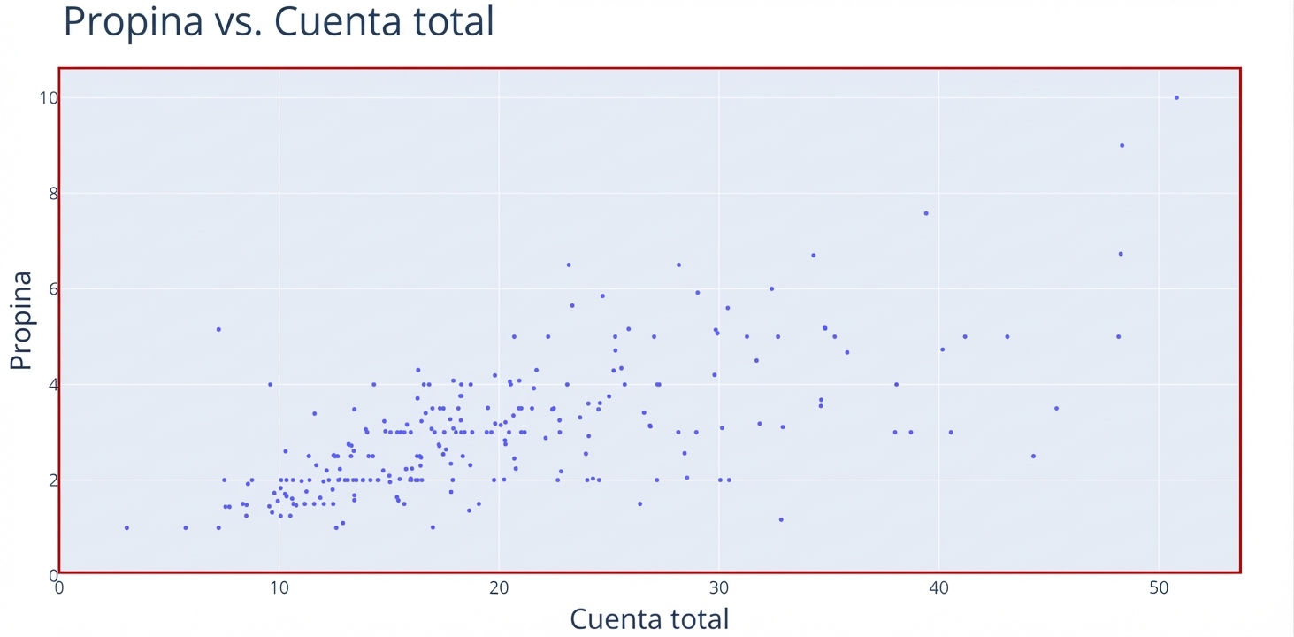
Coeficiente de correlación y diagramas de dispersión
Fuerte-positiva r=0.9
Fuerte-negativa r=-0.9
Débil-positiva r=0.35
Sin relación r=0.0
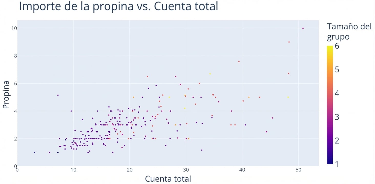
Añadir contexto a un diagrama de dispersión