Estadísticas: sum y quantile
Visualización de datos intermedia con ggplot2

Rick Scavetta
Founder, Scavetta Academy
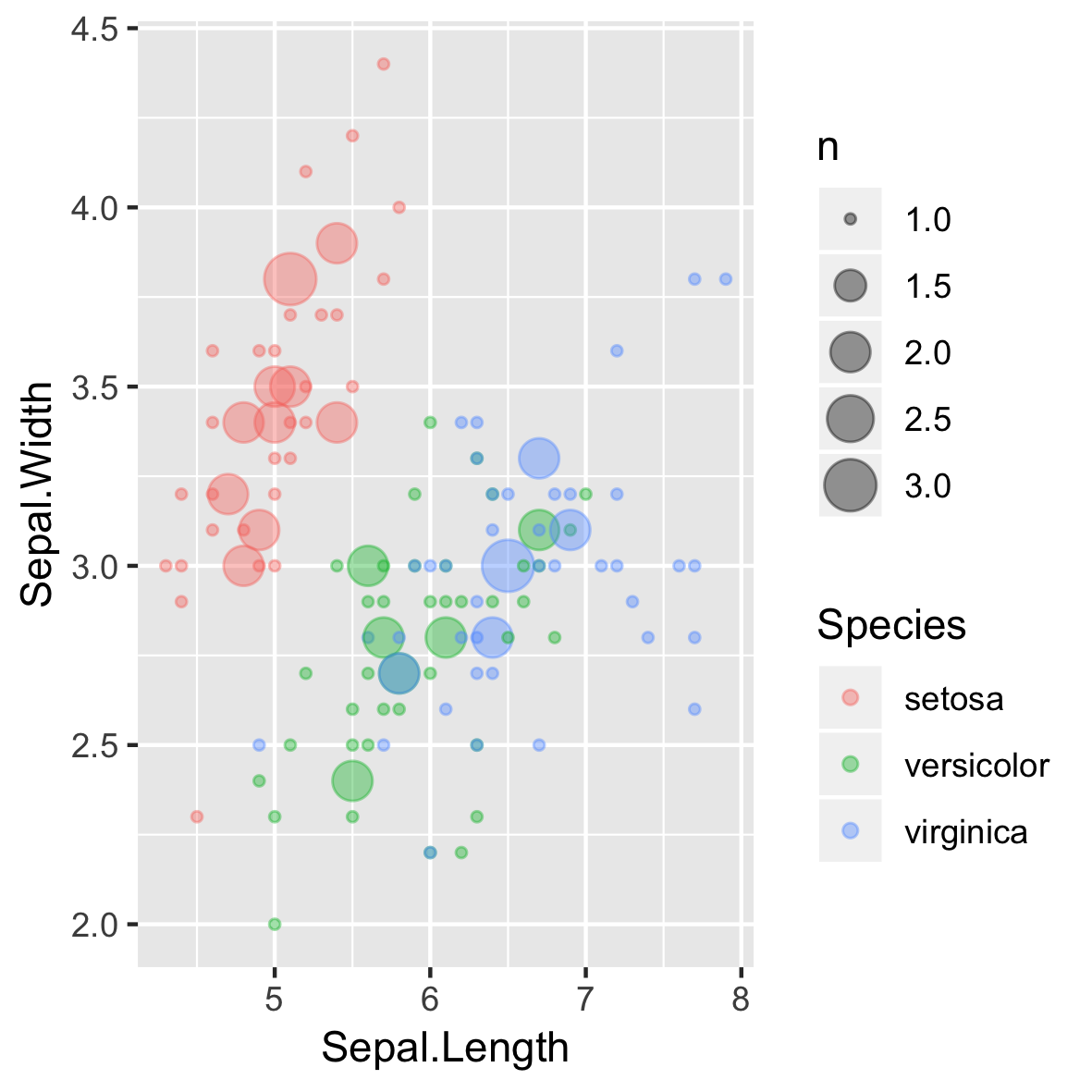
Datos de baja precisión (y enteros)
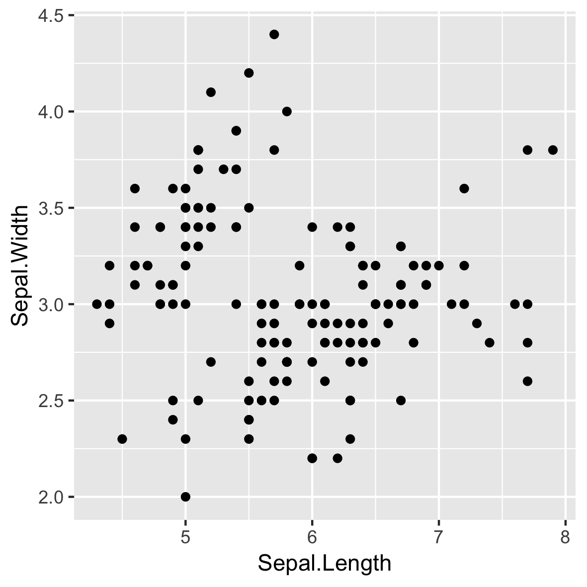
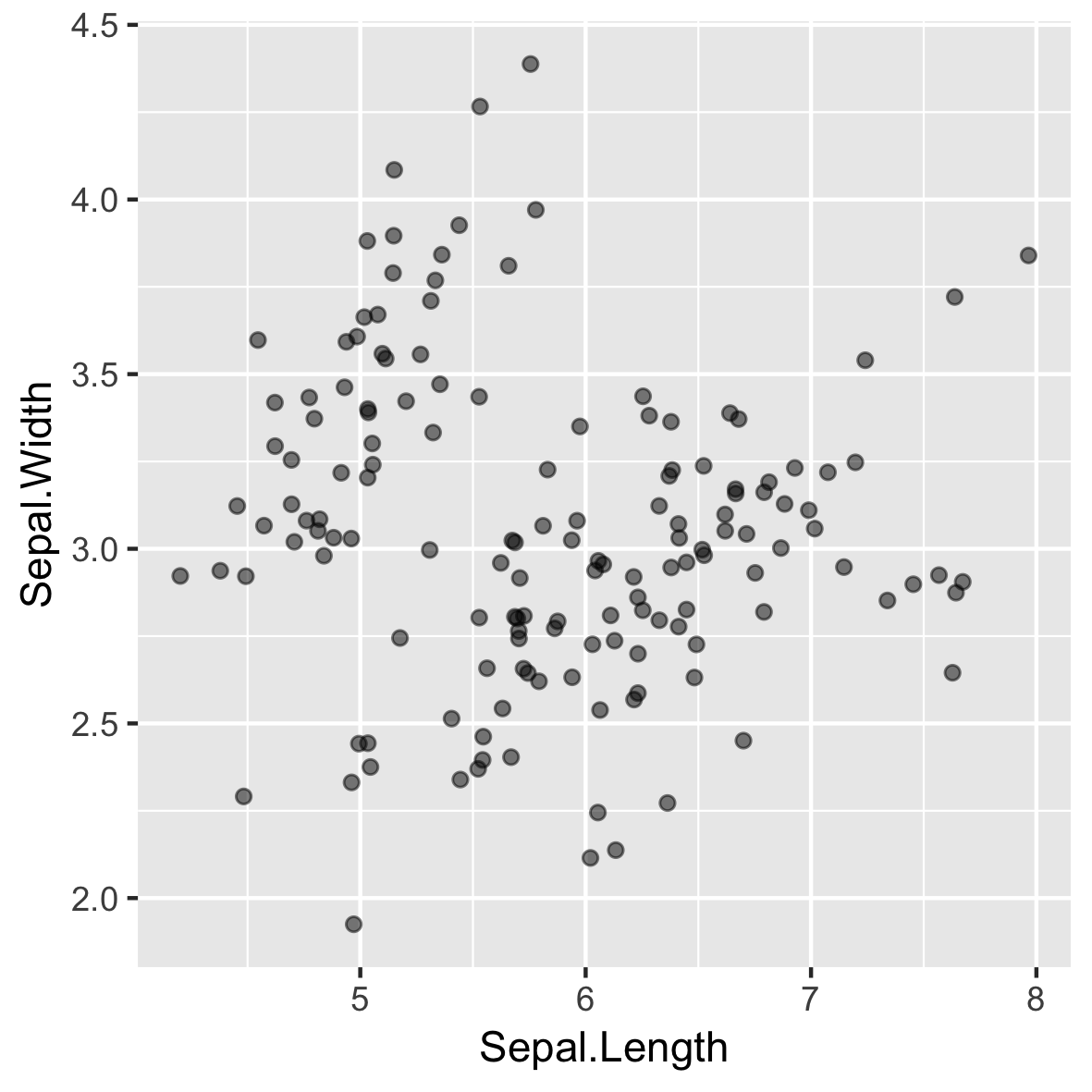
El jitter puede dar una impresión errónea
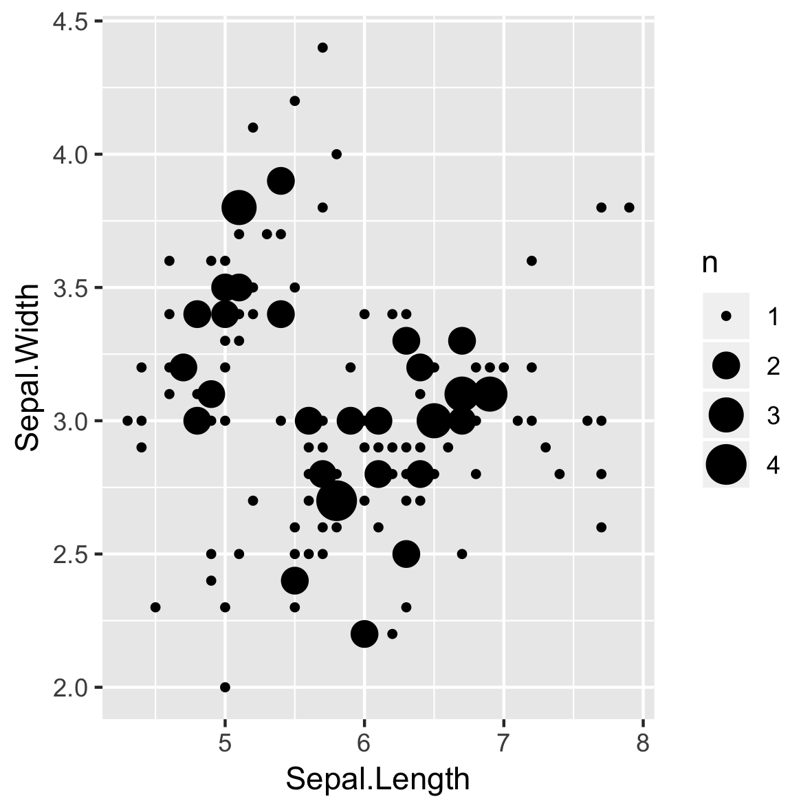
geom_count()

stat_sum()
El sobretrazado aún puede ser un problema
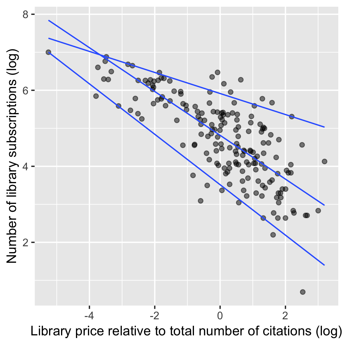
Cómo tratar la heterocedasticidad
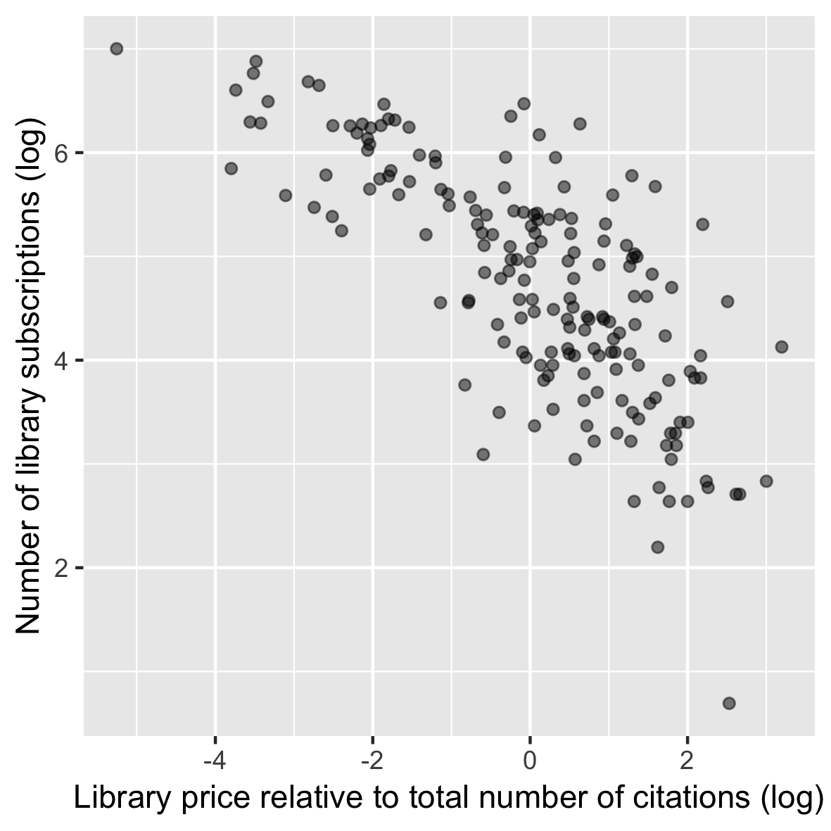
Usar geom_quantile