Estadísticas fuera de los geoms
Visualización de datos intermedia con ggplot2

Rick Scavetta
Founder, Scavetta Academy
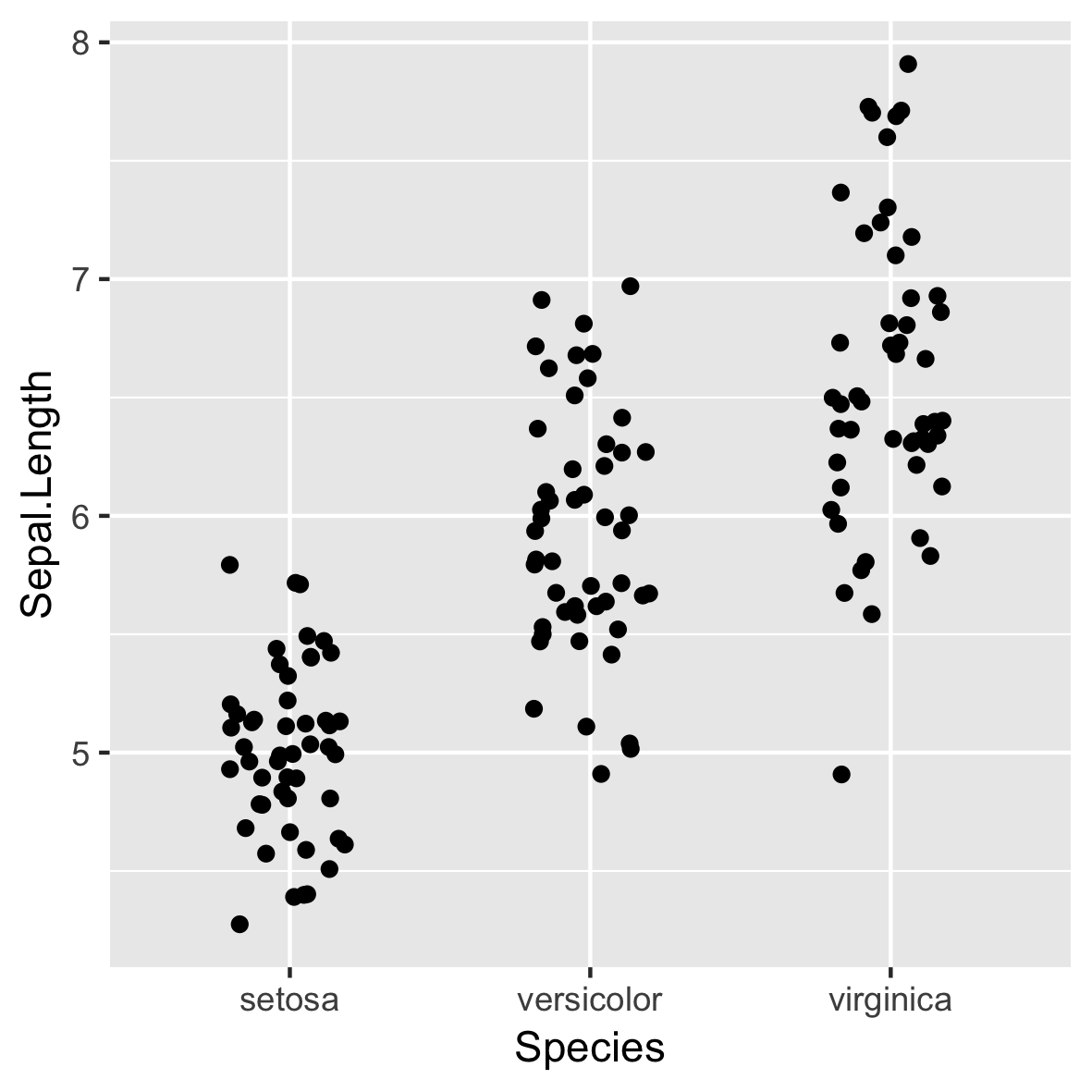
Gráfico básico
stat_summary()
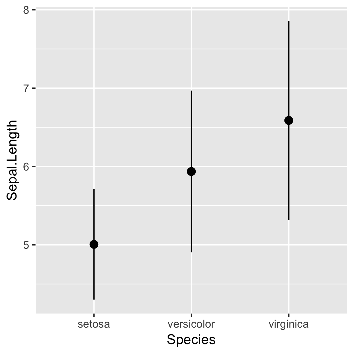
stat_summary()
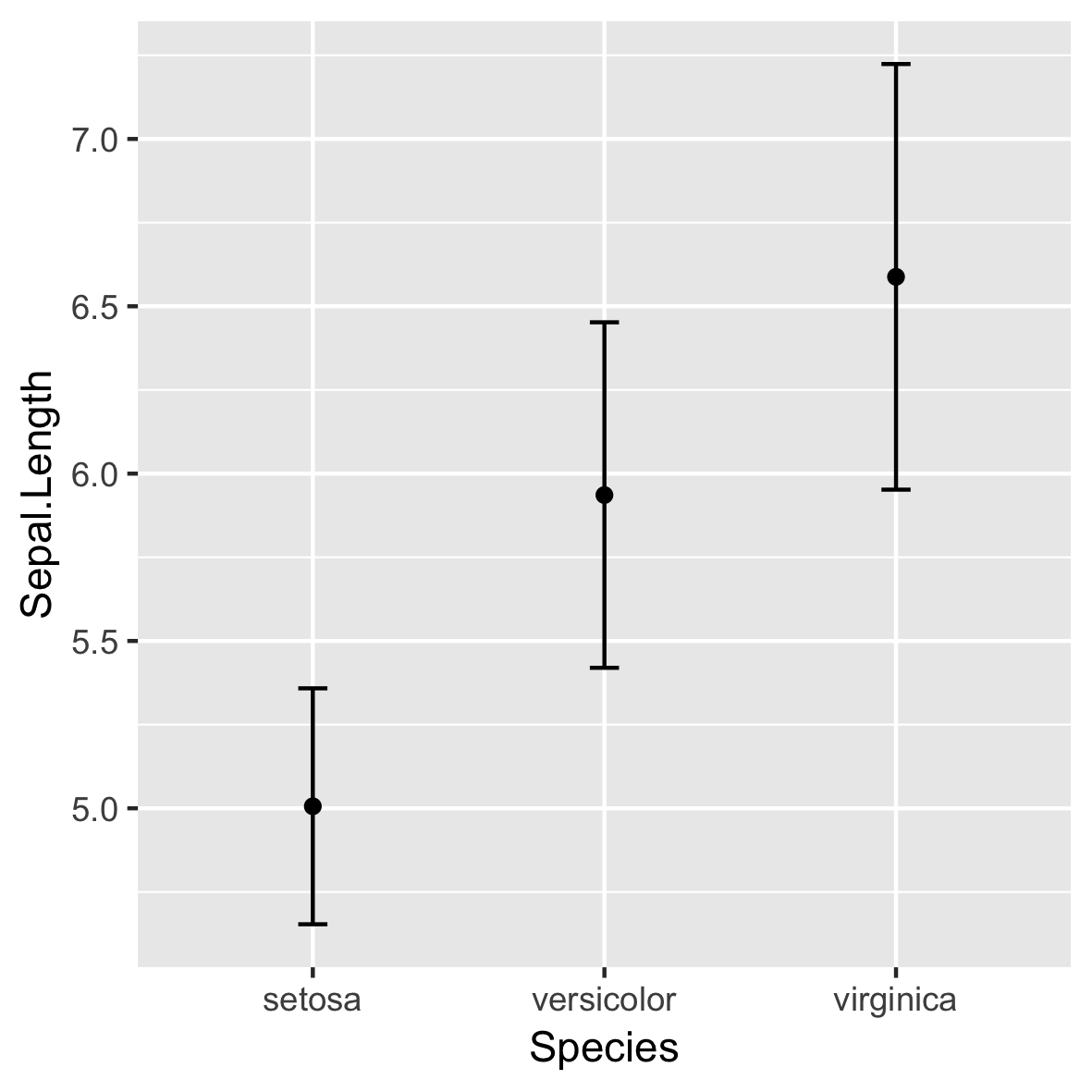
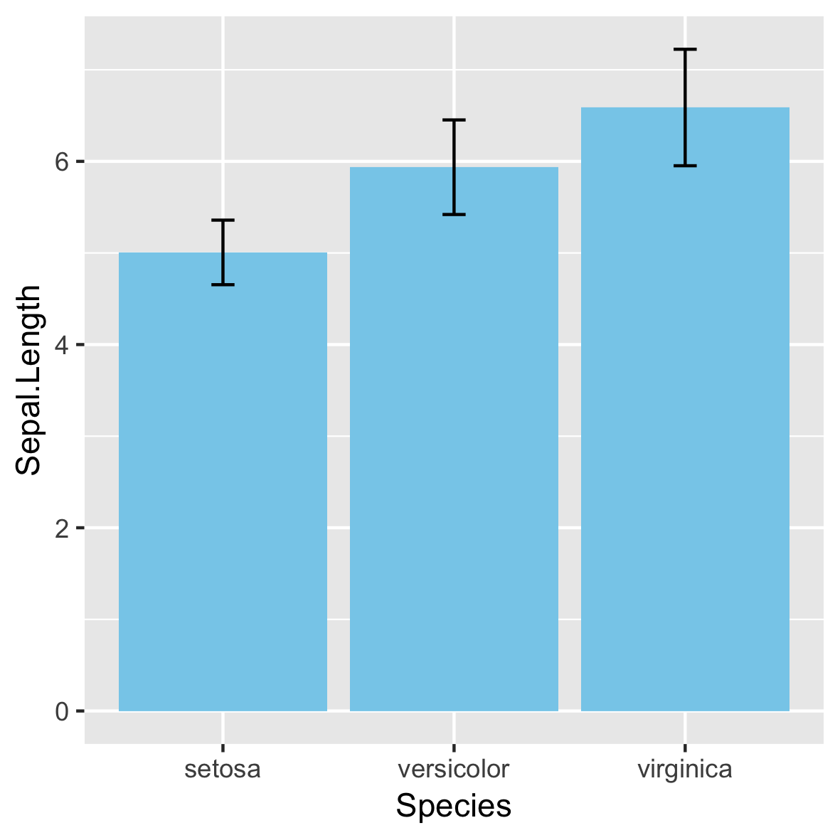
¡No recomendado!
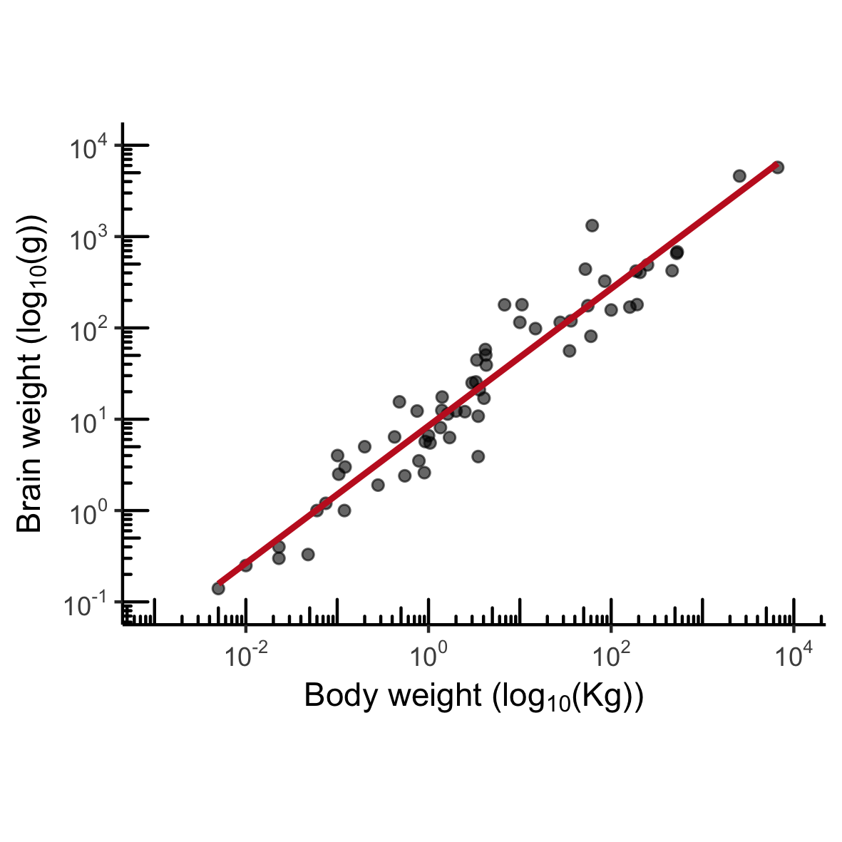
MASS::mammals
Distribución normal
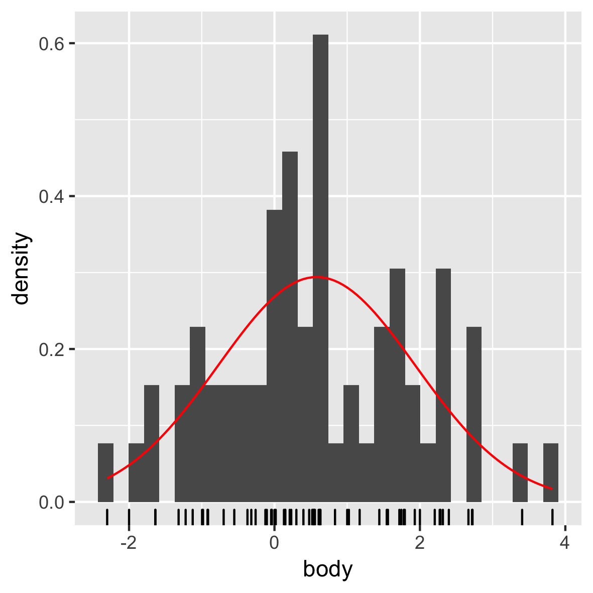
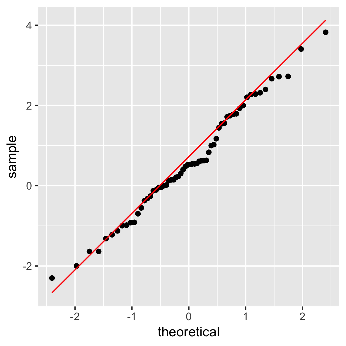
Gráfico QQ
Visualización de datos intermedia con ggplot2
Rick Scavetta
Founder, Scavetta Academy
¡No recomendado!

