Cuando buenos datos crean malos gráficos
Visualización de datos intermedia con ggplot2

Rick Scavetta
Founder, Scavetta Academy
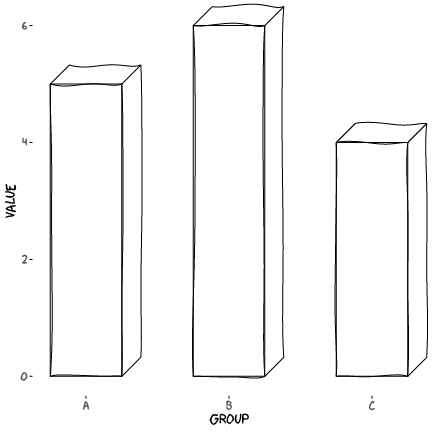
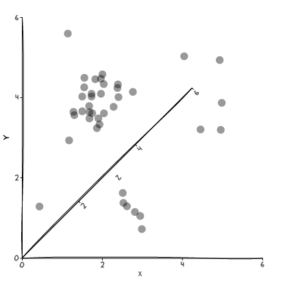
Orientación incorrecta
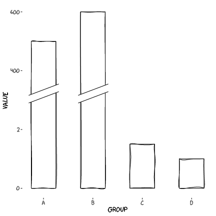
Ejes y rotos
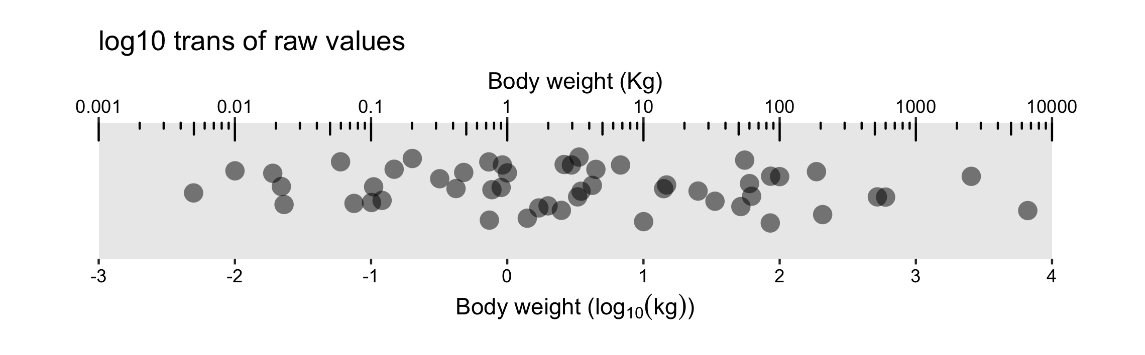
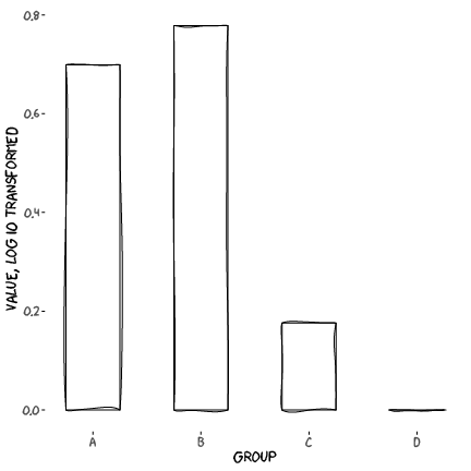
Ejes y rotos, sustituir por datos transformados
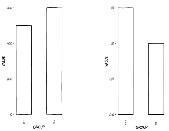
Ejes y rotos, usar facetas
Gráficos 3D, sin datos en el 3er eje
Gráficos 3D, con datos en el 3er eje
Doble eje y
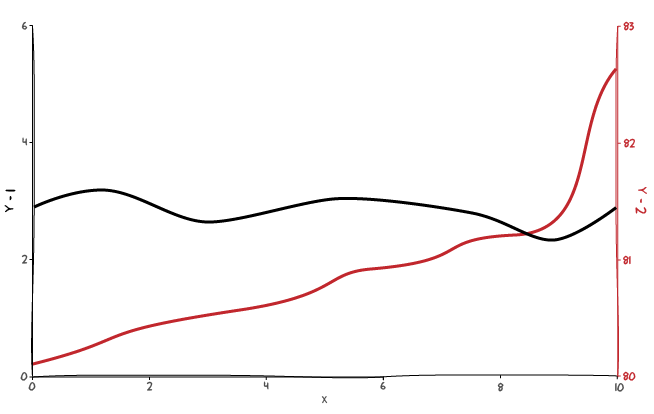
Doble eje y para transformaciones