Uso de cores
Entendendo a visualização de dados

Richie Cotton
Data Evangelist at DataCamp
Espaços de cores: Vermelho-Verde-Azul

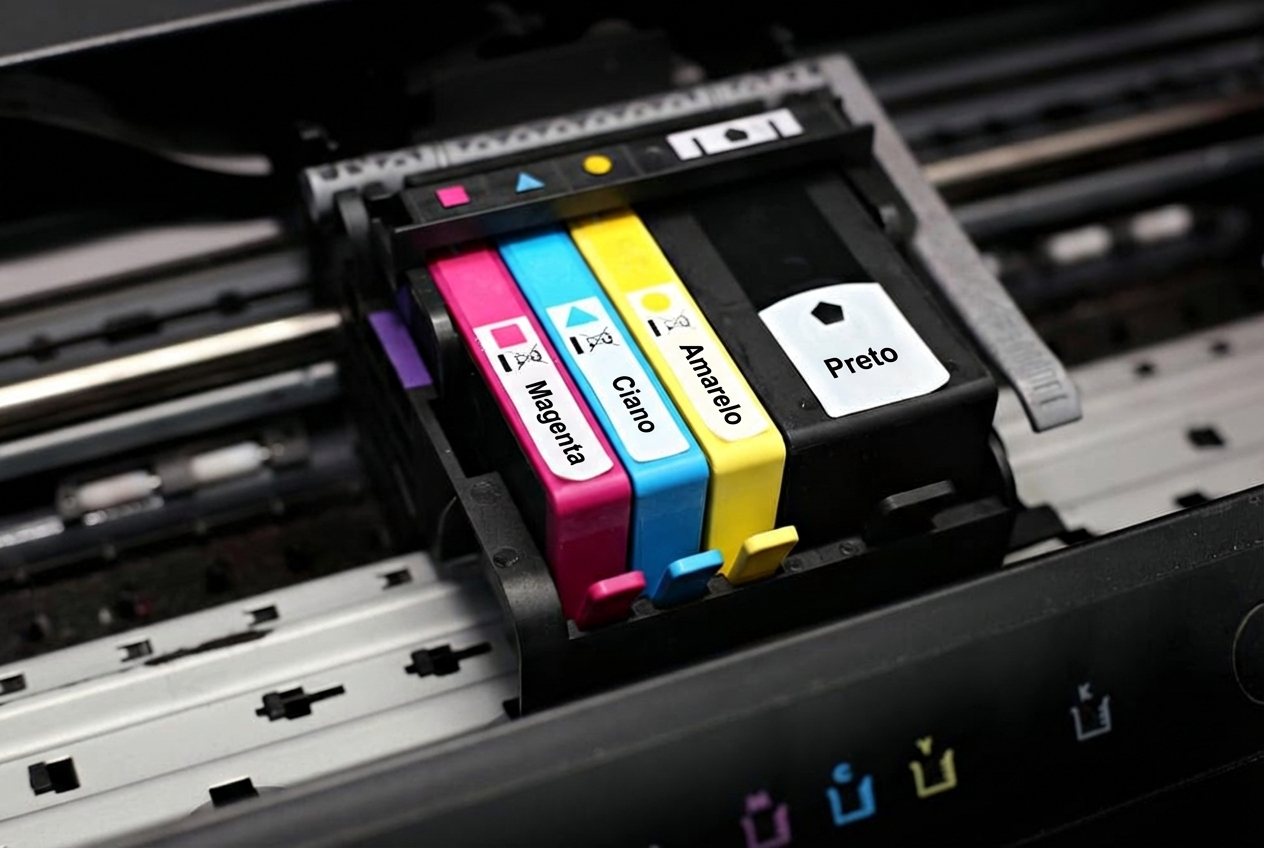
Espaços de cores: Ciano-Magenta-Amarelo-Preto
Escolha de uma paleta para gráficos
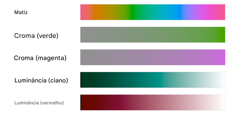
Espaços de cores: Matiz-Croma-Luminância
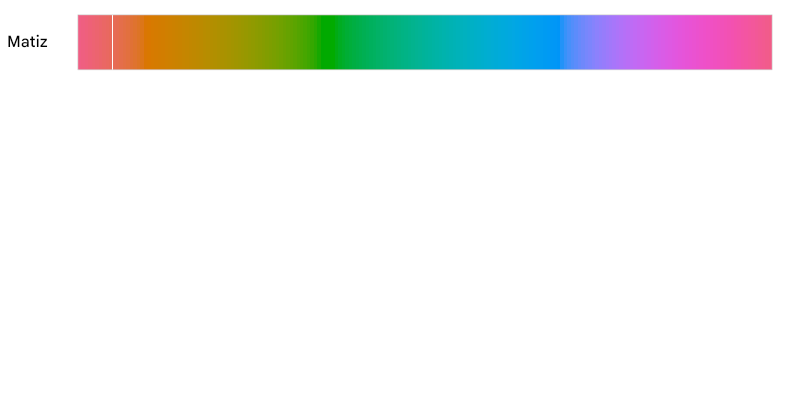
Espaços de cores: Matiz-Croma-Luminância
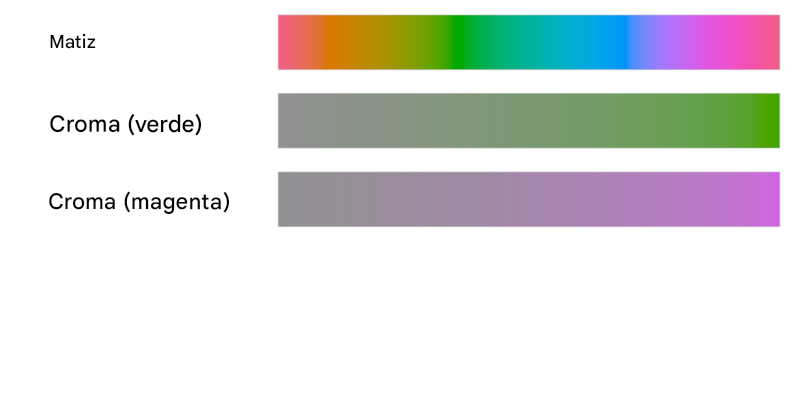
Espaços de cores: Matiz-Croma-Luminância
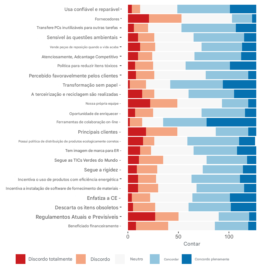
Três tipos de escala de cores: qualitativa

Exemplo de paleta qualitativa
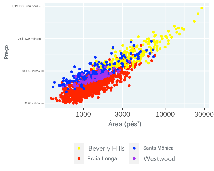
Três tipos de escala de cores: sequencial

Exemplo de paleta sequencial

Outro exemplo de paleta sequencial
1 Escala de cores Viridis: https://bids.github.io/colormap
Três tipos de escala de cores: divergente

Exemplo de paleta divergente