Como automatizar figuras baseadas em dados
Introdução à Visualização de Dados com a Matplotlib

Ariel Rokem
Data Scientist
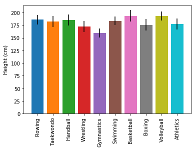
Valor calculado automaticamente a partir dos dados
Introdução à Visualização de Dados com a Matplotlib
Ariel Rokem
Data Scientist

