Gráficos estatísticos
Introdução à Visualização de Dados com a Matplotlib

Ariel Rokem
Data Scientist
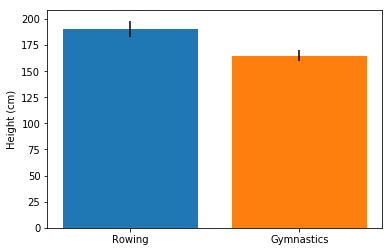
Barras de erro em um gráfico de barras
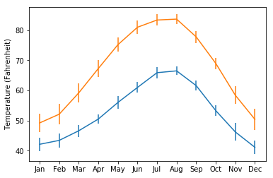
Barras de erro nos gráficos
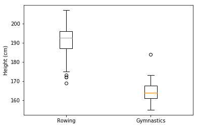
Interpretando gráficos de caixa
Introdução à Visualização de Dados com a Matplotlib
Ariel Rokem
Data Scientist

