Comparações quantitativas: gráficos de barras
Introdução à Visualização de Dados com a Matplotlib

Ariel Rokem
Data Scientist
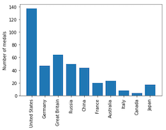
Medalhas olímpicas: visualizando os dados
medals = pd.read_csv('medals_by_country_2016.csv', index_col=0)fig, ax = plt.subplots()ax.bar(medals.index, medals["Gold"]) plt.show()
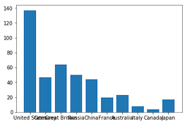
Interlúdio: gire as etiquetas dos ticks
fig, ax = plt.subplots() ax.bar(medals.index, medals["Gold"])ax.set_xticklabels(medals.index, rotation=90) ax.set_ylabel("Number of medals")plt.show()
Medalhas olímpicas: visualizando as outras medalhas
fig, ax = plt.subplots ax.bar(medals.index, medals["Gold"])ax.bar(medals.index, medals["Silver"], bottom=medals["Gold"])ax.set_xticklabels(medals.index, rotation=90) ax.set_ylabel("Number of medals") plt.show()
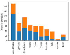
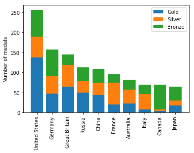
Gráfico de barras empilhadas
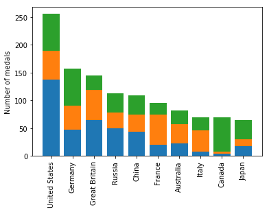
Gráfico de barras empilhadas com legenda