Como gerar gráficos de dados de séries temporais
Introdução à Visualização de Dados com a Matplotlib

Ariel Rokem
Data Scientist
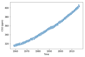
Dados de séries temporais
Como gerar gráficos de dados de séries temporais
import matplotlib.pyplot as plt
fig, ax = plt.subplots()
ax.plot(climate_change.index, climate_change['co2'])
ax.set_xlabel('Time')
ax.set_ylabel('CO2 (ppm)')
plt.show()
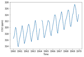
Focando em uma década
sixties = climate_change["1960-01-01":"1969-12-31"]
fig, ax = plt.subplots()
ax.plot(sixties.index, sixties['co2'])
ax.set_xlabel('Time')
ax.set_ylabel('CO2 (ppm)')
plt.show()
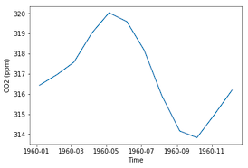
Focando em um ano
sixty_nine = climate_change["1969-01-01":"1969-12-31"]fig, ax = plt.subplots() ax.plot(sixty_nine.index, sixty_nine['co2']) ax.set_xlabel('Time') ax.set_ylabel('CO2 (ppm)') plt.show()